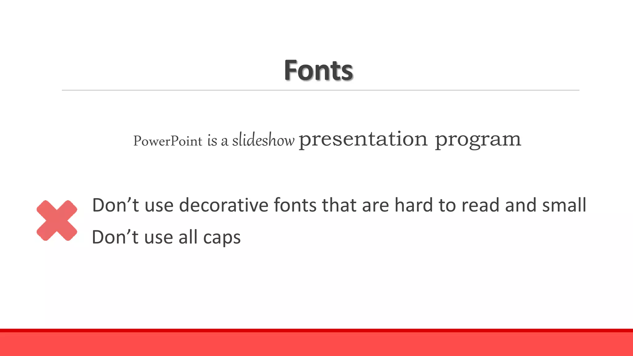
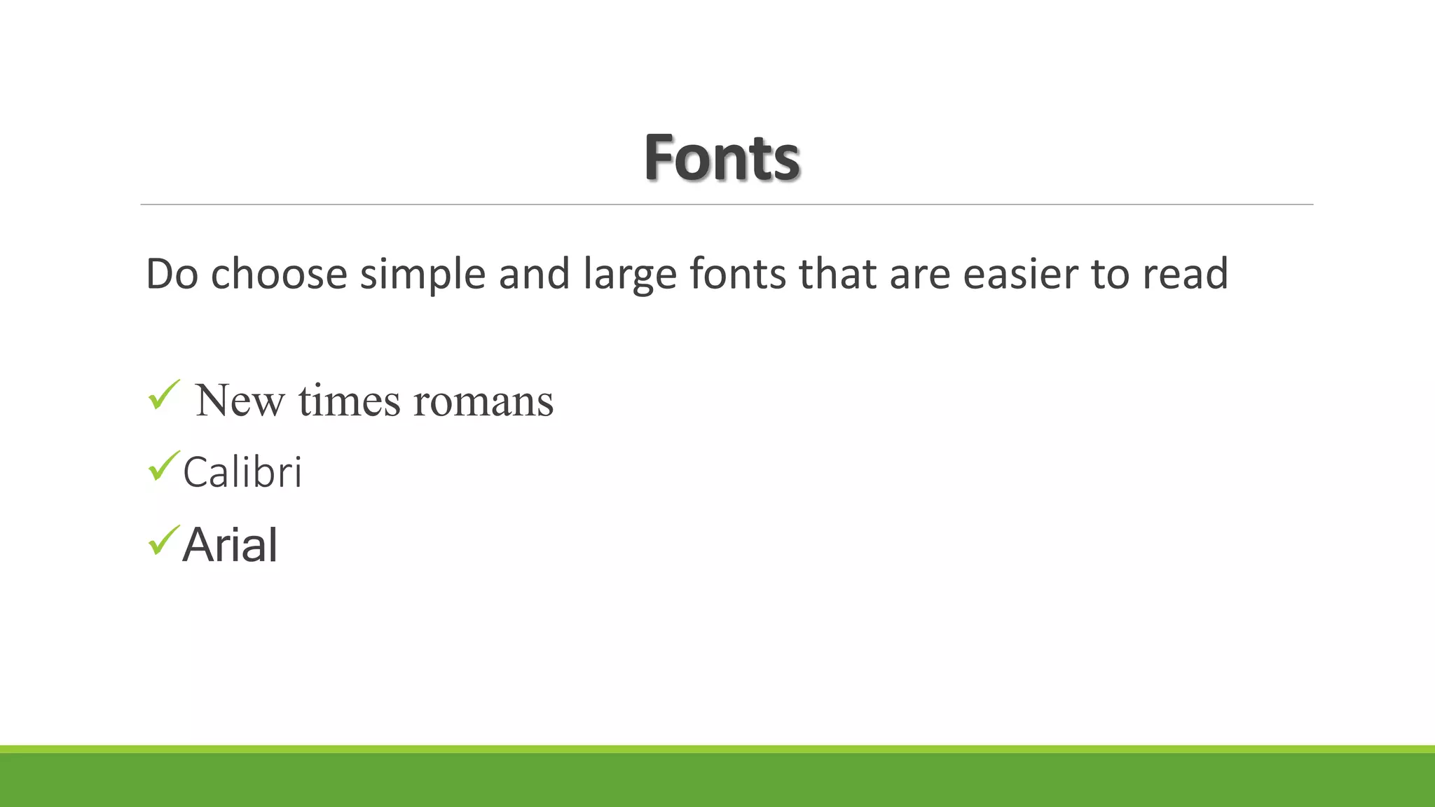
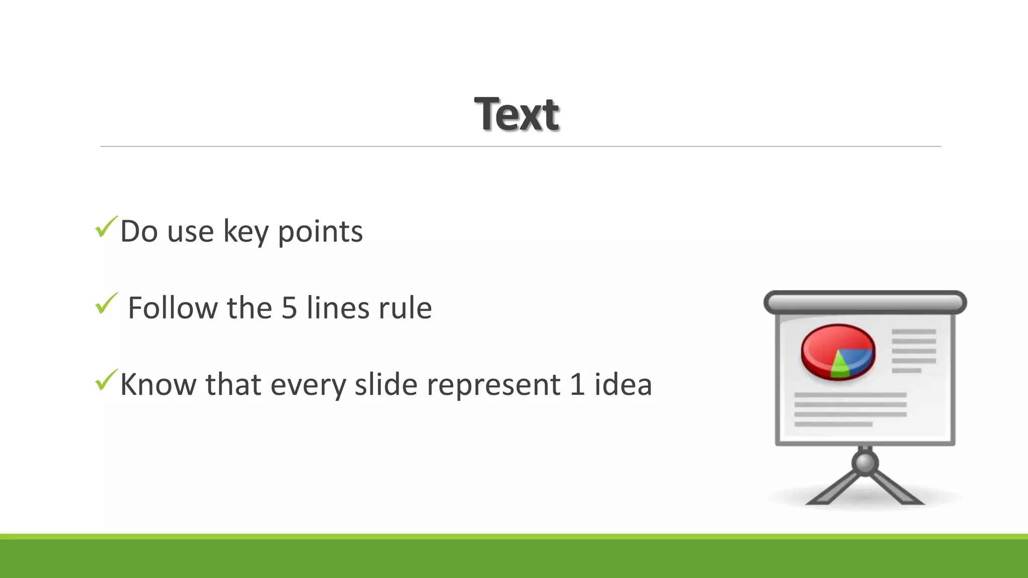
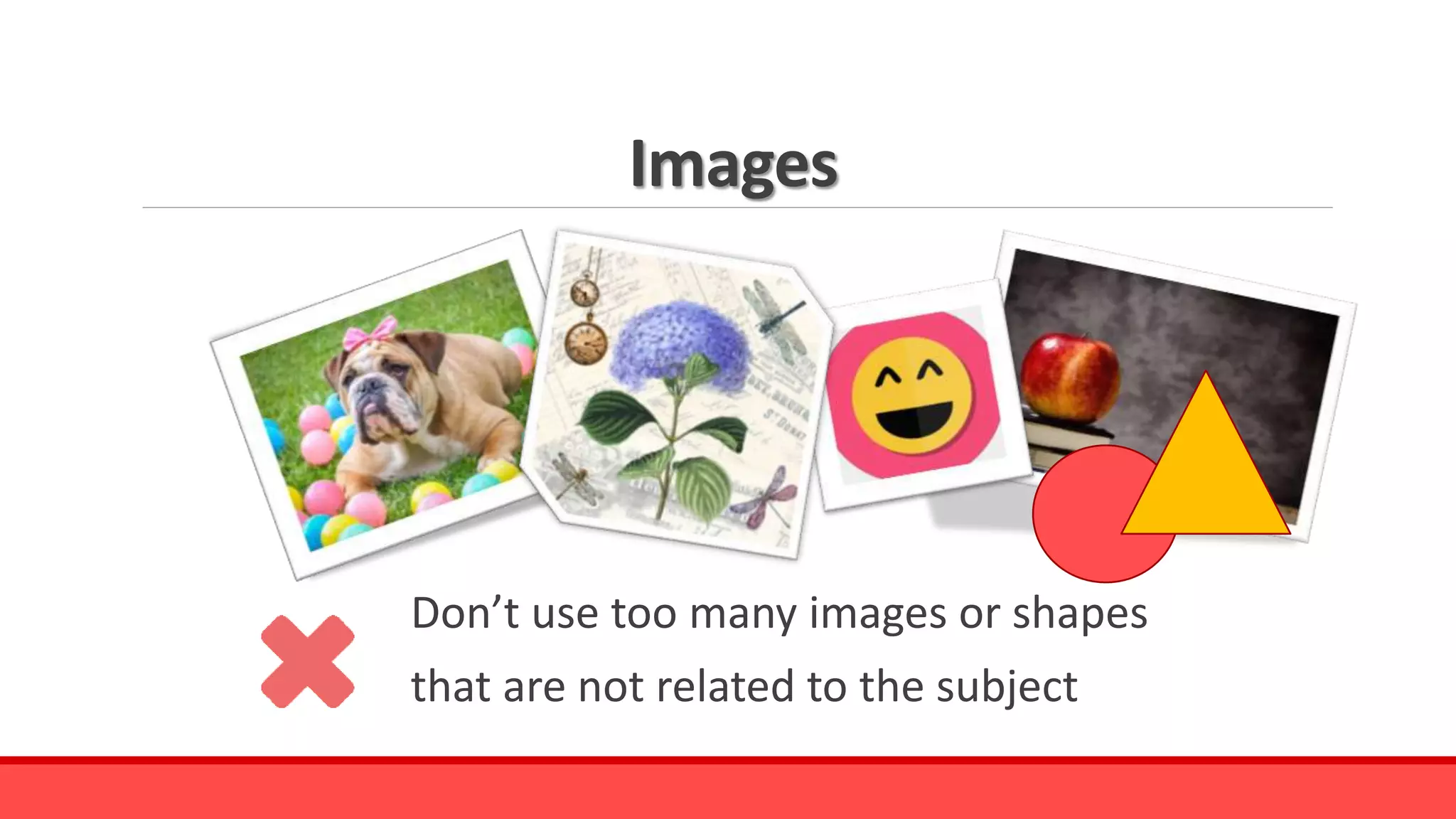
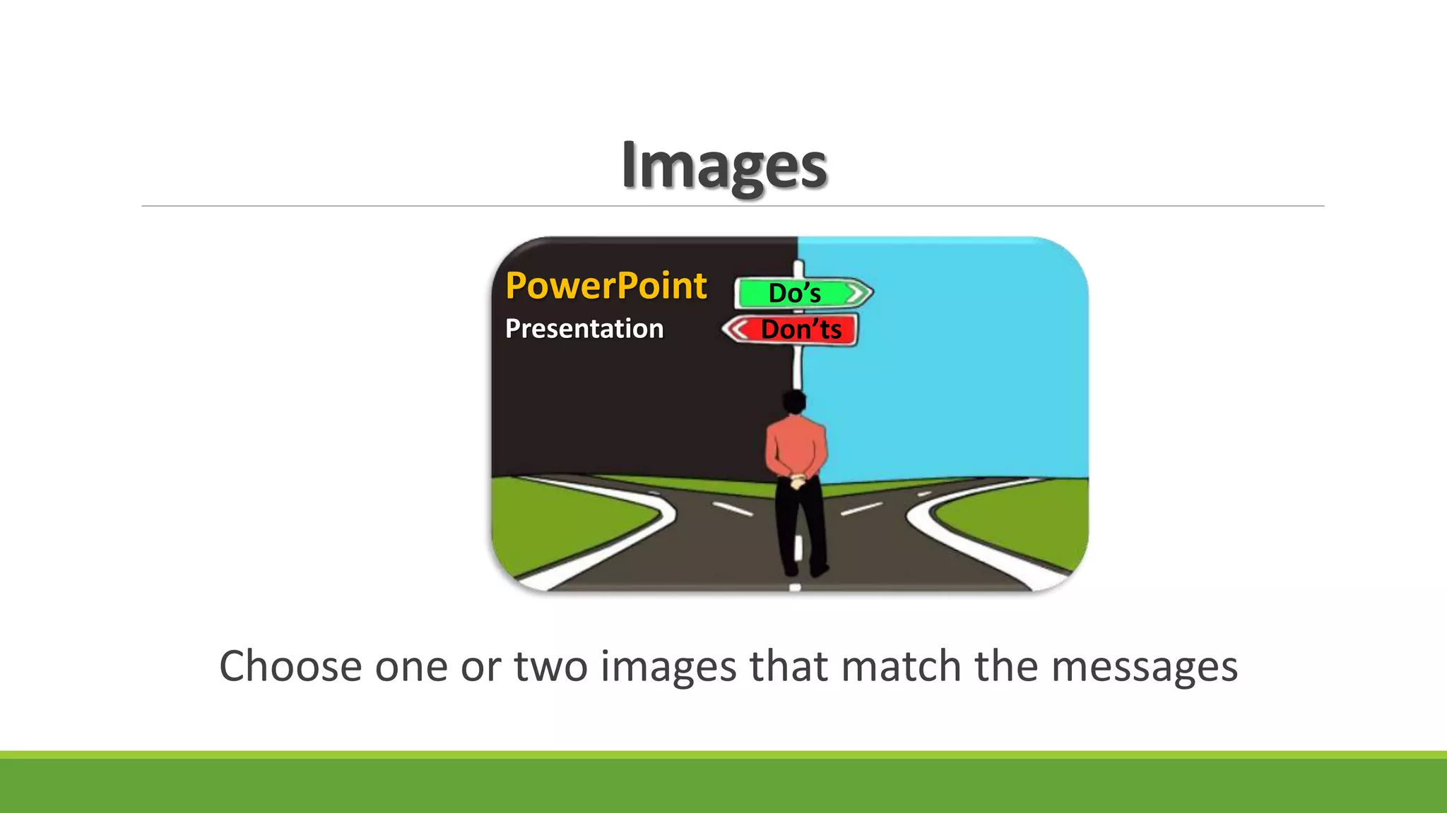
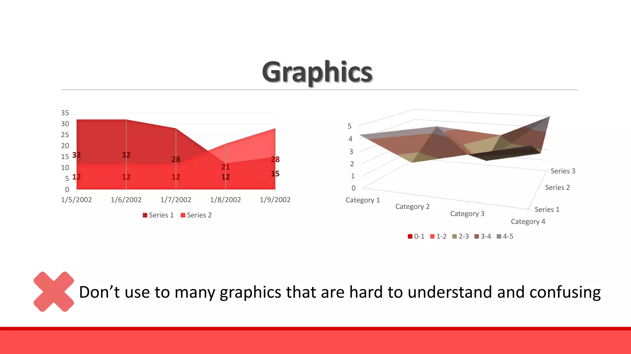
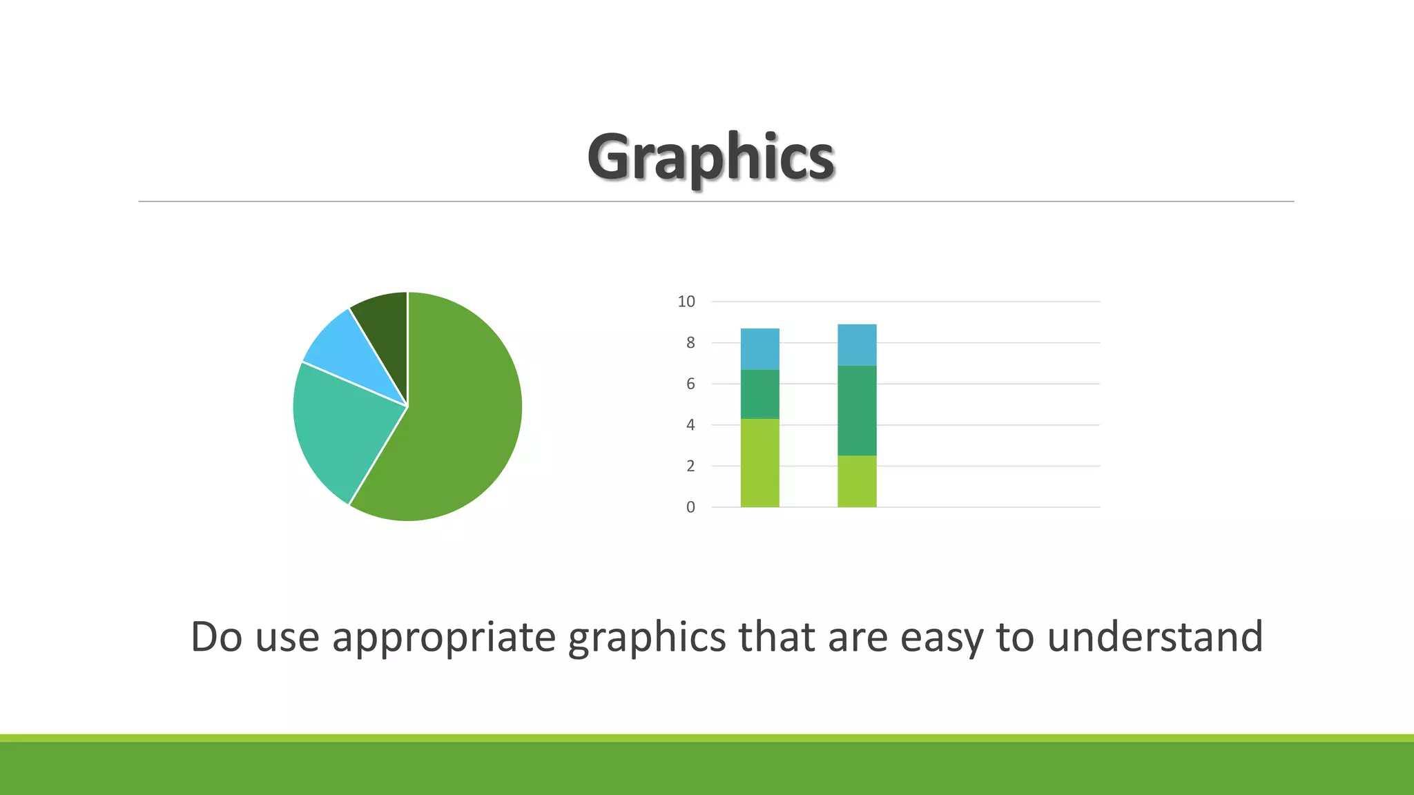
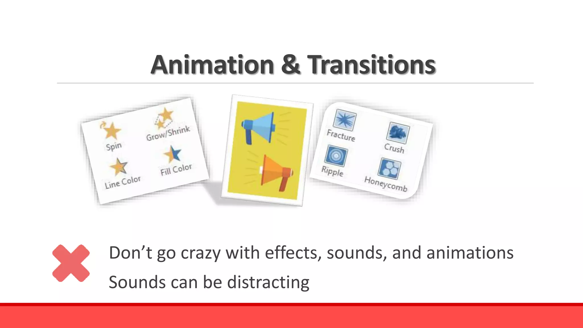
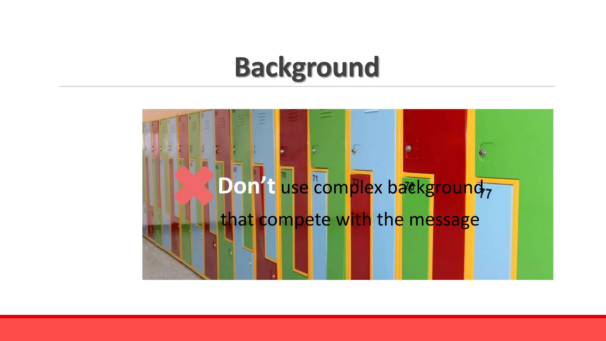
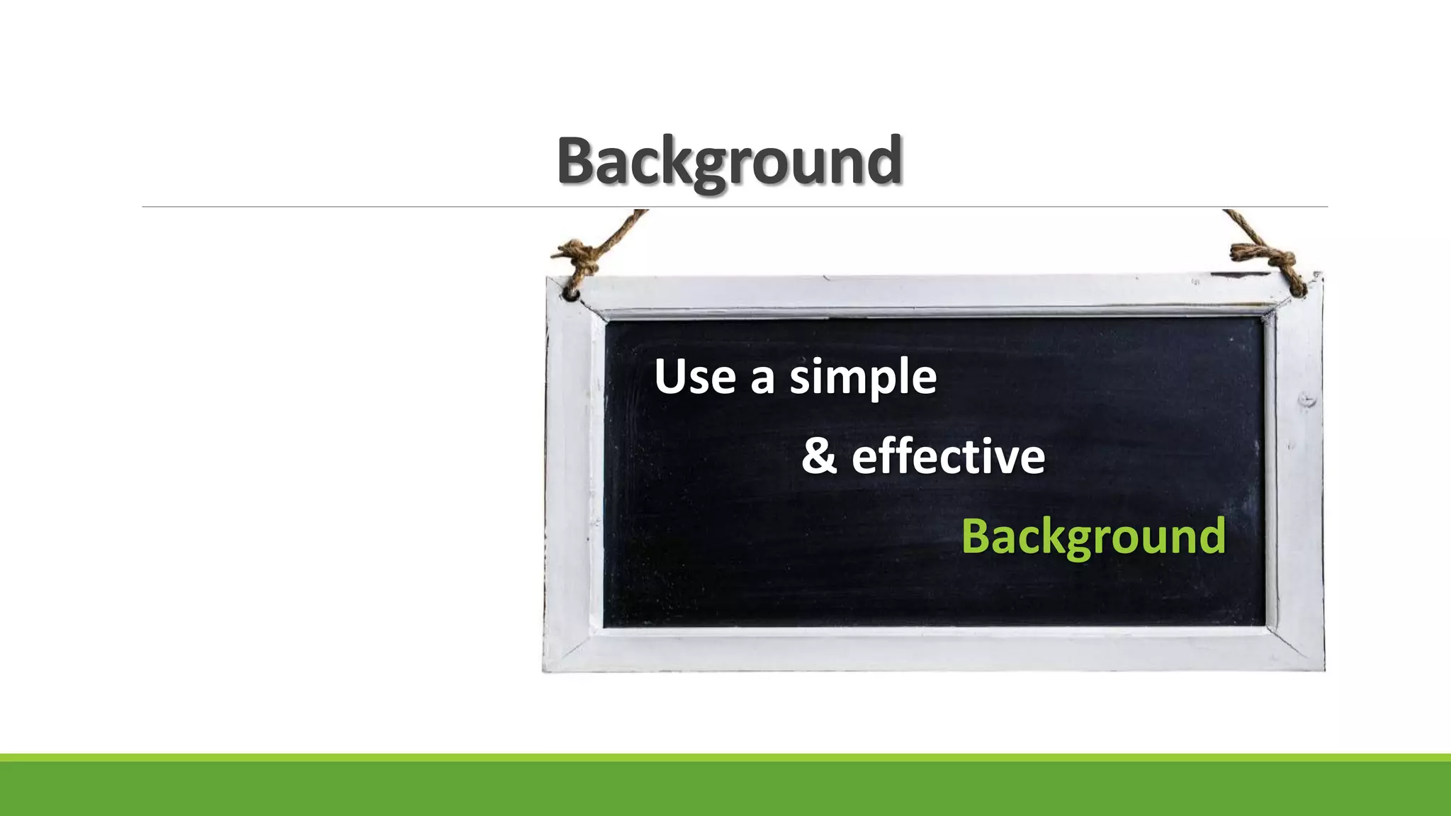
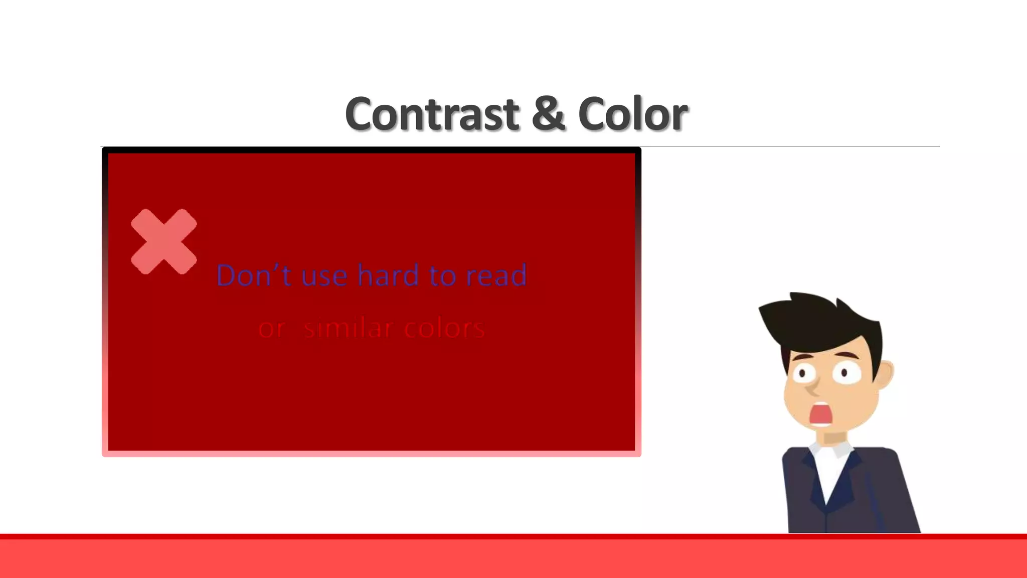
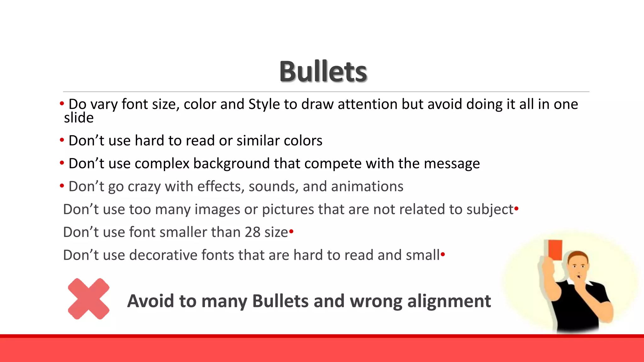
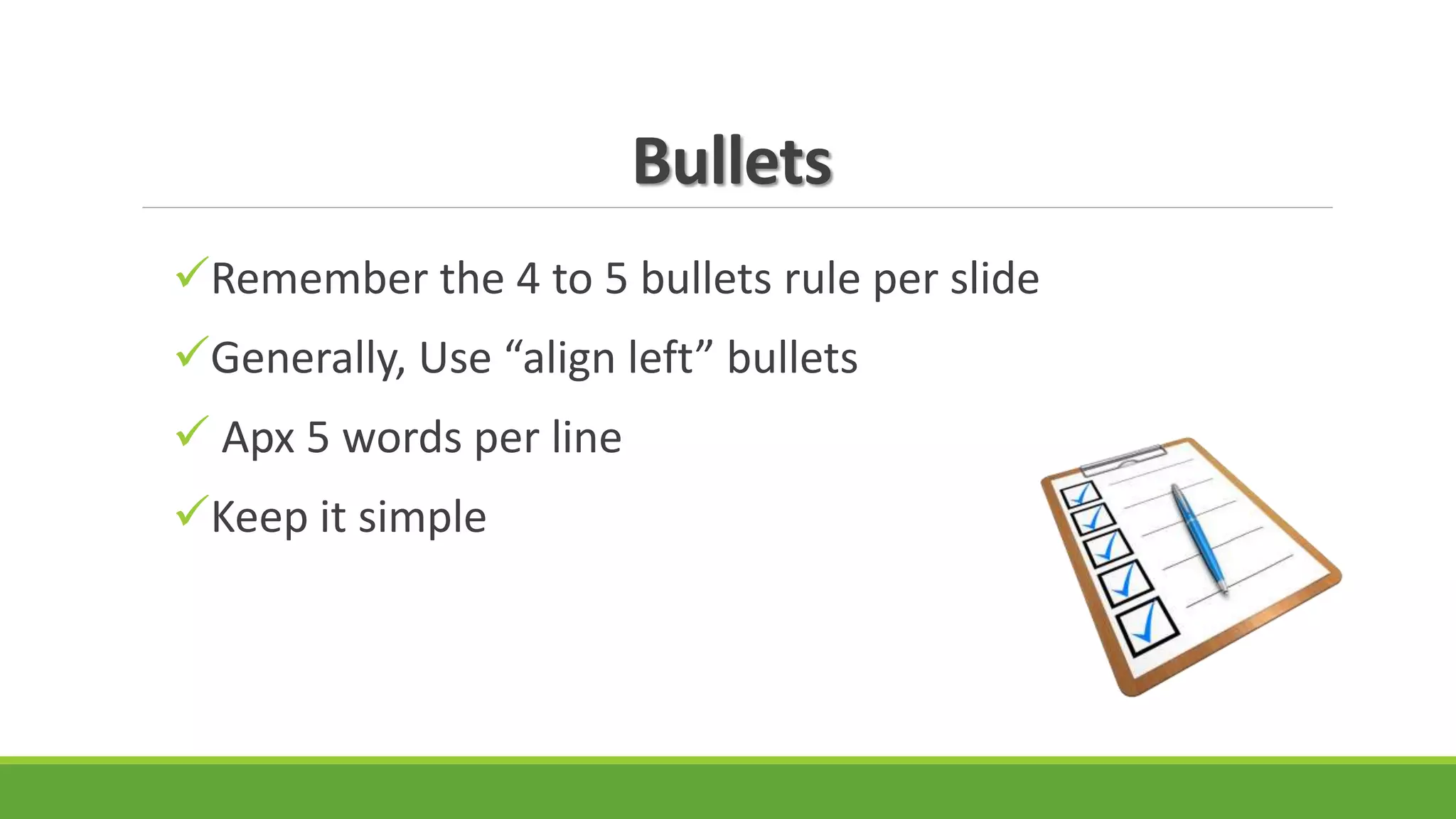
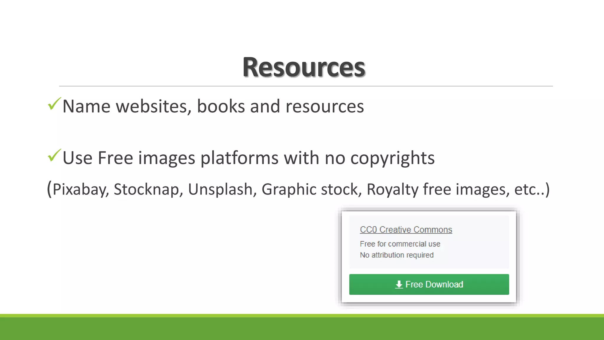
Do’s and Don’ts
for an effective PowerPoint
BY NATHALIE GEHA
PowerPoint
PowerPoint can be extremely effective
if you follow a few simple rules
Fonts
PowerPoint is a slideshow presentation program
Don’t use decorative fonts that are hard to read and small
Don’t use all caps
Fonts
Do choose simple and large fonts that are easier to read
 New times romans
Calibri
Arial
Fonts
“Whether you need a few slides to share with colleagues, classmates, or friends or an award-winning presentation to persuade
an auditorium full of strangers, you need to maximize the impact of your message”.
Don’t use font smaller than 28 size
Underline
PowerPoint is a slideshow presentation program that's part
of the Microsoft office suite of tools. PowerPoint makes it
easy to create, collaborate, and present your ideas in
dynamic, visually compelling ways.
Don’t underline words.
Audience might consider it a hyperlink and it is hard to read.
Fonts
Do vary font size, color and Style to draw attention
but avoid doing it all in one slide
Text
Whether you need a few slides to share with colleagues, classmates, or friends or an
award-winning presentation to persuade an auditorium full of strangers, you need to
maximize the impact of your message. Don't know much about design? No problem!
PowerPoint delivers the easy-to-use features you need to create great-looking
presentations and express yourself with power—without having the skills of a
professional designer. Save your presentation to OneDrive or SharePoint Online for
Office 365 and you can see how your presentation evolved over time and restore an
older version if you make a mistake. You can also work on a presentation at the same
time as your colleagues. If someone else views or works in the presentation, their
thumbnail picture appears in the top-right corner of the ribbon. If someone makes
changes in the presentation, you can easily choose the changes you want to keep.
Don’t use too much information
Text
Do use key points
 Follow the 5 lines rule
Know that every slide represent 1 idea
Images
Don’t use too many images or shapes
that are not related to the subject
Images
Choose one or two images that match the messages
Do’s
Don’ts
PowerPoint
Presentation
Graphics
32 32
28
12 1512 12 12
21
28
0
5
10
15
20
25
30
35
1/5/2002 1/6/2002 1/7/2002 1/8/2002 1/9/2002
Series 1 Series 2
Series 1
Series 2
Series 3
0
1
2
3
4
5
Category 1
Category 2
Category 3
Category 4
0-1 1-2 2-3 3-4 4-5
Don’t use to many graphics that are hard to understand and confusing
Graphics
Do use appropriate graphics that are easy to understand
0
2
4
6
8
10
Animation & Transitions
Don’t go crazy with effects, sounds, and animations
Sounds can be distracting
Animation & Transitions
Animations should be used if it is necessary for the slide
Sounds are used to help deliver the message.
Background
Don’t use complex background
that compete with the message
Background
Use a simple
& effective
Background
Contrast & Color
Don’t use hard to read
or similar colors
Bullets
• Do vary font size, color and Style to draw attention but avoid doing it all in one
slide
• Don’t use hard to read or similar colors
• Don’t use complex background that compete with the message
• Don’t go crazy with effects, sounds, and animations
•Don’t use too many images or pictures that are not related to subject
•Don’t use font smaller than 28 size
•Don’t use decorative fonts that are hard to read and small
Avoid to many Bullets and wrong alignment
Bullets
Remember the 4 to 5 bullets rule per slide
Generally, Use “align left” bullets
 Apx 5 words per line
Keep it simple
Consistency
Keep slides consistent
Same font
Same background/ design
Same animations
Same colors
Resources
Name websites, books and resources
Use Free images platforms with no copyrights
(Pixabay, Stocknap, Unsplash, Graphic stock, Royalty free images, etc..)
Spell check & Practice
Check your spelling in each slide
Make sure all information is correct
Practice ahead of time and know your slides
Don’t read your presentation
Do’s and Don’ts
for an effective PowerPoint
Thank you for your time
References
• https://products.office.com/en-us/what-is-powerpoint
• PowerPoint Do’s and Don’ts: www.asha.org
•DO's and DON'Ts in making presentation more effective: https://youtu.be/X50StnWVh9I
• Simple rules for better PowerPoint presentations:
https://www.gcflearnfree.org/searchresults?q=Simple+rules+for+better+PowerPoint+presentati
ons
• Do’s and Don’ts of power point presentations :
https://www.slideshare.net/MpumeleloMadlavu/mpumelelo-madlavu-dos-and-donts-of-power-
point-presentations?qid=f4c54bae-e6d4-49e7-a786-2972571dfe3c&v=&b=&from_search=4

Do's and don'ts for an effective PowerPoint Presentation

  • 1.
    Do’s and Don’ts foran effective PowerPoint BY NATHALIE GEHA
  • 2.
    PowerPoint PowerPoint can beextremely effective if you follow a few simple rules
  • 3.
    Fonts PowerPoint is aslideshow presentation program Don’t use decorative fonts that are hard to read and small Don’t use all caps
  • 4.
    Fonts Do choose simpleand large fonts that are easier to read  New times romans Calibri Arial
  • 5.
    Fonts “Whether you needa few slides to share with colleagues, classmates, or friends or an award-winning presentation to persuade an auditorium full of strangers, you need to maximize the impact of your message”. Don’t use font smaller than 28 size
  • 6.
    Underline PowerPoint is aslideshow presentation program that's part of the Microsoft office suite of tools. PowerPoint makes it easy to create, collaborate, and present your ideas in dynamic, visually compelling ways. Don’t underline words. Audience might consider it a hyperlink and it is hard to read.
  • 7.
    Fonts Do vary fontsize, color and Style to draw attention but avoid doing it all in one slide
  • 8.
    Text Whether you needa few slides to share with colleagues, classmates, or friends or an award-winning presentation to persuade an auditorium full of strangers, you need to maximize the impact of your message. Don't know much about design? No problem! PowerPoint delivers the easy-to-use features you need to create great-looking presentations and express yourself with power—without having the skills of a professional designer. Save your presentation to OneDrive or SharePoint Online for Office 365 and you can see how your presentation evolved over time and restore an older version if you make a mistake. You can also work on a presentation at the same time as your colleagues. If someone else views or works in the presentation, their thumbnail picture appears in the top-right corner of the ribbon. If someone makes changes in the presentation, you can easily choose the changes you want to keep. Don’t use too much information
  • 9.
    Text Do use keypoints  Follow the 5 lines rule Know that every slide represent 1 idea
  • 10.
    Images Don’t use toomany images or shapes that are not related to the subject
  • 11.
    Images Choose one ortwo images that match the messages Do’s Don’ts PowerPoint Presentation
  • 12.
    Graphics 32 32 28 12 151212 12 21 28 0 5 10 15 20 25 30 35 1/5/2002 1/6/2002 1/7/2002 1/8/2002 1/9/2002 Series 1 Series 2 Series 1 Series 2 Series 3 0 1 2 3 4 5 Category 1 Category 2 Category 3 Category 4 0-1 1-2 2-3 3-4 4-5 Don’t use to many graphics that are hard to understand and confusing
  • 13.
    Graphics Do use appropriategraphics that are easy to understand 0 2 4 6 8 10
  • 14.
    Animation & Transitions Don’tgo crazy with effects, sounds, and animations Sounds can be distracting
  • 15.
    Animation & Transitions Animationsshould be used if it is necessary for the slide Sounds are used to help deliver the message.
  • 16.
    Background Don’t use complexbackground that compete with the message
  • 17.
    Background Use a simple &effective Background
  • 18.
    Contrast & Color Don’tuse hard to read or similar colors
  • 19.
    Bullets • Do varyfont size, color and Style to draw attention but avoid doing it all in one slide • Don’t use hard to read or similar colors • Don’t use complex background that compete with the message • Don’t go crazy with effects, sounds, and animations •Don’t use too many images or pictures that are not related to subject •Don’t use font smaller than 28 size •Don’t use decorative fonts that are hard to read and small Avoid to many Bullets and wrong alignment
  • 20.
    Bullets Remember the 4to 5 bullets rule per slide Generally, Use “align left” bullets  Apx 5 words per line Keep it simple
  • 21.
    Consistency Keep slides consistent Samefont Same background/ design Same animations Same colors
  • 22.
    Resources Name websites, booksand resources Use Free images platforms with no copyrights (Pixabay, Stocknap, Unsplash, Graphic stock, Royalty free images, etc..)
  • 23.
    Spell check &Practice Check your spelling in each slide Make sure all information is correct Practice ahead of time and know your slides Don’t read your presentation
  • 24.
    Do’s and Don’ts foran effective PowerPoint Thank you for your time
  • 25.
    References • https://products.office.com/en-us/what-is-powerpoint • PowerPointDo’s and Don’ts: www.asha.org •DO's and DON'Ts in making presentation more effective: https://youtu.be/X50StnWVh9I • Simple rules for better PowerPoint presentations: https://www.gcflearnfree.org/searchresults?q=Simple+rules+for+better+PowerPoint+presentati ons • Do’s and Don’ts of power point presentations : https://www.slideshare.net/MpumeleloMadlavu/mpumelelo-madlavu-dos-and-donts-of-power- point-presentations?qid=f4c54bae-e6d4-49e7-a786-2972571dfe3c&v=&b=&from_search=4