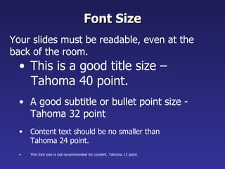
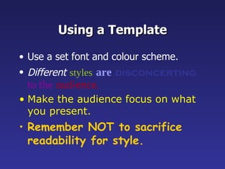
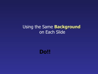
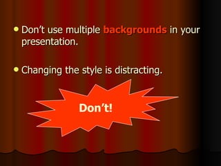
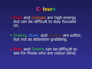
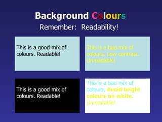
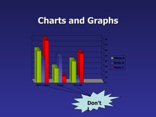
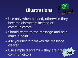
Supplementary Materials  ELC 2203  University English for Business Students Unit 6  Giving Oral Presentations
Activity - Discussion Discuss with a partner and come  up with some guidelines for the use of  fonts, colours, and graphics  when designing PowerPoint slides for presentations.
PowerPoint Presentation Guidelines The following slides present guidelines for the use of  fonts, colours, and graphics  when designing PowerPoint slides for presentations.
PowerPoint Slides Highlight key points and / or reinforce what the facilitator is saying. Should be short and to the point, include only key words and phrases for visual reinforcement.
Consistency of Layout Convey a sense of completeness. Show headings and logos in the same spot on each frame. Use the same margins, font type, font size, and colours.
Fonts Font style should be readable. Recommended fonts:  Arial , Tahoma,  Veranda Standardise the font throughout This presentation is in  Tahoma . Do!
This is a good title size – Tahoma 40 point. A good subtitle or bullet point size - Tahoma 32 point Content text should be no smaller than Tahoma 24 point. This font size is not recommended for content. Tahoma 12 point. Font Size Your slides must be readable, even at the back of the room.
Fonts Don’t Sacrifice Readability for Style. Don’t Sacrifice Readability for Style. Don’t Sacrifice Readability for Style. Don’t Sacrifice Readability for Style. Don’t!
Caps and Italics DO NOT USE ALL CAPITAL LETTERS Makes text hard to read Conceals acronyms Denies their use for EMPHASIS Italics Used for “ quotes ” Used to  highlight  thoughts or ideas Used for book, journal, or magazine  titles
Using a Template Use a set font and colour scheme. Different   styles   are   disconcerting   to the   audience. Make the audience focus on what you present. Remember NOT to sacrifice readability for style.
Using the Same  Background   on Each Slide Do!!
Don’t use multiple  backgrounds  in your presentation. Changing the style is distracting. Don’t!
C o l ou r s Reds   and   oranges   are high-energy but can be difficult to stay focused on. Greens ,   blues,   and   browns   are softer, but not as attention grabbing. Reds  and  Greens  can be difficult to see for those who are colour blind.
Avoid These Combinations Examples: Green on Blue Dark Yellow on Green Purple on Blue Orange on Green Red on Green Don’t!
This is a good mix of colours. Readable! Background   C o l ou r s Remember:  Readability!   This is a bad mix of colours. Low contrast. Unreadable! This is a good mix of  colours. Readable! This is a bad mix of  colours.  Avoid bright colours on white. Unreadable!
Graphs and Charts Make sure the audience  can read them!
8 Graphs and Charts Can you see what this graph is about?
Graphs and Charts Avoid using graphics that are difficult to read.  In the previous example, the bright colours on a white background and the small font make the graph hard to read.  It would be very difficult to see, especially at the back of a room.
This graph contains too much information in an unreadable format. 10 Don’t!
These are examples of “readable” graphs, with nice line widths and good colours. “ Readable”  Graphs Do!
Charts and Graphs Don’t!
Charts and Graphs 0 10 20 30 40 50 60 70 80 North America Europe Australia Mode A Mode B Mode C Do!
Charts and Graphs Look at the previous slide again. What exactly is the chart about? What should be put above or underneath the chart to tell the audience what it is about!
Charts and Graphs Remember that a chart / graph should always carry a  title  which explains what it is about !
Example of a  readable  &  understandable  chart Gross flat production in public and private sectors from the years 1988 to 1997 Title
Example of a  readable  &  understandable  chart Factors leading to serious air pollution % of respondents Title
Illustrations Use only when needed, otherwise they become distracters instead of communicators. Should relate to the message and help make a point. Ask yourself if it makes the message clearer. Use simple diagrams – they are great communicators. Do!
Limit Each Slide to One Idea Use  Bullet Points  to Cover Components of Each Idea.
Bullets Limit each bullet point to only a few words - avoid long sentences that go on and on! Keep each bullet to 1 to 2 lines, 3 at the most. Limit the number of bullets on a screen to 6,  4 if there is a large title, logo, picture, etc.
To make a slide stand out, change the font, background, or add animation. Attention Grabber
Limit Animation! Use the same animation throughout the entire presentation. Using more than one can be very distracting. The audience will only see the animation and not the message you’re trying to get across .
During the presentation… YOU are the presenter  –  DON’T let the media dominate the presentation. Stand aside  – DON’T block the visual ! Expand on points  – Don’t read word for word ! Remove the slide when not talking about it  – DON’T leave it “up” when it’s not needed. GOOD LUCK!!
Source Adapted from the website of  ARMA International (2008)  http://www.arma.org/LearningCenter/Facilitator/uploads/PowerPointGuidelines.ppt   (Accessed on 12 April 2008)

Elc2203 Giving Oral Presentations

  • 1.
    Supplementary Materials ELC 2203 University English for Business Students Unit 6 Giving Oral Presentations
  • 2.
    Activity - DiscussionDiscuss with a partner and come up with some guidelines for the use of fonts, colours, and graphics when designing PowerPoint slides for presentations.
  • 3.
    PowerPoint Presentation GuidelinesThe following slides present guidelines for the use of fonts, colours, and graphics when designing PowerPoint slides for presentations.
  • 4.
    PowerPoint Slides Highlightkey points and / or reinforce what the facilitator is saying. Should be short and to the point, include only key words and phrases for visual reinforcement.
  • 5.
    Consistency of LayoutConvey a sense of completeness. Show headings and logos in the same spot on each frame. Use the same margins, font type, font size, and colours.
  • 6.
    Fonts Font styleshould be readable. Recommended fonts: Arial , Tahoma, Veranda Standardise the font throughout This presentation is in Tahoma . Do!
  • 7.
    This is agood title size – Tahoma 40 point. A good subtitle or bullet point size - Tahoma 32 point Content text should be no smaller than Tahoma 24 point. This font size is not recommended for content. Tahoma 12 point. Font Size Your slides must be readable, even at the back of the room.
  • 8.
    Fonts Don’t SacrificeReadability for Style. Don’t Sacrifice Readability for Style. Don’t Sacrifice Readability for Style. Don’t Sacrifice Readability for Style. Don’t!
  • 9.
    Caps and ItalicsDO NOT USE ALL CAPITAL LETTERS Makes text hard to read Conceals acronyms Denies their use for EMPHASIS Italics Used for “ quotes ” Used to highlight thoughts or ideas Used for book, journal, or magazine titles
  • 10.
    Using a TemplateUse a set font and colour scheme. Different styles are disconcerting to the audience. Make the audience focus on what you present. Remember NOT to sacrifice readability for style.
  • 11.
    Using the Same Background on Each Slide Do!!
  • 12.
    Don’t use multiple backgrounds in your presentation. Changing the style is distracting. Don’t!
  • 13.
    C o lou r s Reds and oranges are high-energy but can be difficult to stay focused on. Greens , blues, and browns are softer, but not as attention grabbing. Reds and Greens can be difficult to see for those who are colour blind.
  • 14.
    Avoid These CombinationsExamples: Green on Blue Dark Yellow on Green Purple on Blue Orange on Green Red on Green Don’t!
  • 15.
    This is agood mix of colours. Readable! Background C o l ou r s Remember: Readability! This is a bad mix of colours. Low contrast. Unreadable! This is a good mix of colours. Readable! This is a bad mix of colours. Avoid bright colours on white. Unreadable!
  • 16.
    Graphs and ChartsMake sure the audience can read them!
  • 17.
    8 Graphs andCharts Can you see what this graph is about?
  • 18.
    Graphs and ChartsAvoid using graphics that are difficult to read. In the previous example, the bright colours on a white background and the small font make the graph hard to read. It would be very difficult to see, especially at the back of a room.
  • 19.
    This graph containstoo much information in an unreadable format. 10 Don’t!
  • 20.
    These are examplesof “readable” graphs, with nice line widths and good colours. “ Readable” Graphs Do!
  • 21.
  • 22.
    Charts and Graphs0 10 20 30 40 50 60 70 80 North America Europe Australia Mode A Mode B Mode C Do!
  • 23.
    Charts and GraphsLook at the previous slide again. What exactly is the chart about? What should be put above or underneath the chart to tell the audience what it is about!
  • 24.
    Charts and GraphsRemember that a chart / graph should always carry a title which explains what it is about !
  • 25.
    Example of a readable & understandable chart Gross flat production in public and private sectors from the years 1988 to 1997 Title
  • 26.
    Example of a readable & understandable chart Factors leading to serious air pollution % of respondents Title
  • 27.
    Illustrations Use onlywhen needed, otherwise they become distracters instead of communicators. Should relate to the message and help make a point. Ask yourself if it makes the message clearer. Use simple diagrams – they are great communicators. Do!
  • 28.
    Limit Each Slideto One Idea Use Bullet Points to Cover Components of Each Idea.
  • 29.
    Bullets Limit eachbullet point to only a few words - avoid long sentences that go on and on! Keep each bullet to 1 to 2 lines, 3 at the most. Limit the number of bullets on a screen to 6, 4 if there is a large title, logo, picture, etc.
  • 30.
    To make aslide stand out, change the font, background, or add animation. Attention Grabber
  • 31.
    Limit Animation! Usethe same animation throughout the entire presentation. Using more than one can be very distracting. The audience will only see the animation and not the message you’re trying to get across .
  • 32.
    During the presentation…YOU are the presenter – DON’T let the media dominate the presentation. Stand aside – DON’T block the visual ! Expand on points – Don’t read word for word ! Remove the slide when not talking about it – DON’T leave it “up” when it’s not needed. GOOD LUCK!!
  • 33.
    Source Adapted fromthe website of ARMA International (2008) http://www.arma.org/LearningCenter/Facilitator/uploads/PowerPointGuidelines.ppt (Accessed on 12 April 2008)