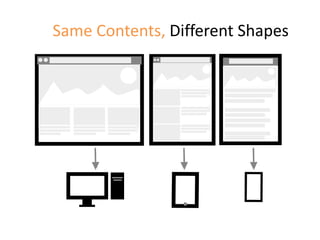
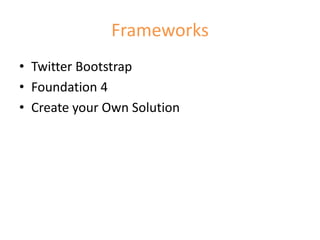
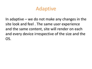
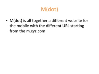
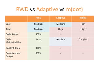
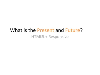
Responsive Web Design
WHAT WHICH WHEN HOW
From - Neha Sharma
Front- end Developer
Technology Stack - HTML5,CSS3, JS, jQuery, RWD
Feedback/Questions
nehha255@gmail.com
Agenda
• Introduction to UI Architecture
• Key Factors
• Past, Present, Future
• Anatomy of a Webpage
• Presentation layer
• Logic Layer
What is UI Architecture
“UI Architecture is a collection of processes. Which plan, develop,
manage a reusable code, modules, components, flexible to use and
provide useful & meaningful solution”
Principle of GOOD UI Architecture:
SOLUTION KISS DRY REUSEABLE
MODULES
PAST, PRESENT , and FUTURE
Lifecycle of Project
USER TEST
VISUAL
WIREFRA
ME
CONCEPT
RESEARCH
DEVELOP
REQUIREME
NT
DOCUMENT
WATERFALL APPROACH
Yesterday
One Browser and One Screen size to focus
Present – More than Web
TV,
Console,
Watch
Non-Flash
Animation
JavaScriptCSS3HTML5
Devices ,
Tabs,
Phones
Range of
Browsers
Present
• Technology vs Browsers vs Size
• Prototype, Sketch, UI Architecture,
Frameworks
• Content strategy
• User Experience
• Digital Experience
What’s the FUTURE?
• more and beyond the web
• Responsive
• Digital
• One solution fit in all
Key Factors for Selection
 Project Context
 Complexity & Functionality
 Budget
 Timeline
 Target Audience
?
Anatomy of a Webpage UI Architecture
HTML + CSS
(Presentation Layer)
JavaScript
(Behavior)
BACKEND CODE + DATABASE
Presentation Layer
MARKUP & STYLING
WHAT WHICH WHEN HOW
Structure + Presentation = HTML + CSS
Blast from the Past
Websites 3 years ago …
Limited Device
support
Cross Browser
Compatibility
issues
Lot of
Workaround
Less user
experience
No Mobile
Support
Now? Not
Just Web
Digital
Experience
Different
Viewport
Fast
Performance
Broadband
to
4G
HTML5 vs XHTML
Requirement :
Required a Clean, Semantic, devices and future support markup.
Options:
HTML5 or XHTML?
Key Factor for Selection:
• Semantic Code
• Clean Code
• Easily Readable
• Devices/Mobile Support
Skeleton of HTML5
XHTML HTML5
Not Semantic tags Semantic tags
Not Clean Clean
Limited tags Lot of Tags
Limited Attributes Lot of new attributes
Not 100% support to Devices/Mobiles Support on Mobile/Devices
No Future Future
HTML5 vs XHTML
Solution:
HTML5
Future – more than web…
Same Contents, Different Shapes
Shape of Digital Experience
Solutions
RWD Adaptive m.(dot)
RWD- One Solution for all Sizes
Responsive Web Design
Responsive Website Design (RWD) means
designing your website so that it responds
to your user environment based on the
screen-size, platform and orientation.
What We got in RWD?
• Flexible grids
• Responsive images and Videos
• Flexible Content
• View port specific user experience
Frameworks
• Twitter Bootstrap
• Foundation 4
• Create your Own Solution
Adaptive
In adaptive – we do not make any changes in the
site look and feel . The same user experience
and the same content, site will render on each
and every device irrespective of the size and the
OS.
M(dot)
• M(dot) is all together a different website for
the mobile with the different URL starting
from the m.xyz.com
RWD vs Adaptive vs m(dot)
RWD Adaptive m(dot)
Cost Medium Medium High
Time Medium High High
Code Reuse 100% -
Code
Maintainability
Easy Medium Complex
Content Reuse 100% - -
Consistency of
Design
100% - -
What is the Present and Future?
HTML5 + Responsive
References
• Stack overflow
• Slide share
• Google
• Own Experience

Responsive Web design