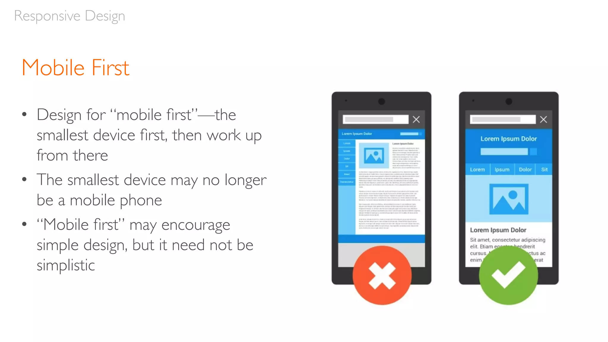
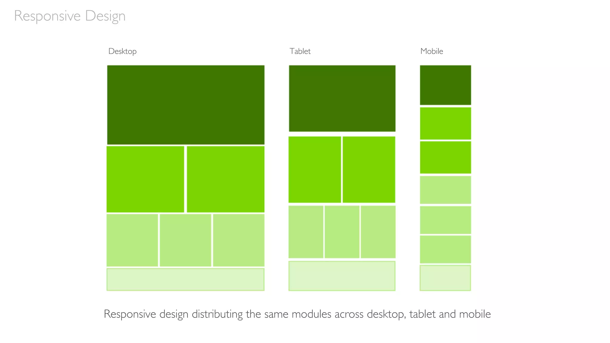
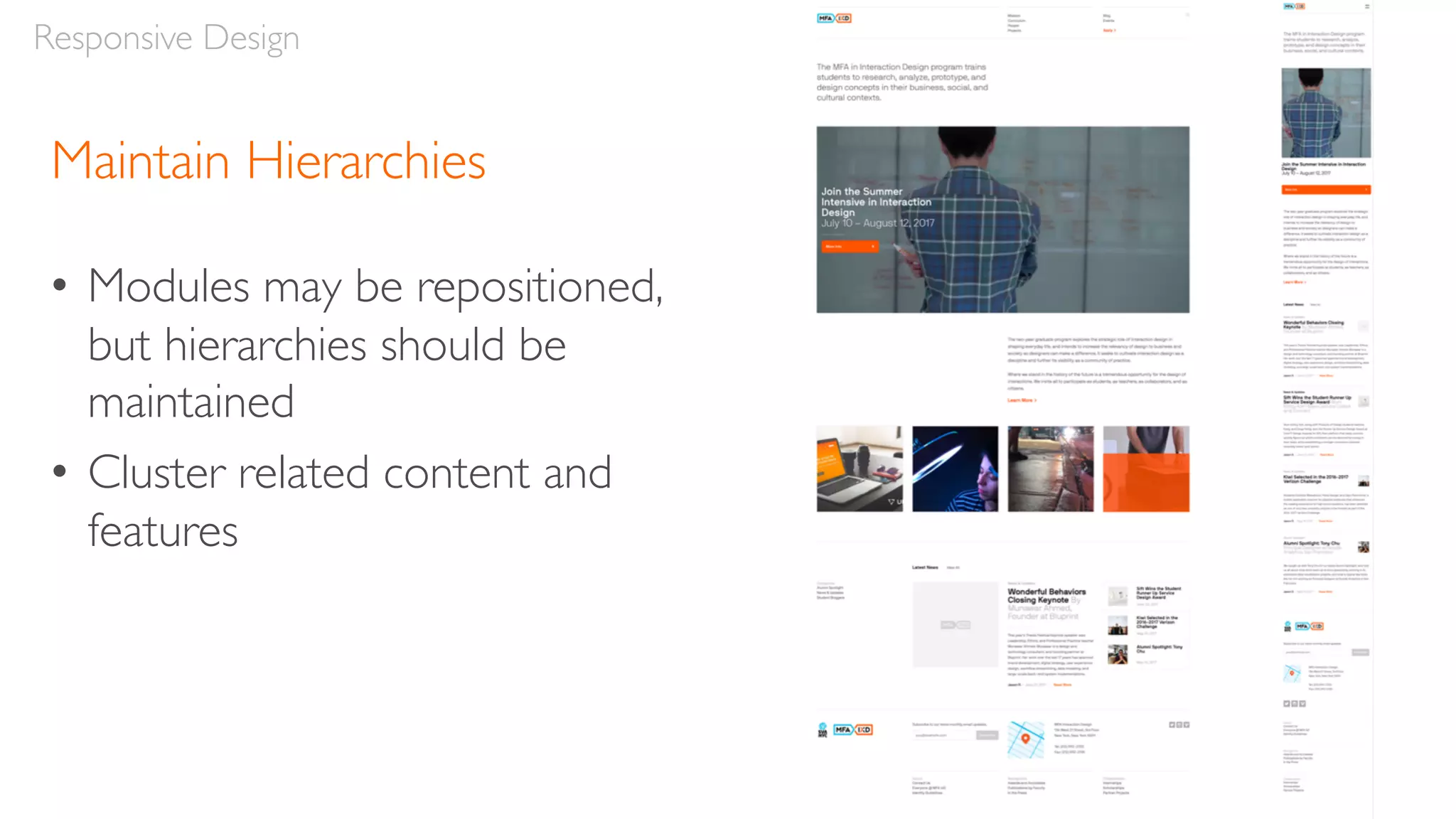
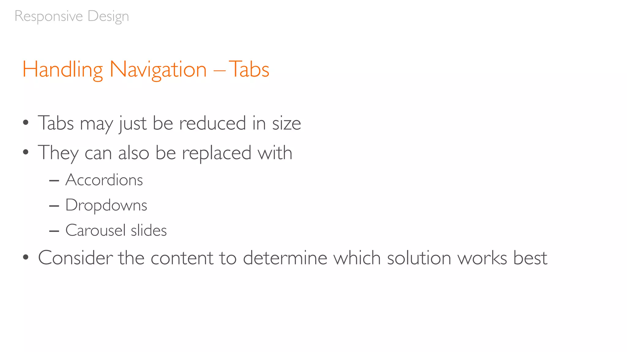
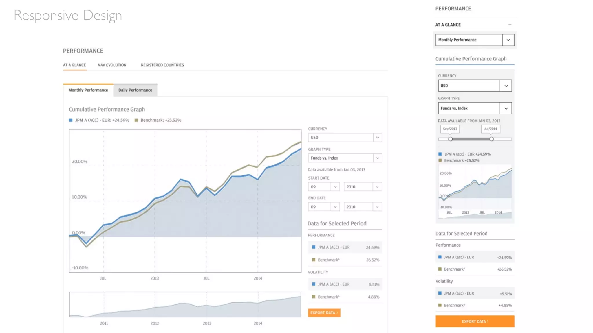
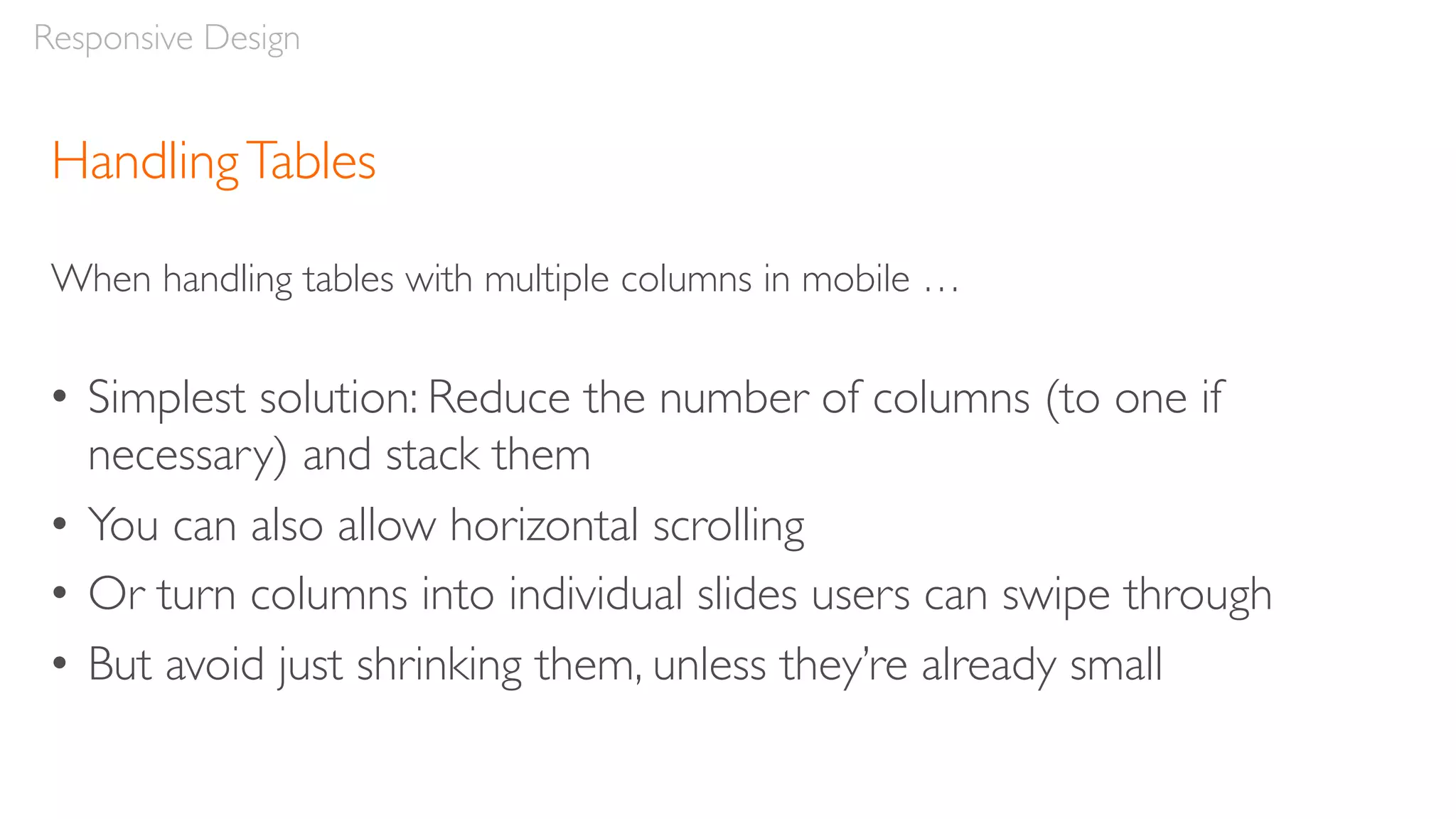
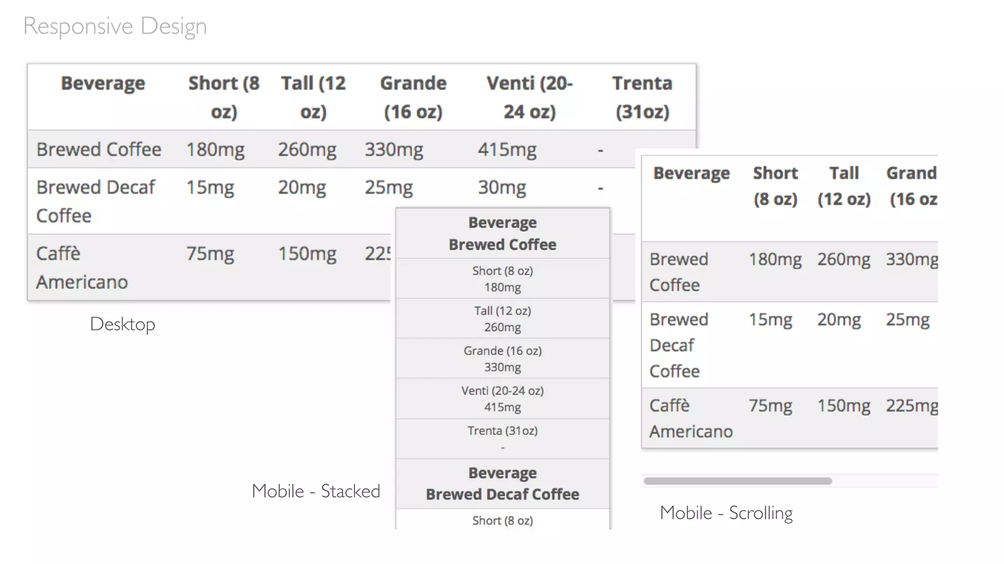
Download to read offline
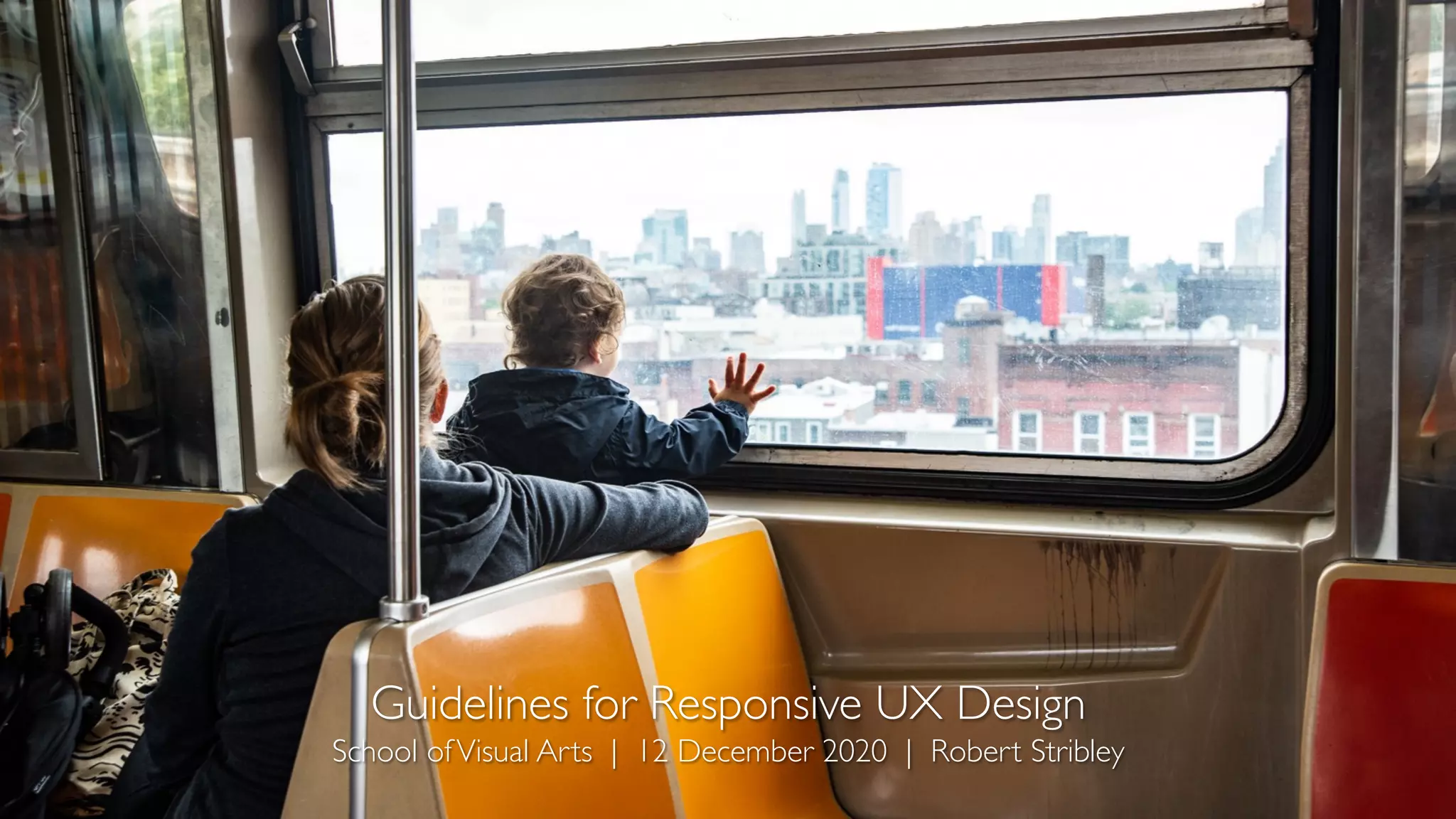


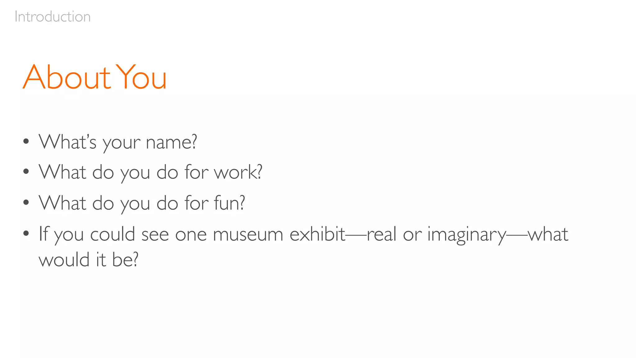
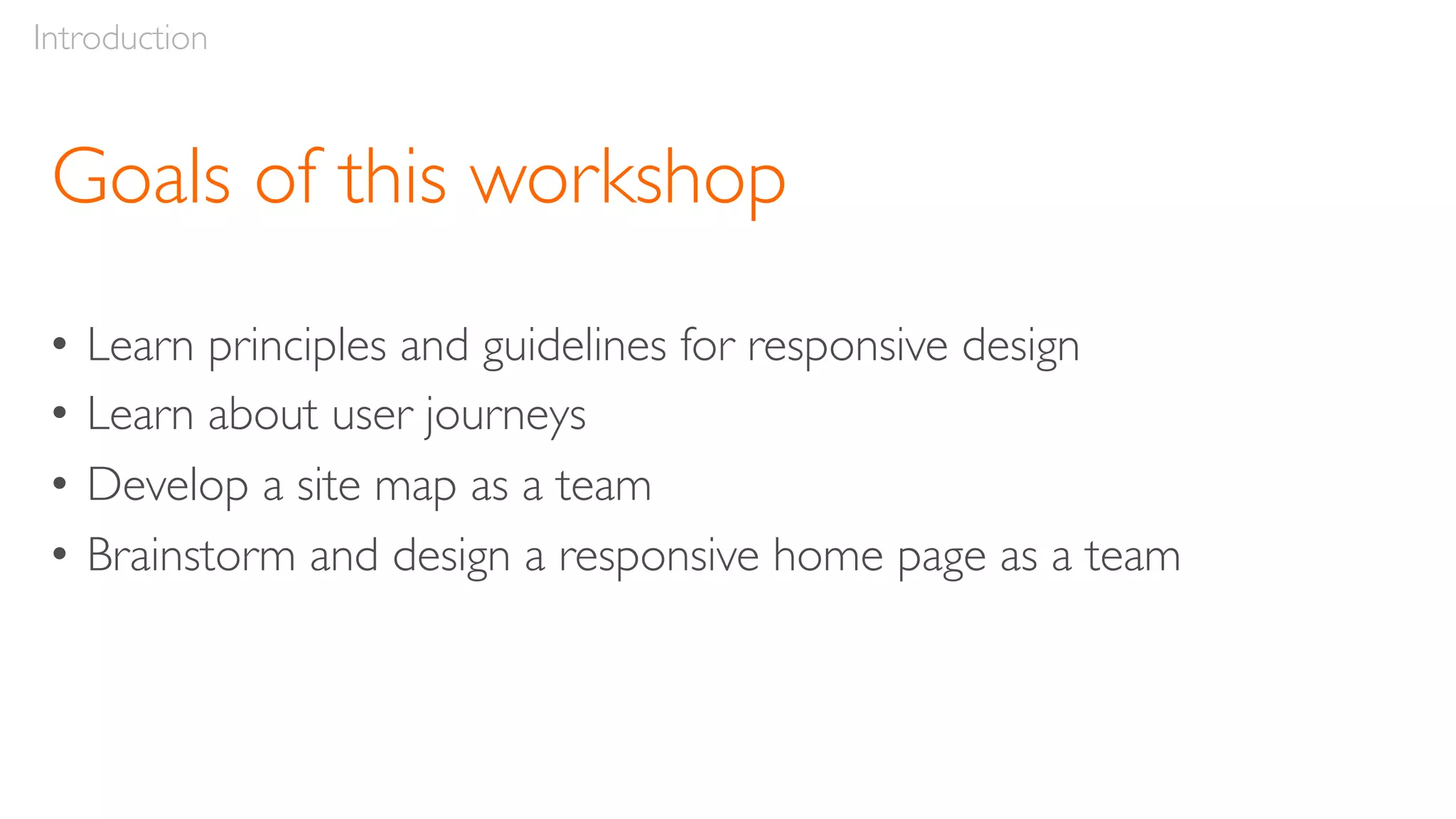


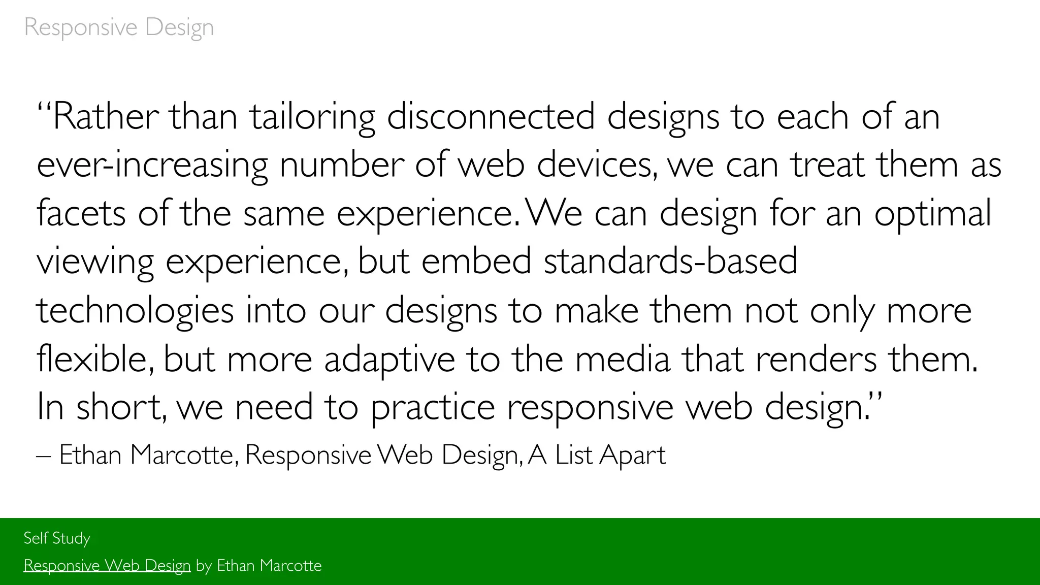
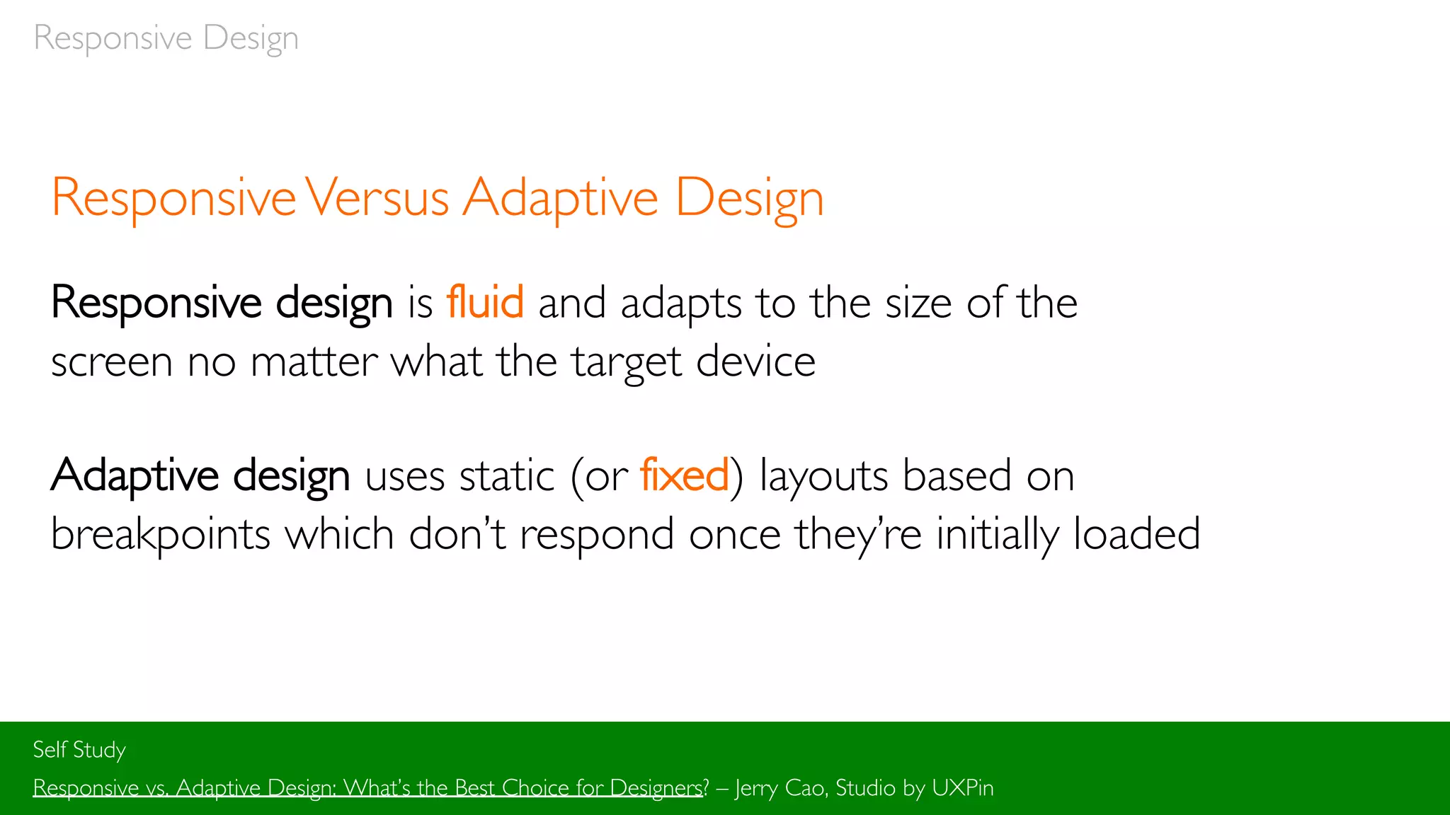
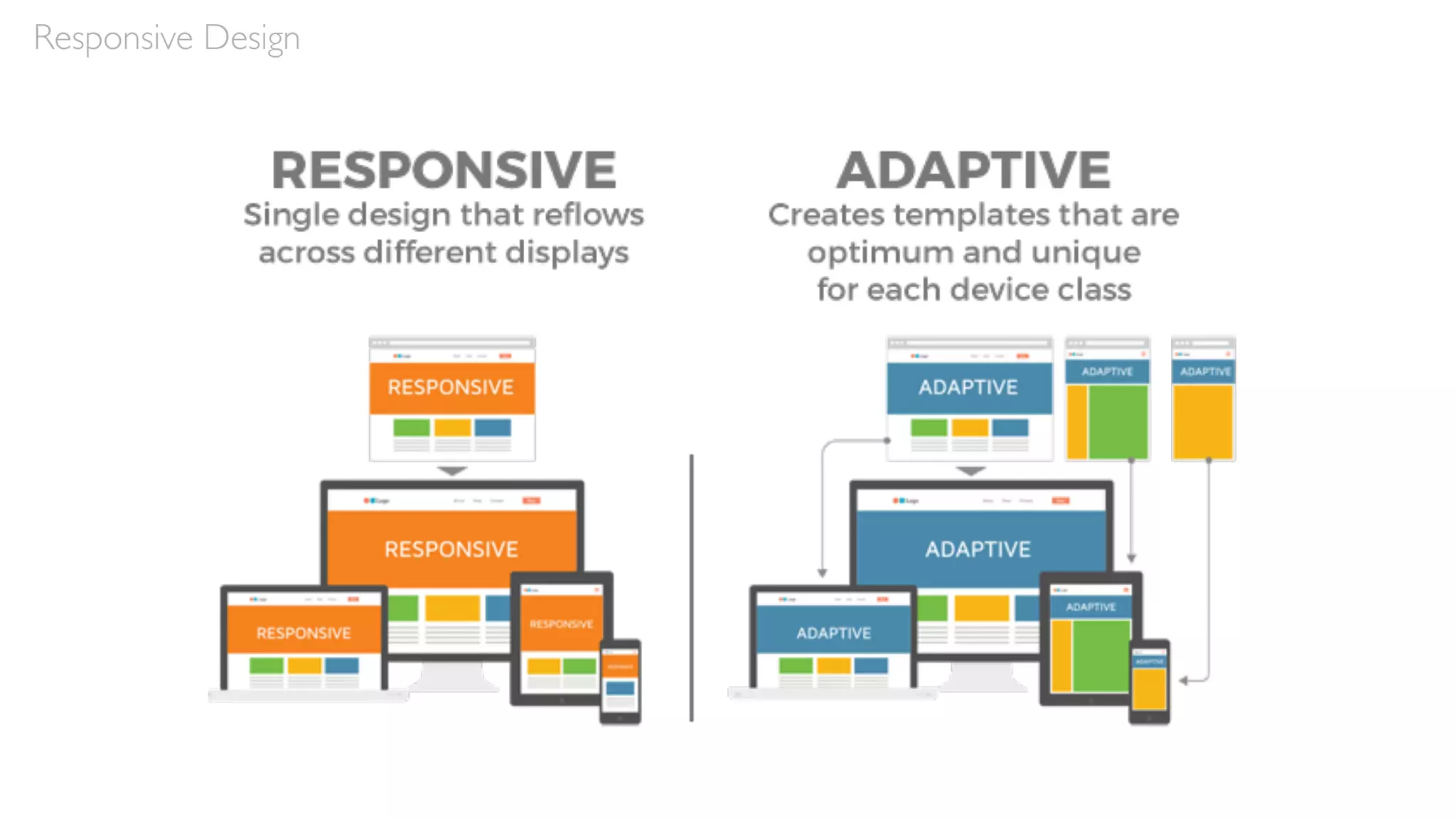


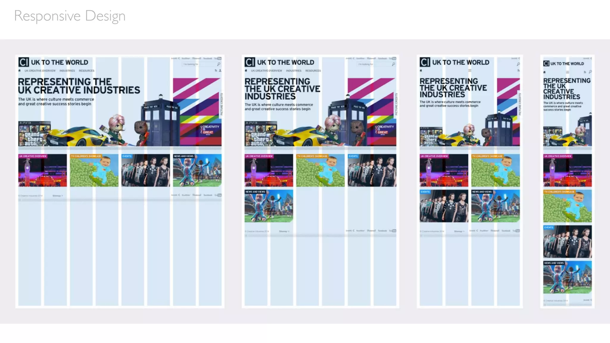

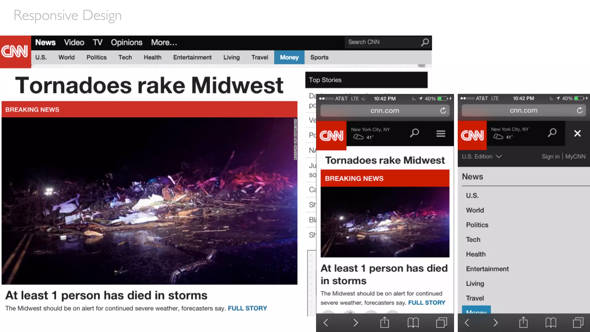
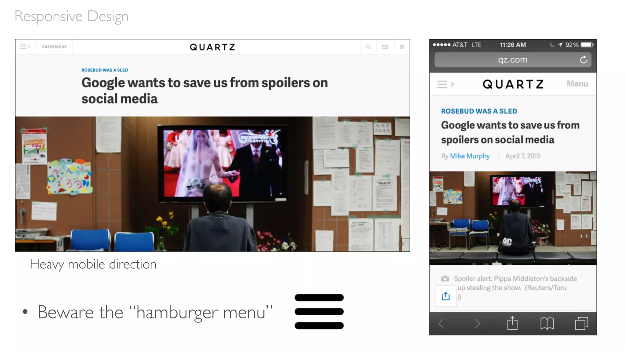


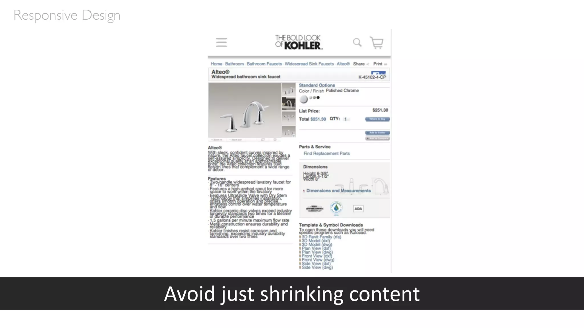

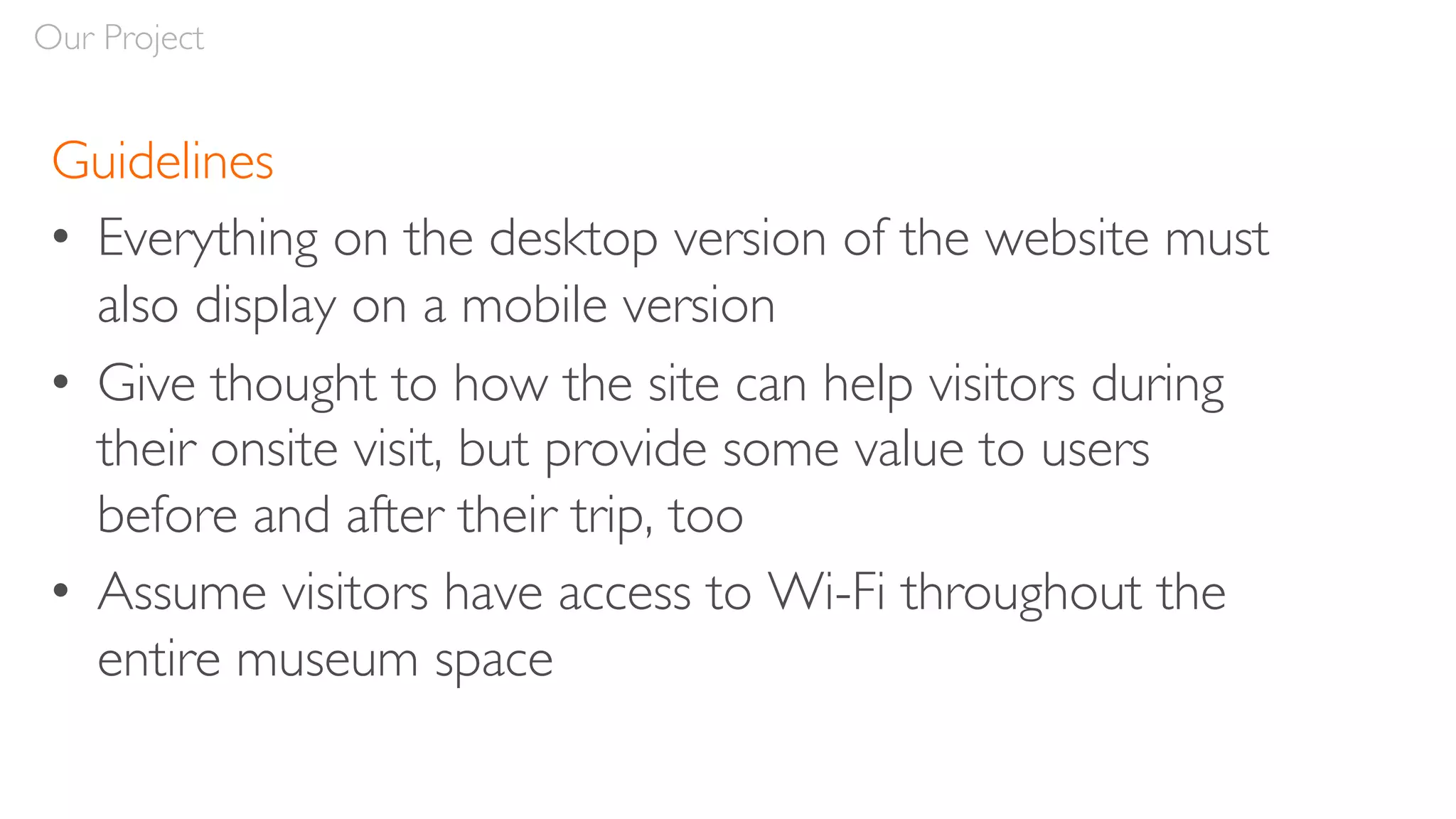

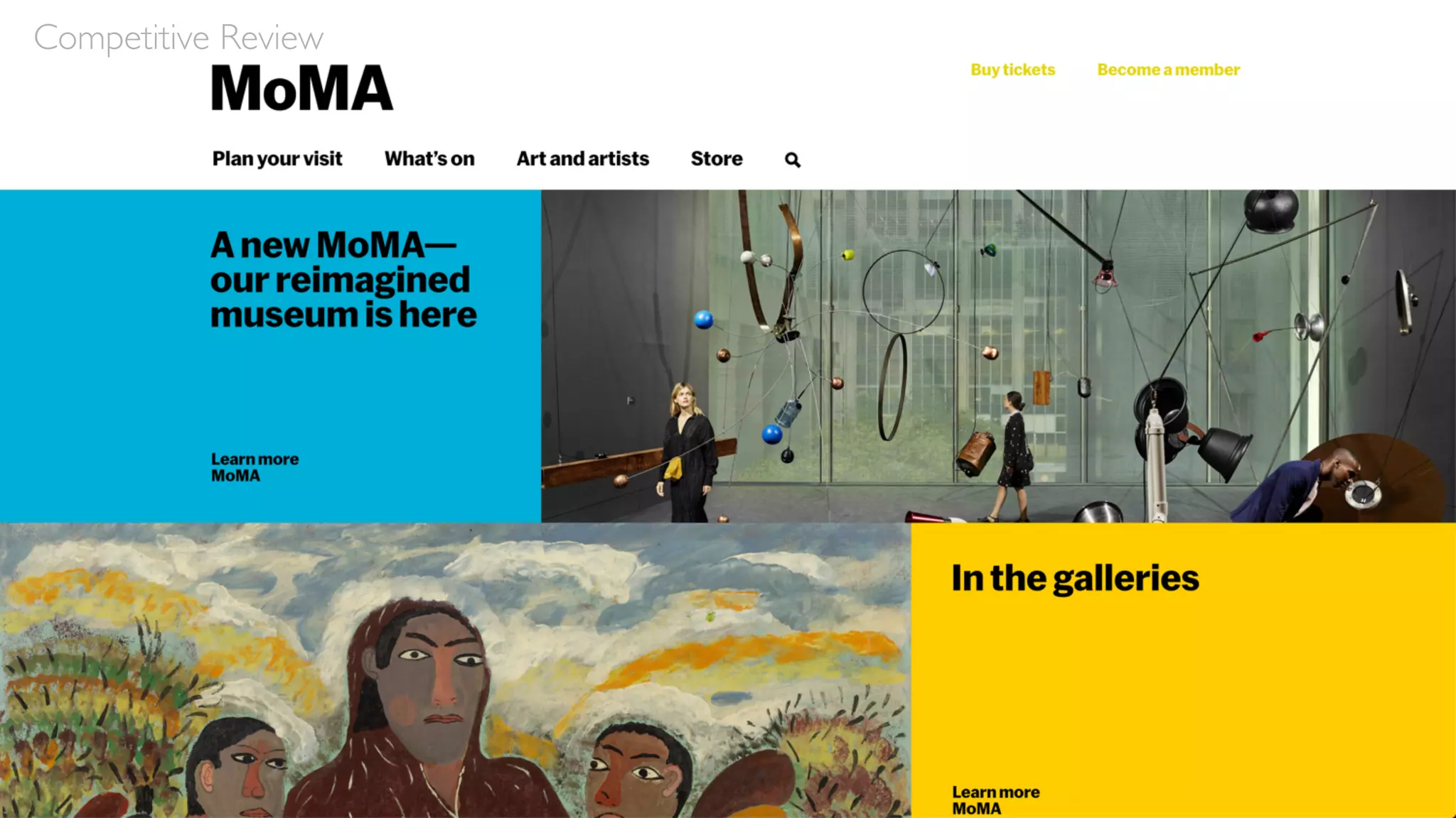


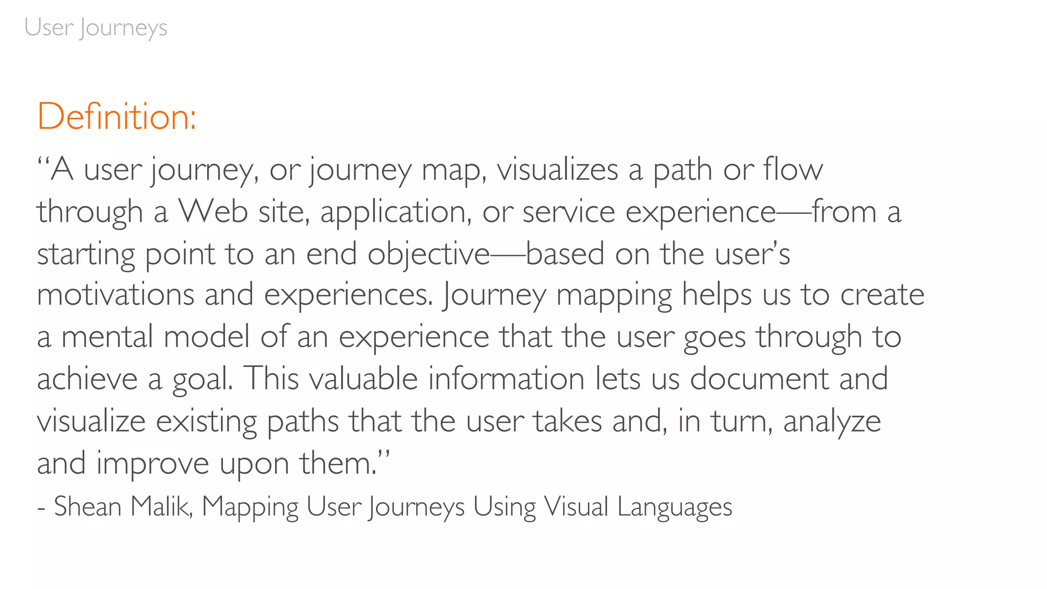
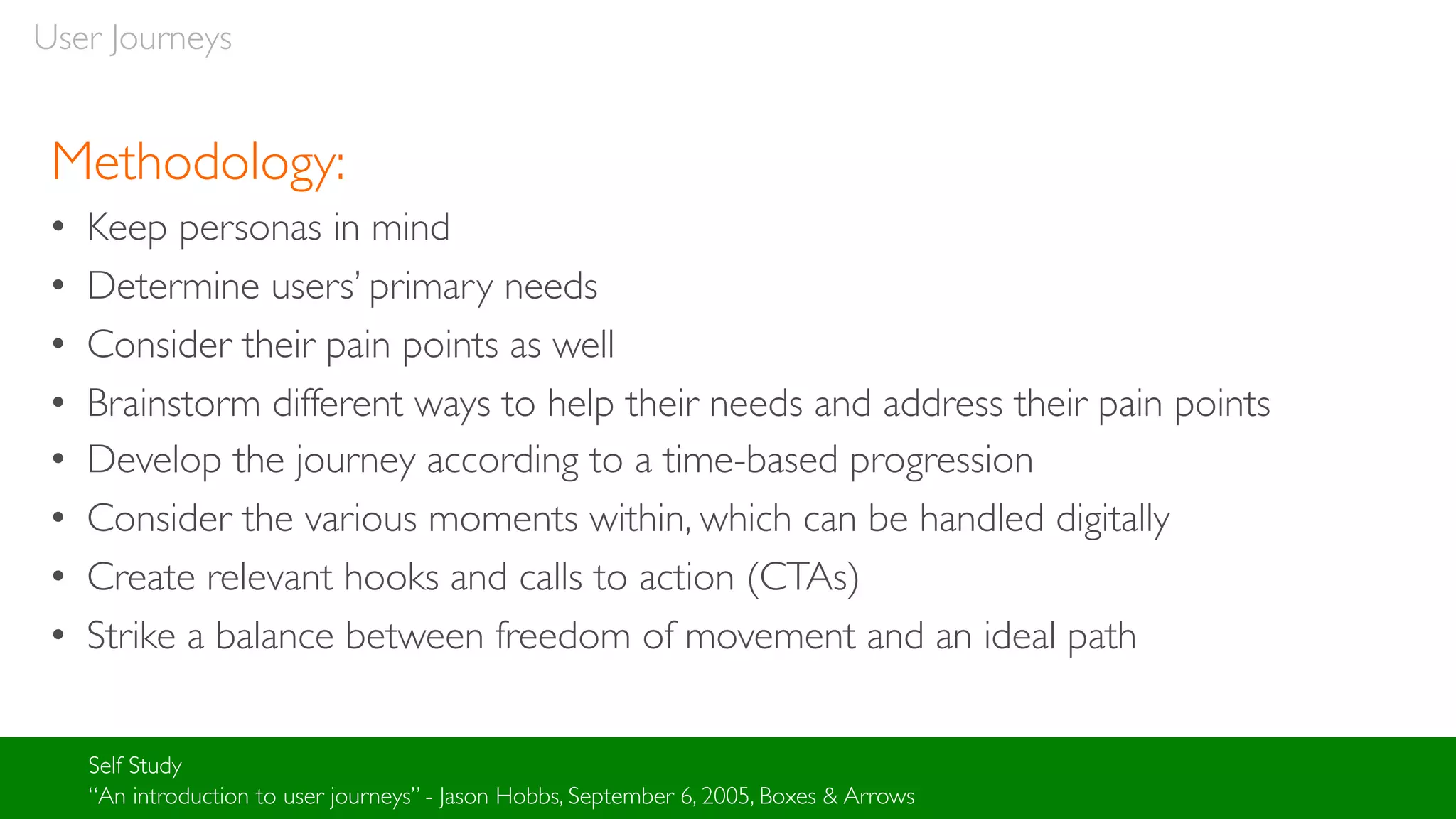
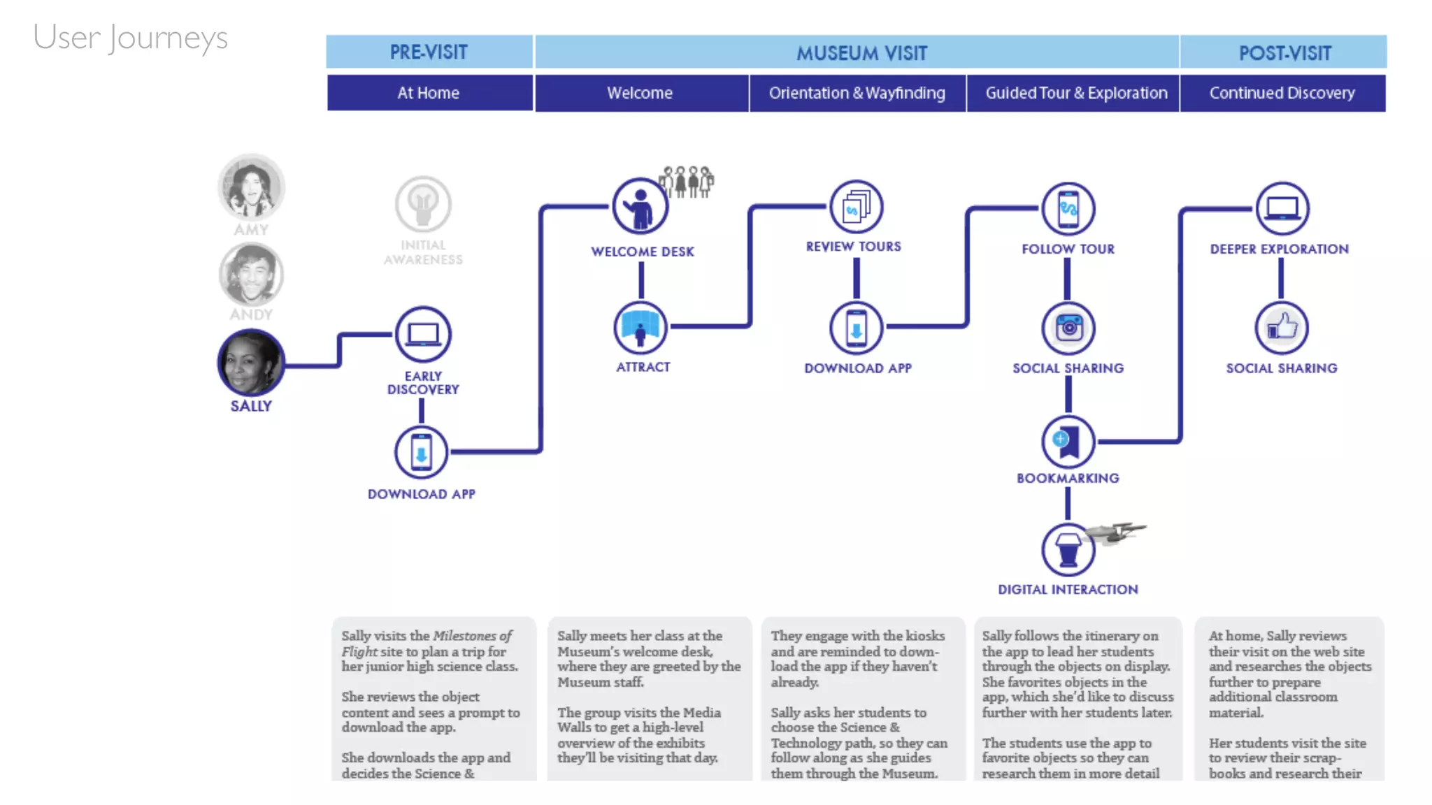
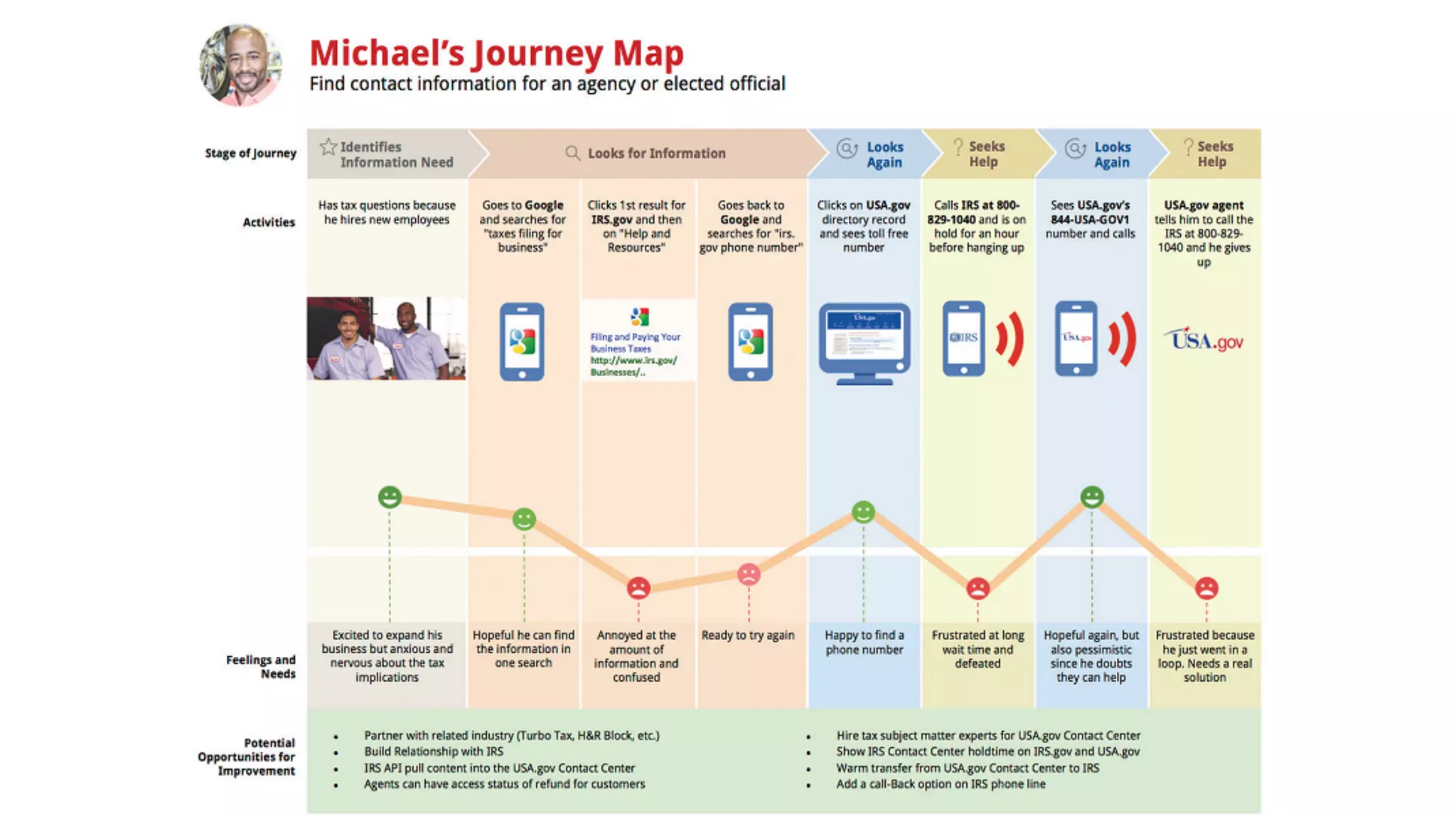
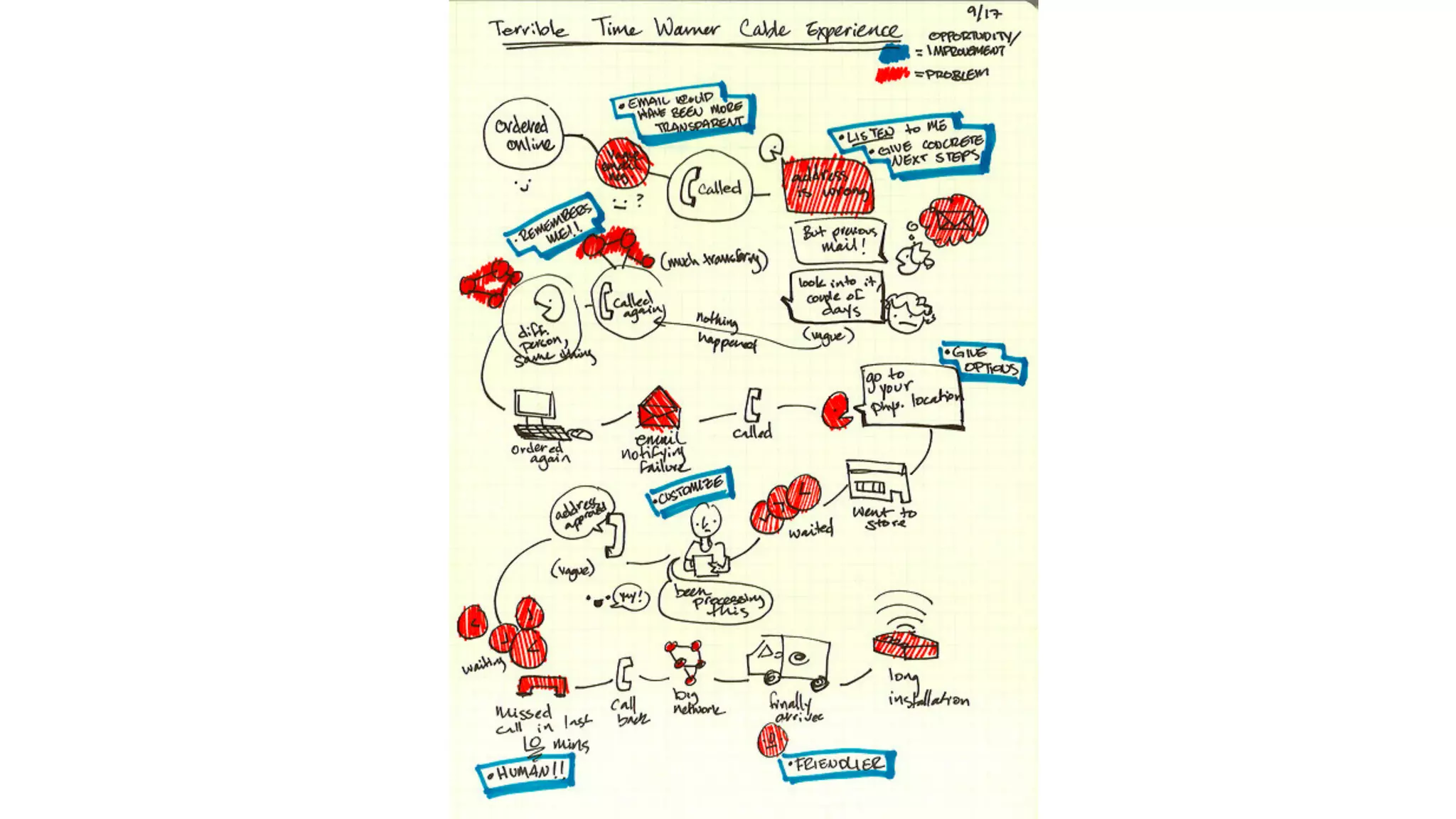

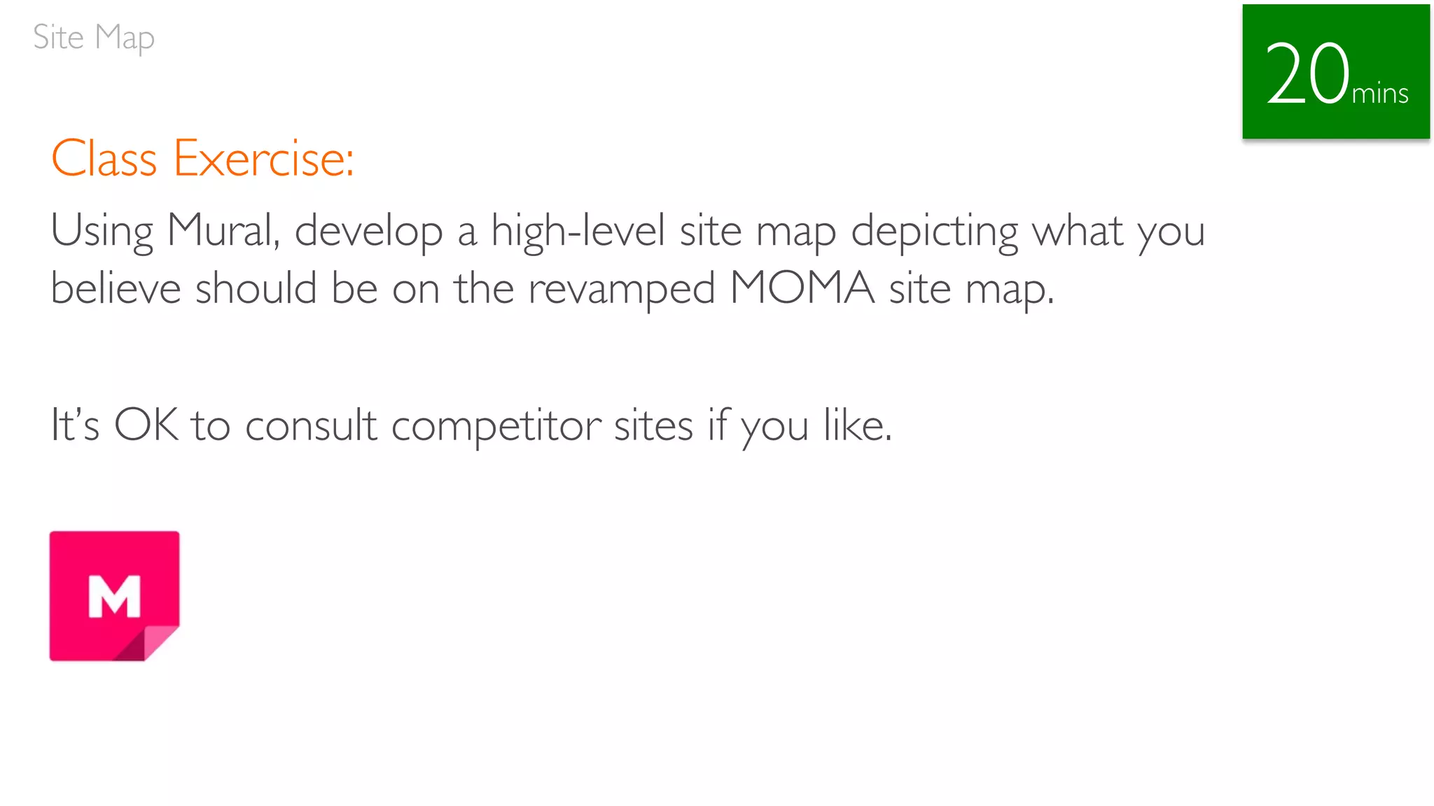


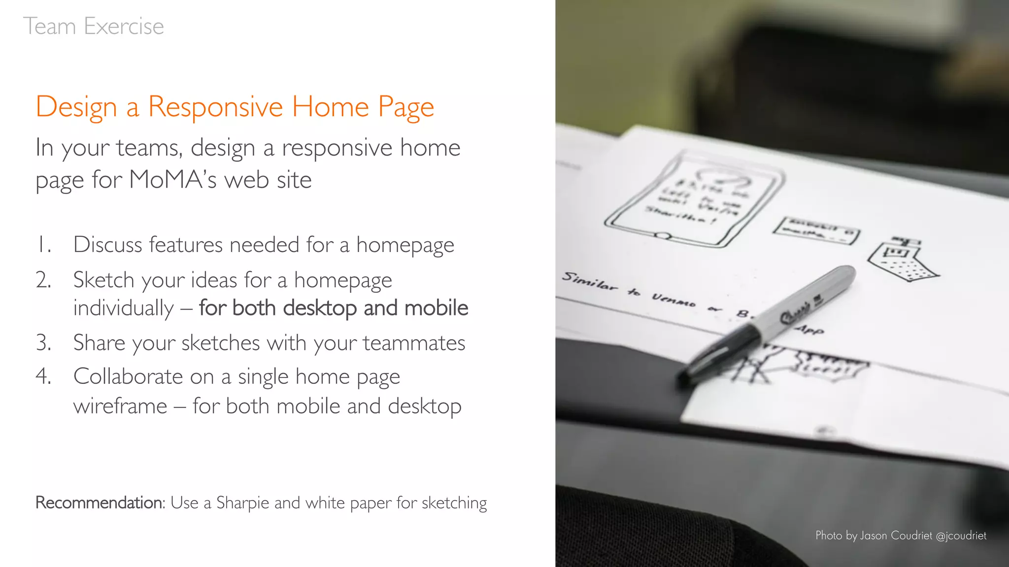


The document outlines principles and guidelines for responsive web design, emphasizing the importance of creating adaptable layouts for various devices. It covers topics such as user journeys, site maps, and team exercises to enhance collaborative design efforts, particularly for the Museum of Modern Art's updated web presence. The workshop encourages participants to prioritize mobile-first strategies and maintain content and feature consistency across devices while considering user experience goals.


![Responsive Design Studio [Mountain View 2013]](https://cdn.slidesharecdn.com/ss_thumbnails/responsivedesignstudiomountainview-131018101452-phpapp01-thumbnail.jpg?width=640&height=640&fit=bounds)


![Chapter4_Initiation_of_Sediment_Motion_v2[1].pptx](https://cdn.slidesharecdn.com/ss_thumbnails/chapter4initiationofsedimentmotionv21-251208223747-f94ef163-thumbnail.jpg?width=640&height=640&fit=bounds)


