Download as PDF, PPTX


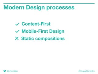

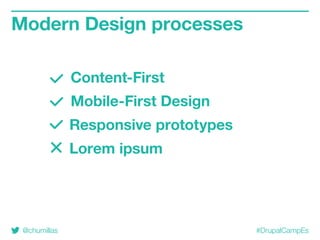
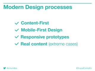
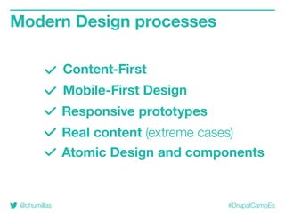


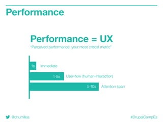


The document discusses improving the responsive web design process by emphasizing content-first and mobile-first design approaches. It covers performance optimization strategies, CSS structuring methodologies, and best practices for responsive images and typography to enhance user experience. It also highlights the importance of accessibility and accommodating various interaction methods while designing for modern web environments.