Download as PDF, PPTX


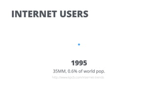


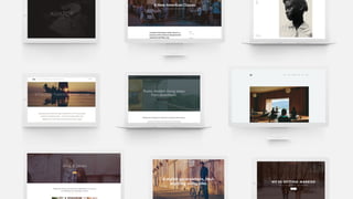


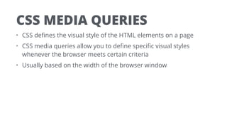


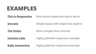


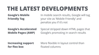

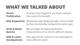
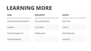


The document discusses responsive web design, emphasizing the need to adapt to various device sizes and capabilities due to the proliferation of internet and mobile phone users. It outlines key considerations for developing responsive websites, including the importance of utilizing CSS media queries and a mobile-first approach. The content also highlights best practices and recent developments in the field, such as Google's mobile-friendly tags and accelerated mobile pages.


