
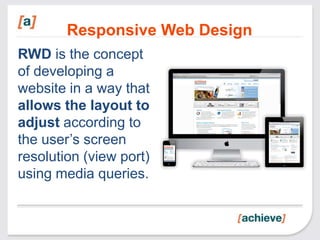
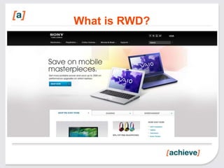
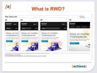
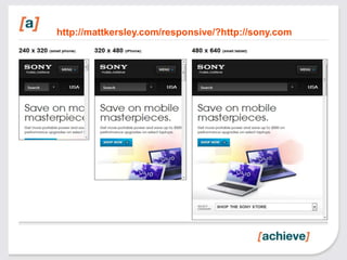
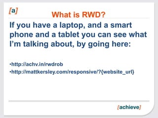


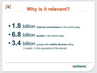
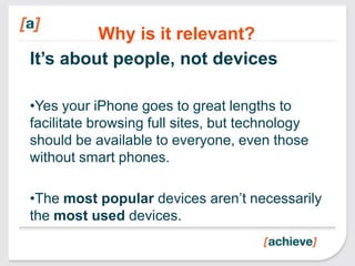
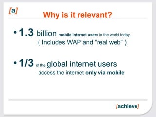
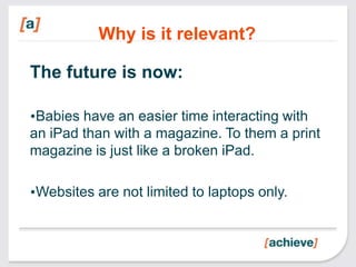

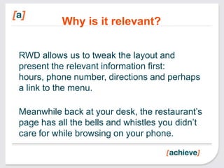


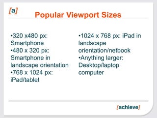
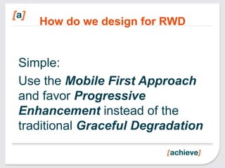
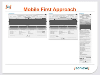
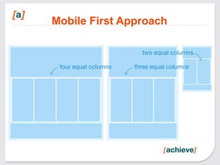
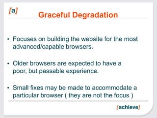
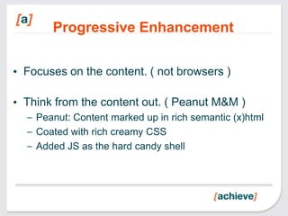
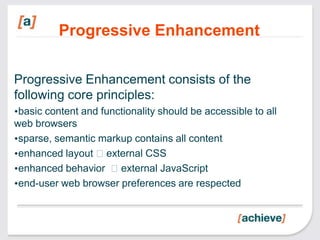


This document discusses responsive web design (RWD). RWD allows websites to automatically adjust their layout depending on the user's screen size using media queries. It is important for accessibility and usability as most internet users now access the web on mobile devices. The document recommends using a mobile-first and progressive enhancement approach where basic content and functionality work on all browsers and advanced features are progressively added. It provides examples of RWD techniques and tools to test responsive designs.


![Getting Started with Apache Spark: Big Data Made Simple [Free Meetup]](https://cdn.slidesharecdn.com/ss_thumbnails/apachesparkgettingstarted-260203175547-8361bcc3-thumbnail.jpg?width=640&height=640&fit=bounds)


