SlideShare a Scribd company logo
1 of 4
  <br />323850029845The design of this contents sheet is extremely eye catching presenting additional images than text which would appeal to viewers involving the ages of 15-20. The pictures are predominantly small with one big one in the middle, each with the page number beneath.The small bit of text is on the left hand side of the page. Bigger text is on the page numbers and titles to                                                                                                                                                                                           put emphasis on these sections to the audience. There are lots of pictures and not much text as this is more in the main magazine. The magazine features mainly orange/red, black and white colours which makes it stand out at the same time as being sophisticated because there is not ridiculous amount of colours. <br />The masthead is positioned in the top right hand corner of the page and the letters drop down to spell the word ‘CONTENTS’, this style of writing evokes a sense of creativity as it is displayed over three lines. The layout of the information is rather straight forward. The font size is kept quite small to help the image stand out more, as otherwise, people may not have even seen the bare legged woman in the middle of the page.I think that the magazine here is “Vibe” because it has a hollowed out “V” in the background of the page, which of course, is the letter which is at the start of the word “Vibe”, and in addition her legs are at the top made into the shape of a V, which I doubt is just coincidence too. This was probably done, just in case the reader decided to skip the front page, and didn’t know what magazine it was that they were looking at.The overall style of this page is an attempt at a very elegant and simple one, there is no range in variety of colours as it is meant to seem more ‘sexy’ than snazzy. Also, the use of having great big high heels, when the woman isn’t even standing on them shows that they were attempting to add to the theme of elegance, even if in reality, they weren’t being used.There is only one problem with this image – the woman has clearly forgotten to put her trousers on. 3319780200660<br />3429000238760<br />This contents page seems to have a lot going on as there is a lot of pictures and there is also a lot of text at the same time. The layout and light use of colours suggests that maybe the magazine is aimed at young teenagers all the way up to adults as it seems to be predominantly about rock/alternative music, but not too heavy, more retro. It shows to male musicians, and due to part of it being about Oasis, it is assumed that at least of the two is a member of that band. There is not much text, only what is needed, which is pulling the audience in and wanting them to want to know more about Oasis. Along the side of the page there are little sub headings which attract the reader as they just give slight glimpses as to what is inside, they work in similar ways to things like demo’s, the hope is that the reader feels that they don’t know enough and therefore want to know more. <br />The layout of this contents page is again simple, but in a stylish way, rather than tedious. The magazine uses the star James Blunt to fill the page on the right and on the left there is more text than pictures. This mixture is probably good because it satisfies the people who prefer to look at pictures, and the people who like to read.  And due to him being a big star the audience immediately draws their eye to him. The background is a cream colour, keeping the colouring simplistic and the clever effect of the ‘narrow depth of field’ shot, keeps the stars face perfectly in focus whilst slightly blurring the background.34290001541780sxz<br />At the bottom of this magazine there is a small advertisement demonstrating a discount, this could persuade more people to buy the magazine. The general layout is similar to most in that there is a picture smack in the middle of the band they talk about beneath – Kasabian. Additionally the inside news of the magazine is on the right hand side in column form.Furthermore on the left hand side there is a “Band Index” which, presumably shows which pages you will find information or mentions of bands, so you can find the exact band you want to hear about within seconds3396615-245745<br />3604260300990<br />The layout of this magazine is more adventurous than the average one, there is more bold writing and more pictures.Moreover, the information on what’s inside is sectioned off and placed across the page covering the whole thing. This could be because they wanted a slightly more exciting look, as opposed to stylish. The colour coding is yellow and black, which are both colours than stand out quite a lot, especially when used in contrast.  <br /> This magazine contents page is laid out in a slightly different style to many in that the main picture is on the top, as opposed to in the background covering the page or slightly to the left/right. The band’s name is highlighted in the middle – “Bring Me The Horizon” which is a very heavy metal band and therefore sets the target audience to be people who like that kind of music. There is also some colour coding, yellow, it distinguishes between different sections of the magazine, making it easier to look around it. 3533140295275<br />This magazine cover has two main pictures on the front of it demonstrating what genre and audience it is aimed at. Additionally, there is a little side picture of the main stage at Leeds Festival, and as Leeds is a rock festival it shows that the magazine is maybe aimed at older/teenage audiences. Similarly to other magazines the listings of what is inside is along the side and separated into different captions so it is easier to navigate around the magazine.The general colour coding is yellow and grey, this may be because it looks stylish yet simple. 34347153556000This magazine contents page has a large picture of a star on the front of it, attracting all of his fans to buy the magazine. It has a similar style to most magazines in that, the topics for what’s inside are listed to one side with page numbers, so there is more room for big bold pictures to attract the audience’s eye. Some of the inside articles are displayed through pictures and little caption next to them, giving the reader a glimpse of what is in the magazine, tempting into buying it. There is no distinctive theme in colour, other than the highlighting of the important parts, in yellow. The pictures of the artists and performances are in colour, to add interest.In the top right of the magazine, is the word “Metallica” which defines the magazine as a heavy metal based magazine, letting the audience know who it is aimed at. 3378835-160020<br />
Reasearch contents pages newest

More Related Content

What's hot

Analysis for my magazine
Analysis for my magazineAnalysis for my magazine
Analysis for my magazineLaurenTaylor8
 
Contents page analysis 1
Contents page analysis 1Contents page analysis 1
Contents page analysis 1betsimegan
 
NME Magazine Textual Analysis
NME Magazine Textual AnalysisNME Magazine Textual Analysis
NME Magazine Textual AnalysisCatherine Baker
 
Rock magazine covers
Rock magazine coversRock magazine covers
Rock magazine coversSigridsynnove
 
Magazine analysis
Magazine analysisMagazine analysis
Magazine analysislsuttie9
 
Music Magazine Evaluation
Music Magazine EvaluationMusic Magazine Evaluation
Music Magazine EvaluationLaurenTaylor8
 
Front Cover analysis
Front Cover analysisFront Cover analysis
Front Cover analysisFlipDexHD1
 
Contents Page 'Top Of The Pops'.
Contents Page 'Top Of The Pops'.Contents Page 'Top Of The Pops'.
Contents Page 'Top Of The Pops'.Antonia-Montefusco
 
Contents Page Analysis- We Love Pop
Contents Page Analysis- We Love PopContents Page Analysis- We Love Pop
Contents Page Analysis- We Love PopAntonia-Montefusco
 
Analysis of magazine covers
Analysis of magazine coversAnalysis of magazine covers
Analysis of magazine coversAmy Lea
 
Magazine Cover analysis
Magazine Cover analysisMagazine Cover analysis
Magazine Cover analysisBobby Abedi
 
Nme front cover analysis
Nme front cover analysisNme front cover analysis
Nme front cover analysisasmediae15
 
Magazine analysis
Magazine analysisMagazine analysis
Magazine analysiselinhh
 
Magazine conventions for arctic monkeys Q
Magazine conventions for arctic monkeys Q Magazine conventions for arctic monkeys Q
Magazine conventions for arctic monkeys Q charlo12345
 
Task 3 - Music Magazine Analysis
Task 3 - Music Magazine AnalysisTask 3 - Music Magazine Analysis
Task 3 - Music Magazine Analysiselliemoore17
 

What's hot (16)

Analysis for my magazine
Analysis for my magazineAnalysis for my magazine
Analysis for my magazine
 
Contents page analysis 1
Contents page analysis 1Contents page analysis 1
Contents page analysis 1
 
NME Magazine Textual Analysis
NME Magazine Textual AnalysisNME Magazine Textual Analysis
NME Magazine Textual Analysis
 
Rock magazine covers
Rock magazine coversRock magazine covers
Rock magazine covers
 
Magazine analysis
Magazine analysisMagazine analysis
Magazine analysis
 
Music Magazine Evaluation
Music Magazine EvaluationMusic Magazine Evaluation
Music Magazine Evaluation
 
Front Cover analysis
Front Cover analysisFront Cover analysis
Front Cover analysis
 
Contents Page 'Top Of The Pops'.
Contents Page 'Top Of The Pops'.Contents Page 'Top Of The Pops'.
Contents Page 'Top Of The Pops'.
 
Contents Page Analysis- We Love Pop
Contents Page Analysis- We Love PopContents Page Analysis- We Love Pop
Contents Page Analysis- We Love Pop
 
Analysis of magazine covers
Analysis of magazine coversAnalysis of magazine covers
Analysis of magazine covers
 
Magazine Cover analysis
Magazine Cover analysisMagazine Cover analysis
Magazine Cover analysis
 
Nme front cover analysis
Nme front cover analysisNme front cover analysis
Nme front cover analysis
 
Magazine analysis
Magazine analysisMagazine analysis
Magazine analysis
 
Magazine conventions for arctic monkeys Q
Magazine conventions for arctic monkeys Q Magazine conventions for arctic monkeys Q
Magazine conventions for arctic monkeys Q
 
Task 3 - Music Magazine Analysis
Task 3 - Music Magazine AnalysisTask 3 - Music Magazine Analysis
Task 3 - Music Magazine Analysis
 
Analysis of kerrang
Analysis of kerrangAnalysis of kerrang
Analysis of kerrang
 

Viewers also liked

Sell Your Hologic Selenia Digital Mammo
Sell Your Hologic Selenia Digital MammoSell Your Hologic Selenia Digital Mammo
Sell Your Hologic Selenia Digital MammoBlock Imaging
 
Semantic web uygulamalarına giriş
Semantic web uygulamalarına girişSemantic web uygulamalarına giriş
Semantic web uygulamalarına girişSavaş Yıldız
 
Exergy on urban scale - Exergy conference Paris
Exergy on urban scale - Exergy conference ParisExergy on urban scale - Exergy conference Paris
Exergy on urban scale - Exergy conference Pariswouterleduc
 
Metro Campus:Geleyn Meijer, Economic Development Board Catch Up Sessie 24 jun...
Metro Campus:Geleyn Meijer, Economic Development Board Catch Up Sessie 24 jun...Metro Campus:Geleyn Meijer, Economic Development Board Catch Up Sessie 24 jun...
Metro Campus:Geleyn Meijer, Economic Development Board Catch Up Sessie 24 jun...KennisKring Amsterdam
 
презентация пресс центр победа Cер.лучник2
презентация пресс центр победа Cер.лучник2презентация пресс центр победа Cер.лучник2
презентация пресс центр победа Cер.лучник2AlexanderKarchenko
 
Aliakbarhassanpour securityproject
Aliakbarhassanpour securityprojectAliakbarhassanpour securityproject
Aliakbarhassanpour securityprojectit88tabriz
 
Infographics - the most socially popular tourism destinations in Indonesia
Infographics - the most socially popular tourism destinations in IndonesiaInfographics - the most socially popular tourism destinations in Indonesia
Infographics - the most socially popular tourism destinations in IndonesiaPeter Goldsworthy
 
Thefuturewewantrio20outcomedocument 120619185658-phpapp02
Thefuturewewantrio20outcomedocument 120619185658-phpapp02Thefuturewewantrio20outcomedocument 120619185658-phpapp02
Thefuturewewantrio20outcomedocument 120619185658-phpapp02Antoine Hauville
 
Teknik menghasilkan blog 1
Teknik menghasilkan blog 1Teknik menghasilkan blog 1
Teknik menghasilkan blog 1Roiamah Basri
 
Hi ha forats negres
Hi ha forats negresHi ha forats negres
Hi ha forats negresranglada64
 
SOUTH EAST EUROPE 2020: JOBS AND PROSPERITY IN A EUROPEAN PERSPECTIVE
SOUTH EAST EUROPE 2020: JOBS AND PROSPERITY IN A EUROPEAN PERSPECTIVESOUTH EAST EUROPE 2020: JOBS AND PROSPERITY IN A EUROPEAN PERSPECTIVE
SOUTH EAST EUROPE 2020: JOBS AND PROSPERITY IN A EUROPEAN PERSPECTIVEAlbania Energy Association
 
Garispanduan penggredan premis_makanan
Garispanduan penggredan premis_makananGarispanduan penggredan premis_makanan
Garispanduan penggredan premis_makananRoiamah Basri
 

Viewers also liked (20)

Session 10 – nuclear power
Session 10 – nuclear powerSession 10 – nuclear power
Session 10 – nuclear power
 
Shopping list
Shopping listShopping list
Shopping list
 
Sell Your Hologic Selenia Digital Mammo
Sell Your Hologic Selenia Digital MammoSell Your Hologic Selenia Digital Mammo
Sell Your Hologic Selenia Digital Mammo
 
Semantic web uygulamalarına giriş
Semantic web uygulamalarına girişSemantic web uygulamalarına giriş
Semantic web uygulamalarına giriş
 
Immune System
Immune SystemImmune System
Immune System
 
Propietat intelectual a l'era digital
Propietat intelectual a l'era digitalPropietat intelectual a l'era digital
Propietat intelectual a l'era digital
 
1. pementoran
1. pementoran1. pementoran
1. pementoran
 
Exergy on urban scale - Exergy conference Paris
Exergy on urban scale - Exergy conference ParisExergy on urban scale - Exergy conference Paris
Exergy on urban scale - Exergy conference Paris
 
Metro Campus:Geleyn Meijer, Economic Development Board Catch Up Sessie 24 jun...
Metro Campus:Geleyn Meijer, Economic Development Board Catch Up Sessie 24 jun...Metro Campus:Geleyn Meijer, Economic Development Board Catch Up Sessie 24 jun...
Metro Campus:Geleyn Meijer, Economic Development Board Catch Up Sessie 24 jun...
 
презентация пресс центр победа Cер.лучник2
презентация пресс центр победа Cер.лучник2презентация пресс центр победа Cер.лучник2
презентация пресс центр победа Cер.лучник2
 
Aliakbarhassanpour securityproject
Aliakbarhassanpour securityprojectAliakbarhassanpour securityproject
Aliakbarhassanpour securityproject
 
The ProActive Network's PRISM product
The ProActive Network's PRISM productThe ProActive Network's PRISM product
The ProActive Network's PRISM product
 
Lima Peru
Lima PeruLima Peru
Lima Peru
 
Infographics - the most socially popular tourism destinations in Indonesia
Infographics - the most socially popular tourism destinations in IndonesiaInfographics - the most socially popular tourism destinations in Indonesia
Infographics - the most socially popular tourism destinations in Indonesia
 
Thefuturewewantrio20outcomedocument 120619185658-phpapp02
Thefuturewewantrio20outcomedocument 120619185658-phpapp02Thefuturewewantrio20outcomedocument 120619185658-phpapp02
Thefuturewewantrio20outcomedocument 120619185658-phpapp02
 
html help
html helphtml help
html help
 
Teknik menghasilkan blog 1
Teknik menghasilkan blog 1Teknik menghasilkan blog 1
Teknik menghasilkan blog 1
 
Hi ha forats negres
Hi ha forats negresHi ha forats negres
Hi ha forats negres
 
SOUTH EAST EUROPE 2020: JOBS AND PROSPERITY IN A EUROPEAN PERSPECTIVE
SOUTH EAST EUROPE 2020: JOBS AND PROSPERITY IN A EUROPEAN PERSPECTIVESOUTH EAST EUROPE 2020: JOBS AND PROSPERITY IN A EUROPEAN PERSPECTIVE
SOUTH EAST EUROPE 2020: JOBS AND PROSPERITY IN A EUROPEAN PERSPECTIVE
 
Garispanduan penggredan premis_makanan
Garispanduan penggredan premis_makananGarispanduan penggredan premis_makanan
Garispanduan penggredan premis_makanan
 

Similar to Reasearch contents pages newest

Annotations of contents pages
Annotations of contents pagesAnnotations of contents pages
Annotations of contents pageslucyvh
 
Analysis of Music Magazines
Analysis of Music MagazinesAnalysis of Music Magazines
Analysis of Music MagazinesBeniboy39
 
Music magazine analysis
Music magazine analysisMusic magazine analysis
Music magazine analysisAmyApples13
 
Task 2 - Detailed Analysis of Music Magazines
Task 2 - Detailed Analysis of Music MagazinesTask 2 - Detailed Analysis of Music Magazines
Task 2 - Detailed Analysis of Music Magazinesayreslou
 
Magazine reserach
Magazine reserachMagazine reserach
Magazine reserachbronnie93
 
Contents pages
Contents pagesContents pages
Contents pages10lysharp
 
Content page analysis
Content page analysisContent page analysis
Content page analysisgrace_hawkins
 
Magazine contents page deconstructions
Magazine contents page deconstructionsMagazine contents page deconstructions
Magazine contents page deconstructionsljones1897
 
Task 2 - Detailed Analysis of Music Magazines
Task 2 - Detailed Analysis of Music MagazinesTask 2 - Detailed Analysis of Music Magazines
Task 2 - Detailed Analysis of Music Magazinesayreslou
 
Magazine covers
Magazine coversMagazine covers
Magazine coversrj5453
 
Task 3- Nathan Green
Task 3- Nathan GreenTask 3- Nathan Green
Task 3- Nathan Greenasmediac15
 
Media analysis of fp, cp and dps
Media analysis of fp, cp and dpsMedia analysis of fp, cp and dps
Media analysis of fp, cp and dpsmali66
 
Analysed front covers
Analysed front coversAnalysed front covers
Analysed front coversellieyoungman
 

Similar to Reasearch contents pages newest (20)

Annotations of contents pages
Annotations of contents pagesAnnotations of contents pages
Annotations of contents pages
 
Textual analysis
Textual analysisTextual analysis
Textual analysis
 
Analysis of Music Magazines
Analysis of Music MagazinesAnalysis of Music Magazines
Analysis of Music Magazines
 
Music magazine analysis
Music magazine analysisMusic magazine analysis
Music magazine analysis
 
Task 2 - Detailed Analysis of Music Magazines
Task 2 - Detailed Analysis of Music MagazinesTask 2 - Detailed Analysis of Music Magazines
Task 2 - Detailed Analysis of Music Magazines
 
Magazine reserach
Magazine reserachMagazine reserach
Magazine reserach
 
Contents pages
Contents pagesContents pages
Contents pages
 
Music Magazine Analysis
Music Magazine AnalysisMusic Magazine Analysis
Music Magazine Analysis
 
Content page analysis
Content page analysisContent page analysis
Content page analysis
 
Research
ResearchResearch
Research
 
.
..
.
 
Kerrang analysis
Kerrang analysisKerrang analysis
Kerrang analysis
 
Magazine contents page deconstructions
Magazine contents page deconstructionsMagazine contents page deconstructions
Magazine contents page deconstructions
 
Task 2 - Detailed Analysis of Music Magazines
Task 2 - Detailed Analysis of Music MagazinesTask 2 - Detailed Analysis of Music Magazines
Task 2 - Detailed Analysis of Music Magazines
 
Magazine covers
Magazine coversMagazine covers
Magazine covers
 
Analysis of Kerrang
Analysis of KerrangAnalysis of Kerrang
Analysis of Kerrang
 
Task 3- Nathan Green
Task 3- Nathan GreenTask 3- Nathan Green
Task 3- Nathan Green
 
Media analysis of fp, cp and dps
Media analysis of fp, cp and dpsMedia analysis of fp, cp and dps
Media analysis of fp, cp and dps
 
Analysed front covers
Analysed front coversAnalysed front covers
Analysed front covers
 
Mood Board
Mood BoardMood Board
Mood Board
 

More from kellyben123

The following (mag cover) (2)
The following (mag cover) (2)The following (mag cover) (2)
The following (mag cover) (2)kellyben123
 
Preliminary task
Preliminary taskPreliminary task
Preliminary taskkellyben123
 
Preliminary task
Preliminary taskPreliminary task
Preliminary taskkellyben123
 
Preliminary task
Preliminary taskPreliminary task
Preliminary taskkellyben123
 

More from kellyben123 (6)

The following (mag cover) (2)
The following (mag cover) (2)The following (mag cover) (2)
The following (mag cover) (2)
 
Timeline plan
Timeline planTimeline plan
Timeline plan
 
Preliminary task
Preliminary taskPreliminary task
Preliminary task
 
Find your tribe
Find your tribeFind your tribe
Find your tribe
 
Preliminary task
Preliminary taskPreliminary task
Preliminary task
 
Preliminary task
Preliminary taskPreliminary task
Preliminary task
 

Reasearch contents pages newest

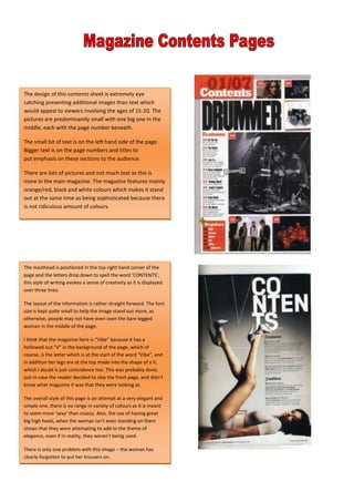
  • 1. <br />323850029845The design of this contents sheet is extremely eye catching presenting additional images than text which would appeal to viewers involving the ages of 15-20. The pictures are predominantly small with one big one in the middle, each with the page number beneath.The small bit of text is on the left hand side of the page. Bigger text is on the page numbers and titles to put emphasis on these sections to the audience. There are lots of pictures and not much text as this is more in the main magazine. The magazine features mainly orange/red, black and white colours which makes it stand out at the same time as being sophisticated because there is not ridiculous amount of colours. <br />The masthead is positioned in the top right hand corner of the page and the letters drop down to spell the word ‘CONTENTS’, this style of writing evokes a sense of creativity as it is displayed over three lines. The layout of the information is rather straight forward. The font size is kept quite small to help the image stand out more, as otherwise, people may not have even seen the bare legged woman in the middle of the page.I think that the magazine here is “Vibe” because it has a hollowed out “V” in the background of the page, which of course, is the letter which is at the start of the word “Vibe”, and in addition her legs are at the top made into the shape of a V, which I doubt is just coincidence too. This was probably done, just in case the reader decided to skip the front page, and didn’t know what magazine it was that they were looking at.The overall style of this page is an attempt at a very elegant and simple one, there is no range in variety of colours as it is meant to seem more ‘sexy’ than snazzy. Also, the use of having great big high heels, when the woman isn’t even standing on them shows that they were attempting to add to the theme of elegance, even if in reality, they weren’t being used.There is only one problem with this image – the woman has clearly forgotten to put her trousers on. 3319780200660<br />3429000238760<br />This contents page seems to have a lot going on as there is a lot of pictures and there is also a lot of text at the same time. The layout and light use of colours suggests that maybe the magazine is aimed at young teenagers all the way up to adults as it seems to be predominantly about rock/alternative music, but not too heavy, more retro. It shows to male musicians, and due to part of it being about Oasis, it is assumed that at least of the two is a member of that band. There is not much text, only what is needed, which is pulling the audience in and wanting them to want to know more about Oasis. Along the side of the page there are little sub headings which attract the reader as they just give slight glimpses as to what is inside, they work in similar ways to things like demo’s, the hope is that the reader feels that they don’t know enough and therefore want to know more. <br />The layout of this contents page is again simple, but in a stylish way, rather than tedious. The magazine uses the star James Blunt to fill the page on the right and on the left there is more text than pictures. This mixture is probably good because it satisfies the people who prefer to look at pictures, and the people who like to read. And due to him being a big star the audience immediately draws their eye to him. The background is a cream colour, keeping the colouring simplistic and the clever effect of the ‘narrow depth of field’ shot, keeps the stars face perfectly in focus whilst slightly blurring the background.34290001541780sxz<br />At the bottom of this magazine there is a small advertisement demonstrating a discount, this could persuade more people to buy the magazine. The general layout is similar to most in that there is a picture smack in the middle of the band they talk about beneath – Kasabian. Additionally the inside news of the magazine is on the right hand side in column form.Furthermore on the left hand side there is a “Band Index” which, presumably shows which pages you will find information or mentions of bands, so you can find the exact band you want to hear about within seconds3396615-245745<br />3604260300990<br />The layout of this magazine is more adventurous than the average one, there is more bold writing and more pictures.Moreover, the information on what’s inside is sectioned off and placed across the page covering the whole thing. This could be because they wanted a slightly more exciting look, as opposed to stylish. The colour coding is yellow and black, which are both colours than stand out quite a lot, especially when used in contrast. <br /> This magazine contents page is laid out in a slightly different style to many in that the main picture is on the top, as opposed to in the background covering the page or slightly to the left/right. The band’s name is highlighted in the middle – “Bring Me The Horizon” which is a very heavy metal band and therefore sets the target audience to be people who like that kind of music. There is also some colour coding, yellow, it distinguishes between different sections of the magazine, making it easier to look around it. 3533140295275<br />This magazine cover has two main pictures on the front of it demonstrating what genre and audience it is aimed at. Additionally, there is a little side picture of the main stage at Leeds Festival, and as Leeds is a rock festival it shows that the magazine is maybe aimed at older/teenage audiences. Similarly to other magazines the listings of what is inside is along the side and separated into different captions so it is easier to navigate around the magazine.The general colour coding is yellow and grey, this may be because it looks stylish yet simple. 34347153556000This magazine contents page has a large picture of a star on the front of it, attracting all of his fans to buy the magazine. It has a similar style to most magazines in that, the topics for what’s inside are listed to one side with page numbers, so there is more room for big bold pictures to attract the audience’s eye. Some of the inside articles are displayed through pictures and little caption next to them, giving the reader a glimpse of what is in the magazine, tempting into buying it. There is no distinctive theme in colour, other than the highlighting of the important parts, in yellow. The pictures of the artists and performances are in colour, to add interest.In the top right of the magazine, is the word “Metallica” which defines the magazine as a heavy metal based magazine, letting the audience know who it is aimed at. 3378835-160020<br />