SlideShare a Scribd company logo
1 of 3
Dazed & Confused is a fashion, music and art magazine. It uses a very minimalistic approach for the cover layout. For example, a very bold and plain masthead, along with using the single colour  of white for all text elements. The photograph used is quite a bizarre image. It is a simple mid –shot of the two models, however as it is not a conventional shot of their faces it makes the whole cover quite intriguing. The background used is fairly blurry/unfocused, this helps to draw attention to the models, as they stand out from it. A strange palette of colours are used for this, however they do blend in with the helmet reflections and tie in with the ‘3D’ theme of the cover line. It also ties in with Daft Punk’s digital/techno feel. The issue number, date and price are quite discretely positioned on the white are of shirt, on the right hand side. The white on white effect means the text is visible  when read closely, however is hidden when  the cover is looked at as a whole. The cover line is positioned centrally, and the text is kept to a minimum. The majority of the text on the cover relates directly to the image of Daft Punk, followed by an overview of other content in the magazine at the bottom
The masthead in this image is partly layered behind the model image. This allows the audience to see enough of the text to recognise the magazine, whilst drawing their attention to the splash and cover lines. The use of contrasting colours such as pink also helps this effect. The use of the colour palette in the strapline allows for keywords or phrases to be highlighted by using different colours, however maintains consistency as this is used throughout the whole cover. The colour palette in this cover is a pink, blue and black for the text – with a neutral background. Also, some of the colour elements such as the masthead and right hand cover lines match the model’s clothing, giving the effect of the overall image being of the same theme.  The photograph is a close-up, allowing the shot to show facial expression. A fairly arrogant expression is used, which supports the cover line ‘I AM RAP’, by showing his self-confidence.  The website is quite discretely positioned in the bottom left corner, in white text. This means the more relevant information on the cover can be allowed to stand out whilst this is less obvious.
The strapline indicates that the issue is a special edition, and the audience’s eyes are drawn to this as the masthead is usually at the very top, yet this time it is lower.  The main cover lines are very bold, and capitalised. This means more attention is drawn to these than the purple  areas of text which are less significant, as they  are just sub-headings of the cover story. The colour palette is mainly pink, purple and white, with some black as well for the text – whilst the  photograph is part multi-colour, part black and white – creating a contrast. The barcode follows the conventional method of being placed in the bottom corner, however is quite small and discreet so that more attention is focused on the masthead, cover lines and splash.

More Related Content

What's hot

Front covers
Front coversFront covers
Front coversLeanne94
 
Inception
InceptionInception
Inceptionemzy_95
 
Contents Page Codes And Conventions
Contents Page Codes And ConventionsContents Page Codes And Conventions
Contents Page Codes And ConventionsLewisAllen2000
 
Photography plan
Photography planPhotography plan
Photography planLeah Allie
 
Inception
InceptionInception
Inceptionemzy_95
 
Inception film magazine
Inception film magazineInception film magazine
Inception film magazineemzy_95
 
Poster and magazine
Poster and magazinePoster and magazine
Poster and magazinewelche8692
 
Task 2c double page spread nme analysis
Task 2c double page spread nme analysisTask 2c double page spread nme analysis
Task 2c double page spread nme analysisasmediae15
 
Movie magazine analysis 1
Movie magazine analysis 1Movie magazine analysis 1
Movie magazine analysis 1katiemccreesh
 
Poster and magazine
Poster and magazinePoster and magazine
Poster and magazinewelche8692
 
Scott pilgrim vs. the world poster analysis
Scott pilgrim vs. the world poster analysis Scott pilgrim vs. the world poster analysis
Scott pilgrim vs. the world poster analysis fifipoo
 
6 b magazine conventions (cole robinson)
6 b   magazine conventions (cole robinson)6 b   magazine conventions (cole robinson)
6 b magazine conventions (cole robinson)Crobinson17
 
Magazine Textual Analysis
Magazine Textual AnalysisMagazine Textual Analysis
Magazine Textual Analysisfbracken1
 
Magazine cover analysis_worksheet (muse)
Magazine cover analysis_worksheet (muse)Magazine cover analysis_worksheet (muse)
Magazine cover analysis_worksheet (muse)Nicole Greenhalgh
 
Analysing magazines
Analysing magazinesAnalysing magazines
Analysing magazineslaura-illing
 
Poster Textual Analysis
Poster Textual AnalysisPoster Textual Analysis
Poster Textual Analysisfbracken1
 

What's hot (20)

Front covers
Front coversFront covers
Front covers
 
Inception
InceptionInception
Inception
 
Contents Page Codes And Conventions
Contents Page Codes And ConventionsContents Page Codes And Conventions
Contents Page Codes And Conventions
 
Photography plan
Photography planPhotography plan
Photography plan
 
Inception
InceptionInception
Inception
 
Inception film magazine
Inception film magazineInception film magazine
Inception film magazine
 
Poster and magazine
Poster and magazinePoster and magazine
Poster and magazine
 
Task 2c double page spread nme analysis
Task 2c double page spread nme analysisTask 2c double page spread nme analysis
Task 2c double page spread nme analysis
 
Movie magazine analysis 1
Movie magazine analysis 1Movie magazine analysis 1
Movie magazine analysis 1
 
Empire magazine analysis
Empire magazine analysisEmpire magazine analysis
Empire magazine analysis
 
Poster and magazine
Poster and magazinePoster and magazine
Poster and magazine
 
Question 1
Question 1Question 1
Question 1
 
Scott pilgrim vs. the world poster analysis
Scott pilgrim vs. the world poster analysis Scott pilgrim vs. the world poster analysis
Scott pilgrim vs. the world poster analysis
 
Film Poster Analysis
Film Poster AnalysisFilm Poster Analysis
Film Poster Analysis
 
6 b magazine conventions (cole robinson)
6 b   magazine conventions (cole robinson)6 b   magazine conventions (cole robinson)
6 b magazine conventions (cole robinson)
 
Magazine Textual Analysis
Magazine Textual AnalysisMagazine Textual Analysis
Magazine Textual Analysis
 
Magazine cover analysis_worksheet (muse)
Magazine cover analysis_worksheet (muse)Magazine cover analysis_worksheet (muse)
Magazine cover analysis_worksheet (muse)
 
Magazine analysis
Magazine analysisMagazine analysis
Magazine analysis
 
Analysing magazines
Analysing magazinesAnalysing magazines
Analysing magazines
 
Poster Textual Analysis
Poster Textual AnalysisPoster Textual Analysis
Poster Textual Analysis
 

Viewers also liked

Magazine Inspiration
Magazine InspirationMagazine Inspiration
Magazine InspirationTaggar97
 
Market Research
Market ResearchMarket Research
Market Researchizmacgreg
 
Dazed & Confused
Dazed & ConfusedDazed & Confused
Dazed & ConfusedDawn Tse
 
Examples of magazines
Examples of magazines Examples of magazines
Examples of magazines godsell1999
 
Institution research
Institution researchInstitution research
Institution researchEmily852
 
Dazed & Confused + i-D Magazine Analysis
Dazed & Confused + i-D Magazine AnalysisDazed & Confused + i-D Magazine Analysis
Dazed & Confused + i-D Magazine Analysiscloestead
 
Dazed and confused toc analysis
Dazed and confused toc analysisDazed and confused toc analysis
Dazed and confused toc analysisjessiekeegan
 

Viewers also liked (8)

Coveranalysis
CoveranalysisCoveranalysis
Coveranalysis
 
Magazine Inspiration
Magazine InspirationMagazine Inspiration
Magazine Inspiration
 
Market Research
Market ResearchMarket Research
Market Research
 
Dazed & Confused
Dazed & ConfusedDazed & Confused
Dazed & Confused
 
Examples of magazines
Examples of magazines Examples of magazines
Examples of magazines
 
Institution research
Institution researchInstitution research
Institution research
 
Dazed & Confused + i-D Magazine Analysis
Dazed & Confused + i-D Magazine AnalysisDazed & Confused + i-D Magazine Analysis
Dazed & Confused + i-D Magazine Analysis
 
Dazed and confused toc analysis
Dazed and confused toc analysisDazed and confused toc analysis
Dazed and confused toc analysis
 

Similar to Magazine Cover Analysis

Contents Pages of Magazines
Contents Pages of Magazines Contents Pages of Magazines
Contents Pages of Magazines stonee1
 
Analysing magazines
Analysing magazinesAnalysing magazines
Analysing magazineslaura-illing
 
Magazine analysis cover, contents and double page spread
Magazine analysis cover, contents and double page spreadMagazine analysis cover, contents and double page spread
Magazine analysis cover, contents and double page spreadleahmilner1999
 
Mag analysis
Mag analysisMag analysis
Mag analysiszoeyc
 
NME Cover Analysis
NME Cover AnalysisNME Cover Analysis
NME Cover AnalysisLukaMedia
 
Magazine front cover analysis
Magazine front cover analysis Magazine front cover analysis
Magazine front cover analysis ellyjeffrey
 
Textual Analysis
Textual AnalysisTextual Analysis
Textual Analysispinogo
 
Analysis of cover, contents page + double page spread
Analysis of cover, contents page + double page spread Analysis of cover, contents page + double page spread
Analysis of cover, contents page + double page spread EDavoile13
 
Music magazine analysis
Music magazine analysisMusic magazine analysis
Music magazine analysisbroganmain
 
NME Cover Analysis
NME Cover AnalysisNME Cover Analysis
NME Cover AnalysisLukaMedia
 
NME Cover Analysis
NME Cover AnalysisNME Cover Analysis
NME Cover AnalysisLukaMedia
 
Magazine Analysis - Kerrang
Magazine Analysis - KerrangMagazine Analysis - Kerrang
Magazine Analysis - Kerrangguestb26673
 
Analysing music magazine q
Analysing music magazine   qAnalysing music magazine   q
Analysing music magazine qernest16
 

Similar to Magazine Cover Analysis (20)

Final evaluation 2
Final evaluation 2Final evaluation 2
Final evaluation 2
 
Magazine analysis
Magazine analysisMagazine analysis
Magazine analysis
 
Magazine further research
Magazine further researchMagazine further research
Magazine further research
 
Contents Pages of Magazines
Contents Pages of Magazines Contents Pages of Magazines
Contents Pages of Magazines
 
F:\Magazine Radials
F:\Magazine RadialsF:\Magazine Radials
F:\Magazine Radials
 
Analysing magazines
Analysing magazinesAnalysing magazines
Analysing magazines
 
Magazine analysis cover, contents and double page spread
Magazine analysis cover, contents and double page spreadMagazine analysis cover, contents and double page spread
Magazine analysis cover, contents and double page spread
 
Mag analysis
Mag analysisMag analysis
Mag analysis
 
NME Cover Analysis
NME Cover AnalysisNME Cover Analysis
NME Cover Analysis
 
Dizzee rascal anaylsis
Dizzee rascal anaylsisDizzee rascal anaylsis
Dizzee rascal anaylsis
 
Magazine front cover analysis
Magazine front cover analysis Magazine front cover analysis
Magazine front cover analysis
 
Magazine assignment
Magazine assignmentMagazine assignment
Magazine assignment
 
Textual Analysis
Textual AnalysisTextual Analysis
Textual Analysis
 
Analysis of cover, contents page + double page spread
Analysis of cover, contents page + double page spread Analysis of cover, contents page + double page spread
Analysis of cover, contents page + double page spread
 
Music magazine analysis
Music magazine analysisMusic magazine analysis
Music magazine analysis
 
Magazine cover
Magazine coverMagazine cover
Magazine cover
 
NME Cover Analysis
NME Cover AnalysisNME Cover Analysis
NME Cover Analysis
 
NME Cover Analysis
NME Cover AnalysisNME Cover Analysis
NME Cover Analysis
 
Magazine Analysis - Kerrang
Magazine Analysis - KerrangMagazine Analysis - Kerrang
Magazine Analysis - Kerrang
 
Analysing music magazine q
Analysing music magazine   qAnalysing music magazine   q
Analysing music magazine q
 

Magazine Cover Analysis

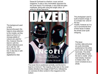
  • 1. Dazed & Confused is a fashion, music and art magazine. It uses a very minimalistic approach for the cover layout. For example, a very bold and plain masthead, along with using the single colour of white for all text elements. The photograph used is quite a bizarre image. It is a simple mid –shot of the two models, however as it is not a conventional shot of their faces it makes the whole cover quite intriguing. The background used is fairly blurry/unfocused, this helps to draw attention to the models, as they stand out from it. A strange palette of colours are used for this, however they do blend in with the helmet reflections and tie in with the ‘3D’ theme of the cover line. It also ties in with Daft Punk’s digital/techno feel. The issue number, date and price are quite discretely positioned on the white are of shirt, on the right hand side. The white on white effect means the text is visible when read closely, however is hidden when the cover is looked at as a whole. The cover line is positioned centrally, and the text is kept to a minimum. The majority of the text on the cover relates directly to the image of Daft Punk, followed by an overview of other content in the magazine at the bottom
  • 2. The masthead in this image is partly layered behind the model image. This allows the audience to see enough of the text to recognise the magazine, whilst drawing their attention to the splash and cover lines. The use of contrasting colours such as pink also helps this effect. The use of the colour palette in the strapline allows for keywords or phrases to be highlighted by using different colours, however maintains consistency as this is used throughout the whole cover. The colour palette in this cover is a pink, blue and black for the text – with a neutral background. Also, some of the colour elements such as the masthead and right hand cover lines match the model’s clothing, giving the effect of the overall image being of the same theme. The photograph is a close-up, allowing the shot to show facial expression. A fairly arrogant expression is used, which supports the cover line ‘I AM RAP’, by showing his self-confidence. The website is quite discretely positioned in the bottom left corner, in white text. This means the more relevant information on the cover can be allowed to stand out whilst this is less obvious.
  • 3. The strapline indicates that the issue is a special edition, and the audience’s eyes are drawn to this as the masthead is usually at the very top, yet this time it is lower. The main cover lines are very bold, and capitalised. This means more attention is drawn to these than the purple areas of text which are less significant, as they are just sub-headings of the cover story. The colour palette is mainly pink, purple and white, with some black as well for the text – whilst the photograph is part multi-colour, part black and white – creating a contrast. The barcode follows the conventional method of being placed in the bottom corner, however is quite small and discreet so that more attention is focused on the masthead, cover lines and splash.