
Recommended
More Related Content
What's hot
What's hot (19)
Viewers also liked
Viewers also liked (12)
Similar to Contents Page Analysis
Similar to Contents Page Analysis (20)
Recently uploaded
Recently uploaded (20)
Contents Page Analysis
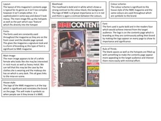
- 1. Layout- The layout of this magazine’s contents page is typical for its genre as it isn’t too complex however it isn’t simple either. It is sophisticated in some way and doesn’t look messy. The main image fills up the hotspots as well as the part which says ‘feature’ which fits directly into the hotspot Fonts- The fonts used are constantly used throughout the magazine as they are on the front cover and the double page spread. This gives the magazine a signature look and is a form of branding as this type of font is significant to NME magazine. Main Image- The main image appears to be of a white female who looks like she may be interested in rock music as well as heavy metal. We can tell that this may be the case by the clothes she is wearing and the makeup she has on which is very dark. This all goes links to the mise-en-scene. House-style- The logo of the NME magazine is at the top which is significant and reinstates the brand on the page. This will make it symbolic so when people see it they know it is NME. Masthead- The masthead is bold and in white which shows a strong contrast to the colour black; the background. The logo of NME is of great importance as it is in red and there is again a contrast between the colours. Colour scheme- The colour scheme is significant to the house style of the NME magazine and the same colours are used throughout which are symbolic to the brand. Font- The font used is quite bold and in the readers face which would achieve interest from the target audience. The logo is on the contents page which is branding as they are continuously selling their brand by making the logo appear on every page to show its importance and significance. Rule of Thirds- The blank spaces as well as the hotspots are filled up with something to make the contents page appear more appealing to the target audience and interest them more easily with minimal effort.