Social media marketing/Seo expert and digital marketing
Typography research 1
1. TYPOGRAPHY
RESEARCH:
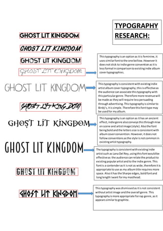
This typography is an option as it is feminine, it
uses similar font to the one bellow. However it
does not stick to indie genre convention as it is
less formal in comparison to existing indie album
cover typographies.
This typography is consistent with existing indie
artist album cover typography, this is effective as
the audience can associate this typography with
this particular genre. Therefore more revenue will
be made as they will require less persuading
through advertising. This typography is similar to
Birdy’s, it is simple. Therefore this font type may
be used for my album.
This typography is an option as it has an ancient
effect, indie genre also conveys this through mise
en scene and artist image (style). Also the font
being bold and the letters size is consistent with
album cover convention. However, it does not
follow conventions as the style is not common in
existing artist typography.
The typography is consistent with existing indie
artist such as Lana Del Rey, using this font would be
effective as the audience can relate the product to
existing popular artist and to the indie genre. This
font is a contender as it is not as wide, therefore it is
appropriate to use as my album title requires more
space. Also it has the Sharpe edges, bold font and
long length I want for my masthead.
This typography was dismissed as it is not consistent
without artist image and the overall genre. This
typography is more appropriate for rap genre, as it
appears similar to graphite.