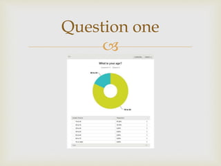
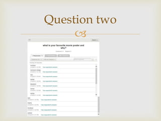
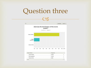
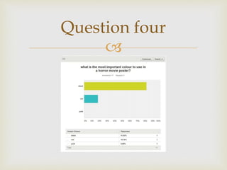
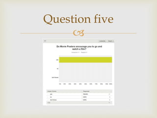
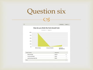
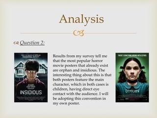
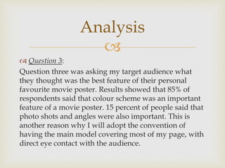
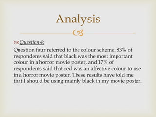
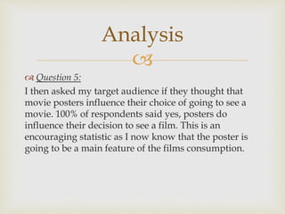
By Sophie Canning

Screen shot of
questionnaire

Question one

Question two

Question three

Question four

Question five

Question six

Question 1:
This question was designed to try and identify what
age groups I will be targeting with my poster. The
results showed that the most common age range was
15-24 year olds. This means that when creating my
poster I should adhere to codes and conventions that
apply to a young target audience.
Analysis

 Question 2:
Analysis
Results from my survey tell me
that the most popular horror
movie posters that already exist
are orphan and insidious. The
interesting thing about this is that
both posters feature the main
character, which in both cases is
children, having direct eye
contact with the audience. I will
be adopting this convention in
my own poster.

 Question 3:
Question three was asking my target audience what
they thought was the best feature of their personal
favourite movie poster. Results showed that 85% of
respondents said that colour scheme was an important
feature of a movie poster. 15 percent of people said that
photo shots and angles were also important. This is
another reason why I will adopt the convention of
having the main model covering most of my page, with
direct eye contact with the audience.
Analysis

 Question 4:
Question four referred to the colour scheme. 83% of
respondents said that black was the most important
colour in a horror movie poster, and 17% of
respondents said that red was an affective colour to use
in a horror movie poster. These results have told me
that I should be using mainly black in my movie poster.
Analysis

 Question 5:
I then asked my target audience if they thought that
movie posters influence their choice of going to see a
movie. 100% of respondents said yes, posters do
influence their decision to see a film. This is an
encouraging statistic as I now know that the poster is
going to be a main feature of the films consumption.
Analysis

 Question 6:
The final question in the survey asked respondents
what font choice they thought would be the most
effective in a horror movie poster. The choices that
were available to choose from was bold and large,
curvy and stylish or small and type-writer like. Put of
all 11 respondents 10 said that they thought that ‘bold
and big’ would be the most effective choice of font. The
remaining respondents said ‘small and type-writer
like’. I will be going with the majority vote, in that I will
be using a big and bold font on my movie poster.
Analysis

Questionnaire, analysis and results on poster

  • 1.
  • 2.
  • 3.
  • 4.
  • 5.
  • 6.
  • 7.
  • 8.
  • 9.
     Question 1: This questionwas designed to try and identify what age groups I will be targeting with my poster. The results showed that the most common age range was 15-24 year olds. This means that when creating my poster I should adhere to codes and conventions that apply to a young target audience. Analysis
  • 10.
      Question 2: Analysis Resultsfrom my survey tell me that the most popular horror movie posters that already exist are orphan and insidious. The interesting thing about this is that both posters feature the main character, which in both cases is children, having direct eye contact with the audience. I will be adopting this convention in my own poster.
  • 11.
      Question 3: Questionthree was asking my target audience what they thought was the best feature of their personal favourite movie poster. Results showed that 85% of respondents said that colour scheme was an important feature of a movie poster. 15 percent of people said that photo shots and angles were also important. This is another reason why I will adopt the convention of having the main model covering most of my page, with direct eye contact with the audience. Analysis
  • 12.
      Question 4: Questionfour referred to the colour scheme. 83% of respondents said that black was the most important colour in a horror movie poster, and 17% of respondents said that red was an affective colour to use in a horror movie poster. These results have told me that I should be using mainly black in my movie poster. Analysis
  • 13.
      Question 5: Ithen asked my target audience if they thought that movie posters influence their choice of going to see a movie. 100% of respondents said yes, posters do influence their decision to see a film. This is an encouraging statistic as I now know that the poster is going to be a main feature of the films consumption. Analysis
  • 14.
      Question 6: Thefinal question in the survey asked respondents what font choice they thought would be the most effective in a horror movie poster. The choices that were available to choose from was bold and large, curvy and stylish or small and type-writer like. Put of all 11 respondents 10 said that they thought that ‘bold and big’ would be the most effective choice of font. The remaining respondents said ‘small and type-writer like’. I will be going with the majority vote, in that I will be using a big and bold font on my movie poster. Analysis