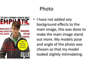
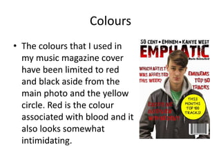
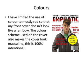
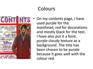
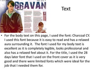
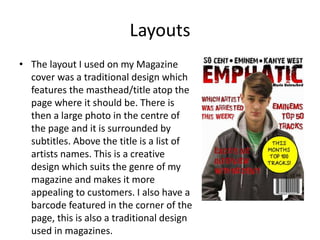
The document discusses the design choices made for a music magazine cover and contents page. It describes using 4 photos of a model in the same clothes across multiple photo shoots to maintain continuity. The photos focus on the model's clothing and were edited to add effects and flip the image. Red and black were the primary colors used to make the cover look masculine and intimidating while complementing the main photo. Specific fonts were selected for their readability, formality and to match the genre of music. The layout uses a traditional magazine cover design with the title at the top and a large central photo surrounded by subtitles.