
Recommended
More Related Content
What's hot
What's hot (19)
Similar to Magazine analysis
Similar to Magazine analysis (20)
More from kingdomdawson
Recently uploaded
Recently uploaded (20)
Magazine analysis
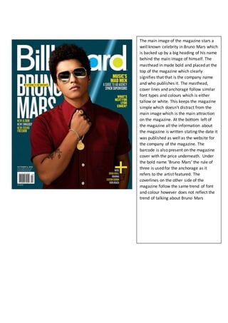
- 1. The main image of the magazine stars a well known celebrity in Bruno Mars which is backed up by a big heading of his name behind the main image of himself. The masthead in made bold and placed at the top of the magazine which clearly signifies that that is the company name and who publishes it. The masthead, cover lines and anchorage follow similar font types and colours which is either tallow or white. This keeps the magazine simple which doesn’t distract from the main image which is the main attraction on the magazine. At the bottom left of the magazine all the information about the magazine is written stating the date it was published as well as the website for the company of the magazine. The barcode is also present on the magazine cover with the price underneath. Under the bold name ‘Bruno Mars’ the rule of three is used for the anchorage as it refers to the artist featured. The coverlines on the other side of the magazine follow the same trend of font and colour however does not reflect the trend of talking about Bruno Mars