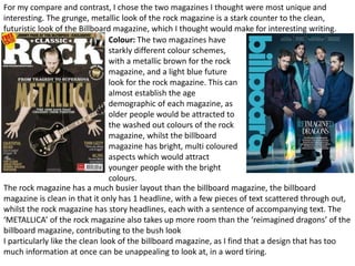
The document compares and contrasts two magazines - a rock magazine and a Billboard magazine. Some key differences summarized:
1) The rock magazine has a metallic brown colour scheme while the Billboard magazine has a light blue, futuristic look. The colour schemes help establish the different target demographics.
2) The rock magazine has a busier layout with multiple story headlines and text, while the Billboard magazine has a cleaner layout with just one headline and scattered text.
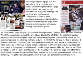
3) For the contents pages, the Kerrang magazine uses the bottom half for page numbers and top half for pictures, while the Q magazine uses the left 1/3 for page numbers and the rest for pictures. The document prefers the cleaner design of the