The document discusses how the creator's main film product and ancillary texts like posters and a radio trailer are effectively combined and connected. Key points:
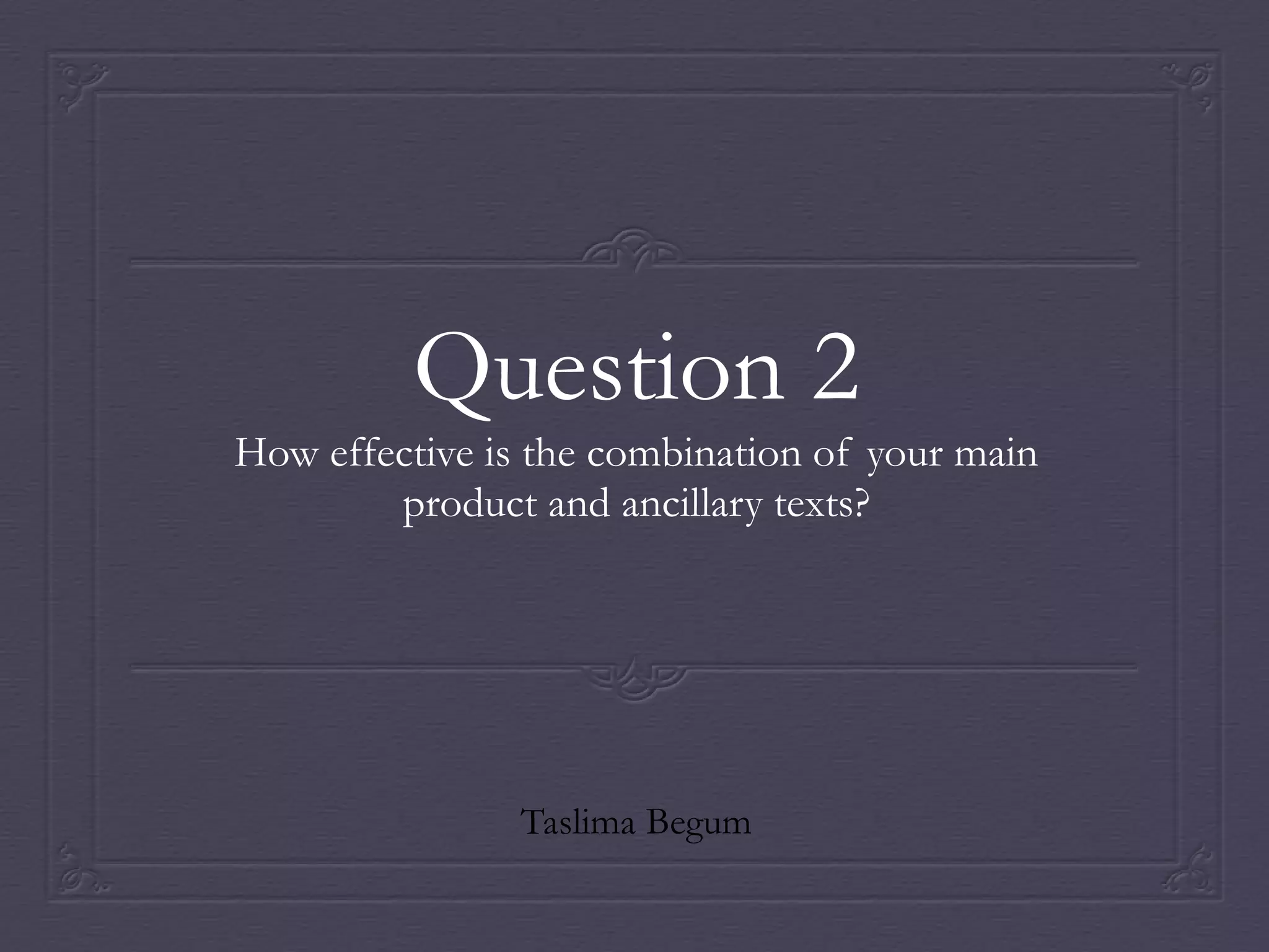
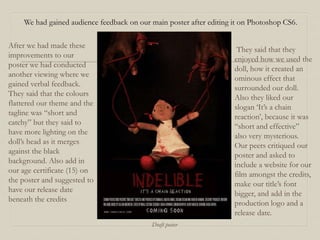
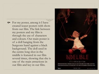
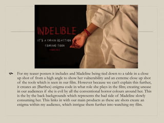
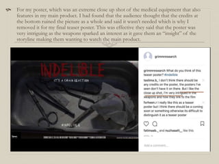
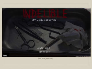
1) The main film poster uses colors that represent the film's themes and binary oppositions, while teaser posters feature close-up shots from the film to intrigue audiences.
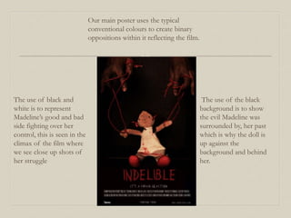
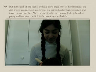
2) Feedback found the posters' use of characters and colors effectively linked them to the film and created mystery about the storyline.
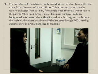
3) The radio trailer uses dialogue and sound effects from the film to provide context and build suspense, teasing audiences to watch the full film.
4) Elements like whispered words in the trailer are also present in flashback scenes in the


![Evaluation -powerpoint_presentation[1]](https://cdn.slidesharecdn.com/ss_thumbnails/evaluation-powerpointpresentation1-110408181158-phpapp02-thumbnail.jpg?width=640&height=640&fit=bounds)


