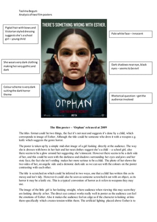
The poster for the film "Orphan" features a young girl looking directly at the viewer with shadows around her eyes, suggesting two sides - innocent and demonic. The scratched title can refer to either a child writing it or someone using a weapon like a knife, hinting at the horror genre. It draws the viewer in by the girl's unsmiling gaze that creates tension.
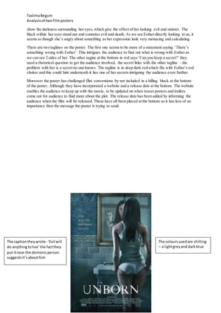
The poster for "The Unborn" uses chilling blue and grey colors and cracks/scratches drawing attention to twin children - a white-clad girl and a black-clad demonic boy in the mirror. The positioning of the tagline "Evil will do anything to live" near the boy suggests he is the evil


![Film poster all genres[1]](https://cdn.slidesharecdn.com/ss_thumbnails/filmposterallgenres1-140203041225-phpapp02-thumbnail.jpg?width=640&height=640&fit=bounds)


