Editing my magazine front cover
•Download as PPTX, PDF•
0 likes•249 views
The magazine cover was changed from photo 1 to photo 2 as photo 2 showed an action shot that foreshadowed something bad happening, fitting the thriller genre of the film better. Additional side headings were added and positioned professionally. Feedback suggested placing the magazine title behind the main photo, which required complex editing in BeFunky to isolate the character from the background and add blurring to focus on her while tying backgrounds and lighting together. Further edits added secondary headings about Emma Watson and films getting darker, using colors from the actual film titles. The final poster incorporated all elements with synergy between colors and fonts to create an enticing cover linking to their trailer.
Report
Share
Report
Share

Recommended
Evaluation question 3
Sophie and I created multiple cuts of a trailer for our film project, getting feedback from friends and classmates between each iteration. Based on feedback that our trailer needed more clarity and drama, we added an "obsession wall" with creepy details. Additional feedback helped refine the film poster and magazine cover to be more intriguing and visually appealing to our target age group of 15-21. Gathering input from a variety audiences helped us improve our work and catch details we had missed.
Editing the film poster
This document describes the process of creating a film poster for "Cerys' Thriller" from an original photo. Several revisions were made to the photo such as blurring the background, darkening Cerys' skin, and adding elements like a title, tagline, and credits. The poster also includes information like nominations, promotional logos, the production company ident, and age rating to make it look like a professional movie poster. The creator believes the final poster clearly conveys its message and stands out.
How effective is the combination of your main product and ancillary tasks
The combination of the main product (trailer) and ancillary tasks (magazine and poster) were very effective due to the continuity across all three. Similar dark colors like black and red were used to represent the horror genre. Font, images, and other elements like the four-star rating and tagline "The secret is out" were also consistent. This continuity helped link the products together and make them appealing and professional for the intended audience. Minor differences like the color of the tagline and release dates were acceptable to add some variety. Overall, the parallel design and shared elements of the trailer, magazine, and poster made for an engaging horror-themed experience.
Question one
The document discusses how the media product, including a poster, magazine, and trailer, uses and develops conventions of real media products. The poster includes elements like the main image filling most of the page, a large central masthead to attract attention, and credits and details along the bottom. The magazine similarly centers the main image and places the large masthead and title alongside it. The trailer uses common title elements like "based on true events" and credits to signal it is a trailer. Locations in the trailer also follow horror film conventions, shifting from a normal to creepier setting.
Grown ups film poster analysis
The film poster depicts the main characters enjoying themselves at a water park. The characters who are closer to the camera have more dominant roles in the film. The location suggests the funniest parts of the film take place there and that it will be enjoyable for both children and adults. Names of major actors are featured at the top to grab attention, though they do not overshadow the main image which is meant to catch viewers' interest. Text at the bottom sums up the main image without spoiling the plot. The color scheme and positioning of elements follows traditional poster conventions.
The grown ups poster analysis
The poster summarizes the film "Grown Ups" by featuring the main protagonists names along the top. Their performances in the film indicate that they enjoy playing like children even as adults. The title is placed below the main image of the actors on water slides. The release date is colored red to connote the danger of growing up. Overall the poster represents the film's comedic genre by depicting the main characters acting in childish ways despite being adults.
Film poster conventions
Film posters follow certain conventions in their visual design. The main image typically represents a key moment or character(s) to convey the genre and attract interest. Typography provides information about the film through titles, quotes, and ratings. Camera angles and lighting are chosen to set the mood and match the film's tone, such as close-ups for mystery or low lighting for horror. Additional text lists the director, producers, actors, and other production details to promote those involved and provide relevant details.
Semiology
This document discusses types of signs used in film posters and their meanings. It provides examples of iconic, symbolic, and indexical signs. Film posters use signs like costumes, lighting, colors, and body language to convey messages and hint at the genre and plot. Effective posters deconstructed in the document use faint facial images and placement in the sky to indicate a spirit or death, and establish settings and postures and scales to imply searching and difficulty in finding someone. Color balancing and bold titles also help audiences quickly understand the genre and title.
Movie Poster Codes & Conventions.
The document discusses different types of movie posters and their purposes. It explains that movie posters are used to promote and advertise upcoming films. Posters come in different types, including teaser posters, official release posters, and DVD posters. Key elements of movie posters typically include the title, actors, release date, taglines, and images related to the genre and plot. The document then analyzes examples of posters, noting design elements and how they provide clues about the genre and story.
Film poster ideas
1) The document discusses design choices for a film poster promoting a short film about characters Ellie and Sam.
2) It considers using a close-up shot of Ellie and Sam hugging from the film to capture their relationship and following typical film poster conventions.
3) Factors like font, colors, lighting, and positioning of the characters are analyzed to convey the purity of Ellie's character and her safe, calming feelings with Sam while not distracting from their loving focus on each other.
Question 1
Our film trailer uses and develops some common codes and conventions of film trailers while also challenging others. It introduces the main character, a young blonde girl, and establishes the thriller genre through clues like her bruises and the creepy music. However, it does not clearly show the antagonist or stick to conventions like only using low-key lighting. The poster uses subtle colors like greens and browns to depict the protagonist alone in the woods, restricting what she can say, rather than using typical thriller colors or showing weapons. The magazine cover similarly uses red and black text to stand out while featuring the main character and promoting exclusive interviews.
Our Pitch
This document outlines the marketing campaign for a coming-of-age teen drama film. The film follows a female protagonist who uses photography to cope with her OCD and feels like an outcast in school. The marketing will emphasize themes of mental illness, isolation, and the protagonist's use of her camera as an outlet. The campaign elements discussed include a teaser trailer highlighting key events and characters, a poster featuring the protagonist and her camera, and a magazine cover continuing the yellow and blue color scheme to match the tone of films like The Perks of Being a Wallflower. The target audience is teens and young adults who can relate to themes of friendship, introversion, and outsider status.
Codes and Conventions of a Film Poster
The document discusses the codes and conventions of film posters. It explains that film posters are meant to attract the target audience and establish the genre and narrative. Posters typically feature the main image showing the narrative or protagonist, the central title at the top, and information about directors, producers and actors at the bottom. Posters also commonly include mottos or quotes from the film and ratings. The document proposes ideas for a film poster including featuring the protagonist in a character shot to introduce her, using lighting and composition techniques, and designing the title with a gradient and the words "lost in the" inside each letter of the protagonist's name.
The Pitch
This film is a coming-of-age teen drama that follows a female protagonist who is an outcast at school due to her OCD. She uses photography to cope with and relieve her anxiety. The protagonist struggles to fit in but uses her camera as an outlet. The promotional campaign will not reveal the protagonist's identity and will focus on her internal struggles and use of photography through voiceovers and point-of-view shots. The teaser trailer, poster, and magazine cover being designed will emphasize the protagonist, photography theme, and tone of films like Perks of Being a Wallflower to promote the film.
Poster semiology
This document discusses types of signs and how they are used in film posters to convey meaning and messages to audiences. It defines signifier, signified, iconic, symbolic, and indexical signs. It then analyzes several film posters, discussing how elements like costumes, lighting, framing, colors and imagery are used semiotically to provide clues about the genre and plot. Specific techniques like faded faces, establishing shots, and placement of text and images are examined for their connotative effects in representing themes of death, loss, and the supernatural.
Movie Poster Codes and Conventions
The document discusses several key elements that are commonly found in film posters across different genres. Most film posters include a billing block that provides information about the producers, directors, and other crew. The colors used are typically genre-specific to help viewers quickly identify the type of film. The title of the film is always prominently displayed in the top, middle, or bottom third of the poster. A tagline is also usually present to summarize the film in a memorable phrase. The main image typically takes up most of the poster and features the main character(s). These elements are designed to attract audience attention and intrigue them about the film.
Evaluation question 2
1) The document discusses the effectiveness of combining a film's main product (poster, short film) with ancillary tasks (magazine review).
2) Key elements like mise-en-scene, semiology, paradigm/syntagm, color scheme, shot types were considered to effectively represent the psychological thriller genre and story across products.
3) Feedback was that the poster and tasks portrayed the film's mood, characters, and narrative well while avoiding spoilers, through choices like Eve's vulnerable expression and white dress, Richard's worried look, and subtle narrative hints in still images.
Poster progress
The document discusses the design choices made for a movie poster. It describes experimenting with different fonts and deciding on a slimmer, taller text for the title. Colors like red, white and blue were considered to match the teaser trailer, with red ultimately chosen for the title against a blue background. Actresses' names were featured at the top to fill space and follow conventions. Additional tweaks were made to placement of credits and the release date before finalizing the poster design.
Film posters terminology and features
The document discusses the key elements and conventions of film posters, including billing, title, release date, images, credits, quotes, and taglines. It analyzes posters for the films The Theory of Everything and Rush, noting their use of stars, romantic poses, and colors to portray genre. Alternative posters for Vantage Point and The Girl with the Dragon Tattoo are also examined, highlighting differences in main images and taglines.
Evaluation q2
The document discusses the brand identity of the film "The Girl on the Train" and how its marketing campaign effectively conveyed a consistent brand identity across the teaser trailer, film posters, and magazine covers. It then discusses how the student's marketing campaign for their fictional film "Skylar" also aimed to establish a clear and cohesive brand identity through the use of similar fonts, colors, images and design elements in the teaser trailer, film poster, and magazine cover. The student feels they largely succeeded in linking the three pieces together but could have improved the magazine cover further.
Editing my magazine front cover
The magazine cover was changed from photo 1 to photo 2 as photo 2 showed an action shot that foreshadowed something bad happening, fitting the thriller genre of the film better. Additional side headings were added and positioned professionally. Feedback suggested placing the magazine title behind the main photo, which required complex editing in BeFunky to isolate the character from the background while adding blur and lighting adjustments. Further edits included selecting secondary headlines about Emma Watson and tying film titles to their actual colors. The "Restricted" text was changed to the film poster font, requiring starting over. The final poster ties all elements together well to entice readers to buy the magazine.
Editing my magazine front cover
The magazine cover was changed from photo 1 to photo 2 as photo 2 showed an action shot that foreshadowed something bad happening, fitting the thriller genre of the film better. Additional side headings were added and positioned professionally. Feedback suggested placing the magazine title behind the main photo, which required complex editing in BeFunky to isolate the character from the background while adding blur and lighting adjustments. Further edits included selecting secondary headlines about Emma Watson and tying film titles to their actual colors. The "Restrict me" text was changed to the film poster font, requiring starting over. The final poster ties all elements together well to entice readers to buy the magazine.
Evaluation 1. in what ways does your media product use, develop or challenge ...
The teaser trailer was 1.13 minutes long to match typical trailer lengths. Editing techniques like cut to black and gradual speeding were used to build tension. Dark tones and ominous sounds created an unsettling mood. Minimal plot details aligned with conventions to pique interest. The title was placed at the end to linger in viewers' minds. Research informed the trailer's style and color scheme.
Our film presentation
This document outlines the promotional campaign for a coming-of-age teen drama film. The protagonist is a female high school student who uses photography to cope with her OCD. Despite being an outcast, she is confident and challenges stereotypes about mental illness. The marketing strategy will highlight the protagonist's wit and use of her camera as a coping mechanism. Promotional materials like the teaser trailer, poster, and magazine cover will feature the camera as a motif and use similar colors and fonts to create continuity. The target audience is teens and young adults who can relate to themes of friendship and being an outscast.
Film poster terminology and features
a powerpoint discussing the different features of a film poster and the terminology that is required to analyse them.
Evaluation 2 media
The combination of the main product (film "The Passage") and ancillary texts (poster, teaser trailer, magazine cover) was effective because key elements were consistently featured across all materials. This included similar titles/fonts, taglines, characters, settings, costumes/mise-en-scene, and color schemes. While some individual elements differed slightly between materials due to being produced by different companies, the overall marketing package clearly conveyed that all pieces were advertising the same film. Featuring these consistent elements helped link the materials and ensured the audience would recognize they were all part of the same promotional campaign for "The Passage".
Q1
This document discusses how the media product uses and challenges conventions of real film posters and trailers. It analyzes several film posters for quirky dramas that use similar color schemes and compositional elements. The created poster focuses on the main characters in the center and uses the same colors and fonts for branding consistency. The teaser trailer takes influences from 500 Days of Summer and Nowhere Boy in using title sequences and company identifiers. Shots of characters are implemented to show emotion and quirkiness through body language. The magazine cover is influenced by Total Film in layout, with the title, main character images and consistency of style.
Film poster study and analysis
This document discusses different types of film posters and what makes an effective poster. It argues that single image posters with a black background ("SIBB" posters) are most compelling. These posters draw attention with a striking single image and minimal distracting elements. They intrigue viewers about the film's content without revealing too much. The document also praises painted posters and taglines for giving films unique identity. In conclusion, the author believes a SIBB-style poster would best represent their group's film as it can be created without professional painting skills.
Manual slideshare(1)
Este documento explica cómo publicar documentos en SlideShare en 3 pasos: 1) Crear una cuenta en SlideShare. 2) Subir un documento y completar los metadatos. 3) Obtener el código HTML o la URL para incrustar o compartir el documento publicado. Proporciona detalles sobre los formatos compatibles, el proceso de registro, y cómo encontrar y copiar los códigos necesarios.
More Related Content
What's hot
Movie Poster Codes & Conventions.
The document discusses different types of movie posters and their purposes. It explains that movie posters are used to promote and advertise upcoming films. Posters come in different types, including teaser posters, official release posters, and DVD posters. Key elements of movie posters typically include the title, actors, release date, taglines, and images related to the genre and plot. The document then analyzes examples of posters, noting design elements and how they provide clues about the genre and story.
Film poster ideas
1) The document discusses design choices for a film poster promoting a short film about characters Ellie and Sam.
2) It considers using a close-up shot of Ellie and Sam hugging from the film to capture their relationship and following typical film poster conventions.
3) Factors like font, colors, lighting, and positioning of the characters are analyzed to convey the purity of Ellie's character and her safe, calming feelings with Sam while not distracting from their loving focus on each other.
Question 1
Our film trailer uses and develops some common codes and conventions of film trailers while also challenging others. It introduces the main character, a young blonde girl, and establishes the thriller genre through clues like her bruises and the creepy music. However, it does not clearly show the antagonist or stick to conventions like only using low-key lighting. The poster uses subtle colors like greens and browns to depict the protagonist alone in the woods, restricting what she can say, rather than using typical thriller colors or showing weapons. The magazine cover similarly uses red and black text to stand out while featuring the main character and promoting exclusive interviews.
Our Pitch
This document outlines the marketing campaign for a coming-of-age teen drama film. The film follows a female protagonist who uses photography to cope with her OCD and feels like an outcast in school. The marketing will emphasize themes of mental illness, isolation, and the protagonist's use of her camera as an outlet. The campaign elements discussed include a teaser trailer highlighting key events and characters, a poster featuring the protagonist and her camera, and a magazine cover continuing the yellow and blue color scheme to match the tone of films like The Perks of Being a Wallflower. The target audience is teens and young adults who can relate to themes of friendship, introversion, and outsider status.
Codes and Conventions of a Film Poster
The document discusses the codes and conventions of film posters. It explains that film posters are meant to attract the target audience and establish the genre and narrative. Posters typically feature the main image showing the narrative or protagonist, the central title at the top, and information about directors, producers and actors at the bottom. Posters also commonly include mottos or quotes from the film and ratings. The document proposes ideas for a film poster including featuring the protagonist in a character shot to introduce her, using lighting and composition techniques, and designing the title with a gradient and the words "lost in the" inside each letter of the protagonist's name.
The Pitch
This film is a coming-of-age teen drama that follows a female protagonist who is an outcast at school due to her OCD. She uses photography to cope with and relieve her anxiety. The protagonist struggles to fit in but uses her camera as an outlet. The promotional campaign will not reveal the protagonist's identity and will focus on her internal struggles and use of photography through voiceovers and point-of-view shots. The teaser trailer, poster, and magazine cover being designed will emphasize the protagonist, photography theme, and tone of films like Perks of Being a Wallflower to promote the film.
Poster semiology
This document discusses types of signs and how they are used in film posters to convey meaning and messages to audiences. It defines signifier, signified, iconic, symbolic, and indexical signs. It then analyzes several film posters, discussing how elements like costumes, lighting, framing, colors and imagery are used semiotically to provide clues about the genre and plot. Specific techniques like faded faces, establishing shots, and placement of text and images are examined for their connotative effects in representing themes of death, loss, and the supernatural.
Movie Poster Codes and Conventions
The document discusses several key elements that are commonly found in film posters across different genres. Most film posters include a billing block that provides information about the producers, directors, and other crew. The colors used are typically genre-specific to help viewers quickly identify the type of film. The title of the film is always prominently displayed in the top, middle, or bottom third of the poster. A tagline is also usually present to summarize the film in a memorable phrase. The main image typically takes up most of the poster and features the main character(s). These elements are designed to attract audience attention and intrigue them about the film.
Evaluation question 2
1) The document discusses the effectiveness of combining a film's main product (poster, short film) with ancillary tasks (magazine review).
2) Key elements like mise-en-scene, semiology, paradigm/syntagm, color scheme, shot types were considered to effectively represent the psychological thriller genre and story across products.
3) Feedback was that the poster and tasks portrayed the film's mood, characters, and narrative well while avoiding spoilers, through choices like Eve's vulnerable expression and white dress, Richard's worried look, and subtle narrative hints in still images.
Poster progress
The document discusses the design choices made for a movie poster. It describes experimenting with different fonts and deciding on a slimmer, taller text for the title. Colors like red, white and blue were considered to match the teaser trailer, with red ultimately chosen for the title against a blue background. Actresses' names were featured at the top to fill space and follow conventions. Additional tweaks were made to placement of credits and the release date before finalizing the poster design.
Film posters terminology and features
The document discusses the key elements and conventions of film posters, including billing, title, release date, images, credits, quotes, and taglines. It analyzes posters for the films The Theory of Everything and Rush, noting their use of stars, romantic poses, and colors to portray genre. Alternative posters for Vantage Point and The Girl with the Dragon Tattoo are also examined, highlighting differences in main images and taglines.
Evaluation q2
The document discusses the brand identity of the film "The Girl on the Train" and how its marketing campaign effectively conveyed a consistent brand identity across the teaser trailer, film posters, and magazine covers. It then discusses how the student's marketing campaign for their fictional film "Skylar" also aimed to establish a clear and cohesive brand identity through the use of similar fonts, colors, images and design elements in the teaser trailer, film poster, and magazine cover. The student feels they largely succeeded in linking the three pieces together but could have improved the magazine cover further.
Editing my magazine front cover
The magazine cover was changed from photo 1 to photo 2 as photo 2 showed an action shot that foreshadowed something bad happening, fitting the thriller genre of the film better. Additional side headings were added and positioned professionally. Feedback suggested placing the magazine title behind the main photo, which required complex editing in BeFunky to isolate the character from the background while adding blur and lighting adjustments. Further edits included selecting secondary headlines about Emma Watson and tying film titles to their actual colors. The "Restricted" text was changed to the film poster font, requiring starting over. The final poster ties all elements together well to entice readers to buy the magazine.
Editing my magazine front cover
The magazine cover was changed from photo 1 to photo 2 as photo 2 showed an action shot that foreshadowed something bad happening, fitting the thriller genre of the film better. Additional side headings were added and positioned professionally. Feedback suggested placing the magazine title behind the main photo, which required complex editing in BeFunky to isolate the character from the background while adding blur and lighting adjustments. Further edits included selecting secondary headlines about Emma Watson and tying film titles to their actual colors. The "Restrict me" text was changed to the film poster font, requiring starting over. The final poster ties all elements together well to entice readers to buy the magazine.
Evaluation 1. in what ways does your media product use, develop or challenge ...
The teaser trailer was 1.13 minutes long to match typical trailer lengths. Editing techniques like cut to black and gradual speeding were used to build tension. Dark tones and ominous sounds created an unsettling mood. Minimal plot details aligned with conventions to pique interest. The title was placed at the end to linger in viewers' minds. Research informed the trailer's style and color scheme.
Our film presentation
This document outlines the promotional campaign for a coming-of-age teen drama film. The protagonist is a female high school student who uses photography to cope with her OCD. Despite being an outcast, she is confident and challenges stereotypes about mental illness. The marketing strategy will highlight the protagonist's wit and use of her camera as a coping mechanism. Promotional materials like the teaser trailer, poster, and magazine cover will feature the camera as a motif and use similar colors and fonts to create continuity. The target audience is teens and young adults who can relate to themes of friendship and being an outscast.
Film poster terminology and features
a powerpoint discussing the different features of a film poster and the terminology that is required to analyse them.
Evaluation 2 media
The combination of the main product (film "The Passage") and ancillary texts (poster, teaser trailer, magazine cover) was effective because key elements were consistently featured across all materials. This included similar titles/fonts, taglines, characters, settings, costumes/mise-en-scene, and color schemes. While some individual elements differed slightly between materials due to being produced by different companies, the overall marketing package clearly conveyed that all pieces were advertising the same film. Featuring these consistent elements helped link the materials and ensured the audience would recognize they were all part of the same promotional campaign for "The Passage".
Q1
This document discusses how the media product uses and challenges conventions of real film posters and trailers. It analyzes several film posters for quirky dramas that use similar color schemes and compositional elements. The created poster focuses on the main characters in the center and uses the same colors and fonts for branding consistency. The teaser trailer takes influences from 500 Days of Summer and Nowhere Boy in using title sequences and company identifiers. Shots of characters are implemented to show emotion and quirkiness through body language. The magazine cover is influenced by Total Film in layout, with the title, main character images and consistency of style.
Film poster study and analysis
This document discusses different types of film posters and what makes an effective poster. It argues that single image posters with a black background ("SIBB" posters) are most compelling. These posters draw attention with a striking single image and minimal distracting elements. They intrigue viewers about the film's content without revealing too much. The document also praises painted posters and taglines for giving films unique identity. In conclusion, the author believes a SIBB-style poster would best represent their group's film as it can be created without professional painting skills.
What's hot (20)
Evaluation 1. in what ways does your media product use, develop or challenge ...
Evaluation 1. in what ways does your media product use, develop or challenge ...
Viewers also liked
Manual slideshare(1)
Este documento explica cómo publicar documentos en SlideShare en 3 pasos: 1) Crear una cuenta en SlideShare. 2) Subir un documento y completar los metadatos. 3) Obtener el código HTML o la URL para incrustar o compartir el documento publicado. Proporciona detalles sobre los formatos compatibles, el proceso de registro, y cómo encontrar y copiar los códigos necesarios.
Publicidade e Propaganda entre 1910 e 1920 - Síntese
Trabalho baseado na apresentação do Prof. Quico sobre o tema.
Grupo 3 - PP - Turma 1A 2017 - Barão de Mauá
Film distribution
Film distribution involves making a movie available to audiences through various platforms over time. Initially, films are typically shown in movie theaters. Then, around 16 weeks later, films are released on DVD and streaming services. After a few more months, films are released on pay TV and subscription streaming sites. Around two years later, films become available on free-to-air TV. Standard distribution aims to maximize profits by releasing films across different platforms over an extended period to maintain interest and generate income from multiple sources. Simultaneous distribution releases films on all platforms at once to appeal to different audience preferences but risks less promotion and investment.
In-house lawyers' forum, March 2017, Nottingham
In this forum we looked at updates in different areas of law including:
- Commercial Law – six changes to contract law that you might have missed over the last six months
- Employment Law – what’s new, what’s changed, your questions answered
- Data Protection - looking at ICO investigations and news, ahead of GDPR coming into force
- Competition Law – what's new, will the post Brexit world be different and the evolving position in relation to online reselling restrictions
- Regulatory Update - in-house lawyers and legal privilege and impact of the new sentencing guidelines for health and safety offences.
Turk film arsivi_yayini_04
Film Dergisi Mecmua Yayını 4
7 Aralık 1970 yılında Türk Film Arşivi Devlet Güzel Sanatlar Akademisi tarafından yayına hazırlanan “Türk Film Arşivi Film Yayını” nı sahibi Sami Şekeroğlu şöyle açıklıyor:
“Film’i yayınlamaya 1963 yılında başlamıştık. İmkansızlıklar devam ettirmemize engel oldu. Üç yıla yakın bir zamanda üç sayı çıkarabilmiştik. Bugünkü imkanlarımızla daha uzun ömürlü, daha yararlı olacağı kanısındayız. Bu küçük derginin asıl amacı üyelerimize film gösterileri yanında yardımcı bir yayın olmaktr. “Film” Sinemadan, arşivden haberler ve gösterilen filmlerin konuları, yönetmenleri ya da diğer sanatçıları hakkında kısa fakat gerekli bilgiler verecektir. Şimdilik dergi için tam kadromuz yok. Dileğimiz, yakın bir zamanda bu küçük yayın, yalnız üyelere değil yurdumuzun her tarafındaki sinema severlere daha geniş bilgiler verebilecek çok sayfalı ve her ay düzenli çıkabilen bir kitap niteliği taşısın.”
Bu değerli mecmuayı sizlerle paylaşıyoruz.
Daha fazlası için:
Redakte.net
CCIAA REGGIO EMILIA - Incentivi alle PMI per l'internazionalizzazione
La Camera di Commercio destina la somma di € 1.000.000 ripartite come segue:
• Misura 1: € 800.000 Partecipazione collettive a fiere all'estero organizzate da ICE- Agenzia per la promozione all'estero e l'internazionalizzazione delle imprese italiane e partecipazione a fiere all'estero e a fiere internazionali in Italia che si svolgono dal 1 Febbraio 2017 al 31 Dicembre 2017;
• Misura 2: € 200.000 Servizi specialistici per l'internazionalizzazione (Spese relative a Temporary Export Manager).
Viewers also liked (8)
Publicidade e Propaganda entre 1910 e 1920 - Síntese
Publicidade e Propaganda entre 1910 e 1920 - Síntese
CCIAA REGGIO EMILIA - Incentivi alle PMI per l'internazionalizzazione
CCIAA REGGIO EMILIA - Incentivi alle PMI per l'internazionalizzazione
Similar to Editing my magazine front cover
Media A2 Evaluation Question 2
The document discusses the production of a student thriller film. It was intended to keep audiences engaged through suspense about what would happen. The film portrayed a woman who kills her ex and his new bride out of jealousy. Black and white was used to set the period setting, while color was used for flashbacks. Music was intended to heighten tension but did not work well across scenes. The poster and marketing materials were designed to fit the thriller genre and promote mystery and intrigue about the plot.
Question 1
The document discusses how the student's short film follows conventions of real media products such as the film Phone Booth. It discusses using quick cuts, close-ups, suspenseful themes and camera angles to mimic Phone Booth's fast-paced style. No dialogue was used to keep the main character focused. Common props and realistic student locations were chosen. Voiceovers were done for messages rather than reading aloud. The film was meant to have a cliffhanger ending to set up a potential sequel.
Media evaluation
The document discusses how the media product uses and develops conventions of real media products. It analyzes horror movie posters and their common elements, such as featuring scared characters. It describes choosing to use an image of a necklace from the film rather than a character. Research on other horror films informed design choices for the poster, such as a plain background and focusing the image. The trailer was influenced by films like Paranormal Activity and Blair Witch Project that used a documentary style with handheld cameras. Characters introduce themselves and react to their surroundings on camera.
Overview
The document describes a series of photographs taken in a low-key lighting studio setting. The first photo features a hooded woman with her face partially obscured, giving a mysterious vibe. The second photo highlights the woman's posture and a prop she is holding, with smoke visible from her mouth, conveying a sense of relief. The remaining photos discuss using props and lighting to anonymize identities while still revealing emotions and messages.
Overview
The document describes a series of photographs taken in a low-key lighting studio setting. The first photo features a hooded woman holding a mask, hiding her identity. The lighting helps set a mysterious tone. Subsequent photos show different characters and props in intriguing poses, leaving the story and meaning open to interpretation. The document discusses how the lighting is used to highlight important details while keeping other aspects hidden, creating intrigue.
6. FMP Production Reflection
George Wetton reflects on creating movie posters for a film production class. He shot photos of himself in costume using a studio space and equipment. For the nun poster, he posed in a nun costume and used lighting to cast shadows on his face. In Photoshop, he placed the photo on a black backdrop and added a title with splattered blood effects. The process summary describes editing photos and elements in Photoshop to create a creepy horror poster promoting "that scary nun lady".
Evaluation
This document evaluates different design ideas for the layout of a music magazine. It discusses changes made to the color scheme, backgrounds, fonts, and positioning of images and text over multiple iterations. Various photos were considered but not used for reasons such as eyes being closed, unfavorable angles, or hands blocking the face. The final design placed the main image in the center, included a DVD cover, and aligned the text with the image.
Anaylisis on my poster
The poster came out how the creator wanted, with the main character Mary as the background filling most of the page to draw attention. Text was added in separate layers, including the film title in a horror-style font with a mirror effect, and credits, release date, and age rating to provide important audience information. The creator was pleased with removing the original background and making Mary the clear focus as the main character creeping from a crack.
6. production reflection(2) (luke headland)
Luke Headland created two horror movie posters and a credit sequence for a class project. For the first poster, he took a photo and adjusted it to have a classic horror style by adding a black background and night sky image. For the second poster, he took a photo of himself and extended the background in Photoshop, adding concrete textures and a blood trail with a desaturated, gloomy color scheme. He was happy with how different yet cohesive the two posters were. He then created a credit sequence by compiling shots and adding color corrections, film effects, and glitching title screens to give it a "crime scene" look.
Contact sheets
The document discusses photos taken for a magazine cover and film poster. For the magazine cover, photos were taken outside featuring a character looking at the camera to engage the audience. The final cover image was edited to increase contrast and saturation. For the film poster, a low-angle photo of a house was selected as the background to set an eerie scene. Photos were also taken of two characters against a white background for the poster sides. A vignette was added to draw attention to the house.
Evaluation question 2
The combination of the main product and ancillary texts is very effective. The poster depicts the protagonist in a long shot standing alone in the trees, which directly relates to one of the key shots in the film where the protagonist stands alone in the center of the frame surrounded by trees. For the double page spread, the creator aimed to directly link it to the climax of the film. Elements like character costumes, lighting colors, and the protagonist's image were adapted from the climax scene to the double page spread layout and design.
Media question 1
This document summarizes and analyzes the creative choices made in developing the opening of a student thriller film. It discusses the selection of a house location to set the scene, the use of editing techniques like short cuts and color correction to improve storytelling, drawing inspiration from title designs in another film, employing handheld camera work and point-of-view shots to build tension, choosing a font for the film title to represent its themes, and ways sound design and music were utilized. The document reflects on how these formal elements were strategized and could potentially be further improved or developed.
Media evaluation 1
The document discusses the design of a magazine cover, teaser poster, and trailer for a thriller film called "My Name Is Jon". For the magazine cover, conventions were followed such as placing the main image off-center and including a headline. The teaser poster features an ominous image and minimal text as is typical. Shots in the trailer were chosen to create an unsettling atmosphere about the mysterious main character without revealing details, breaking from conventions of typical trailer structures.
Walk through of our film poster
The photograph was taken to make the actors look like they were peering into a grave, as in the film's storyline the characters accidentally hit and killed their friend's boyfriend with a car and kept it a secret. The blue sky created empty space but worked for including the film title. The lighting was dark to suit a horror film. A box was used and the camera placed in a hole to create the grave effect. In post-production, the faces were lightened in Photoshop to make them more visible.
Movie poster research
This document summarizes research on movie posters. It analyzes posters for The Hunger Games and Red Riding Hood. For The Hunger Games poster, it notes the use of Katniss' familiar image but finds it a bit boring. The Red Riding Hood poster stands out for its use of bright red against dark colors and sub-line text that draws the viewer in. Both posters effectively use a dark background and shading to connect the characters to the atmosphere. Based on this research, the author plans to keep their own movie poster simple, show key characters, and use a shadowed, dark atmosphere.
Rough Cut Screening Feedback
The feedback received from three groups that viewed the rough cut of the trailer was mostly positive. All three groups understood the genre and story that was being portrayed. The only criticisms were that the trailer needed more text to provide context, could benefit from some visual effects to make it seem darker and more intense, and the soundtrack needed adjustments to flow more smoothly. Based on the feedback, improvements were made to add more text to the trailer, incorporate effects, and refine the soundtrack.
Editing the film poster
The document summarizes the steps taken to edit a film poster, including using Photoplus and Drawplus software to edit photographs and design layout. Key aspects edited included changing photo colors to purple, adding a galaxy overlay, and positioning and styling text elements like the title, tagline, and credits. Feedback was gathered on a draft, which informed minor final changes to improve readability of the tagline and prominence of the title and release date.
Development pro forma(3)
The story follows a woman who is hired by a strange old man to be his servant. He introduces bizarre new names for everyday objects in his home, calling himself "Master of all Masters" and referring to his bed as a "barnacle", trousers as "squibs and crackers", the cat as "white-faced simmny", fire as "hot cockalorum", and water as "pondalorum". One night, the cat's tail catches fire, and the servant must wake her master, using the nonsensical names to warn that the house will burn down if he does not put out the fire.
Magazine & poster construction
The document discusses editing a magazine poster image. It describes adjusting brightness, exposure, and vibrance in Photoshop to emphasize the red blazer and gun and make the image less dull. Layers were used to insert a masthead behind the image. The colors red and gold were isolated to convey fear and wealth, and the image was changed to black and white to emulate gangster film posters with a film noir look through chiaroscuro effects and a dramatic face. The title font was changed to better match the action genre over urban/gangster.
Evaluation question 2
The document discusses the effectiveness of combining a main product (a film trailer) with ancillary tasks like a film poster and magazine cover. For the poster and trailer, the same fonts and color red were used to link them while conveying danger. The poster image comes from the trailer to hint at the ghost story plot. The magazine cover features one actress in character to focus the image and represent the trailer, and uses similar genre films and people to emphasize the thriller theme. Both ancillary tasks effectively promote the trailer while maintaining separate styles.
Similar to Editing my magazine front cover (20)
Recently uploaded
➒➌➎➏➑➐➋➑➐➐ Dpboss Matka Guessing Satta Matka Kalyan panel Chart Indian Matka ...
➒➌➎➏➑➐➋➑➐➐ Dpboss Matka Guessing Satta Matka Kalyan panel Chart Indian Matka ...➒➌➎➏➑➐➋➑➐➐Dpboss Matka Guessing Satta Matka Kalyan Chart Indian Matka
KALYAN MATKA | MATKA RESULT | KALYAN MATKA TIPS | SATTA MATKA | MATKA.COM | MATKA PANA JODI TODAY | BATTA SATKA | MATKA PATTI JODI NUMBER | MATKA RESULTS | MATKA CHART | MATKA JODI | SATTA COM | FULL RATE GAME | MATKA GAME | MATKA WAPKA | ALL MATKA RESULT LIVE ONLINE | MATKA RESULT | KALYAN MATKA RESULT | DPBOSS MATKA 143 | MAIN MATKA一比一原版美国亚利桑那大学毕业证(ua毕业证书)如何办理
一模一样【微信:A575476】【美国亚利桑那大学毕业证(ua毕业证书)成绩单Offer】【微信:A575476】(留信学历认证永久存档查询)采用学校原版纸张、特殊工艺完全按照原版一比一制作(包括:隐形水印,阴影底纹,钢印LOGO烫金烫银,LOGO烫金烫银复合重叠,文字图案浮雕,激光镭射,紫外荧光,温感,复印防伪)行业标杆!精益求精,诚心合作,真诚制作!多年品质 ,按需精细制作,24小时接单,全套进口原装设备,十五年致力于帮助留学生解决难题,业务范围有加拿大、英国、澳洲、韩国、美国、新加坡,新西兰等学历材料,包您满意。
【业务选择办理准则】
一、工作未确定,回国需先给父母、亲戚朋友看下文凭的情况,办理一份就读学校的毕业证【微信:A575476】文凭即可
二、回国进私企、外企、自己做生意的情况,这些单位是不查询毕业证真伪的,而且国内没有渠道去查询国外文凭的真假,也不需要提供真实教育部认证。鉴于此,办理一份毕业证【微信:A575476】即可
三、进国企,银行,事业单位,考公务员等等,这些单位是必需要提供真实教育部认证的,办理教育部认证所需资料众多且烦琐,所有材料您都必须提供原件,我们凭借丰富的经验,快捷的绿色通道帮您快速整合材料,让您少走弯路。
留信网认证的作用:
1:该专业认证可证明留学生真实身份
2:同时对留学生所学专业登记给予评定
3:国家专业人才认证中心颁发入库证书
4:这个认证书并且可以归档倒地方
5:凡事获得留信网入网的信息将会逐步更新到个人身份内,将在公安局网内查询个人身份证信息后,同步读取人才网入库信息
6:个人职称评审加20分
7:个人信誉贷款加10分
8:在国家人才网主办的国家网络招聘大会中纳入资料,供国家高端企业选择人才
→ 【关于价格问题(保证一手价格)
我们所定的价格是非常合理的,而且我们现在做得单子大多数都是代理和回头客户介绍的所以一般现在有新的单子 我给客户的都是第一手的代理价格,因为我想坦诚对待大家 不想跟大家在价格方面浪费时间
对于老客户或者被老客户介绍过来的朋友,我们都会适当给一些优惠。
选择实体注册公司办理,更放心,更安全!我们的承诺:可来公司面谈,可签订合同,会陪同客户一起到教育部认证窗口递交认证材料,客户在教育部官方认证查询网站查询到认证通过结果后付款,不成功不收费!
一比一原版(BC毕业证)波士顿学院毕业证如何办理
BC毕业证学历书【微信95270640】办理波士顿学院毕业证成绩单(Q微信95270640)毕业证学历认证OFFER专卖国外文凭学历学位证书办理澳洲文凭|澳洲毕业证,澳洲学历认证,澳洲成绩单 澳洲offer,教育部学历认证及使馆认证永久可查 ,国外毕业证|国外学历认证,国外学历文凭证书 BC毕业证,BC毕业证,BC毕业证,BC毕业证,BC毕业证,BC毕业证,BC毕业证,专业为留学生办理毕业证、成绩单、使馆留学回国人员证明、教育部学历学位认证、录取通知书、Offer、
专业为留学生办理波士顿学院波士顿学院本科学位证成绩单【100%存档可查】留学全套申请材料办理。本公司承诺所有毕业证成绩单成品全部按照学校原版工艺对照一比一制作和学校一样的羊皮纸张保证您证书的质量!
如果你回国在学历认证方面有以下难题请联系我们我们将竭诚为你解决认证瓶颈
1所有材料真实但资料不全无法提供完全齐整的原件。【如:成绩单丶毕业证丶回国证明等材料中有遗失的。】
2获得真实的国外最终学历学位但国外本科学历就读经历存在问题或缺陷。【如:国外本科是教育部不承认的或者是联合办学项目教育部没有备案的或者外本科没有正常毕业的。】
3学分转移联合办学等情况复杂不知道怎么整理材料的。时间紧迫自己不清楚递交流程的。
如果你是以上情况之一请联系我们我们将在第一时间内给你免费咨询相关信息。我们将帮助你整理认证所需的各种材料.帮你解决国外学历认证难题。
国外波士顿学院波士顿学院本科学位证成绩单办理方法:
1客户提供办理信息:姓名生日专业学位毕业时间等(如信息不确定可以咨询顾问:我们有专业老师帮你查询波士顿学院波士顿学院本科学位证成绩单);
2开始安排制作波士顿学院毕业证成绩单电子图;
3波士顿学院毕业证成绩单电子版做好以后发送给您确认;
4波士顿学院毕业证成绩单电子版您确认信息无误之后安排制作成品;
5波士顿学院成品做好拍照或者视频给您确认;
6快递给客户(国内顺丰国外DHLUPS等快读邮寄)。疯一把山娃算了算这一次足足花了老爸元够他挣上半个月的山娃很不解一向节俭的父亲啥时变得如此阔绰大方大把大把掏钱时居然连眉头也不皱一下车票早买好了直达卧铺车得经过山娃老家门口山娃拒绝父亲送说往车上一躺就等着下车决无丢失的道理有手机在身联系也方便再说他都岁了还有大半车的小伙伴相伴他不怕在父亲千叮咛万嘱咐中山娃依依不舍地爬上车朝窗外不住地挥手别了父亲别了父亲的城别了我的暑假生活我的城市生活望着窗外挥舞的房
➒➌➎➏➑➐➋➑➐➐ Dpboss Satta Matka Matka Guessing Kalyan Chart Indian Matka Satta ...
➒➌➎➏➑➐➋➑➐➐ Dpboss Satta Matka Matka Guessing Kalyan Chart Indian Matka Satta ...➒➌➎➏➑➐➋➑➐➐Dpboss Matka Guessing Satta Matka Kalyan Chart Indian Matka
➒➌➎➏➑➐➋➑➐➐ Dpboss Satta Matta Matka Kalyan Chart Indian Matka Dpboss Matka Kalyan panel Chart Matka Guessing Satta Matka Domino Express Storyboard - TV Adv Toys 30"
Storyboard for a tv commercial about a toy "Domino Express"
Colour Theory for Painting - Fine Artist.pdf
This document is all about Colour Theory for Fine Artist / Painter.
一比一原版加拿大多伦多大学毕业证(uoft毕业证书)如何办理
一模一样【微信:A575476】【加拿大多伦多大学毕业证(uoft毕业证书)成绩单Offer】【微信:A575476】(留信学历认证永久存档查询)采用学校原版纸张、特殊工艺完全按照原版一比一制作(包括:隐形水印,阴影底纹,钢印LOGO烫金烫银,LOGO烫金烫银复合重叠,文字图案浮雕,激光镭射,紫外荧光,温感,复印防伪)行业标杆!精益求精,诚心合作,真诚制作!多年品质 ,按需精细制作,24小时接单,全套进口原装设备,十五年致力于帮助留学生解决难题,业务范围有加拿大、英国、澳洲、韩国、美国、新加坡,新西兰等学历材料,包您满意。
【业务选择办理准则】
一、工作未确定,回国需先给父母、亲戚朋友看下文凭的情况,办理一份就读学校的毕业证【微信:A575476】文凭即可
二、回国进私企、外企、自己做生意的情况,这些单位是不查询毕业证真伪的,而且国内没有渠道去查询国外文凭的真假,也不需要提供真实教育部认证。鉴于此,办理一份毕业证【微信:A575476】即可
三、进国企,银行,事业单位,考公务员等等,这些单位是必需要提供真实教育部认证的,办理教育部认证所需资料众多且烦琐,所有材料您都必须提供原件,我们凭借丰富的经验,快捷的绿色通道帮您快速整合材料,让您少走弯路。
留信网认证的作用:
1:该专业认证可证明留学生真实身份
2:同时对留学生所学专业登记给予评定
3:国家专业人才认证中心颁发入库证书
4:这个认证书并且可以归档倒地方
5:凡事获得留信网入网的信息将会逐步更新到个人身份内,将在公安局网内查询个人身份证信息后,同步读取人才网入库信息
6:个人职称评审加20分
7:个人信誉贷款加10分
8:在国家人才网主办的国家网络招聘大会中纳入资料,供国家高端企业选择人才
→ 【关于价格问题(保证一手价格)
我们所定的价格是非常合理的,而且我们现在做得单子大多数都是代理和回头客户介绍的所以一般现在有新的单子 我给客户的都是第一手的代理价格,因为我想坦诚对待大家 不想跟大家在价格方面浪费时间
对于老客户或者被老客户介绍过来的朋友,我们都会适当给一些优惠。
选择实体注册公司办理,更放心,更安全!我们的承诺:可来公司面谈,可签订合同,会陪同客户一起到教育部认证窗口递交认证材料,客户在教育部官方认证查询网站查询到认证通过结果后付款,不成功不收费!
My storyboard for a sword fight scene with lightsabers
My storyboard for a sword fight scene with lightsabers
All the images mentioned in 'See What You're Missing'
We've gathered together all of the images mentioned in Will Gompertz's 'See What You're Missing'
Dino Ranch Storyboard / Kids TV Advertising
Storyboard produced for the TV commercial of a toy from the children's show “Dino Ranch”
In Focus_ The Evolution of Boudoir Photography in NYC.pdf
In Focus_ The Evolution of Boudoir Photography in NYC.pdfBoudoir Photography by Your Hollywood Portrait
Boudoir photography, a genre that captures intimate and sensual images of individuals, has experienced significant transformation over the years, particularly in New York City (NYC). Known for its diversity and vibrant arts scene, NYC has been a hub for the evolution of various art forms, including boudoir photography. This article delves into the historical background, cultural significance, technological advancements, and the contemporary landscape of boudoir photography in NYC.Ealing London Independent Photography meeting - June 2024
Photographs from trip to American Deep South
Recently uploaded (20)
storyboard: Victor and Verlin discussing about top hat
storyboard: Victor and Verlin discussing about top hat
➒➌➎➏➑➐➋➑➐➐ Dpboss Matka Guessing Satta Matka Kalyan panel Chart Indian Matka ...
➒➌➎➏➑➐➋➑➐➐ Dpboss Matka Guessing Satta Matka Kalyan panel Chart Indian Matka ...
➒➌➎➏➑➐➋➑➐➐ Dpboss Satta Matka Matka Guessing Kalyan Chart Indian Matka Satta ...
➒➌➎➏➑➐➋➑➐➐ Dpboss Satta Matka Matka Guessing Kalyan Chart Indian Matka Satta ...
My storyboard for a sword fight scene with lightsabers
My storyboard for a sword fight scene with lightsabers
All the images mentioned in 'See What You're Missing'
All the images mentioned in 'See What You're Missing'
In Focus_ The Evolution of Boudoir Photography in NYC.pdf
In Focus_ The Evolution of Boudoir Photography in NYC.pdf
Ealing London Independent Photography meeting - June 2024
Ealing London Independent Photography meeting - June 2024
Editing my magazine front cover
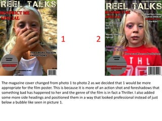
- 1. The magazine cover changed from photo 1 to photo 2 as we decided that 1 would be more appropriate for the film poster. This is because it is more of an action shot and foreshadows that something bad has happened to her and the genre of the film is in fact a Thriller. I also added some more side headings and positioned them in a way that looked professional instead of just below a bubble like seen in picture 1. 1 2
- 2. Feedback from our teacher was that it would look really good with the Magazines Title behind the main photo. With the software that we were using, ‘BeFunky’ this was a complicated task. What I had to do was cut out the full picture of Cerys, this took a while as I had to zoom in and back out to make sure that even the tiniest parts of her were still there. This then took out the background of trees around Cerys. I then put the new edit and the old photo together so that I could put the ‘REEL TALKS’ tile behind her head. But while the background looked really cool it was way too bright meaning not many colours would go onto the poster and stand out. So I edited the photo so that the background was blurry around her, putting the focus on the main character and played with the lighting. 3 4 5
- 3. You can already tell that this is a lot more detailed than the photos 1 and 2. I really thought on what should be the secondary headings. I went with Emma Watson as at this time she is the main actress that every body is talking about, due to ‘Beauty and the Beast’ she also stared in Harry Potter, these films got very dark and twisted as the years went on, meaning she would have experience in the sort of role. So I tied two secondary headings together for synergy, using different colours for the film names, the colours used for their actual titles. These versions of the magazine front covers also have extra stuff such as; barcode, price, website and an issue date. 6 7
- 4. I started over as I realised that the ‘Restrict me’ Special should be in the same font as in the film poster. This meant starting again with the blank poster and re adding everything. 8
- 5. This is the final poster. I really like it and it has clearly come a long way I a couple of weeks. For synergy I made the titles ‘Split’ and ‘Get Out’ also in yellow with a black outline so that the colours for the whole front cover really tied together. Over all, I think that this front cover is really good and links very well with out trailer and mine and Sophie's friends all said that this would entice them to pick it up and buy it.