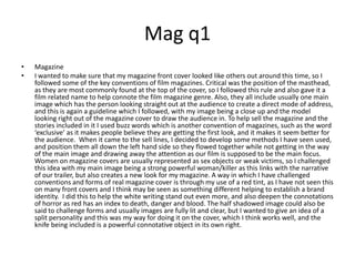
SlideShare a Scribd company logo
Evaluation ybonee
q1 In what ways does your media product use, develop or challenge forms and conventions of real media products? The trailer I created uses commonly found forms and conventions of other real products, not least the setting used. We had a school setting, a wood and a house as our 3 main places of action, and these are found in many films in the horror genre, such as Prom Night with its critical location of the school for the death of a student there. Also such films as Cabin Fever or Texas Chainsaw Massacre with their forest/wood setting also helps give a creepy and more frightening feel to a film, and this is why we included this setting, with the idea of a chase taking place. Linking from this idea of making the trailer creepy, we used low key lighting to create a dark mise-en-scene, which again we identified as a key convention when analysing horror film trailers, as the darkness in the scenes connoted something was going to happen, and also gives a sense of mystery as the audience don’t know what is round the corner. We didn’t want to give away too much about the killer, so made sure that in the majority of the shots with the killer included, her face was not scene, or was not very visible, and this came from ideas from other films where you don’t find out much about the killer until the end, with a twist in the plot and the killer being unexpected. But also in such films, like Scream, the killer wears a mask to hide their face, we thought this would be a good idea but we had no masks that would work with the storyline so decided on the keeping the killer’s face excluded from the frame, and this also added to the enigma code and mystery about who it is.  I found from watching other film trailers that a title screen of the production company was included at the beginning of the trailer, and this is where I again followed a convention of trailers, but where my trailer differs is I have used a montage of shots as the beginning of the trailer, then had the production company after this, so I did keep the inclusion of the production company but just had it as the forth shot. None of the trailers I watched started with a montage and I think this is a way my trailer developed its own visual impact, as I wanted to have a quick overview of some creepy shots that would draw in the audience’s attention but also connote a horror style to the trailer from the very beginning.
Cont... The non-diegetic sounds we included are another addition which helped us to stay close to the conventions of horror film trailers. One particular example is the eerie violin sound we used, as this is a staple of horror trailers as it does sound chilling and creates a fright mode of address.  We employed a lot of handheld camera work in our trailer as this is another effective camerawork technique I found used throughout professional horror trailers. In our trailer as the girl is running through the woods handheld camera work is used, and also again when the killer is following their victim down the corridor. This was to make the audience feel more involved in the action, but also as they are seeing it from the killer’s point of view.   When it comes to the narrative of our trailer, it follows the traditional Todorovian structure of peaceful at the start, then an abrupt disruption followed by a death. And with the main characters being teenagers, this is another idea following forms of real products such as ‘The Hole 3D’ as this focused around 3 teenagers in their home. Where our trailer challenges conventions and stereotypes is our having a female killer. This is not seen in the majority of horror films as males are represented as being strong and tough so they are seen as the killers, but we wanted a female to mix it up a little and subvert audience gender expectations. The colour red is important in horror films as it conventionally connotes death and blood, and this is something that we referenced but developed as we had the killer wearing red gloves. In many films the killer abides by an all black vestural code which we also used with the black coat the killer was wearing.  Finally the last shots of our trailer were information about the release date and finally the name of the film. This came to us as we watched other trailers and we saw this was the common way of ending them. We decided that worked well and chose to follow this convention.
Mag q1 Magazine I wanted to make sure that my magazine front cover looked like others out around this time, so I followed some of the key conventions of film magazines. Critical was the position of the masthead, as they are most commonly found at the top of the cover, so I followed this rule and also gave it a film related name to help connote the film magazine genre. Also, they all include usually one main image which has the person looking straight out at the audience to create a direct mode of address, and this is again a guideline which I followed, with my image being a close up and the model looking right out of the magazine cover to draw the audience in. To help sell the magazine and the stories included in it I used buzz words which is another convention of magazines, such as the word ‘exclusive’ as it makes people believe they are getting the first look, and it makes it seem better for the audience.  When it came to the sell lines, I decided to develop some methods I have seen used, and position them all down the left hand side so they flowed together while not getting in the way of the main image and drawing away the attention as our film is supposed to be the main focus.  Women on magazine covers are usually represented as sex objects or weak victims, so I challenged this idea with my main image being a strong powerful woman/killer as this links with the narrative of our trailer, but also creates a new look for my magazine. A way in which I have challenged conventions and forms of real magazine cover is through my use of a red tint, as I have not seen this on many front covers and I think may be seen as something different helping to establish a brand identity.  I did this to help the white writing stand out even more, and also deepen the connotations of horror as red has an index to death, danger and blood. The half shadowed image could also be said to challenge forms and usually images are fully lit and clear, but I wanted to give an idea of a split personality and this was my way for doing it on the cover, which I think works well, and the knife being included is a powerful connotative object in its own right.
poster Poster The one large main image I have used for the poster is another way in which I follow the forms of real film posters as this is done throughout them all, but then saying this, the image I have chosen also challenges what you would expect to find on a poster, as they are usually a shot of the main character looking all interesting and intriguing, where as ours is the main character looking at her own reflection to show the killer. It is more challenging to understand but gives away some information about the storyline which is good for the potential audience to know, as this could encourage them to watch the film. All films seem to have a slogan, and this is why we decided to follow that convention and create our very own slogan: ‘It only takes a split second’. This gives another indication as to what may happen in the film, with the word split being key in signifying the ‘split’ personality of the main character. We positioned this under the title as from looking at many other posters this is how they are laid out. We developed our poster as we included a key visual motif throughout each of our products, which is the red glove, and this is visible on the poster and draws in some attention as it is a bright colour but gives off connotations of death. We have made sure that a clear genre has been signified with the horror theme shown and the dark mise-en-scene and knife included. The way I see that we have challenged other forms of posters was first, we were going to have ours in a landscape layout, which is not the most common way to present a poster as people are used to it in portrait with information leading from the top down. We then changed this but kept the mirror and reflection idea, which is not what you would expect from a poster, as they are usually more ‘straight forward’ but we wanted a more detailed idea of what our film is about to be suggested.

More Related Content

What's hot

In what ways does your media product use, develop or challenge forms and conv...
In what ways does your media product use, develop or challenge forms and conv...In what ways does your media product use, develop or challenge forms and conv...
In what ways does your media product use, develop or challenge forms and conv...shannoncotton
 
Evaluation – Question Two
Evaluation – Question TwoEvaluation – Question Two
Evaluation – Question Two
Marie Besley
 
Question 2
Question 2Question 2
Question 2dapaz93
 
Maisy wilgoss script
Maisy wilgoss scriptMaisy wilgoss script
Maisy wilgoss script
mw12676
 
Film poster analysis
Film poster analysisFilm poster analysis
Film poster analysischloemedia
 
1. In what ways does your media product use, develop or challenge forms and c...
1. In what ways does your media product use, develop or challenge forms and c...1. In what ways does your media product use, develop or challenge forms and c...
1. In what ways does your media product use, develop or challenge forms and c...bobsled
 
Short Horror Film Poster Analysis
Short Horror Film Poster AnalysisShort Horror Film Poster Analysis
Short Horror Film Poster Analysis
lilypotterxo
 
The Hostage Evaluation
The Hostage EvaluationThe Hostage Evaluation
The Hostage Evaluationstephgray
 
Little Beings Magazine Review (draft 1)
Little Beings Magazine Review (draft 1) Little Beings Magazine Review (draft 1)
Little Beings Magazine Review (draft 1)
lilypotterxo
 
Evaluation - Question One
Evaluation - Question OneEvaluation - Question One
Evaluation - Question One
gmgproductions
 
Movie Poster Analysis
Movie Poster Analysis Movie Poster Analysis
Movie Poster Analysis
Ryan Bogle
 
Horror Movie Poster Analysis
Horror Movie Poster AnalysisHorror Movie Poster Analysis
Horror Movie Poster Analysis
Rachel Emmett
 
Media starter
Media starterMedia starter
Media starter
sarahlouise12
 
B322 GCSE Media Exam Revision Session
B322 GCSE Media Exam Revision SessionB322 GCSE Media Exam Revision Session
B322 GCSE Media Exam Revision Session
rhughes82
 
Foundation production portfolio - Evaluation
Foundation production portfolio - EvaluationFoundation production portfolio - Evaluation
Foundation production portfolio - EvaluationMayesV1
 
Movie poster analysis
Movie poster analysis Movie poster analysis
Movie poster analysis jillsheridan
 
Narrative theories
Narrative theories Narrative theories
Narrative theories
Jack Cooper
 
Evaluation Question 1
Evaluation Question 1 Evaluation Question 1
Evaluation Question 1
caitttt
 

What's hot (20)

In what ways does your media product use, develop or challenge forms and conv...
In what ways does your media product use, develop or challenge forms and conv...In what ways does your media product use, develop or challenge forms and conv...
In what ways does your media product use, develop or challenge forms and conv...
 
Evaluation – Question Two
Evaluation – Question TwoEvaluation – Question Two
Evaluation – Question Two
 
Question 2
Question 2Question 2
Question 2
 
Maisy wilgoss script
Maisy wilgoss scriptMaisy wilgoss script
Maisy wilgoss script
 
Evaluation 1
Evaluation 1Evaluation 1
Evaluation 1
 
Film poster analysis
Film poster analysisFilm poster analysis
Film poster analysis
 
1. In what ways does your media product use, develop or challenge forms and c...
1. In what ways does your media product use, develop or challenge forms and c...1. In what ways does your media product use, develop or challenge forms and c...
1. In what ways does your media product use, develop or challenge forms and c...
 
Short Horror Film Poster Analysis
Short Horror Film Poster AnalysisShort Horror Film Poster Analysis
Short Horror Film Poster Analysis
 
The Hostage Evaluation
The Hostage EvaluationThe Hostage Evaluation
The Hostage Evaluation
 
Evaluation question 2
Evaluation question 2Evaluation question 2
Evaluation question 2
 
Little Beings Magazine Review (draft 1)
Little Beings Magazine Review (draft 1) Little Beings Magazine Review (draft 1)
Little Beings Magazine Review (draft 1)
 
Evaluation - Question One
Evaluation - Question OneEvaluation - Question One
Evaluation - Question One
 
Movie Poster Analysis
Movie Poster Analysis Movie Poster Analysis
Movie Poster Analysis
 
Horror Movie Poster Analysis
Horror Movie Poster AnalysisHorror Movie Poster Analysis
Horror Movie Poster Analysis
 
Media starter
Media starterMedia starter
Media starter
 
B322 GCSE Media Exam Revision Session
B322 GCSE Media Exam Revision SessionB322 GCSE Media Exam Revision Session
B322 GCSE Media Exam Revision Session
 
Foundation production portfolio - Evaluation
Foundation production portfolio - EvaluationFoundation production portfolio - Evaluation
Foundation production portfolio - Evaluation
 
Movie poster analysis
Movie poster analysis Movie poster analysis
Movie poster analysis
 
Narrative theories
Narrative theories Narrative theories
Narrative theories
 
Evaluation Question 1
Evaluation Question 1 Evaluation Question 1
Evaluation Question 1
 

Viewers also liked

Faster than light_presentation
Faster than light_presentationFaster than light_presentation
Faster than light_presentationMarc Phillip
 
Memberi kaki pada Mimpi
Memberi kaki pada MimpiMemberi kaki pada Mimpi
Memberi kaki pada MimpiAinun Chomsun
 
花棚花架-- 李老師的花絮【旭榕景觀有限公司】
花棚花架-- 李老師的花絮【旭榕景觀有限公司】花棚花架-- 李老師的花絮【旭榕景觀有限公司】
花棚花架-- 李老師的花絮【旭榕景觀有限公司】
創意 禮品
 
Popo, 2011 nr 6, december 2011
Popo, 2011 nr 6, december 2011Popo, 2011 nr 6, december 2011
Popo, 2011 nr 6, december 2011Yolanda Carati
 
Mta public sl meeting
Mta public sl meetingMta public sl meeting
Mta public sl meeting
David Foster
 
I3master
I3masterI3master
I3master
Gio Wiederhold
 
Cs207 9
Cs207 9Cs207 9
Cs207 9
Cs207 9Cs207 9
111 the purpose of creation
111 the purpose of creation111 the purpose of creation
111 the purpose of creation
Timothy Henning
 
Connactor Kennislunch thema mobility
Connactor Kennislunch thema mobilityConnactor Kennislunch thema mobility
Connactor Kennislunch thema mobility
Frankwin Mussche
 
Cs207 2
Cs207 2Cs207 2
Cs207 4
Cs207 4Cs207 4
Software economics+ssitc13 tutorial
Software economics+ssitc13 tutorialSoftware economics+ssitc13 tutorial
Software economics+ssitc13 tutorial
Gio Wiederhold
 
Cs207 8
Cs207 8Cs207 8
Taqtkd
TaqtkdTaqtkd
Contractul colectiv de_munca_2011-2014
Contractul colectiv de_munca_2011-2014Contractul colectiv de_munca_2011-2014
Contractul colectiv de_munca_2011-2014
contafinanciara
 

Viewers also liked (18)

Faster than light_presentation
Faster than light_presentationFaster than light_presentation
Faster than light_presentation
 
Memberi kaki pada Mimpi
Memberi kaki pada MimpiMemberi kaki pada Mimpi
Memberi kaki pada Mimpi
 
花棚花架-- 李老師的花絮【旭榕景觀有限公司】
花棚花架-- 李老師的花絮【旭榕景觀有限公司】花棚花架-- 李老師的花絮【旭榕景觀有限公司】
花棚花架-- 李老師的花絮【旭榕景觀有限公司】
 
Cs207 1
Cs207 1Cs207 1
Cs207 1
 
Popo, 2011 nr 6, december 2011
Popo, 2011 nr 6, december 2011Popo, 2011 nr 6, december 2011
Popo, 2011 nr 6, december 2011
 
Mta public sl meeting
Mta public sl meetingMta public sl meeting
Mta public sl meeting
 
I3master
I3masterI3master
I3master
 
Cs207 9
Cs207 9Cs207 9
Cs207 9
 
Cs207 9
Cs207 9Cs207 9
Cs207 9
 
111 the purpose of creation
111 the purpose of creation111 the purpose of creation
111 the purpose of creation
 
Connactor Kennislunch thema mobility
Connactor Kennislunch thema mobilityConnactor Kennislunch thema mobility
Connactor Kennislunch thema mobility
 
Cs207 2
Cs207 2Cs207 2
Cs207 2
 
Cs207 4
Cs207 4Cs207 4
Cs207 4
 
Poam
PoamPoam
Poam
 
Software economics+ssitc13 tutorial
Software economics+ssitc13 tutorialSoftware economics+ssitc13 tutorial
Software economics+ssitc13 tutorial
 
Cs207 8
Cs207 8Cs207 8
Cs207 8
 
Taqtkd
TaqtkdTaqtkd
Taqtkd
 
Contractul colectiv de_munca_2011-2014
Contractul colectiv de_munca_2011-2014Contractul colectiv de_munca_2011-2014
Contractul colectiv de_munca_2011-2014
 

Similar to Test

Evaluation question 2
Evaluation question 2Evaluation question 2
Evaluation question 2chrissarson
 
Evaluation question 1: In what way does your media product use, develop or ch...
Evaluation question 1: In what way does your media product use, develop or ch...Evaluation question 1: In what way does your media product use, develop or ch...
Evaluation question 1: In what way does your media product use, develop or ch...
Zainab1311
 
Evaluation question 1
Evaluation question 1Evaluation question 1
Evaluation question 1
Zainab1311
 
Ellie part22
Ellie part22Ellie part22
Ellie part22
ellieevanss
 
Hush Hush Evaluation.
Hush Hush Evaluation.Hush Hush Evaluation.
Hush Hush Evaluation.
danielleisbritish
 
1a 1b 45-50 AS school-music mag A2 horror trailer
1a 1b 45-50 AS school-music mag A2 horror trailer1a 1b 45-50 AS school-music mag A2 horror trailer
1a 1b 45-50 AS school-music mag A2 horror trailer
DB3igs
 
June 2010 exemplar 1 (highlighted)
June 2010 exemplar 1 (highlighted)June 2010 exemplar 1 (highlighted)
June 2010 exemplar 1 (highlighted)lpgsmedia
 
June 2010 example level 4
June 2010 example level 4June 2010 example level 4
June 2010 example level 4hammonda
 
Evaluation 1 presentation 2014
Evaluation 1 presentation 2014Evaluation 1 presentation 2014
Evaluation 1 presentation 2014annaquinn_
 
Evaluation 1
Evaluation 1 Evaluation 1
Evaluation 1
euddin1
 
Question 1: How effective is the combination of your main product and ancilla...
Question 1: How effective is the combination of your main product and ancilla...Question 1: How effective is the combination of your main product and ancilla...
Question 1: How effective is the combination of your main product and ancilla...
dannimccart
 
In what ways does your media products use, develop or challenge forms and con...
In what ways does your media products use, develop or challenge forms and con...In what ways does your media products use, develop or challenge forms and con...
In what ways does your media products use, develop or challenge forms and con...
ellad96
 
First question
First question First question
First question
ellad96
 
Final Ideas
Final IdeasFinal Ideas
Final Ideas
MeganReanne
 
Evaluation question 1
Evaluation question 1Evaluation question 1
Evaluation question 1
shaniquebonifacio
 
In what way does your media product use, develop or challenge forms and conve...
In what way does your media product use, develop or challenge forms and conve...In what way does your media product use, develop or challenge forms and conve...
In what way does your media product use, develop or challenge forms and conve...
michaelcooke
 

Similar to Test (20)

Evaluation question 2
Evaluation question 2Evaluation question 2
Evaluation question 2
 
Evaluation question 1: In what way does your media product use, develop or ch...
Evaluation question 1: In what way does your media product use, develop or ch...Evaluation question 1: In what way does your media product use, develop or ch...
Evaluation question 1: In what way does your media product use, develop or ch...
 
Evaluation question 1
Evaluation question 1Evaluation question 1
Evaluation question 1
 
Ellie part2
Ellie part2Ellie part2
Ellie part2
 
Ellie part22
Ellie part22Ellie part22
Ellie part22
 
Hush Hush Evaluation.
Hush Hush Evaluation.Hush Hush Evaluation.
Hush Hush Evaluation.
 
1a 1b 45-50 AS school-music mag A2 horror trailer
1a 1b 45-50 AS school-music mag A2 horror trailer1a 1b 45-50 AS school-music mag A2 horror trailer
1a 1b 45-50 AS school-music mag A2 horror trailer
 
June 2010 exemplar 1 (highlighted)
June 2010 exemplar 1 (highlighted)June 2010 exemplar 1 (highlighted)
June 2010 exemplar 1 (highlighted)
 
June 2010 example level 4
June 2010 example level 4June 2010 example level 4
June 2010 example level 4
 
Trailer1 q1a q1b
Trailer1 q1a q1bTrailer1 q1a q1b
Trailer1 q1a q1b
 
Evaluation 1 presentation 2014
Evaluation 1 presentation 2014Evaluation 1 presentation 2014
Evaluation 1 presentation 2014
 
Evaluation 1
Evaluation 1 Evaluation 1
Evaluation 1
 
Question 1: How effective is the combination of your main product and ancilla...
Question 1: How effective is the combination of your main product and ancilla...Question 1: How effective is the combination of your main product and ancilla...
Question 1: How effective is the combination of your main product and ancilla...
 
In what ways does your media products use, develop or challenge forms and con...
In what ways does your media products use, develop or challenge forms and con...In what ways does your media products use, develop or challenge forms and con...
In what ways does your media products use, develop or challenge forms and con...
 
First question
First question First question
First question
 
Final Ideas
Final IdeasFinal Ideas
Final Ideas
 
A2 Media Evaluation - Word Version
A2 Media Evaluation - Word VersionA2 Media Evaluation - Word Version
A2 Media Evaluation - Word Version
 
Evaluation question 1
Evaluation question 1Evaluation question 1
Evaluation question 1
 
Evaluation question 1
Evaluation question 1Evaluation question 1
Evaluation question 1
 
In what way does your media product use, develop or challenge forms and conve...
In what way does your media product use, develop or challenge forms and conve...In what way does your media product use, develop or challenge forms and conve...
In what way does your media product use, develop or challenge forms and conve...
 

Test

  • 2. q1 In what ways does your media product use, develop or challenge forms and conventions of real media products? The trailer I created uses commonly found forms and conventions of other real products, not least the setting used. We had a school setting, a wood and a house as our 3 main places of action, and these are found in many films in the horror genre, such as Prom Night with its critical location of the school for the death of a student there. Also such films as Cabin Fever or Texas Chainsaw Massacre with their forest/wood setting also helps give a creepy and more frightening feel to a film, and this is why we included this setting, with the idea of a chase taking place. Linking from this idea of making the trailer creepy, we used low key lighting to create a dark mise-en-scene, which again we identified as a key convention when analysing horror film trailers, as the darkness in the scenes connoted something was going to happen, and also gives a sense of mystery as the audience don’t know what is round the corner. We didn’t want to give away too much about the killer, so made sure that in the majority of the shots with the killer included, her face was not scene, or was not very visible, and this came from ideas from other films where you don’t find out much about the killer until the end, with a twist in the plot and the killer being unexpected. But also in such films, like Scream, the killer wears a mask to hide their face, we thought this would be a good idea but we had no masks that would work with the storyline so decided on the keeping the killer’s face excluded from the frame, and this also added to the enigma code and mystery about who it is. I found from watching other film trailers that a title screen of the production company was included at the beginning of the trailer, and this is where I again followed a convention of trailers, but where my trailer differs is I have used a montage of shots as the beginning of the trailer, then had the production company after this, so I did keep the inclusion of the production company but just had it as the forth shot. None of the trailers I watched started with a montage and I think this is a way my trailer developed its own visual impact, as I wanted to have a quick overview of some creepy shots that would draw in the audience’s attention but also connote a horror style to the trailer from the very beginning.
  • 3. Cont... The non-diegetic sounds we included are another addition which helped us to stay close to the conventions of horror film trailers. One particular example is the eerie violin sound we used, as this is a staple of horror trailers as it does sound chilling and creates a fright mode of address. We employed a lot of handheld camera work in our trailer as this is another effective camerawork technique I found used throughout professional horror trailers. In our trailer as the girl is running through the woods handheld camera work is used, and also again when the killer is following their victim down the corridor. This was to make the audience feel more involved in the action, but also as they are seeing it from the killer’s point of view. When it comes to the narrative of our trailer, it follows the traditional Todorovian structure of peaceful at the start, then an abrupt disruption followed by a death. And with the main characters being teenagers, this is another idea following forms of real products such as ‘The Hole 3D’ as this focused around 3 teenagers in their home. Where our trailer challenges conventions and stereotypes is our having a female killer. This is not seen in the majority of horror films as males are represented as being strong and tough so they are seen as the killers, but we wanted a female to mix it up a little and subvert audience gender expectations. The colour red is important in horror films as it conventionally connotes death and blood, and this is something that we referenced but developed as we had the killer wearing red gloves. In many films the killer abides by an all black vestural code which we also used with the black coat the killer was wearing. Finally the last shots of our trailer were information about the release date and finally the name of the film. This came to us as we watched other trailers and we saw this was the common way of ending them. We decided that worked well and chose to follow this convention.
  • 4. Mag q1 Magazine I wanted to make sure that my magazine front cover looked like others out around this time, so I followed some of the key conventions of film magazines. Critical was the position of the masthead, as they are most commonly found at the top of the cover, so I followed this rule and also gave it a film related name to help connote the film magazine genre. Also, they all include usually one main image which has the person looking straight out at the audience to create a direct mode of address, and this is again a guideline which I followed, with my image being a close up and the model looking right out of the magazine cover to draw the audience in. To help sell the magazine and the stories included in it I used buzz words which is another convention of magazines, such as the word ‘exclusive’ as it makes people believe they are getting the first look, and it makes it seem better for the audience. When it came to the sell lines, I decided to develop some methods I have seen used, and position them all down the left hand side so they flowed together while not getting in the way of the main image and drawing away the attention as our film is supposed to be the main focus. Women on magazine covers are usually represented as sex objects or weak victims, so I challenged this idea with my main image being a strong powerful woman/killer as this links with the narrative of our trailer, but also creates a new look for my magazine. A way in which I have challenged conventions and forms of real magazine cover is through my use of a red tint, as I have not seen this on many front covers and I think may be seen as something different helping to establish a brand identity. I did this to help the white writing stand out even more, and also deepen the connotations of horror as red has an index to death, danger and blood. The half shadowed image could also be said to challenge forms and usually images are fully lit and clear, but I wanted to give an idea of a split personality and this was my way for doing it on the cover, which I think works well, and the knife being included is a powerful connotative object in its own right.
  • 5. poster Poster The one large main image I have used for the poster is another way in which I follow the forms of real film posters as this is done throughout them all, but then saying this, the image I have chosen also challenges what you would expect to find on a poster, as they are usually a shot of the main character looking all interesting and intriguing, where as ours is the main character looking at her own reflection to show the killer. It is more challenging to understand but gives away some information about the storyline which is good for the potential audience to know, as this could encourage them to watch the film. All films seem to have a slogan, and this is why we decided to follow that convention and create our very own slogan: ‘It only takes a split second’. This gives another indication as to what may happen in the film, with the word split being key in signifying the ‘split’ personality of the main character. We positioned this under the title as from looking at many other posters this is how they are laid out. We developed our poster as we included a key visual motif throughout each of our products, which is the red glove, and this is visible on the poster and draws in some attention as it is a bright colour but gives off connotations of death. We have made sure that a clear genre has been signified with the horror theme shown and the dark mise-en-scene and knife included. The way I see that we have challenged other forms of posters was first, we were going to have ours in a landscape layout, which is not the most common way to present a poster as people are used to it in portrait with information leading from the top down. We then changed this but kept the mirror and reflection idea, which is not what you would expect from a poster, as they are usually more ‘straight forward’ but we wanted a more detailed idea of what our film is about to be suggested.