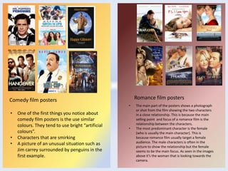
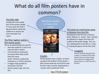
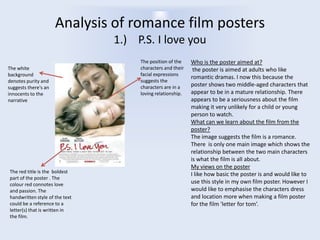
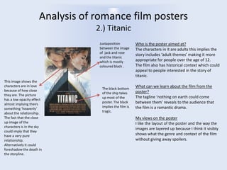
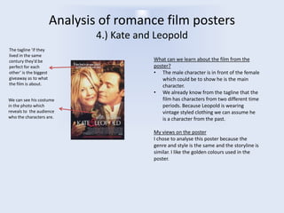
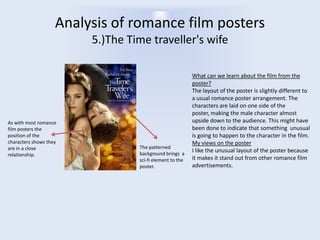
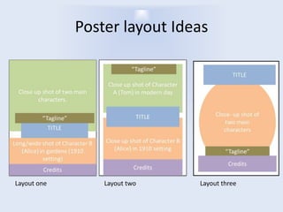
Film Posters
Libby Jones
Romance film posters

Comedy film posters
•

•

•
•

One of the first things you notice about
comedy film posters is the use similar
colours. They tend to use bright “artificial
colours”.
Characters that are smirking
A picture of an unusual situation such as
Jim carrey surrounded by penguins in the
first example.

•

The main part of the posters shows a photograph
or shot from the film showing the two characters
in a close relationship. This is because the main
selling point and focus of a romance film is the
relationship between the characters.
The most predominant character is the female
(who is usually the main character). This is
because romance film usually target a female
audience. The male characters is often in the
picture to show the relationship but the female
seems to be the main focus. As seen in the images
above it’s the woman that is looking towards the
camera.
Action/Adventure film posters

Horror and thriller film posters
•

•

•

Horrifying /disturbing or abnormal
images
Strong use of the colours black and red

•

Common colours used to illustrate action films is
gold and ‘earthy’ colours such as blue, brown and
green.
Most adventure films posters are filled with
complex images this is done to show the filmed is
‘packed with action’
Crime film posters

Sci- Fi film posters
•

•

The most obvious similarity between scifi film posters is the use of the colour
blue. The colour blue can often be used
in posters to show there is a sci-fi
element to the film.
The sci-fi posters include images which
either show a strange character you
wouldn’t expect to see in everyday life or
a futuristic looking object.

•

Guns are one of the main iconography elements
used in crime films . Crime film posters usually
have an action shot of the main character(s)
partaking in some form of criminal act.
Documentary film posters

Musical film posters
•

•

The posters are generally bright and
colourful and have a false/staged or
unrealistic look about them. They give
the impression of a theatre performance.

The film posters for documentary films don’t
really follow a pattern. The poster displays what
the documentary is about and there is a vide
variety of documentaries on different subjects.

•

Documentary film posters use real photographs as
appose to staged scenes or actors to show the
realism of the film.
What do all film posters have in
common?
The film title
usually the most visible
part of the poster design.
In most cases the title is
big and bold to allow the
audience to clearly see
and remember the
name.

Elements needed
to make a film
poster
The name of a well known actor
or director from the film
Sometimes if the film has a famous
actor, director or author their name(s)
are placed in a larger font than the
credits in the poster design. This can
be a selling point to the film or a way
of making the genre of the film clear.

The films ‘tagline’ and/or a
film review quote.
This is an advertising tool used to:
• Give the audience a clue as to
what the film is about.
• Link the film to previously
successful films that could
have the same
actors, director, production
company or a similar storyline.
• A slogan helps people to
remember the film.
• Good reviews help ‘sell’ the
film.

Image(s)
Credits
All the posters have ‘credits’ on them
usually at the bottom of the poster. I
don’t know what the actual font used
for this is but a similar looking font is
‘univers ultra condensed’ font.

Used to illustrate what the film
is about. In romance films their
tends to be one central image
this could be an image from a
photo-shoot or a still shot from
the film.
Analysis of romance film posters
1.) P.S. I love you
The white
background
denotes purity and
suggests there's an
innocents to the
narrative

The red title is the boldest
part of the poster . The
colour red connotes love
and passion. The
handwritten style of the text
could be a reference to a
letter(s) that is written in
the film.

The position of the
characters and their
facial expressions
suggests the
characters are in a
loving relationship.

Who is the poster aimed at?
the poster is aimed at adults who like
romantic dramas. I now this because the
poster shows two middle-aged characters that
appear to be in a mature relationship. There
appears to be a seriousness about the film
making it very unlikely for a child or young
person to watch.
What can we learn about the film from the
poster?
The image suggests the film is a romance.
There is only one main image which shows the
relationship between the two main characters
is what the film is all about.
My views on the poster
I like how basic the poster is and would like to
use this style in my own film poster. However I
would like to emphasise the characters dress
and location more when making a film poster
for the film 'letter for tom’.
Analysis of romance film posters
2.) Titanic
Juxtaposition
between the image
of jack and rose
and the titanic
which is mostly
coloured black .

This image shows the
characters are in love
because of how close
they are. The picture
has a low opacity effect
almost implying theirs
something ‘heavenly’
about the relationship.
The fact that the close
up image of the
characters is in the sky
could imply that they
have a very pure
relationship.
Alternatively it could
foreshadow the death in
the storyline.

The black bottom
of the ship takes
up most of the
poster. The black
implies the film is
tragic.

Who is the poster aimed at?
The characters in it are adults this implies the
story includes ‘adult themes’ making it more
appropriate for people over the age of 12.
The film also has historical context which could
appeal to people interested in the story of
titanic.
What can we learn about the film from the
poster?
The tagline ‘nothing on earth could come
between them’ reveals to the audience that
the film is a romantic drama.
My views on the poster
I like the layout of the poster and the way the
images are layered up because I think it visibly
shows what the genre and context of the film
without giving away spoilers.
Analysis of romance film posters
3.) Dear John
Because they are
well known the
actors are listed at
the top of the poster.

This image shows the
male character
embracing the female
character. Because of
this we assume it is a
romance film. Its typical
of for a romance film to
feature two main
characters.

What can we learn about the film from the
poster?
We can assume from the main actors in the
film that the film is going to be a romance. This
is because actors such as Channing Tatum tend
to act in similar films. He is well known for
playing the male love interest in many popular
romantic dramas.
Also there appears to be a faded image of a
beach in the background which links to the
idea of a romantic getaway.
My views on the poster
I think the actors are the main selling point of
the film because there is very little else in the
poster that explains the film.
It looks as though the title and credits have
been layout in the format of a letter .
Analysis of romance film posters
4.) Kate and Leopold
The tagline ‘if they
lived in the same
century they'd be
perfect for each
other’ is the biggest
giveaway as to what
the film is about.
We can see his costume
in the photo which
reveals to the audience
who the characters are.

What can we learn about the film from the
poster?
• The male character is in front of the female
which could be to show he is the main
character.
• We already know from the tagline that the
film has characters from two different time
periods. Because Leopold is wearing
vintage styled clothing we can assume he
is a character from the past.
My views on the poster
I chose to analyse this poster because the
genre and style is the same and the storyline is
similar. I like the golden colours used in the
poster.
Analysis of romance film posters
5.)The Time traveller's wife

As with most romance
film posters the
position of the
characters shows they
are in a close
relationship.

The patterned
background brings a
sci-fi element to the
poster.

What can we learn about the film from the
poster?
The layout of the poster is slightly different to
a usual romance poster arrangement. The
characters are laid on one side of the
poster, making the male character almost
upside down to the audience. This might have
been done to indicate that something unusual
is going to happen to the character in the film.
My views on the poster
I like the unusual layout of the poster because
it makes it stand out from other romance film
advertisements.
Poster layout Ideas

Layout one

Layout two

Layout three

Film posters research

  • 1.
  • 2.
    Romance film posters Comedyfilm posters • • • • One of the first things you notice about comedy film posters is the use similar colours. They tend to use bright “artificial colours”. Characters that are smirking A picture of an unusual situation such as Jim carrey surrounded by penguins in the first example. • The main part of the posters shows a photograph or shot from the film showing the two characters in a close relationship. This is because the main selling point and focus of a romance film is the relationship between the characters. The most predominant character is the female (who is usually the main character). This is because romance film usually target a female audience. The male characters is often in the picture to show the relationship but the female seems to be the main focus. As seen in the images above it’s the woman that is looking towards the camera.
  • 3.
    Action/Adventure film posters Horrorand thriller film posters • • • Horrifying /disturbing or abnormal images Strong use of the colours black and red • Common colours used to illustrate action films is gold and ‘earthy’ colours such as blue, brown and green. Most adventure films posters are filled with complex images this is done to show the filmed is ‘packed with action’
  • 4.
    Crime film posters Sci-Fi film posters • • The most obvious similarity between scifi film posters is the use of the colour blue. The colour blue can often be used in posters to show there is a sci-fi element to the film. The sci-fi posters include images which either show a strange character you wouldn’t expect to see in everyday life or a futuristic looking object. • Guns are one of the main iconography elements used in crime films . Crime film posters usually have an action shot of the main character(s) partaking in some form of criminal act.
  • 5.
    Documentary film posters Musicalfilm posters • • The posters are generally bright and colourful and have a false/staged or unrealistic look about them. They give the impression of a theatre performance. The film posters for documentary films don’t really follow a pattern. The poster displays what the documentary is about and there is a vide variety of documentaries on different subjects. • Documentary film posters use real photographs as appose to staged scenes or actors to show the realism of the film.
  • 6.
    What do allfilm posters have in common? The film title usually the most visible part of the poster design. In most cases the title is big and bold to allow the audience to clearly see and remember the name. Elements needed to make a film poster The name of a well known actor or director from the film Sometimes if the film has a famous actor, director or author their name(s) are placed in a larger font than the credits in the poster design. This can be a selling point to the film or a way of making the genre of the film clear. The films ‘tagline’ and/or a film review quote. This is an advertising tool used to: • Give the audience a clue as to what the film is about. • Link the film to previously successful films that could have the same actors, director, production company or a similar storyline. • A slogan helps people to remember the film. • Good reviews help ‘sell’ the film. Image(s) Credits All the posters have ‘credits’ on them usually at the bottom of the poster. I don’t know what the actual font used for this is but a similar looking font is ‘univers ultra condensed’ font. Used to illustrate what the film is about. In romance films their tends to be one central image this could be an image from a photo-shoot or a still shot from the film.
  • 7.
    Analysis of romancefilm posters 1.) P.S. I love you The white background denotes purity and suggests there's an innocents to the narrative The red title is the boldest part of the poster . The colour red connotes love and passion. The handwritten style of the text could be a reference to a letter(s) that is written in the film. The position of the characters and their facial expressions suggests the characters are in a loving relationship. Who is the poster aimed at? the poster is aimed at adults who like romantic dramas. I now this because the poster shows two middle-aged characters that appear to be in a mature relationship. There appears to be a seriousness about the film making it very unlikely for a child or young person to watch. What can we learn about the film from the poster? The image suggests the film is a romance. There is only one main image which shows the relationship between the two main characters is what the film is all about. My views on the poster I like how basic the poster is and would like to use this style in my own film poster. However I would like to emphasise the characters dress and location more when making a film poster for the film 'letter for tom’.
  • 8.
    Analysis of romancefilm posters 2.) Titanic Juxtaposition between the image of jack and rose and the titanic which is mostly coloured black . This image shows the characters are in love because of how close they are. The picture has a low opacity effect almost implying theirs something ‘heavenly’ about the relationship. The fact that the close up image of the characters is in the sky could imply that they have a very pure relationship. Alternatively it could foreshadow the death in the storyline. The black bottom of the ship takes up most of the poster. The black implies the film is tragic. Who is the poster aimed at? The characters in it are adults this implies the story includes ‘adult themes’ making it more appropriate for people over the age of 12. The film also has historical context which could appeal to people interested in the story of titanic. What can we learn about the film from the poster? The tagline ‘nothing on earth could come between them’ reveals to the audience that the film is a romantic drama. My views on the poster I like the layout of the poster and the way the images are layered up because I think it visibly shows what the genre and context of the film without giving away spoilers.
  • 9.
    Analysis of romancefilm posters 3.) Dear John Because they are well known the actors are listed at the top of the poster. This image shows the male character embracing the female character. Because of this we assume it is a romance film. Its typical of for a romance film to feature two main characters. What can we learn about the film from the poster? We can assume from the main actors in the film that the film is going to be a romance. This is because actors such as Channing Tatum tend to act in similar films. He is well known for playing the male love interest in many popular romantic dramas. Also there appears to be a faded image of a beach in the background which links to the idea of a romantic getaway. My views on the poster I think the actors are the main selling point of the film because there is very little else in the poster that explains the film. It looks as though the title and credits have been layout in the format of a letter .
  • 10.
    Analysis of romancefilm posters 4.) Kate and Leopold The tagline ‘if they lived in the same century they'd be perfect for each other’ is the biggest giveaway as to what the film is about. We can see his costume in the photo which reveals to the audience who the characters are. What can we learn about the film from the poster? • The male character is in front of the female which could be to show he is the main character. • We already know from the tagline that the film has characters from two different time periods. Because Leopold is wearing vintage styled clothing we can assume he is a character from the past. My views on the poster I chose to analyse this poster because the genre and style is the same and the storyline is similar. I like the golden colours used in the poster.
  • 11.
    Analysis of romancefilm posters 5.)The Time traveller's wife As with most romance film posters the position of the characters shows they are in a close relationship. The patterned background brings a sci-fi element to the poster. What can we learn about the film from the poster? The layout of the poster is slightly different to a usual romance poster arrangement. The characters are laid on one side of the poster, making the male character almost upside down to the audience. This might have been done to indicate that something unusual is going to happen to the character in the film. My views on the poster I like the unusual layout of the poster because it makes it stand out from other romance film advertisements.
  • 12.
    Poster layout Ideas Layoutone Layout two Layout three