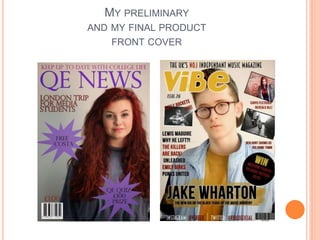
PANDITA RAMABAI- Indian political thought GENDER.pptx
Evaluation 7 - .
1. EVALUATION 7
Looking back at your preliminary task (the school
magazine task), what do you feel you have learnt in the
progression from it to your final production?
4. PHOTOGRAPHY (SHOT TYPES)
It is clear in my preliminary work my
knowledge about shot types, directing and rule
of thirds was not as good as it was in my final
product shown to the right below my
preliminary. In my preliminary, my model
blends in due to the fact the costume is the
same colour as the background, consequently
not standing out against it. In addition, the
model was placed on the right of my
magazine, which is the less dominant side of
the page, representing her as almost quite
weak which is not what I wanted. Also the
models facial expression is smiling and the
photo has no meaning to any story in the
magazine. I learned from my preliminary and
as my knowledge widened I was able to make
a much more professional shot, and using the
live gig shot gives a sense of atmosphere to
my magazine and the long angle of the
camera looking up on the artist, allowing the
audience to look up to them almost a
inspiration.
5. RESEARCH AND PLANNING
Through research and planning, it enabled me to create a much more
professional looking magazine compared to my preliminary task. It gave
me the ability to understand the typical conventions of an indie genre
music magazine in which I was creating and widened my knowledge to
many aspects that I took on board through the construction process of
my media product. One example of this is my understanding of spacial
awareness was broadened and I learnt that dead space was to be
prevented enabling me to fill it with more productive information creating
a more professional looking magazine. The research that I had done
prior to the production process enabled me to create my magazine
swiftly but to a professional extent as my construction process was all
based on this and I had planned on how I wanted it to look and due to
the fact I had researched about colour, layout, shot and font types etc. I
was able to just transfer all my knowledge on to my own magazine which
was a more productive and professional process compared to my
preliminary in which I had not carried out any research and had not
planned it at all therefore unsure on what to do and what I was creating.
6. SKYLINE AND FOOTERS
Looking back at my preliminary, it is obvious
I was uncertain of the common conventions
linking to skylines and footer used in
magazines. I developed my knowledge
throughout the construction process and this
enabled me to use skyline and footers that
resembled those of a professional magazine.
The bold, edgy font of the skyline and footer
linked in with the genre of my magazine
(indie) and created consistency on the page.
Again, the use of colours allowed me to
highlight information that would interest the
audience and allow it to standout on the
page. This differs from the preliminary task,
in which I only used a skyline, not a footer. It
doesn’t stand out from the page and isn’t
very interesting for the audience.
7. MASTHEADS
The use of mastheads on a magazine is a key aspect when
creating a magazine, as it is the one thing designed to stand
out from the page attracting the audience and is made to be
normally short allowing it to be memorable for the reader. I
did not really know much about mastheads when creating
my preliminary, and this is clear as it is not bold, it doesn’t
stand out and the font and colour are to blame for this as the
purple is quite dull and doesn’t really stand out on the grey
background and the font is too thin however in my final
product my masthead used is much what I explained before
for it to be bold, eye-catching and to stand off the page. The
use of the stroke on the masthead allows it to stand out from
the magazine therefore, not clashing with anything else on
the page allowing the audience to see this first. In addition
on my final magazine, the masthead is much shorter oppose
to my prelim which is much more effective when wanting to
catch the attention of the audience. In contrast my
preliminary task the masthead is shown to be highly
unprofessional on the page due to the fact it doesn’t stand
out, but more blends in as the colour are all dull, however I
have learnt from this as you can to in my final product due to
the I learnt that I was to use a more bold colour and font in
order to create a profession al looking magazine and to
appeal to my audience therefore influencing my decisions
when designing it.
8. COLOUR SCHEME
As you can see in the preliminary, it
really only has a one colour palette
throughout, which can be seen as
boring and dull where as in my final
product you can see I have widened
the colour palette, including the
common convention known as the 3
colour palette (red, white, black) that
associates with the indie genre and I
also used the yellow to co-ordinate
with the models outfit and to give a
sense of something fresh and
something new therefore attracting
the audience much more than the
preliminary ever would have. My
final product looks more like a
professional magazine because of
this.
9. USE OF TITLES AND HEADINGS
You can clearly see the dramatic change in headings and
titles from the preliminary task to my final product. Titles
and heading are presented at a higher level through the
use of different graphic effects, fonts etc. Consequently
leaving my final product resembling a professional music
magazine. I developed skills through the skills
development challenge learning more about graphic
effects which help the main headings stand out on the
page attracting the audience, and giving them an insight
to what is inside. The use of the paint behind the main
title on my final product co-ordinates with the models
costume consequently leaving a sense of consistency on
the page and enables the title to stand out and the stroke
effect on the font creates contrast between the black and
white again allowing it to stand out. The alternate colour
scheme of the heading down the left hand-side of the
page allows me to highlight different stories individually,
leaving it clear for the audience to read whereas on my
preliminary, you can see the colour doesn’t stand out
against the background, it is boring to look at and
wouldn’t appeal to an audience because of this.
10. PUFFS
The use of a puff on my final product is done in a
much more effective way, in which was to avoid
the front cover being left with dead space. In
addition, due to the fact it is black with the red
and yellow and red text inside, it stands out from
the lighter background therefore, appealing to the
audience. Furthermore, it is advertising a
competition which will also attract the audience
and is much more appealing that the puff used on
my preliminary as it is a more appealing shape
and place in a better place than it is on the
preliminary. On the preliminary puff, it looks very
unprofessional, and this comes from aspects
such as the shape (which almost looks childlike),
the text not standing out from the background
because of the font and colour, content of text
and the fact the purple puff almost blends in with
the grey background creating a dull page which
does not appeal to the audience at all.
11. USE OF IMAGES
In my preliminary magazine, the use of images are very
unprofessional. One reason for this is that I have used the
same model for all the image which is very unappealing and in
addition, the images have no real link to any of the stories
mentioned on the pages which makes it confusing. Also, the
images are too large on the contents page and they
overpower the content of text which I wanted to avoid
therefore, working on this the of images has much more
variation in models, size and I have placed them in a way
which isn’t too overpowering and in a way that they give
personality to them and the magazine as a whole. On my final
product and on the contents pages, the layout of images splits
the page into clear sections which resembles a professional
magazine which is similar to my preliminary however isn’t too
over because of the higher content on the page.
12. JOURNALISM SKILLS
The journalism skills from my preliminary to my
final product has clearly improved with it having
much more content and using vocabulary along
side visual effects to stand out and appeal to the
audience. My final product resembles a
professional magazine because of this and does
not have any dead space on it which differs from
the preliminary task, which I something that I
focused on in the construction process of my
magazine to make sure I used my journalism skill
in a much more effective way to prevent it looking
unprofessional.
13. COMPOSITION AND MANIPULATION OF IMAGES
As my knowledge widened about the software I used to
manipulate images, it enabled me to create a much more
professional looking image from those that were used in the
preliminary magazine that I created. Using the DSLR cameras it
enabled me to create a high resolution image and setting the
camera into manual focus, created a clear image of a high quality
that resembled those used in a professional magazine. In
addition, light boxes that were used on my front cover image,
allowed me to created a much lighter photo that focused its main
light on the main model, then upon loading these onto editing
software (Photoshop), I enhanced the brightness changing levels
of the image to create a more professional looking imaged to be
used on the front cover. This differs from my preliminary which I
learnt greatly from because I didn’t really have any meaning
behind the images and this show in them as they are dull, boring
and don’t appeal to the audience in the slightest making them
unprofessional and because I was unaware of how to use the
editing software, the images were not of a high quality which I
wanted to avoid when creating my final product.
14. LOCATION OF IMAGES
As you can see there is a much better
variation image locations in my final
product than there was in my preliminary
task. In my preliminary, all the images
were took in the studio which makes the
pages look quite boring and doesn’t
appeal to the audience. However, I learnt
from this task and in my final product, you
can see more variety in locations adding
personality to the images and adds to the
atmosphere of the indie genre that I
wanted to create throughout the
magazine. I wanted to reflect the indie
genre in the images that I took and used
in my magazine, there this lead me to
take images in front of brick walls, graffiti
and down back alleys.