
Recommended
More Related Content
What's hot
What's hot (20)
Viewers also liked
Similar to Evaluation
Similar to Evaluation (20)
More from olibrandon
Evaluation
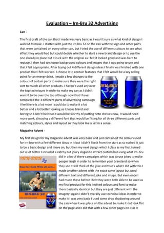
- 1. Evaluation – Irn-Bru 32 Advertising Can The first draft of the can that I made was very basic as I wasn’t sure as what kind of design I wanted to make. I started with just the irn bru 32 on the can with the logo and other parts that were contained on every other can, but I tried the use of different colours to see what affect they would had but could decide whether to start a new brand design or to use the one already in place but I stuck with the original as I felt it looked good and was hard to replace. I then had to choose background colours and images that I was going to use and that I felt appropriate. After trying out 4 different design ideas I finally was finished with one product that I felt worked. I choose it to contain features that I felt would be a key selling point for an energy drink. I made a few changes to the colours of certain parts to make sure they were the right sort to match all other products. I haven’t used any over the top techniques in order to make my can as I didn’t want it to be over the top although now that I have completed the 3 different parts of advertising campaign I feel there is a lot more I could do to make it a lot better and a lot better looking as it looks bland and boring so I don’t feel that it would be worthy of putting onto shelves now, it would need more work, choosing a different font that would be fitting for all three different parts and matching colours, styles and layout so they look like a set in a sense. Magazine Advert My first design for my magazine advert was very basic and just contained the colours used for irn-bru with a few different ideas in it but I didn’t like it from the start as so rushed it just to be a basic design and move on, but then my next design which I class as my first turned out a lot better I included a catchy but jokey slogan to attract custom but using what irn-bru did in a lot of there campaigns which was to use jokes to make people laugh in order to remember your brandand so when they see it will think of the joke and that’s what I did with this I made another advert with the exact same layout but used different text and different joke and image. But even once I had made these before I felt they were both able to be used as my final product for this I edited colours and font to make them basically identical but they are just different with the imagery. Again I didn’t overally use technical ideas in order to make it I was very basic I used some drop shadowing around the can when it was place on the advert to make it not look flat on the page and I did that with a few other pages on it as it
- 2. would be anywhere near as interesting if was all flat to the page, because of this people may say its not ready to be put up on view to attract customers which I was agree with in some ways as it’s a basic idea and with new fonts and colours would look a lot more modernised and might make it even more attractive but with the key information I feel it could work as an advert. Web Banner I only made one banner although it started as a really horrendous state as I wasn’t sure at all what to make so I started with a basic design but I decided it wasn’t that good and because I felt it easier If started by designing it hand and so made a few different ideas and scanned them in and remade my final design by adding features in from different parts of each design I had made from drawing. I tried to stick to the same layout and using the same colours fonts and the same text in order to keep it fitting with the design and would look like a total refresh and rebrand. As I didn’t have all that much time in order to make this I didn’t make it as well as I hoped it could be although I didn’t feel overly confident with the web banner anyway. If I was to make it again I would plan it a lot better finding more fitting imagery that would fit in a lot better than what is in now and also would sharpen up other parts looking at replacing text so it looks a lot more fitting maybe even looking at doing that with all three different parts of brand so that it looks. Nothing that I did whilst making this was overly technical and didn’t have a high professional looking standard when I had finished it although I did use different blending to make it come across as one as so wouldn’t look bland and flat with a ton of layer pilled on top, If I was to redo this topic again the web banner would definitely need to be my main placer that needs working on as I felt it was the worst part about all three types of advertisement that I did and so more time would be needed in order to gain a better mark from making it look a lot more professional.