Call girls in Kanpur - 9761072362 with room service
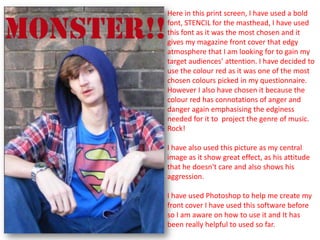
Print screen front cover
1. Here in this print screen, I have used a bold
font, STENCIL for the masthead, I have used
this font as it was the most chosen and it
gives my magazine front cover that edgy
atmosphere that I am looking for to gain my
target audiences’ attention. I have decided to
use the colour red as it was one of the most
chosen colours picked in my questionnaire.
However I also have chosen it because the
colour red has connotations of anger and
danger again emphasising the edginess
needed for it to project the genre of music.
Rock!
I have also used this picture as my central
image as it show great effect, as his attitude
that he doesn't care and also shows his
aggression.
I have used Photoshop to help me create my
front cover I have used this software before
so I am aware on how to use it and It has
been really helpful to used so far.
2. As you can see here I have wrote my
positioning statement in yellow which is one
of the colours chosen most in my
questionnaire. It says “RAWR TO THE MUSIC”
because It show aggression and it is very
linked to rock.
I have added a dark blue graphics straight
along the top of the cover which I have
written “MASSIVE REVIEWS” and then I have
put some famous artists and bands this is
used in may rock magazines link kerrang and
NME! So I thought It would be a good idea to
use in my own work to show that I have a
good understanding of rock magazine
layouts.
3. Again I have used the same short of graphic
design at the bottom of the magazine which
contains information about the artists and
thing that are going on inside the magazine.
I have used “PLUS” in bold letters, and the
colour yellow to make it stand out, to the
target audience so that they can see what is
up for grabs inside the magazine. Also it will
emphasise that there is something special
about this magazine, which would hopefully
(if it where to be a really magazine) make it
sell more.
I am finding Photoshop really helpful when it
come to wanting things such as graphics in
my work I am able to adjust the to what ever
shape I want and I have many other great
Ideas which Photoshop will help me with.
4. I have written the main coverline in bold
letters and in red to emphasise that this is
the main story in side the magazine. I have
given it a drop shadow to create more
effect, also to help it stand out more from
the picture and other cover lines that I am
going to write.
I feel here that all the colour is beginning to
come together, as the image uses the same
colours that where chosen to be my colour
scheme (Red, yellow, blue, white, black)
5. This image here has all of the coverline on
which are all in capital to make it stand out
more each one includes something to do
with great artists or great music which is
what I want the target audience to see.
I feel I have done well here but there is
certainly room for improvement, as some of
these coverlines are hard to read, even
focus on because there are some other
things which are far to bold and stand out
to much over most of the coverlines.
6. I handed in my work so that I could get some constructive
feedback. I knew I needed to make some changes. when I
got my work back I started to realise that my work wasn’t
nowhere near as good enough as it should be to get the
mark I am hoping to get. So I began to do more research
on magazine covers to help me find a way of making my
work more professional and much more attractive to the
eye as it seem a little dull and boring.
7. I have change the dark blue graphics to both
being black so that my work shows a more
dark and aggressive tone, by doing this I have
noticed the white, yellow and red writing
stand out much more now.
Knowing that blue was a colour that was
chosen to be in my colour scheme I will
change some of the coverlines so that I can
still use the same colour scheme.
8. I have made a change to the central image,
which I know has made a big difference and I
am much happier with this picture as I feel it
suits its purpose more than my last image.
Also I feel now I am needing to work far much
harder as I only have a very little amount of
time left to have this complete, but I know
how to use Photoshop well so I will be able to
do what it is I need to do as long as I plan
ahead.
9. Here I have change the colours of my
coverlines and made some of them bolder
and I have changed the sizes to create more
effect. I have also added more coverlines to
fill my magazine with more exciting things
E.g. “THE ALL AMERICAN REJECT TELL US
THEIR DIRTY LITTLE SECRET!” I have done this
because it makes the cover look more
energetic and fun. Also if you look you can
see I have put a drop shadow on the
positioning statement to make it stand out
more.
I have also added a black Graphic down the
side in a rectangular shape to place some of
the coverlines. I have made it a little see-
threw by lowering the opacity, so that you
can still see the picture. But so that my
coverlines can also be seen more clearly.
I feel now that my front cover is starting to
look more professional and realistic.
10. To finish off I have created some more
graphic designs so that my coverlines can
bee seen more clearly and Photoshop has
allowed me to adjust them into the shapes I
feel will make it look more edgy and rough
as in this print screen you can see I have
slanted one of the white graphic in which
says “30 SECONDS TO MARS” in big bold
capitals to help it stand out.
And towards the bottom I have created
another graphic in red which includes some
of the pictures used in my DPS to allow the
target audience to feel more attracted to the
magazine.