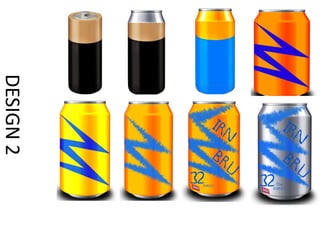
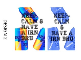
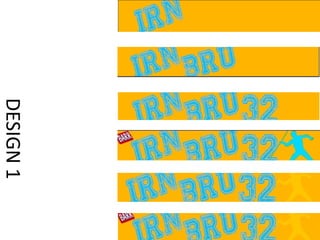
For his first design, the author created an Irn Bru can design with overlapping text in different colors to make the text stand out. He added a blue stripe and silhouette to make the packaging look more professional. For his second design, he tried a battery-shaped can but it did not work with the brand colors. He then created a simple design with orange background and blue details, struggling with color shades. His third design combined elements he liked, using simple shapes. He added a watermarked silhouette to tie the design together professionally. For posters, his first stained glass design had technical issues. His second used scattered cans and the phrase "Keep Calm and have a Bru." For web banners, his first used brand colors and