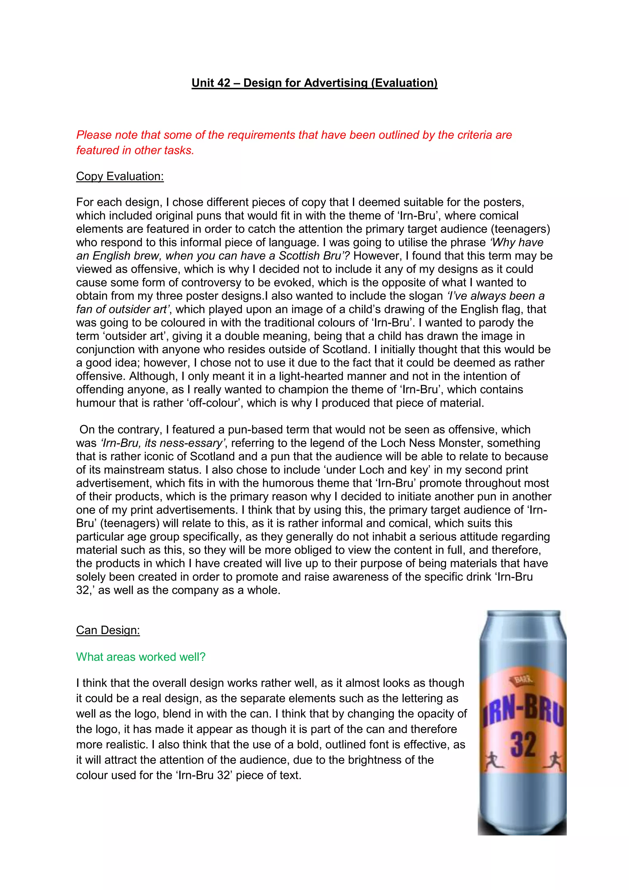
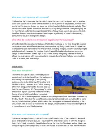
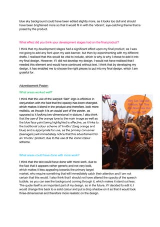
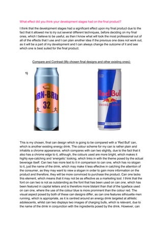
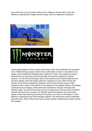
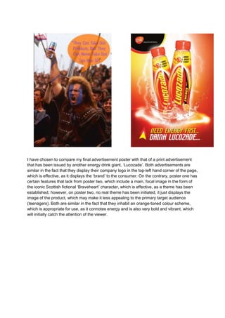
SlideShare a Scribd company logo
Unit 42 – Design for Advertising (Evaluation)

Please note that some of the requirements that have been outlined by the criteria are
featured in other tasks.
Copy Evaluation:
For each design, I chose different pieces of copy that I deemed suitable for the posters,
which included original puns that would fit in with the theme of ‘Irn-Bru’, where comical
elements are featured in order to catch the attention the primary target audience (teenagers)
who respond to this informal piece of language. I was going to utilise the phrase ‘Why have
an English brew, when you can have a Scottish Bru’? However, I found that this term may be
viewed as offensive, which is why I decided not to include it any of my designs as it could
cause some form of controversy to be evoked, which is the opposite of what I wanted to
obtain from my three poster designs.I also wanted to include the slogan ‘I’ve always been a
fan of outsider art’, which played upon an image of a child’s drawing of the English flag, that
was going to be coloured in with the traditional colours of ‘Irn-Bru’. I wanted to parody the
term ‘outsider art’, giving it a double meaning, being that a child has drawn the image in
conjunction with anyone who resides outside of Scotland. I initially thought that this would be
a good idea; however, I chose not to use it due to the fact that it could be deemed as rather
offensive. Although, I only meant it in a light-hearted manner and not in the intention of
offending anyone, as I really wanted to champion the theme of ‘Irn-Bru’, which contains
humour that is rather ‘off-colour’, which is why I produced that piece of material.
On the contrary, I featured a pun-based term that would not be seen as offensive, which
was ‘Irn-Bru, its ness-essary’, referring to the legend of the Loch Ness Monster, something
that is rather iconic of Scotland and a pun that the audience will be able to relate to because
of its mainstream status. I also chose to include ‘under Loch and key’ in my second print
advertisement, which fits in with the humorous theme that ‘Irn-Bru’ promote throughout most
of their products, which is the primary reason why I decided to initiate another pun in another
one of my print advertisements. I think that by using this, the primary target audience of ‘IrnBru’ (teenagers) will relate to this, as it is rather informal and comical, which suits this
particular age group specifically, as they generally do not inhabit a serious attitude regarding
material such as this, so they will be more obliged to view the content in full, and therefore,
the products in which I have created will live up to their purpose of being materials that have
solely been created in order to promote and raise awareness of the specific drink ‘Irn-Bru
32,’ as well as the company as a whole.

Can Design:
What areas worked well?
I think that the overall design works rather well, as it almost looks as though
it could be a real design, as the separate elements such as the lettering as
well as the logo, blend in with the can. I think that by changing the opacity of
the logo, it has made it appear as though it is part of the can and therefore
more realistic. I also think that the use of a bold, outlined font is effective, as
it will attract the attention of the audience, due to the brightness of the
colour used for the ‘Irn-Bru 32’ piece of text.
What areas could have done with more work?
I believe that the colour used for the main body of the can could be altered, as it is a rather
bland blue colour and in order for the attention of the audience to be grabbed, I would have
to change this tone, as it does not stand out enough and spoils the design as a whole. Also,
the two silhouette figures that I have featured upon my design could be changed slightly, as
my main target audience (teenagers) respond to a heavy visual aspect, as opposed to text,
therefore, I would have to emphasise these images significantly in order for the primary
consumer to focus on this specific design.
What effect did you think your development stages had on the final product?
When I initiated the development stages (that led inevitably up to my final design) it enabled
me to experiment with different possible outcomes that my design could have. It helped me
to choose the right elements for my final product, including imagery, which I was not going to
include originally, however, by creating drafts, I was able to place the images on my can
design to see whether it looked right or not. I think that by instigating a series of drafts, it
allows you to progress with your product and evaluate the changes that you have made in
order to achieve your final design.

Web Banner:
What areas worked well?
I think that the use of a bold, outlined typeface
worked well, as it stands out from the background
and initially catches the eye of the primary
audience, due to the blatancy of the colour and
the font in which I sourced from Dafont, making it
differ from a regular font style. I would also say
that the use of the pun ‘It’s Ness-essary’ is rather
effective as it plays upon the traditional ‘Irn-Bru’
theme of being light-hearted and humorous,
therefore, it fits in with the previous pieces of marketing material that have been produced by
‘Irn-Bru’ itself. I think that the use of the clone stamp tool worked well, as I utilised it to blend
the can in with the orange lake, which makes the can appear as though it is floating in the
lake, which adds a sense of realism into the design, which is rather ironic considering that it
is centred around a mythical creature.

What areas could have done with more work?
I think that the logo, in which I placed in the top-left hand corner of the product looks out of
place and is rather large in size, so I would edit this and make it blend in with the design so
that it did not look unrealistic. I would also change the opacity of the logo, so that it looks as
though it is part of the design and so that it will not be as blatant as it is now. I think that the
blue sky background could have been edited slightly more, as it looks too dull and should
have been brightened more so that it would fit in with the ‘vibrant’, eye-catching theme that is
posed by the product.

What effect did you think your development stages had on the final product?
I think that my development stages had a significant effect upon my final product, as I was
not going to add any font upon my web banner, but then by experimenting with my different
drafts, I realised that this would be vital to include, which is why is why I chose to add it into
my final design. However, if I did not develop my design, I would not have realised that I
needed this element and would have continued without text. I think that by developing my
design, it has enabled me to choose the right pieces to put into my final design, which I am
grateful for.

Advertisement Poster:
What areas worked well?
I think that the use of the warped ‘Barr’ logo is effective in
conjunction with the fact that the opacity has been changed,
which makes it blend in the product and therefore, look more
realistic, as though it is an acutal part of the poster, as
opposed to it looking two-dimensional in stature. I also think
that the use of the orange tone to the main image as well as
the blue face paint being highlighted is effective, as it links to
the traditional colour scheme of ‘Irn-Bru’ (beig orange and
blue) and is appropriate for use, as the primary conusmer
(teenagers) will immediately notice that this advertisment for
an ‘Irn-Bru’ product, due to the use of the iconic colour
scheme.

What areas could have done with more work?
I think that the text could have done with more work, due to
the fact that it appears rather generic and not very bold,
which makes it less appealing towards the primary target
market, who require something that will immediately catch their attention and I am not
certain that this would. I also think that I should not have altered the opacity of the speech
bubble, as you can see the background coming through it, which makes it stand out less.
The quote itself is an important part of my design, so in the future, if I decided to edit it, I
would change this back to a solid colour and put a drop shadow on it so that it would look
three-dimensional and therefore more realistic on the design.
What effect did you think your development stages had on the final product?
I think that the development stages had a significant effect upon my final product due to the
fact that it allowed me to try out several different techniques, before deciding on my final
ones, which I believe to be useful, as then I know what will look the most professional out of
all of the effects that I use and I can plan another idea if the previous one does not work out,
as it will be a part of my development and I can always change the outcome of it and see
which one is best suited for the final product.

Compare and Contrast (My chosen final designs and other existing ones):

1)

2)

This is my chosen, final can design which is going to be compared with a ‘Red Bull’ can,
which is another existing energy drink. The colour scheme for my can is rather plain and
inhabits a chrome appearance, which compares with can two slightly, due to the fact that it
also has a chrome edge to it, although, the colours used are more bright, which makes it
highly eye-catching and ‘energetic’ looking, which links in with the theme posed by the actual
beverage itself. Can two has more text to it in comparison to can one, which has no slogan
to it, just the name of the drink, which may make it less effective in catching the attention of
the consumer, as they may want to view a slogan in order to gain more information on the
product and therefore, they will be more convinced to purchase the product. Can one lacks
this element, which means that it may not be as effective as a marketing tool. I think that the
font on can two is not as outstanding as the font that has been used on can one, which has
been featured in capital letters and is therefore more blatant than that of the typeface used
on can one, where the use of the colour blue is more prominent than the colour red. The
visual aspect posed by both of these can designs differ, as can one features silhouette men
running, which is appropriate, as it is centred around an energy drink targeted at athletic
adolescents, whilst can two displays two images of charging bulls, which is relevant, due to
the name of the drink in conjunction with the ingredients posed by the drink. However, can
one contains the use of a human, whilst can two utilises an animal, which is the main
difference, although both images connote energy, which is a significant comparison.

1)

2)

These images display my final, chosen web banner, which I have selected to be compared
with a ‘Monster Energy’ product. Banner two is rather plain in colour in comparison to my
design, which inhabits the traditional colour scheme of ‘Irn-Bru’, but is bright and vibrant,
whilst banner two does also use the house style that has been outlined by ‘monster’,
however, I do not think that the green piece of text stands out and that the brightness of it
should be altered, which will enable audience to respond to it more. Both of these web
banners are aimed at an adolescent audience, which means that they require a high
image:text ratio in order for the attention of the audience to be grabbed. Banner one displays
several amounts of imagery, whilst banner two only features one type of imagery (the
‘Monster’ logo). This shows that banner one has a large amount of visual means included in
contrast with banner two, however, the ‘Monster’ logo that is featured upon the second
design is rather eye-catching and because the product as a whole is minimalistic, it is still
effective in catching the eye of the teenager audience, who will become weary of extended
amounts of text, which is why banner two is a good example of balancing out written content
with imagery.
1)

2)

I have chosen to compare my final advertisement poster with that of a print advertisement
that has been issued by another energy drink giant, ‘Lucozade’. Both advertisements are
similar in the fact that they display their company logo in the top-left hand corner of the page,
which is effective, as it displays the ‘brand’ to the consumer. On the contrary, poster one has
certain features that lack from poster two, which include a main, focal image in the form of
the iconic Scottish fictional ‘Braveheart’ character, which is effective, as a theme has been
established, however, on poster two, no real theme has been initiated, it just displays the
image of the product, which may make it less appealing to the primary target audience
(teenagers). Both are similar in the fact that they inhabit an orange-toned colour scheme,
which is appropriate for use, as it connotes energy and is also very bold and vibrant, which
will initially catch the attention of the viewer.

More Related Content

What's hot

Factual writing analysing
Factual writing analysingFactual writing analysing
Factual writing analysing
Jordan Bohill
 
Digital graphics evaluation pro forma
Digital graphics evaluation pro formaDigital graphics evaluation pro forma
Digital graphics evaluation pro forma
Imogen Hick
 
Critical creative reflection
Critical creative reflectionCritical creative reflection
Critical creative reflection
baninadeem
 
Task7- Production Development (webbanner)
Task7- Production Development (webbanner)Task7- Production Development (webbanner)
Task7- Production Development (webbanner)chamahan
 
Can and Magazine evaluations
Can and Magazine evaluationsCan and Magazine evaluations
Can and Magazine evaluationsHannah Sewell
 
Digital graphics evaluation pro forma
Digital graphics evaluation pro formaDigital graphics evaluation pro forma
Digital graphics evaluation pro forma
twilliams1992
 
Pre production FMP y2
Pre production FMP y2Pre production FMP y2
Pre production FMP y2
aliceleeman
 
Graphic Design
Graphic DesignGraphic Design
Graphic DesignEllen M
 
Planning and production
Planning and productionPlanning and production
Planning and production
Charlotte Oliver
 
Development pro forma
Development pro formaDevelopment pro forma
Development pro forma
Ruby Hooper
 
Graphic design
Graphic designGraphic design
Graphic designEllen M
 
Digital graphics evaluation pro forma
Digital graphics evaluation pro formaDigital graphics evaluation pro forma
Digital graphics evaluation pro forma
Aaron Aacster
 
GRPAHICISSS
GRPAHICISSSGRPAHICISSS
GRPAHICISSSEllen M
 
7. evaluation [comp]
7. evaluation [comp]7. evaluation [comp]
7. evaluation [comp]
Allison Hewitt
 

What's hot (20)

Factual writing analysing
Factual writing analysingFactual writing analysing
Factual writing analysing
 
Digital graphics evaluation pro forma
Digital graphics evaluation pro formaDigital graphics evaluation pro forma
Digital graphics evaluation pro forma
 
Mini Evaluations
Mini EvaluationsMini Evaluations
Mini Evaluations
 
Critical creative reflection
Critical creative reflectionCritical creative reflection
Critical creative reflection
 
Task7- Production Development (webbanner)
Task7- Production Development (webbanner)Task7- Production Development (webbanner)
Task7- Production Development (webbanner)
 
Mini Evaluations
Mini EvaluationsMini Evaluations
Mini Evaluations
 
Can and Magazine evaluations
Can and Magazine evaluationsCan and Magazine evaluations
Can and Magazine evaluations
 
Eval
EvalEval
Eval
 
Digital graphics evaluation pro forma
Digital graphics evaluation pro formaDigital graphics evaluation pro forma
Digital graphics evaluation pro forma
 
Pre production FMP y2
Pre production FMP y2Pre production FMP y2
Pre production FMP y2
 
Graphic Design
Graphic DesignGraphic Design
Graphic Design
 
Evaluation
EvaluationEvaluation
Evaluation
 
Evaluation
EvaluationEvaluation
Evaluation
 
Planning and production
Planning and productionPlanning and production
Planning and production
 
Development pro forma
Development pro formaDevelopment pro forma
Development pro forma
 
Graphic design
Graphic designGraphic design
Graphic design
 
Digital graphics evaluation pro forma
Digital graphics evaluation pro formaDigital graphics evaluation pro forma
Digital graphics evaluation pro forma
 
Development pro forma(3)
Development pro forma(3)Development pro forma(3)
Development pro forma(3)
 
GRPAHICISSS
GRPAHICISSSGRPAHICISSS
GRPAHICISSS
 
7. evaluation [comp]
7. evaluation [comp]7. evaluation [comp]
7. evaluation [comp]
 

Viewers also liked

Advertisement Project
Advertisement ProjectAdvertisement Project
Advertisement Project
guesta41e47
 
Presentation2015
Presentation2015Presentation2015
Presentation2015
Farhad Badie
 
advertisement industry in india
advertisement industry in india advertisement industry in india
advertisement industry in india Shivam Kundra
 
Advertisement
AdvertisementAdvertisement
Indian advertising industry and creativity in advertisement
Indian advertising industry and creativity in advertisementIndian advertising industry and creativity in advertisement
Indian advertising industry and creativity in advertisement
Janhavi Patil
 
Advertisement in india
Advertisement in indiaAdvertisement in india
Advertisement in india
Shubhra Dewangan
 

Viewers also liked (6)

Advertisement Project
Advertisement ProjectAdvertisement Project
Advertisement Project
 
Presentation2015
Presentation2015Presentation2015
Presentation2015
 
advertisement industry in india
advertisement industry in india advertisement industry in india
advertisement industry in india
 
Advertisement
AdvertisementAdvertisement
Advertisement
 
Indian advertising industry and creativity in advertisement
Indian advertising industry and creativity in advertisementIndian advertising industry and creativity in advertisement
Indian advertising industry and creativity in advertisement
 
Advertisement in india
Advertisement in indiaAdvertisement in india
Advertisement in india
 

Similar to Unit 42 evaluation

Task7- Evaluation
Task7- EvaluationTask7- Evaluation
Task7- Evaluationchamahan
 
Devlopment
DevlopmentDevlopment
Devlopmenthndoja
 
Evaluation
Evaluation Evaluation
Evaluation
Scott Harrand
 
Final evaluation
Final evaluationFinal evaluation
Final evaluationrachel1305
 
Devlopment
DevlopmentDevlopment
Devlopmenthndoja
 
Client Evaluation
Client EvaluationClient Evaluation
Client Evaluation
Harry Taylor
 
Task 6, development of packaging
Task 6, development of packagingTask 6, development of packaging
Task 6, development of packagingsavannahryan11
 
Evaluation
EvaluationEvaluation
Evaluation
Courtney Day
 
Task7- Production Development (energydrinkpackaging)
Task7- Production Development (energydrinkpackaging)Task7- Production Development (energydrinkpackaging)
Task7- Production Development (energydrinkpackaging)chamahan
 
Production Development
Production DevelopmentProduction Development
Production Developmentchamahan
 
Evaluation h – skills development
Evaluation h – skills developmentEvaluation h – skills development
Evaluation h – skills development
Ryan Tarran
 
TASK 7- EVALUATIONS
TASK 7- EVALUATIONSTASK 7- EVALUATIONS
TASK 7- EVALUATIONSsanemesra1995
 
Evaluation
EvaluationEvaluation
Evaluation
Hannah Harkus
 
Evaluation
Evaluation Evaluation
Evaluation
VickyPatchett
 
Development of advert powerpoint
Development of advert powerpointDevelopment of advert powerpoint
Development of advert powerpointAbbeyAndJess
 

Similar to Unit 42 evaluation (20)

Fonts
FontsFonts
Fonts
 
Continuing of my evaluation
Continuing of my evaluationContinuing of my evaluation
Continuing of my evaluation
 
Task7- Evaluation
Task7- EvaluationTask7- Evaluation
Task7- Evaluation
 
Packaging Evaluation
Packaging EvaluationPackaging Evaluation
Packaging Evaluation
 
Devlopment
DevlopmentDevlopment
Devlopment
 
Evaluation
Evaluation Evaluation
Evaluation
 
Final evaluation
Final evaluationFinal evaluation
Final evaluation
 
Devlopment
DevlopmentDevlopment
Devlopment
 
Client Evaluation
Client EvaluationClient Evaluation
Client Evaluation
 
Task 6, development of packaging
Task 6, development of packagingTask 6, development of packaging
Task 6, development of packaging
 
Final evaluation
Final evaluationFinal evaluation
Final evaluation
 
Evaluation
EvaluationEvaluation
Evaluation
 
Task7- Production Development (energydrinkpackaging)
Task7- Production Development (energydrinkpackaging)Task7- Production Development (energydrinkpackaging)
Task7- Production Development (energydrinkpackaging)
 
Production Development
Production DevelopmentProduction Development
Production Development
 
Evaluation h – skills development
Evaluation h – skills developmentEvaluation h – skills development
Evaluation h – skills development
 
TASK 7- EVALUATIONS
TASK 7- EVALUATIONSTASK 7- EVALUATIONS
TASK 7- EVALUATIONS
 
TASK 7- EVALUATIONS
TASK 7- EVALUATIONSTASK 7- EVALUATIONS
TASK 7- EVALUATIONS
 
Evaluation
EvaluationEvaluation
Evaluation
 
Evaluation
Evaluation Evaluation
Evaluation
 
Development of advert powerpoint
Development of advert powerpointDevelopment of advert powerpoint
Development of advert powerpoint
 

More from veggieburgers4lyf (20)

Page layout and design evaluation!!
Page layout and design evaluation!!Page layout and design evaluation!!
Page layout and design evaluation!!
 
Task 9 – flat plans, fonts development
Task 9 – flat plans, fonts developmentTask 9 – flat plans, fonts development
Task 9 – flat plans, fonts development
 
Task 8 – flat plans, fonts and development
Task 8 – flat plans, fonts and developmentTask 8 – flat plans, fonts and development
Task 8 – flat plans, fonts and development
 
Task 7 – flat plans & fonts
Task 7 – flat plans & fontsTask 7 – flat plans & fonts
Task 7 – flat plans & fonts
 
Task 6 evaluation
Task 6 evaluationTask 6 evaluation
Task 6 evaluation
 
Task 5 (evaluations)
Task 5 (evaluations)Task 5 (evaluations)
Task 5 (evaluations)
 
Task 4 evaluations
Task 4 evaluationsTask 4 evaluations
Task 4 evaluations
 
Task 3
Task 3Task 3
Task 3
 
Task 2
Task 2Task 2
Task 2
 
Task 1
Task 1Task 1
Task 1
 
Contact sheet
Contact sheetContact sheet
Contact sheet
 
On going evaluations
On going evaluationsOn going evaluations
On going evaluations
 
Planning sheet
Planning sheetPlanning sheet
Planning sheet
 
Task 4
Task 4Task 4
Task 4
 
Experiments evidence
Experiments evidenceExperiments evidence
Experiments evidence
 
Experimental photography case studies
Experimental photography   case studiesExperimental photography   case studies
Experimental photography case studies
 
Ideas and moodboards
Ideas and moodboardsIdeas and moodboards
Ideas and moodboards
 
Task 3
Task 3Task 3
Task 3
 
Opportunities
OpportunitiesOpportunities
Opportunities
 
Constraints
ConstraintsConstraints
Constraints
 

Recently uploaded

DevOps and Testing slides at DASA Connect
DevOps and Testing slides at DASA ConnectDevOps and Testing slides at DASA Connect
DevOps and Testing slides at DASA Connect
Kari Kakkonen
 
Dev Dives: Train smarter, not harder – active learning and UiPath LLMs for do...
Dev Dives: Train smarter, not harder – active learning and UiPath LLMs for do...Dev Dives: Train smarter, not harder – active learning and UiPath LLMs for do...
Dev Dives: Train smarter, not harder – active learning and UiPath LLMs for do...
UiPathCommunity
 
UiPath Test Automation using UiPath Test Suite series, part 4
UiPath Test Automation using UiPath Test Suite series, part 4UiPath Test Automation using UiPath Test Suite series, part 4
UiPath Test Automation using UiPath Test Suite series, part 4
DianaGray10
 
Securing your Kubernetes cluster_ a step-by-step guide to success !
Securing your Kubernetes cluster_ a step-by-step guide to success !Securing your Kubernetes cluster_ a step-by-step guide to success !
Securing your Kubernetes cluster_ a step-by-step guide to success !
KatiaHIMEUR1
 
Software Delivery At the Speed of AI: Inflectra Invests In AI-Powered Quality
Software Delivery At the Speed of AI: Inflectra Invests In AI-Powered QualitySoftware Delivery At the Speed of AI: Inflectra Invests In AI-Powered Quality
Software Delivery At the Speed of AI: Inflectra Invests In AI-Powered Quality
Inflectra
 
Key Trends Shaping the Future of Infrastructure.pdf
Key Trends Shaping the Future of Infrastructure.pdfKey Trends Shaping the Future of Infrastructure.pdf
Key Trends Shaping the Future of Infrastructure.pdf
Cheryl Hung
 
JMeter webinar - integration with InfluxDB and Grafana
JMeter webinar - integration with InfluxDB and GrafanaJMeter webinar - integration with InfluxDB and Grafana
JMeter webinar - integration with InfluxDB and Grafana
RTTS
 
Accelerate your Kubernetes clusters with Varnish Caching
Accelerate your Kubernetes clusters with Varnish CachingAccelerate your Kubernetes clusters with Varnish Caching
Accelerate your Kubernetes clusters with Varnish Caching
Thijs Feryn
 
When stars align: studies in data quality, knowledge graphs, and machine lear...
When stars align: studies in data quality, knowledge graphs, and machine lear...When stars align: studies in data quality, knowledge graphs, and machine lear...
When stars align: studies in data quality, knowledge graphs, and machine lear...
Elena Simperl
 
Kubernetes & AI - Beauty and the Beast !?! @KCD Istanbul 2024
Kubernetes & AI - Beauty and the Beast !?! @KCD Istanbul 2024Kubernetes & AI - Beauty and the Beast !?! @KCD Istanbul 2024
Kubernetes & AI - Beauty and the Beast !?! @KCD Istanbul 2024
Tobias Schneck
 
UiPath Test Automation using UiPath Test Suite series, part 3
UiPath Test Automation using UiPath Test Suite series, part 3UiPath Test Automation using UiPath Test Suite series, part 3
UiPath Test Automation using UiPath Test Suite series, part 3
DianaGray10
 
GraphRAG is All You need? LLM & Knowledge Graph
GraphRAG is All You need? LLM & Knowledge GraphGraphRAG is All You need? LLM & Knowledge Graph
GraphRAG is All You need? LLM & Knowledge Graph
Guy Korland
 
FIDO Alliance Osaka Seminar: The WebAuthn API and Discoverable Credentials.pdf
FIDO Alliance Osaka Seminar: The WebAuthn API and Discoverable Credentials.pdfFIDO Alliance Osaka Seminar: The WebAuthn API and Discoverable Credentials.pdf
FIDO Alliance Osaka Seminar: The WebAuthn API and Discoverable Credentials.pdf
FIDO Alliance
 
De-mystifying Zero to One: Design Informed Techniques for Greenfield Innovati...
De-mystifying Zero to One: Design Informed Techniques for Greenfield Innovati...De-mystifying Zero to One: Design Informed Techniques for Greenfield Innovati...
De-mystifying Zero to One: Design Informed Techniques for Greenfield Innovati...
Product School
 
State of ICS and IoT Cyber Threat Landscape Report 2024 preview
State of ICS and IoT Cyber Threat Landscape Report 2024 previewState of ICS and IoT Cyber Threat Landscape Report 2024 preview
State of ICS and IoT Cyber Threat Landscape Report 2024 preview
Prayukth K V
 
Epistemic Interaction - tuning interfaces to provide information for AI support
Epistemic Interaction - tuning interfaces to provide information for AI supportEpistemic Interaction - tuning interfaces to provide information for AI support
Epistemic Interaction - tuning interfaces to provide information for AI support
Alan Dix
 
Generating a custom Ruby SDK for your web service or Rails API using Smithy
Generating a custom Ruby SDK for your web service or Rails API using SmithyGenerating a custom Ruby SDK for your web service or Rails API using Smithy
Generating a custom Ruby SDK for your web service or Rails API using Smithy
g2nightmarescribd
 
Elevating Tactical DDD Patterns Through Object Calisthenics
Elevating Tactical DDD Patterns Through Object CalisthenicsElevating Tactical DDD Patterns Through Object Calisthenics
Elevating Tactical DDD Patterns Through Object Calisthenics
Dorra BARTAGUIZ
 
Monitoring Java Application Security with JDK Tools and JFR Events
Monitoring Java Application Security with JDK Tools and JFR EventsMonitoring Java Application Security with JDK Tools and JFR Events
Monitoring Java Application Security with JDK Tools and JFR Events
Ana-Maria Mihalceanu
 
Neuro-symbolic is not enough, we need neuro-*semantic*
Neuro-symbolic is not enough, we need neuro-*semantic*Neuro-symbolic is not enough, we need neuro-*semantic*
Neuro-symbolic is not enough, we need neuro-*semantic*
Frank van Harmelen
 

Recently uploaded (20)

DevOps and Testing slides at DASA Connect
DevOps and Testing slides at DASA ConnectDevOps and Testing slides at DASA Connect
DevOps and Testing slides at DASA Connect
 
Dev Dives: Train smarter, not harder – active learning and UiPath LLMs for do...
Dev Dives: Train smarter, not harder – active learning and UiPath LLMs for do...Dev Dives: Train smarter, not harder – active learning and UiPath LLMs for do...
Dev Dives: Train smarter, not harder – active learning and UiPath LLMs for do...
 
UiPath Test Automation using UiPath Test Suite series, part 4
UiPath Test Automation using UiPath Test Suite series, part 4UiPath Test Automation using UiPath Test Suite series, part 4
UiPath Test Automation using UiPath Test Suite series, part 4
 
Securing your Kubernetes cluster_ a step-by-step guide to success !
Securing your Kubernetes cluster_ a step-by-step guide to success !Securing your Kubernetes cluster_ a step-by-step guide to success !
Securing your Kubernetes cluster_ a step-by-step guide to success !
 
Software Delivery At the Speed of AI: Inflectra Invests In AI-Powered Quality
Software Delivery At the Speed of AI: Inflectra Invests In AI-Powered QualitySoftware Delivery At the Speed of AI: Inflectra Invests In AI-Powered Quality
Software Delivery At the Speed of AI: Inflectra Invests In AI-Powered Quality
 
Key Trends Shaping the Future of Infrastructure.pdf
Key Trends Shaping the Future of Infrastructure.pdfKey Trends Shaping the Future of Infrastructure.pdf
Key Trends Shaping the Future of Infrastructure.pdf
 
JMeter webinar - integration with InfluxDB and Grafana
JMeter webinar - integration with InfluxDB and GrafanaJMeter webinar - integration with InfluxDB and Grafana
JMeter webinar - integration with InfluxDB and Grafana
 
Accelerate your Kubernetes clusters with Varnish Caching
Accelerate your Kubernetes clusters with Varnish CachingAccelerate your Kubernetes clusters with Varnish Caching
Accelerate your Kubernetes clusters with Varnish Caching
 
When stars align: studies in data quality, knowledge graphs, and machine lear...
When stars align: studies in data quality, knowledge graphs, and machine lear...When stars align: studies in data quality, knowledge graphs, and machine lear...
When stars align: studies in data quality, knowledge graphs, and machine lear...
 
Kubernetes & AI - Beauty and the Beast !?! @KCD Istanbul 2024
Kubernetes & AI - Beauty and the Beast !?! @KCD Istanbul 2024Kubernetes & AI - Beauty and the Beast !?! @KCD Istanbul 2024
Kubernetes & AI - Beauty and the Beast !?! @KCD Istanbul 2024
 
UiPath Test Automation using UiPath Test Suite series, part 3
UiPath Test Automation using UiPath Test Suite series, part 3UiPath Test Automation using UiPath Test Suite series, part 3
UiPath Test Automation using UiPath Test Suite series, part 3
 
GraphRAG is All You need? LLM & Knowledge Graph
GraphRAG is All You need? LLM & Knowledge GraphGraphRAG is All You need? LLM & Knowledge Graph
GraphRAG is All You need? LLM & Knowledge Graph
 
FIDO Alliance Osaka Seminar: The WebAuthn API and Discoverable Credentials.pdf
FIDO Alliance Osaka Seminar: The WebAuthn API and Discoverable Credentials.pdfFIDO Alliance Osaka Seminar: The WebAuthn API and Discoverable Credentials.pdf
FIDO Alliance Osaka Seminar: The WebAuthn API and Discoverable Credentials.pdf
 
De-mystifying Zero to One: Design Informed Techniques for Greenfield Innovati...
De-mystifying Zero to One: Design Informed Techniques for Greenfield Innovati...De-mystifying Zero to One: Design Informed Techniques for Greenfield Innovati...
De-mystifying Zero to One: Design Informed Techniques for Greenfield Innovati...
 
State of ICS and IoT Cyber Threat Landscape Report 2024 preview
State of ICS and IoT Cyber Threat Landscape Report 2024 previewState of ICS and IoT Cyber Threat Landscape Report 2024 preview
State of ICS and IoT Cyber Threat Landscape Report 2024 preview
 
Epistemic Interaction - tuning interfaces to provide information for AI support
Epistemic Interaction - tuning interfaces to provide information for AI supportEpistemic Interaction - tuning interfaces to provide information for AI support
Epistemic Interaction - tuning interfaces to provide information for AI support
 
Generating a custom Ruby SDK for your web service or Rails API using Smithy
Generating a custom Ruby SDK for your web service or Rails API using SmithyGenerating a custom Ruby SDK for your web service or Rails API using Smithy
Generating a custom Ruby SDK for your web service or Rails API using Smithy
 
Elevating Tactical DDD Patterns Through Object Calisthenics
Elevating Tactical DDD Patterns Through Object CalisthenicsElevating Tactical DDD Patterns Through Object Calisthenics
Elevating Tactical DDD Patterns Through Object Calisthenics
 
Monitoring Java Application Security with JDK Tools and JFR Events
Monitoring Java Application Security with JDK Tools and JFR EventsMonitoring Java Application Security with JDK Tools and JFR Events
Monitoring Java Application Security with JDK Tools and JFR Events
 
Neuro-symbolic is not enough, we need neuro-*semantic*
Neuro-symbolic is not enough, we need neuro-*semantic*Neuro-symbolic is not enough, we need neuro-*semantic*
Neuro-symbolic is not enough, we need neuro-*semantic*
 

Unit 42 evaluation

  • 1. Unit 42 – Design for Advertising (Evaluation) Please note that some of the requirements that have been outlined by the criteria are featured in other tasks. Copy Evaluation: For each design, I chose different pieces of copy that I deemed suitable for the posters, which included original puns that would fit in with the theme of ‘Irn-Bru’, where comical elements are featured in order to catch the attention the primary target audience (teenagers) who respond to this informal piece of language. I was going to utilise the phrase ‘Why have an English brew, when you can have a Scottish Bru’? However, I found that this term may be viewed as offensive, which is why I decided not to include it any of my designs as it could cause some form of controversy to be evoked, which is the opposite of what I wanted to obtain from my three poster designs.I also wanted to include the slogan ‘I’ve always been a fan of outsider art’, which played upon an image of a child’s drawing of the English flag, that was going to be coloured in with the traditional colours of ‘Irn-Bru’. I wanted to parody the term ‘outsider art’, giving it a double meaning, being that a child has drawn the image in conjunction with anyone who resides outside of Scotland. I initially thought that this would be a good idea; however, I chose not to use it due to the fact that it could be deemed as rather offensive. Although, I only meant it in a light-hearted manner and not in the intention of offending anyone, as I really wanted to champion the theme of ‘Irn-Bru’, which contains humour that is rather ‘off-colour’, which is why I produced that piece of material. On the contrary, I featured a pun-based term that would not be seen as offensive, which was ‘Irn-Bru, its ness-essary’, referring to the legend of the Loch Ness Monster, something that is rather iconic of Scotland and a pun that the audience will be able to relate to because of its mainstream status. I also chose to include ‘under Loch and key’ in my second print advertisement, which fits in with the humorous theme that ‘Irn-Bru’ promote throughout most of their products, which is the primary reason why I decided to initiate another pun in another one of my print advertisements. I think that by using this, the primary target audience of ‘IrnBru’ (teenagers) will relate to this, as it is rather informal and comical, which suits this particular age group specifically, as they generally do not inhabit a serious attitude regarding material such as this, so they will be more obliged to view the content in full, and therefore, the products in which I have created will live up to their purpose of being materials that have solely been created in order to promote and raise awareness of the specific drink ‘Irn-Bru 32,’ as well as the company as a whole. Can Design: What areas worked well? I think that the overall design works rather well, as it almost looks as though it could be a real design, as the separate elements such as the lettering as well as the logo, blend in with the can. I think that by changing the opacity of the logo, it has made it appear as though it is part of the can and therefore more realistic. I also think that the use of a bold, outlined font is effective, as it will attract the attention of the audience, due to the brightness of the colour used for the ‘Irn-Bru 32’ piece of text.
  • 2. What areas could have done with more work? I believe that the colour used for the main body of the can could be altered, as it is a rather bland blue colour and in order for the attention of the audience to be grabbed, I would have to change this tone, as it does not stand out enough and spoils the design as a whole. Also, the two silhouette figures that I have featured upon my design could be changed slightly, as my main target audience (teenagers) respond to a heavy visual aspect, as opposed to text, therefore, I would have to emphasise these images significantly in order for the primary consumer to focus on this specific design. What effect did you think your development stages had on the final product? When I initiated the development stages (that led inevitably up to my final design) it enabled me to experiment with different possible outcomes that my design could have. It helped me to choose the right elements for my final product, including imagery, which I was not going to include originally, however, by creating drafts, I was able to place the images on my can design to see whether it looked right or not. I think that by instigating a series of drafts, it allows you to progress with your product and evaluate the changes that you have made in order to achieve your final design. Web Banner: What areas worked well? I think that the use of a bold, outlined typeface worked well, as it stands out from the background and initially catches the eye of the primary audience, due to the blatancy of the colour and the font in which I sourced from Dafont, making it differ from a regular font style. I would also say that the use of the pun ‘It’s Ness-essary’ is rather effective as it plays upon the traditional ‘Irn-Bru’ theme of being light-hearted and humorous, therefore, it fits in with the previous pieces of marketing material that have been produced by ‘Irn-Bru’ itself. I think that the use of the clone stamp tool worked well, as I utilised it to blend the can in with the orange lake, which makes the can appear as though it is floating in the lake, which adds a sense of realism into the design, which is rather ironic considering that it is centred around a mythical creature. What areas could have done with more work? I think that the logo, in which I placed in the top-left hand corner of the product looks out of place and is rather large in size, so I would edit this and make it blend in with the design so that it did not look unrealistic. I would also change the opacity of the logo, so that it looks as though it is part of the design and so that it will not be as blatant as it is now. I think that the
  • 3. blue sky background could have been edited slightly more, as it looks too dull and should have been brightened more so that it would fit in with the ‘vibrant’, eye-catching theme that is posed by the product. What effect did you think your development stages had on the final product? I think that my development stages had a significant effect upon my final product, as I was not going to add any font upon my web banner, but then by experimenting with my different drafts, I realised that this would be vital to include, which is why is why I chose to add it into my final design. However, if I did not develop my design, I would not have realised that I needed this element and would have continued without text. I think that by developing my design, it has enabled me to choose the right pieces to put into my final design, which I am grateful for. Advertisement Poster: What areas worked well? I think that the use of the warped ‘Barr’ logo is effective in conjunction with the fact that the opacity has been changed, which makes it blend in the product and therefore, look more realistic, as though it is an acutal part of the poster, as opposed to it looking two-dimensional in stature. I also think that the use of the orange tone to the main image as well as the blue face paint being highlighted is effective, as it links to the traditional colour scheme of ‘Irn-Bru’ (beig orange and blue) and is appropriate for use, as the primary conusmer (teenagers) will immediately notice that this advertisment for an ‘Irn-Bru’ product, due to the use of the iconic colour scheme. What areas could have done with more work? I think that the text could have done with more work, due to the fact that it appears rather generic and not very bold, which makes it less appealing towards the primary target market, who require something that will immediately catch their attention and I am not certain that this would. I also think that I should not have altered the opacity of the speech bubble, as you can see the background coming through it, which makes it stand out less. The quote itself is an important part of my design, so in the future, if I decided to edit it, I would change this back to a solid colour and put a drop shadow on it so that it would look three-dimensional and therefore more realistic on the design.
  • 4. What effect did you think your development stages had on the final product? I think that the development stages had a significant effect upon my final product due to the fact that it allowed me to try out several different techniques, before deciding on my final ones, which I believe to be useful, as then I know what will look the most professional out of all of the effects that I use and I can plan another idea if the previous one does not work out, as it will be a part of my development and I can always change the outcome of it and see which one is best suited for the final product. Compare and Contrast (My chosen final designs and other existing ones): 1) 2) This is my chosen, final can design which is going to be compared with a ‘Red Bull’ can, which is another existing energy drink. The colour scheme for my can is rather plain and inhabits a chrome appearance, which compares with can two slightly, due to the fact that it also has a chrome edge to it, although, the colours used are more bright, which makes it highly eye-catching and ‘energetic’ looking, which links in with the theme posed by the actual beverage itself. Can two has more text to it in comparison to can one, which has no slogan to it, just the name of the drink, which may make it less effective in catching the attention of the consumer, as they may want to view a slogan in order to gain more information on the product and therefore, they will be more convinced to purchase the product. Can one lacks this element, which means that it may not be as effective as a marketing tool. I think that the font on can two is not as outstanding as the font that has been used on can one, which has been featured in capital letters and is therefore more blatant than that of the typeface used on can one, where the use of the colour blue is more prominent than the colour red. The visual aspect posed by both of these can designs differ, as can one features silhouette men running, which is appropriate, as it is centred around an energy drink targeted at athletic adolescents, whilst can two displays two images of charging bulls, which is relevant, due to the name of the drink in conjunction with the ingredients posed by the drink. However, can
  • 5. one contains the use of a human, whilst can two utilises an animal, which is the main difference, although both images connote energy, which is a significant comparison. 1) 2) These images display my final, chosen web banner, which I have selected to be compared with a ‘Monster Energy’ product. Banner two is rather plain in colour in comparison to my design, which inhabits the traditional colour scheme of ‘Irn-Bru’, but is bright and vibrant, whilst banner two does also use the house style that has been outlined by ‘monster’, however, I do not think that the green piece of text stands out and that the brightness of it should be altered, which will enable audience to respond to it more. Both of these web banners are aimed at an adolescent audience, which means that they require a high image:text ratio in order for the attention of the audience to be grabbed. Banner one displays several amounts of imagery, whilst banner two only features one type of imagery (the ‘Monster’ logo). This shows that banner one has a large amount of visual means included in contrast with banner two, however, the ‘Monster’ logo that is featured upon the second design is rather eye-catching and because the product as a whole is minimalistic, it is still effective in catching the eye of the teenager audience, who will become weary of extended amounts of text, which is why banner two is a good example of balancing out written content with imagery.
  • 6. 1) 2) I have chosen to compare my final advertisement poster with that of a print advertisement that has been issued by another energy drink giant, ‘Lucozade’. Both advertisements are similar in the fact that they display their company logo in the top-left hand corner of the page, which is effective, as it displays the ‘brand’ to the consumer. On the contrary, poster one has certain features that lack from poster two, which include a main, focal image in the form of the iconic Scottish fictional ‘Braveheart’ character, which is effective, as a theme has been established, however, on poster two, no real theme has been initiated, it just displays the image of the product, which may make it less appealing to the primary target audience (teenagers). Both are similar in the fact that they inhabit an orange-toned colour scheme, which is appropriate for use, as it connotes energy and is also very bold and vibrant, which will initially catch the attention of the viewer.