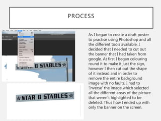
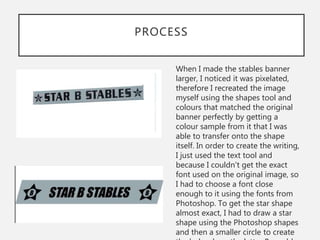
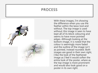
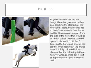
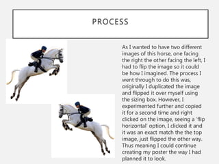
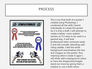
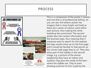
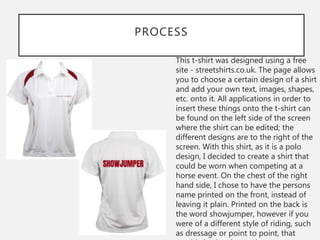
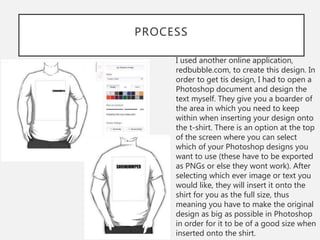
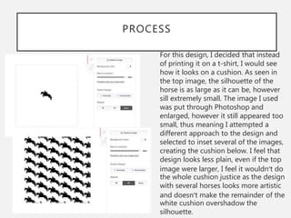
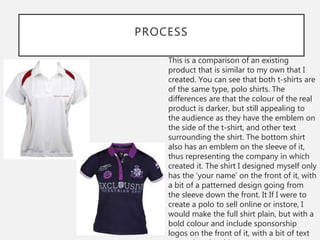
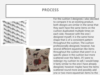
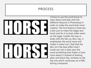
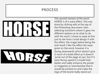
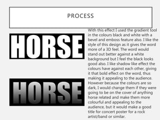
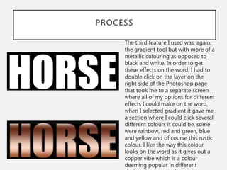
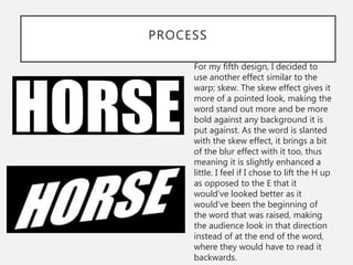
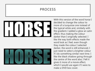
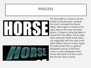
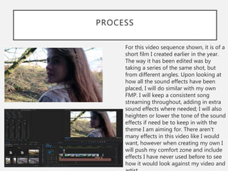
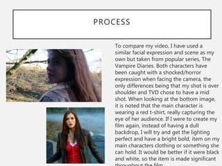
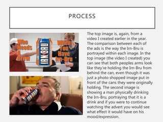
2. PROCESS
As I began to create a draft poster
to practise using Photoshop and all
the different tools available, I
decided that I needed to cut out
the banner that I had taken from
google. At first I began colouring
round it to make it just the sign,
however I then cut out the shape
of it instead and in order to
remove the entire background
image with no faults, I had to
âInverseâ the image which selected
all the different areas of the picture
that weren't highlighted to be
deleted. Thus how I ended up with
only the banner on the screen.
3. PROCESS
When I made the stables banner
larger, I noticed it was pixelated,
therefore I recreated the image
myself using the shapes tool and
colours that matched the original
banner perfectly by getting a
colour sample from it that I was
able to transfer onto the shape
itself. In order to create the writing,
I just used the text tool and
because I couldn't get the exact
font used on the original image, so
I had to choose a font close
enough to it using the fonts from
Photoshop. To get the star shape
almost exact, I had to draw a star
shape using the Photoshop shapes
and then a smaller circle to create
4. PROCESS
With these images, I'm showing
the difference when you use the
feather within the lasso tool and
without. The top image is used
without; this image is seen to have
kept all of its block colouring and
seems to have more pointed
edges. Although looking at the
bottom image, it is noted that the
colour is seemingly more faded
and the outline of the image isn't
as pointed, instead rounded. Both
images are good in their own right,
I like the look of the feathered
image as I feel it would soften the
entire look of the poster, where as
the top image is more prominent
and would also look good on a
poster in its own right.
5. PROCESS
As you can see in the top left
image, there is a green and yellow
pole blocking the stomach of the
horse and saddle, this meant I had
to draw/colour over it. In order to
do this, I took colour samples from
the side of the horse that would be
of similar colour that was covered
up and coloured it; I did this 5
times on the horse and once of the
saddle. When looking at the image
when it is fully coloured it looks
obvious that the colouring is there,
however when zoomed out it isn't
as apparent unless you fully focus
on it.
6. PROCESS
As I wanted to have two different
images of this horse, one facing
the right the other facing the left, I
had to flip the image so it could
be how I imagined. The process I
went through to do this was,
originally I duplicated the image
and flipped it over myself using
the sizing box. However, I
experimented further and copied
it for a second time and right
clicked on the image, seeing a âflip
horizontalâ option, I clicked it and
it was an exact match the the top
image, just flipped the other way.
Thus meaning I could continue
creating my poster the way I had
planned it to look.
7. PROCESS
This is my final draft of a poster I
created using Photoshop. I
combined all the skills I learnt
individually to create this poster.
As it is only a draft, I will attempt to
create a better, more realistic
version so if it were to be used in a
general way, it will look
professional when someone reads
it and will consider attending said
riding stables. I feel the white
background overshadows the text
and imagery on the poster, thus
meaning when I create it again I
will either add a background colour
or have the shapes/text/images
stand out more by giving them a
shadow or use a bold colour
8. PROCESS
This is a comparison of the poster I created
and one that is of professional editing. As
you can see, the bottom poster has
imagery that is more bright and bold as
there are a series of colours used within
each picture, thus making the white
backdrop less prominent. The second
poster also has contact information and
the business logo, thus meaning that if
someone were to search for the website,
the logo would come up on the first page
and it would be familiar to that person as
the correct web page theyâre on. They also
show part of the stables in the second
image, e.g. a picture of the arenas
(explaining they have an indoor and
outdoor ring) plus the inside of the barn
where the stables are. They're even
showing a picture of who could be the
9. REFLECTION - POSTER
For my final product I will use all the skills I learnt when making these
posters, such as the feather technique as I feel it gives the image used
more of a dreamlike look when printed. The image used with the feather
feature, as seen above, is of a lighter shading, making the image almost
transparent. I like how the feather feature looks if there were to be several
images on the page, that being used overtop another. Another feature Iâll
use is the âInverseâ button when wanting to cut out a selected area of an
image. This feature proves to be of a great help when wanting to have
only a small section of a large image, as it saves time on having to paint
over it or erasing it yourself, risking erasing part of the selected image
yourself. I will definitely compare my completed work with professional
work in order to see similarities and differences between the two, and
hopefully be able to make my product look more professional and real,
with colours and original pictures being used to brighten the poster; as
opposed to having a simple looking and plain poster that has photos
taken from google.
10. PROCESS
This t-shirt was designed using a free
site - streetshirts.co.uk. The page allows
you to choose a certain design of a shirt
and add your own text, images, shapes,
etc. onto it. All applications in order to
insert these things onto the t-shirt can
be found on the left side of the screen
where the shirt can be edited; the
different designs are to the right of the
screen. With this shirt, as it is a polo
design, I decided to create a shirt that
could be worn when competing at a
horse event. On the chest of the right
hand side, I chose to have the persons
name printed on the front, instead of
leaving it plain. Printed on the back is
the word showjumper, however if you
were of a different style of riding, such
as dressage or point to point, that
11. PROCESS
I used another online application,
redbubble.com, to create this design. In
order to get tis design, I had to open a
Photoshop document and design the
text myself. They give you a boarder of
the area in which you need to keep
within when inserting your design onto
the t-shirt. There is an option at the top
of the screen where you can select
which of your Photoshop designs you
want to use (these have to be exported
as PNGs or else they wont work). After
selecting which ever image or text you
would like, they will insert it onto the
shirt for you as the full size, thus
meaning you have to make the original
design as big as possible in Photoshop
in order for it to be of a good size when
inserted onto the shirt.
12. PROCESS
For this design, I decided that instead
of printing it on a t-shirt, I would see
how it looks on a cushion. As seen in
the top image, the silhouette of the
horse is as large as it can be, however
sill extremely small. The image I used
was put through Photoshop and
enlarged, however it still appeared too
small, thus meaning I attempted a
different approach to the design and
selected to inset several of the images,
creating the cushion below. I feel that
design looks less plain, even if the top
image were larger, I feel it wouldnât do
the whole cushion justice as the design
with several horses looks more artistic
and doesnât make the remainder of the
white cushion overshadow the
silhouette.
13. PROCESS
This is a comparison of an existing
product that is similar to my own that I
created. You can see that both t-shirts are
of the same type, polo shirts. The
differences are that the colour of the real
product is darker, but still appealing to
the audience as they have the emblem on
the side of the t-shirt, and other text
surrounding the shirt. The bottom shirt
also has an emblem on the sleeve of it,
thus representing the company in which
created it. The shirt I designed myself only
has the âyour nameâ on the front of it, with
a bit of a patterned design going from
the sleeve down the front. It If I were to
create a polo to sell online or instore, I
would make the full shirt plain, but with a
bold colour and include sponsorship
logos on the front of it, with a bit of text
14. PROCESS
For the cushion I designed, I also decided
to compare it to an existing product,
both designs are similar in the sense that
they each have the same items on the
cushion duplicated multiple times on
each side. However with the one I
designed myself, it is the same horse
shape that is of a consistent pattern
throughout the cushion. The cushion
professionally designed, however, has
several different equestrian like items
throughout the cushion that arenât in a
specific place in the cushion but more
scattered over the fabric. If I were to
redesign my cushion to sell, I would keep
it fairly similar to the one I have already
designed, however maybe have the items
scattered round more and possibly add
one or two more equestrian items to the
15. REFLECTION - MERCHANDISE
In my final product, I will probably use the cushion design I created, but
for my chosen artist as opposed to the horse. In order to create the
designs that will go on the t-shirts I will have to use all the Photoshop
knowledge I have to design the patterns / images that will go on the front
or the back of the shirts. I will most likely use both programmes I
originally used to design the shirts with also, as theyâre simple and easy to
use and give me a broad range of what Iâm able to use within them to
place the designs and write what I like on the shirts. All images / designs /
text will all be my own original work and won be taken from online, thus
meaning I need to find images from one particular artist that I have taken
myself to use and edit over them to enhance them enough in order to be
printed on a t-shirt or hoodie etc. In order to make the merchandise the
best it can be, I will look at designs that are already being sold online and
try and look at what features they have that make the audience want to
buy that item over any other, thus meaning I can do similar with my
designs without copyrighting.
16. PROCESS
I chose to use the word horse to
mess about and play with the
different features in Photoshop in
order to make the word look more
creative. The first feature I tried was
a blur just to make the edges less
harsh and for it to look softer when
on the page. I prefer the way in
looks with the blur as, like I say, it
emphasises the word more and
makes it stand out, I feel that the
blur isn't the best effect that I
could use, but it does give the
word something that makes it have
more about it instead of looking
plain and block like, similarly to the
top one which could pass as a little
boring compared.
17. PROCESS
This second version of the word
HORSE is of a warp effect. This was
done by clicking edit at the top of
the Photoshop document, then
selecting transform where it gave me
different options as to what to do
with the word. I chose to warp at first
just to see how I could design it with
the effect, the image below being the
end result. I like the effect the warp
gives on the word, however it is
facing downwards which doesnât give
it much of a bold effect as it doesnât
âjump out of the page at youâ but if it
were facing upward it would look
better and really enhance the poster
or magazine or merchandise that it
would be printed on and make the
logo of the brand really stand out
18. PROCESS
With this effect I used the gradient tool
in the colours black and white with a
bevel and emboss feature also. I like the
style of this design as it gives the word
more of a 3D feel. The word would
stand out better against a white
background but I feel the black looks
good also. I like shadow like effect the
colours have against each other, giving
it that bold effect on the word, thus
making it appealing to the audience.
However because the colours are so
dark, I would change them if they were
going to be on the cover of anything
horse related and make them more
colourful and appealing to the
audience, but it would make a good
title for concert poster for a rock
artist/band or similar.
19. PROCESS
The third feature I used was, again,
the gradient tool but with more of a
metallic colouring as opposed to
black and white. In order to get
these effects on the word, I had to
double click on the layer on the
right side of the Photoshop page
that took me to a separate screen
where all of my options for different
effects I could make on the word,
when I selected gradient it gave me
a section where I could click several
different colours it could be, some
were rainbow, red and green, blue
and yellow and of course this rustic
colour. I like the way this colour
looks on the word as it gives out a
copper vibe which is a colour
deeming popular in different
20. PROCESS
For my fifth design, I decided to
use another effect similar to the
warp; skew. The skew effect gives it
more of a pointed look, making the
word stand out more and be more
bold against any background it is
put against. As the word is slanted
with the skew effect, it brings a bit
of the blur effect with it too, thus
meaning it is slightly enhanced a
little. I feel if I chose to lift the H up
as opposed to the E that it
wouldâve looked better as it
wouldâve been the beginning of
the word that was raised, making
the audience look in that direction
instead of at the end of the word,
where they would have to read it
backwards.
21. PROCESS
With this version of the word horse I
decided to change the colour to
more of a turquoise one instead of
the typical white and, similarly with
the gradient, I added a glow an satin
effect, thus making the colour
darker than I originally selected. I
like the way both effects made the
word look as I feel, even though
they made the colour I selected
darker, the word is still enhanced, I
just need to select a brighter colour
if I do something similar next time. I
like the black shadow going through
the centre of the word also, I fell it
gives it more of a movie effect,
which I would use again if I were to
make a DVD box cover.
22. PROCESS
The final effects I chose to do are
similar to the previous, however
this time I included the distort
effect, which again is found in the
same area as the warp and skew
effects. I chose to bring the letter H
forward for this effect, which really
does make the whole word stand
out, especially with the colour and
other effects used on it also. Again,
this effect looks like it could be
designed to be on a DVD box
cover, or even displayed as the
movie title within the film, much
like the Star Wars movies.
23. REFLECTION - TYPOGRAPHY
I will definitely use all the new fonts, features etc. when creating my FMP
poster as I feel it will really enhance the name of my selected artist. I will
also use these features when creating merchandise as, from past
experience, different fonts and designs seemingly sell better than fonts
that arenât imaginative. With the merchandise I researched in the previous
PowerPoint, it is noted that the initials NH are designed to look like
matchsticks, thus tying into the theme of the album and tour; thus
meaning that when it comes to creating my own, I will need to emphasise
the initials/name of my chosen artist. The style I will most likely use is the
last I analysed: the glow, silk and distort effect as I feel this is a stand out
font, meaning the merchandise will be eye catching to not only my
chosen audience but others also. I will obviously choose colours that
match the theme I am going for with my artist, hopefully the remainder of
the design will match also.
24. PROCESS
For this video sequence shown, it is of a
short film I created earlier in the year.
The way it has been edited was by
taking a series of the same shot, but
from different angles. Upon looking at
how all the sound effects have been
placed, I will do similar with my own
FMP. I will keep a consistent song
streaming throughout, adding in extra
sound effects where needed; I will also
heighten or lower the tone of the sound
effects if need be to keep in with the
theme I am aiming for. There aren't
many effects in this video like I would
want, however when creating my own I
will push my comfort zone and include
effects I have never used before to see
how it would look against my video and
25. PROCESS
To compare my video, I have used a
similar facial expression and scene as my
own but taken from popular series, The
Vampire Diaries. Both characters have
been caught with a shocked/horror
expression when facing the camera, the
only differences being that my shot is over
shoulder and TVD chose to have a mid
shot. When looking at the bottom image,
it is noted that the main character is
wearing a red t-shirt, really capturing the
eye of her audience. If I were to create my
film again, instead of having a dull
backdrop, I will try and get the lighting
perfect and have a bright bold, item on my
main characters clothing or something she
can hold. It would be better if it were black
and white, so the item is made significant
26. PROCESS
The top image is, again, from a
video I created earlier in the year.
The comparison between each of
the ads is the way the Irn-Bru is
portrayed within each image. In the
top image (the video I created) you
can see that both peoples arms look
like theyâre holding the Irn-Bru from
behind the can, even though it was
just a photo shopped image put in
front of the cans they were originally
holding. The second image is
showing a man physically drinking
the Irn-Bru, portraying that it is a
drink and if you were to continue
watching the advert you would see
what effect it would have on his
mood/expression.
27. REFLECTION - VIDEO
As I explained in the previous slide, I will include effects within my video
that I have never used before. I will attempt to create a video I never have
before in order to make it the best it can be. In order to this, I will have to
research exiting concert videos/adverts and see what effects they use,
how they use them and why they chose that particular effect in a certain
area. Iâd like to use an effect where there are a series of videos at the start
of the ad, with the voice of the artist dubbed over (the videos would be in
slow motion) with dramatic music in the background also, and as the
music speeds up, so do the videos until they stop and its pictures that are
flashed upon screen, the occasionally video also, with music either from
the artist or my own created music dubbed over that. Another way I could
consider creating my video is by adding several different video clips from
previous concerts, including a little speech from the artist, and editing
them all together, with all the information regarding the tour at the very
end, e.g. dates, support act, venues etc.
Editor's Notes
Discuss the tools and processes used in your experiments
What elements of your experiments will you include in your final product?
Discuss the tools and processes used in your experiments
What elements of your experiments will you include in your final product?
Discuss the tools and processes used in your experiments
What elements of your experiments will you include in your final product?
Discuss the tools and processes used in your experiments
What elements of your experiments will you include in your final product?