SlideShare a Scribd company logo
Design for 
Advertising 
Developing, producing and evaluating
Initial Ideas 
Idea 1 
Designed to appeal to teenagers and young adults with a taste for the occult. Aimed at a younger crowd (about 15-20) who have 
more alternative tastes instead of enjoying mainstream things. 
More of a recreational drink than a sports recovery drink. 
Overall dark colour with shiny dots (stars) mixed in. 
Small highlights of colour, particularly in the logo to correspond each flavor. 
Regally styled Gothic logo that sets up a general theme and influence of a classic horror influence, werewolves. 
Wolf graphics that face the moon above the logo. 
Flavours: 
Lycan (Original) 
Blood Red (Cherry) 
Freerunner (Sugarfree) 
Idea 2 
A drink marketed as a powerful recovery drink from strenuous tasks. 
Colour scheme of green and black for the original flavour, with the canā€™s colour changed according to the flavour. 
The canā€™s design is built up of lots of industrial elements, like bolted on panels and rust. These will show up as slightly shiny on the 
can. 
The logo is done with a very heavy and aggressive typeface and coloured black, with a grey stroke. 
Advertises with a lot of hard rock and metal bands to tie in with the heavy industrial theme. 
Flavours: 
Fury (Orange) 
Frenzy (Lemon) 
Fear (Apple) 
Full Throttle (Double Caffeine) 
Idea 3 
A more relaxed drink marketed as organic and for an older crowd. 
Not aimed as a drink for sportsmen. Built up to be a recreational drink for summer. 
The name refers to the summer fruits used in the drink, like orange and blackcurrant. 
A white background with the writing and logo in a pinkish colour to tie in with the colour that is seen when closing your eyes in the 
sun, tying in further with the name. 
Can features a lot of smooth curvy lines to accent the design and also promote a free and unbound feeling. 
Advertises and promotes a lot of competitions to win holidays, outings and summer gear, promoting an outdoors lifestyle.
Initial Ideas 
Idea 4 
A drink that is marketed mainly around motorsport and car-related hobbies. Marketed mainly towards 
young men with a firm interest in cars. 
Can is red in colour to signify extreme speeds. All of the logos, writing and decals are in white. 
Logo has a speedometer dial above it displaying the fastest speed possible. 
Advertising features partnerships with motorsport events and hobby magazines, and their websites also 
offers tips and tutorials for car care, modification and repair. 
Fonts used will try to signify speed, by being slightly curved or leaning to one side. They could also be 
slightly wavy to resemble a checkered flag. 
Idea 5 
Drink marketed for general sports recovery and aims at people who do professional sports and look up 
to famous sportsmen and women. 
Has a mostly silver colour scheme with white highlights to look like a trophy of sorts. The logo and text 
is in black. 
Mostly done with quite a classic and smart theme as opposed to gritty and distressed. 
Heavily involved with professional sports and sponsors many teams around the world. Also organizes 
their own events
Mind map(s)
Mood board(s)
Mood board(s)
Copy/Script development 
1. Darkstar / Full Moon 
Heavy connotations to the occult, werewolf mythos and links to the night, 
as well as astral themes. Darkstar as a name refers to the nocturnal 
and astral themes of this drink. 
- Shine Bright Tonight ā€“ Slogan used to interpret Darkstar as a drink 
that makes you light up or shine brighter as more energy is delivered 
than a regular energy drink. ā€˜Tonightā€™ links to the drinkā€™s nocturnal 
theme. 
- The Night Is Alive ā€“ ties into the drink being an energy/stimulation 
drink, delivering enough power to make the night feel alive. 
- Energy To Compose ā€“ Ties into the artistic and refined aspect of this 
drink, giving creative minds more energy to create new works of art. 
- For Your Nocturnal Side ā€“ Links to Darkstarā€™s alter ego theme (from 
the advert showing people transforming into wolves) and the theme of 
night. 
Advert Dev: Mentions of a dark character who provides the protagonists 
with Darkstar, a reference to the drinkā€™s mysterious nature that it is 
provided by spooky individuals.
Font/Colour Scheme development 
Use this space to document your font and colour test. 
There should be lots of variety here. 
Ensure any font text are saved as images, otherwise I wonā€™t be able to 
see the fonts you intended.
Font/Colour Scheme development 
Use this space to document your font and colour test. 
There should be lots of variety here. 
Ensure any font text are saved as images, otherwise I wonā€™t be able to 
see the fonts you intended.
Font/Colour Scheme development 
Use this space to document your font and colour test. 
There should be lots of variety here. 
Ensure any font text are saved as images, otherwise I wonā€™t be able to 
see the fonts you intended.
Font/Colour Scheme development 
Use this space to document your font and colour test. 
There should be lots of variety here. 
Ensure any font text are saved as images, otherwise I wonā€™t be able to 
see the fonts you intended.
Product packaging development 
The second design was a lot 
different as it ditched the astral 
theme for a distressed classical 
feeling complete with the coat of 
arms. I designed the logo to 
wrap around the can 
horizontally. 
My first mockup 
kept Darkstarā€™s 
theme firmly 
rooted with space 
and stars. In the 
rightmost column 
would have been a 
space that informs 
consumers about 
Darkstar and what 
it sponsors.
Product packaging development 
Another design similar 
to my second that is 
mocked up to celebrate 
Darkstarā€™s birthday. The 
large D in the centre 
column is highly 
reminiscent and inspired 
by the current Relentless 
logo. 
Variant of the above design 
that instead includes a 
diagonal logo across the coat 
of arms.
Task 6: Advert Development 
I began my advert draft with a space-themed 
background to link to my chosen product name, Dark 
Star. I chose this particular image because I thought that 
the inclusion of the Earth at the bottom would make a 
nice footer and round off the image. Initially I had the 
name of the product and the tagline below the 
arrangement of the cans with my slogan, ā€˜Shine Bright 
Tonightā€™ above in a stylized font. I did this to replicate 
the look and feel of an old movie poster, where the font 
is similarly structured, which gave the advert quite a 
dramatic feel and also lead the viewerā€™s eyes onto the 
productā€™s name at the bottom after hyping them up 
using the tagline and background. With the cans in the 
middle, I arranged them so that the middle can (The 
original flavour) was in front of the others to represent its 
flagship status. 
Changes made in the second draft include swapping the 
positions of the tagline and brand name which allowed 
me to increase the size of both so that they became 
much more noticeable. An issue with the first draft was 
that the slogan was quite hard to make out, being a 
white font on a background with lots of white stars. I 
also managed to increase the size of the cans and add 
their respective names under each which raised brand 
awareness and allowed potential consumers to observe 
what flavours were sold before they purchased Dark 
Star. Finally, I added links to Dark Starā€™s official pages 
on both Facebook and Twitter which would be useful in 
spreading awareness about my drink and drawing in 
more consumers.
Task 6: Advert Development 
In the next two advert drafts I went for a radically 
different design with a similar layout, this time 
adopting my auxiliary regal and medieval style 
for my energy drink. This theme included motifs 
such as the use of a large royal crest (taken from 
a dingbat collection) that served as the unofficial 
brand logo. I included this in the centre of the 
advert to show the most artistic aspect of the 
drink and entice customers thanks to its 
prominence and overly imposing appearance. I 
changed the slogan of the drink to, ā€˜The Official 
Drink of the Courtā€™ which further connotates it to 
a royal theme and gave the impression that it 
was a high quality beverage suitable for upper 
class individuals. 
Further changes in the fourth draft included a 
shift in the font colour to a more distinctive purple 
in order to stand out from the background, as 
opposed to the previous dull grey. I also 
reintroduced my idea of having three cans 
placed in the middle of the advert in order to 
promote the brandā€™s range, this time with the 
logo appearing in the background as an effective 
backdrop. I added in the web address at the 
bottom from my previous drafts.
Task 6: Advert Development 
I then decided to start a new advert which didnā€™t follow my 
previous hierarchy of tagline, picture then name of the 
brand. In this new piece I tried to create an advert that 
properly connected to my drinkā€™s brand name and 
philosophy as well as the thinking behind it, and I did this by 
creating a star that seemed to shine down on the three 
drinks at the bottom of the page. The changes also include 
the removal of the two social media links (Facebook and 
Twitter) but I have kept the website as I believe it is an 
important part of an advert if there are no other links to the 
brandā€™s pages, as a website contains everything there is to 
say about the drink. 
I kept this advert mostly minimal, as opposed to my previous 
designs being quite busy and not easy on the eyes. It 
features a simple and smooth background that is intend to 
soothe the viewer and not wear them out by having an 
extremely detailed and heavy background that obscures key 
details. They star and the light beam is the key element in 
this advert as it directly leads down to the display of the 
brands three flavours on offer, and the logo of the brand 
itself. I have kept the logo at the bottom for most of my 
drafts because I think it is important that the thing that sticks 
with viewers after they leave the page should be the name 
of the product itself, so when they are next in a shop they 
can remember that name and recall the advert, hopefully 
being persuaded to purchase the drink in the process. 
I produced a second draft of this particular advert that 
removed the tagline at the very top and added stars in its 
place, as I believed that the advert was more effective with 
the text contained at the bottom as the viewer can gradually 
lead down to it via the light ray.
Task 6: Final Advert
Task 6: Advert Evaluation 
In this final piece I have used a range of aesthetic and technical qualities to produce 
the final result that is when compared to previous results, much more linked to my 
brand as a whole and does a better job at promoting the drink. The technical qualities 
used in this image are mainly usage of shadows, blurring and glows, particularly on 
the stars, to give them an authentic and almost ethereal look. I used Gaussian blur 
on the rectangle that cuts diagonally across the page to give it the appearance of a 
light ray coming from the star and also added outer glows to the cans below to give 
the impression that they were being illuminated by said ray. The beam also ties in to 
an aesthetic aspect as it is also used to direct the viewerā€™s eyes down onto the cans 
and the logo. 
In terms of aesthetics I have been inspired 
by a number of different sources. 
My main inspiration an existing energy drink 
is Relentless, which uses several similar styles 
and motifs to what I have included in my own work, 
particularly the usage of a old yet stylized font. I chose such a font because I wanted 
to aim my drink towards an alternative crowd and also try something different that 
didnā€™t necessarily coincide with todayā€™s standards of logo design, like using sans serif 
and simple yet effective blocky shapes. However, instead of following the Relentless 
logo fully I decided to go for a much more refined look and used a simple medieval 
styled font, lacking any of the curly lines around the Relentless logo that makes it 
almost resemble street art and graffiti, further demonstrating itā€™s appeal to young 
people and teenagers. My ad also uses lots of dark colours which highlights itā€™s 
appeal to the alternative crowd of which I am aiming for with this product.
Task 6: Advert Evaluation 
I have also attempted to go for a house style that consists of three main fonts for 
certain elements. The aforementioned medieval font (Old London) is used strictly for 
the brand name, Verdana for small text and taglines, and Zapfino for my slogan, 
Shine Bright Tonight. The usage of Verdana helps to distinguish that Darkstar is a 
modern brand instead of a years old drink. 
This choice of font is quite common on several 
other drinks I researched including Rockstar, 
Relentless and Monster, which all feature 
distorted logos but with a refined tagline 
underneath that usually says ā€˜Energy Drinkā€™ to highlight what the product is. My 
choice of the astral theme and slogan is due to my idea of enlightenment ā€“ drinking 
Darkstar will help you focus and achieve your goals while also keeping you on your 
path. This is shown by my usage of the light ray to illuminate the drinks. Shine Bright 
Tonight gives consumers the idea that the drink is something that gives you an extra 
burst of energy, hence shining bright. Keeping with the dark and classically gothic 
theme my flavour names are also tied to this theme, with Dusk having links to the 
night-themed aspect (also linking to the slogan) and Sonata, as well as sounding 
quite refined and gothic, gives the drink an aspect that is similar again to Relentless, 
in that it helps with artistic endeavours. 
In terms of areas where I could further develop, I believe that this advert in particular 
could have used some more content in the upper areas, where aside from the stars it 
is quite empty. I experimented with several different slogans to put up there but in the 
end I decided that my slogan worked best when it was level to the cans at the 
bottom, where it was also able to sit nicely on the horizon of the background picture.
Task 6: Advert Evaluation 
In terms of areas where I could further develop, I believe that this advert in particular 
could have used some more content in the upper areas, where aside from the stars it is 
quite empty. I experimented with several different slogans to put up there but in the end I 
decided that my slogan worked best when it was level to the cans at the bottom, where it 
was also able to sit nicely on the horizon of the background picture. 
I would also like to improve my usage of basic shape tools and beyond, as this piece 
uses some very simple geometric shapes for the star and the light beam. I would like to 
develop my skill in this primarily to create my own motifs for use in the media regarding 
the energy drink. An example of this would be the crest I use as the brandā€™s ā€˜officialā€™ logo, 
which is simply a dingbat pulled from a free collection. If I were to develop my 
shape skills I could possibly create my own logo for use in 
this project, which would improve upon my push towards an 
independent brand (that does not use simple and placeholder 
logos) and also improve my skill with Photoshopā€™s tools. 
To improve upon my skills I can study pictures of real life 
subjects that relate to mine and try to draw inspiration and 
draw them in Photoshop. A final point that I would like to 
Improve on is more connotation to my product. This is 
because a lot of my early drafts for the advert had no links 
to the name or style of my energy drink and instead had a 
simple classical theme applied. To work around this in the 
future I could brainstorm much more thoroughly before 
I attempt my drafts which will hopefully lead to a much 
more refined product that has a direction and goal and 
knows what it will look like at the end of the project.
Task 6: Advert Evaluation 
What worked well with this advert was linking the colour scheme to both the 
font and the drink itself. I feel as if the the advert as a whole has a clear 
intended style that helps to tell audiences what the drink is aiming for and 
what kind of people is trying to appeal to, in this case the alternative crowd. 
On the other hand, I would have like to develop my visual elements more 
such as the star at the top and the cans themselves, which lack any sort of 
logo. Also, I think that the Darkstar logo itself could have worked much 
better if I had used a pattern as a clipping mask which would have 
enhanced depth and detail. 
Initially I was prepared to go 
with one of my second designs 
(the floral background with the 
coat of arms and 
ā€˜The official drink of the courtā€™ slogan) 
as my final piece, but I pushed myself and decided to create another draft 
from scratch which scrapped this hierarchy that had appeared in all my 
other drafts and instead start building up a new style, having the logo at the 
very bottom and the main element of the advert being the dark star itself. 
This push allowed me to create an advert that was very visually distinctive 
and didnā€™t look like a carbon copy of my other designs, and also allowed me 
to link my theme to the advert with much greater success.
Task 7: Product Development 
ā€˜Darkstar Originalā€™ 
The first can draft is for Darkstarā€™s original flavour and is the 
most common can in the drinks range. I tried to achieve a 
house style using a combination of two bold colours and 
several small variations of these for accents and borders, in 
this case blue and gold (Originally white that become a pale 
gold through the use of a grunge texture) which gives the 
entire style quite an antiquated and classical theme that fits 
into Darkstarā€™s gothic style. What I like about this draft is the 
combination of colours used as they are unique and not 
seen on any current energy drinks, but at the same time are 
not too outlandish because of of that. I also like the cloudy 
sky backgrounds which while obscure gives the can a lot of 
depth and a dark, ominous flair. Couple with the grunge 
texture this makes the can look very antiquated and rustic. 
I included a shot of the can template without the grunge 
texture to show how much of a difference it makes and how 
the two are two very different styles that still tie into 
Darkstarā€™s theme. 
With the first design I tried to emulate the old design of 
Relentless with the vertically aligned text as I think this 
design makes the brand much more noticeable. However 
the second design is much more legible at first glance which 
increases the brandā€™s awareness as people can scan their 
eyes across the shelf, see the can and immediately know 
what the brand is called. I have tested design on a can 
template and the logo is partially obscured so that it cannot 
be seen completely from head on.
The right side of the can is used to document Darkstar 
and what it is, using the brandā€™s theme to describe 
the drink in a creative way that would entice 
consumers. The line ā€˜see you through to sunriseā€™ 
implies that the drink delivers enough energy for you 
to stay up all night or an equal amount of time which 
appeals to the audience of people that buy these 
types of drinks for their caffeine and other 
supplements that provide lots of energy. To further 
compliment this I added ā€˜Charged With Taurineā€™ 
around the neck of the can which increases the 
visibility of this message. Underneath ā€˜are you brave 
enough to join our ranksā€™ I included links to the 
brandā€™s site as well as their social media profiles 
which, paired with the line, increases brand 
awareness as it invites people to ā€˜join their ranksā€™ by 
becoming a fan, which leads to more people 
knowing about the drink. 
Because the draft here represents the 
Original flavour, I decided to colour the background a 
dark blue to symbolize the brandā€™s trademark colours. 
Because of this when people see the original can they 
can link it back to using the original colours, so when 
they see something else that is Darkstar related they 
can make connections based on the colours used.
Task 7: Product Development 
ā€˜Darkstar 10 Year Anniversary Editionā€™ 
I created a silver and blue themed anniversary edition to 
go alongside my original flavour. What I like about this 
design is the choice of colours and the emphasis on the 
brandā€™s logo, with the full name of the drink at the side 
to give way to the motif and a paragraph explaining the 
occasion. In the second image I moved said motif into 
the top right so that the can resembles the original 
packaging a little more while still being very distinctive. I 
have created the special packaging by using a floral 
patter as the background which makes the drink look 
quite shiny and distinctive. The blue colour used is the 
same blue from the original flavour to keep consistency. 
I imagined that the floral pattern would have a frosted 
effect on a real can which would shine under light, and 
highlight the brandā€™s logo and text. Because this 
particular can does not have Darkstarā€™s signature dark 
background I have emphasised the logos more so than 
other cans, especially the D of Darkstar, which features 
on the main face. I placed the crest behind the D which 
gives it a very bold appearance. This is so anyone 
including people who are not fans of the drink can 
recognize it on a shelf. I prefer the first design because 
it allows the anniversary text and logo to be emphasised 
more and ties in to the main theme of this variety, as 
well as looking much more striking when printed on a 
can.
The anniversary edition contains a small 
paragraph underneath the enlarged logo 
which mentions how long the brand has 
been producing drinks, which helps 
veteran consumers of Darkstar to connect 
and relate. As well as this, I have placed 
the social media links under the paragraph 
so that any newcomers to the drink have a 
quick link to check out the drinkā€™s 
website/social media page and educate 
themselves about the drink and its history. 
The line, ā€˜ten years of shining brightā€™ 
directly ties into the drinkā€™s official slogan, 
ā€˜shine bright tonightā€™ so that anyone who 
is aware of the slogan will be able to make 
the connection. 
I decided to add the single D initial against 
an enlarged coat of arms to symbolize that 
this can was celebrating an achievement 
for Darkstar, as this logo gives the can a 
very bold and confident appearance. For 
easy recognition though I have kept the 
original vertical logo, although pushed to 
the right to make way for the specific 
anniversary text.
Task 7: Final Packaging
Task 7: Packaging Evaluation 
My final can design represents the original and most common flavour of Darkstar, and to link this 
to the design itself, I have used a combination of the brandā€™s typically used colours along with 
several other motifs. My reasoning behind using such colours was that because this flavour is 
considered the flagship of the brand, it would need to be easily recognizable on a shelf for 
consumers to see, and using the brandā€™s default colours would mean that people who have seen 
any other advertising material regarding Darkstar before would be able to instantly make the 
connection between that prior knowledge and the drink on the shelf. The motif below the logo 
itself that tells us what the flavour of the drink is, is on the front side and extremely visible for 
maximum exposure. 
The aesthetics in which I have done well in have been the colour 
choices and the positioning of all of the elements on the template. 
The aforementioned default colours (dark blue and a rustic gold) 
together create a very antiquated and worn appearance that gives 
the feeling of a drink from a bygone age. The group that I aimed towards, the steampunk and 
gothic subcultures are heavily involved with a retro themed styling that includes elements drawn 
from the Victorian era and before. I have tried to emulate this in my canā€™s packaging with the 
usage of the main font for my font for the logo that resembles Medieval text and not something 
that could be considered modern (as most fonts popular today are sans serif or minimalist 
typefaces.) Gold was a very important colour in the creation of this style as it is the most prevalent 
colour in steampunk culture, representing wealth and the upper class. These cultures that I have 
appealed to could also be 
described as dark and underground and not necessarily jolly or 
cheerful, which is the reasoning for my choice of dull and 
weathered textures, achieved through the use of a grunge texture. The grunge represents the 
passage of times as these cultures draw on influences from real life cultures that existed 
hundreds of years ago. As well as these cultural connotations the grunge was used to add depth 
to my can design which features a cloudy blue sky background as the backdrop for the packaging 
which gives the entire packaging a dark and gloomy feeling.
Task 7: Packaging Evaluation 
As well as these cultural inspirations I have also drawn upon several other energy drinks to create 
my own style. In particular, my main influence in this regard was Relentless, a similar energy 
drink in that it is marketed to an ā€˜undergroundā€™ audience, with the difference being that the drink is 
heavily linked to music and music events through advertising and sponsorship. The key elements 
I drew from their packaging included the vertical logo on the front of the packaging (Which I used 
to increase the visibility of the brand name) and the placing of the name of the flavour beneath 
said logo. Another key elements was Relentlessā€™ use of a very detailed and obscure background 
which gives the can a lot of depth and detail when compared to a blank can. I tried to emulate 
something like this with my gloomy sky backdrop and accompanying grunge texture. In addition to 
this I have also drawn inspiration from their logo itself, particularly the use of a stylized, ā€˜classicā€™ 
font but have not included their use of many wave lines and accents which was intended to 
emulate street art of graffiti as this was not the culture I was aiming for. Finally, the new 
Relentless logo includes just the ā€˜Rā€™ of the logo and I have included something like this for the 
side panel of my can above the introduction to the drink and against an enlarged ornament used 
as my emblem. This is a motif that was used to show that just the first initial of Darkstar can mean 
that it is recognized by consumers simply because of how prominent and unique the font is, as is 
the same with Relentless. I was also prepared to have my alternate flavours keep the style of the 
original can but with a different coloured background so that the cans when lined up would have a 
strong brand unity (seen in the first picture below.) One thing I did try to avoid influencing from 
Relentless and other brands was the sponsorship they do, as I wanted my drink to retain the 
same ā€˜undergroundā€™ and independent feeling of the cultures it markets towards.
Task 7: Packaging Evaluation 
In a technical aspect, my product has used a range of techniques to achieve the final piece 
including colour overlays, opacity modifying, warping and image modification. The background in 
particular was achieved by taking a normal picture of the night sky and overlaying it with a grunge 
texture, and then altering the opacity of said texture to blend the two images together. 
I went for this approach to avoid making the backdrop too much in focus and detracting from the 
other elements of the packaging, as well as creating a nice combined background that fits in with 
my drinkā€™s style and creates the ominous atmosphere that it is known for. Usage of this grunge 
texture also allowed me to swap the text colour from a bright white to the weathered gold that is 
present on the final piece which avoided a lengthy process of using clipping masks for such a 
purpose. I also used the opacity tool to allow the ornaments behind the logos to blend in well and 
not obscure the logo while still remaining visible. The logo for Darkstar itself uses a combination 
of a drop shadow and the emboss 
tool gives it more of a three 
dimensional look instead of 
appearing flat on the packaging. 
The box containing the name of 
the flavour uses two ornaments, 
one flipped to accents the sides of 
It and increase detail.
Task 7: Packaging Evaluation 
In terms of opportunities for further improvement and modification of my images, I would primarily 
like to start creating some of my own original motifs instead of using sets that are available for 
free online. Being able to accomplish this will move me further towards independence and will 
allow me to produce a piece of work that is up to professional standards. 
One of my attempts at an original logo (shown here) is built to directly tie into the regal and classy 
theme I have built up for my can and also resembles a logo that can easily take the place of my 
default coat of arms ornament that is used to compliment my logo. Again I have been influenced 
by Relentless slightly by using the initial of my brand name and stylizing it, albeit In a much 
different fashion when compared to the Relentless logo. When using the original ornament, I 
sheared off part of the bottom so that it would fit onto my can better and keep the symmetry with 
the rest of the elements. 
The original ornament used. 
An original logo I 
created to replace it. 
Relentless logo for 
comparison 
The sheared logo in my final 
design. 
If I were to repeat this project I would likely create more original logos which 
vary in style and compare them for use in the final piece instead of keeping 
with a free and generic ornament available on the internet.
Task 7: Packaging Evaluation 
Another element I would like to improve on is my spacing and positioning of each elements and 
how I can vary them. My final design is very geometric ā€“ everything is aligned horizontally or 
vertically ā€“ and there is not much that could be consider this design flared or wavy. What I would 
like to try as an alternative design would be something that has the Darkstar logo aligned 
diagonally or otherwise. This would increase the designā€™s creative and technical appeal and also 
allow me to experiment with something that isnā€™t defined by straight lines and boxes. 
While I do consider my ingredients 
list effective and fit for purpose I 
would have liked to have taken the 
time to create a unique recipe for 
Darkstar by choosing my own 
ingredients instead of lifting the 
ingredients and nutritional 
information directly from Monster. I 
would have liked to do this because I 
believe detail is very important and 
my work falls slightly short because 
of this.
Task 7: Packaging Evaluation 
When talking about the planning and development process of my can design I believe that where 
I succeeded was the combination of grunge and background which affected the design as a 
whole, bringing my theme to life and helping to distinguish it from a test draft. Although my layout 
has remained mostly the same the difference that can be made is how my final piece feels like it 
was made over a hundred years ago, which is the entire point of the theme and audience I have 
tried to appeal towards. The colour choices of my final design are also much more refined and the 
choice of two main colours means that the entire design works together and doesnā€™t feel 
mismatched thanks to loads of different colours. 
Above is 
one of the 
test drafts 
and to the 
right is 
the final 
piece. 
I have also been able to account for the space to the right that 
was left empty in the preliminary draft as I did not know how 
to fill it, and instead planned to include a history of the drink 
and a list of the available flavours in the range. In the final 
piece I scrapped this idea and used the space to briefly explain 
ā€“ albeit poetically ā€“ what Darkstar was about and concluded it 
with links to the brandā€™s social media pages and their official 
website. I chose to put the social media links here because the 
assumption was that if someone is willing to learn more about 
Darkstar and becomes curious, they will pick up the can and 
turn it around to this side where the links can be found, 
prompting them to indulge themselves further and visit 
Darkstarā€™s pages to learn more.
Task 7: Packaging Evaluation 
On the other hand, the areas of development where I could have developed more would have to 
be the variation in my designs and the elements involved. When comparing one of my initial drafts 
to the final product it is easy to see that almost everything is in the same place and orientation. I 
would have liked to experiment more with different layouts, particularly ones that have elements 
that are not aligned horizontally or vertically, instead being on a diagonal alignment to create an 
interesting layout. This was something I experimented with on one of my preliminary designs and 
I would like to implement this if I repeated this project. 
Also, I would have liked to have experimented with several 
different background choices for my design. I did have two 
distinct choices when drafting the can, an astral theme 
and a more upper class style that incorporated a patterned 
background and more lighter colours, which was used for 
my anniversary can. In the future I would like to try out more 
styles so that I have a bigger choice when preparing to make 
my final piece.
Task 8: Web Banner Development 
With the leaderboard banner I 
started with a simple design that 
primarily intended to pull people 
in with the dramatic ā€˜itā€™s hereā€¦ā€™ 
tagline, that is announcing a new 
flavour in the Darkstar range. I 
later used colour overlay to 
change the colour of the cans to 
match the background used in 
this banner, and added a contour 
effect to the tagline to make it 
look more 3D. I have also used a 
grunge texture to give the 
gradient background a rougher 
and more detailed edge. Later I 
tried a more centred logo that still 
promoted the same drink but with 
a different and more fitting 
slogan, as well a custom logo. I 
experimented with positioning of 
the logo on the right.
Task 8: Web Banner Development 
I created several other web banners that 
were a little larger and thus allowed me to 
experiment more. The first draft was akin to 
my very first drafts for my magazine advert, 
following a very similar layout but this time 
having Darkstarā€™s now default colours and 
grungy styling. I like this design for the 
colours and the feeling of it but dislike it for 
following the same formula as previous 
attempts. 
I then decided to use the 
astral theme of my drink to 
a greater extent and used 
a similar element to my final 
advert, as well as a star 
background that greatly 
enhances the imageā€™s detail 
and allows viewers to know 
what the theme of the drink 
Is.
Task 8: Web Banner Development 
I developed my previous banner idea by animating it, 
showing the rays of the star gradually lighting up both of the 
cans and having the logo slowly appear. I improved on this 
by adding a second frame that had the opacity at 25% to 
allow for a smoother transition. To the right, I went for a 
square advert that I kept simple in hierarchy but I think that 
it is still very effective with the large star situated behind the 
row of cans. This time I have included the Darkstar initial so 
that the brand is much more represented then previous 
attempts. This banner is also much more dominating in 
appearance thanks to the size of the star and the cans 
helping to make it stand out more.
Task 8: Final Web Banner
Task 8: Web Banner Evaluation 
I chose this web banner as my final piece because I believe that it is the most striking 
and appealing of all my experiments in this section. I say this particularly for the 
inclusion of the large moon that is placed behind the cans which acts as a backdrop 
against the stars and pulls in viewers thanks to its position and size. Because 
Darkstar is related in name and in theme to stars this will allow consumers to make 
the connection between the advert and brand instantly. This is also supported by the 
inclusion of the Darkstar initial in the centre of the star. In terms of the aesthetic 
quality, I tried to position the cans so that it resembled figures looking out towards the 
moon on a hill, which adds a sense of scale to the image and ties it in to my theme of 
enlightenment. My inspiration for this particular image was the common pose of 
standing in front of a moon, creating a very distinctive silhouette. I didnā€™t place my 
cans directly in front of the star, my reasoning being to give the illusion that the cans 
were ground and the star was shining above them. I added the night sky in the 
background and used the opacity tool to lighten it so that it wasnā€™t too dominating and 
created a nice backdrop which fit the theme the banner was putting across. 
I used a row of all the available flavours of Darkstar so that anyone who is new to the 
brand instantly knows what is on offer and whether or not the flavours appeal to 
them.
Task 8: Web Banner Evaluation 
The technical qualities of my work included use of the blur tool, the outer glow tool 
and saturation modifying to achieve my final result. The cans are all derived from my 
original can but have been made to look like other flavours by altering the hue of the 
image, resulting in a row of different flavours that keep the same design. For the star, 
I used a simple ellipse and gave it a large outer glow that gave the impression of 
luminosity, typical with large stars. 
I used a combination of Gaussian blur and opacity to achieve the background used in 
this banner. First beginning with a gradient I then added the background of stars over 
it and toned the opacity down, before using Gaussian blur to make the two images 
blend together. I did this so that the stars were not too dominating in the image and 
that I wanted them to stay in the background, hence making them visible but not 
standing out too much. 
The ways I could improve this image in a technical sense would be to create some 
more complicated shapes instead of taking them from the internet. For example, I 
could have added some light rays to illuminate each can, or I could have added a 
solid terrain for the cans to stand on instead of floating beneath the star.
Task 8: Web Banner Evaluation 
Considering where I can develop my web banner, I would like to try creating 
some unique hierarchy instead of following the simple can and title that has 
been a staple of most of my advertisements. My theme is a bit difficult to 
adapt for something other than having the star positioned high but if I was 
to repeat this project I would try and experiment with having the star further 
down and creating the advert around it, which would lead to some more 
interesting layouts and untimely a better product at the end. I would also 
like to experiment with combining both my astral theme and classical theme 
into one advert, experimenting with different motifs and layouts to ensure a 
much better end product. In the planning aspect of this task I feel as if going 
back and trying lots of different styles worked well, by beginning with simple 
leaderboard shaped banners and progressing onto rectangular adverts. 
This allowed me to explore a lot of different techniques and ideas and lead 
me on to find what I believed was my preferred style in the end. What didnā€™t 
work as well during planning however was relegating myself to the same 
hierarchy from my magazine advert in the final piece when I could have 
tried something more stylish and experimental. If I was to repeat this task I 
would try out a lot of new styles and layouts to ensure that I end up with a 
striking and unique final piece that does not feel like a carbon copy of my 
other attempts.
Task 9: Storyboard Development 
My first draft utilizes a heroic theme with the wolf jumping the crevasse. This was done to 
emphasize the power that Darkstar supposedly holds and make it appealing to a crowd that 
wants a drink with a lot of energy delivery. The boy turning into a wolf also connotates to 
Darkstarā€™s social media campaign, ā€˜are you brave enough to join our ranks?ā€™
Task 9: Storyboard Development 
The second attempt, which has the same premise, takes on a more mystical theme with the wolves 
circling the fountain, an element that ties into Darkstarā€™s mystery and gloomy-centric advertising. In 
the right image I improved my final frame to include more detail about how the advert ends. It went 
through several revisions such as changing the Darkstar logo to glow yellow and having the wolves 
turn to face the viewer at the very end, before it cut out. This was replaced with the more subtle 
eyes glowing in the background. I am using this one as my final piece.
Task 9: Storyboard Development 
My third storyboard has the same transformation concept that involves someone 
drinking Darkstar and becoming a wolf of the night. This time it involves a man 
defending his home from a zombie attack. It doesnā€™t involve any blood or gore to 
avoid troubles with the ASA but does feature a some cartoon violence, and a very 
ominous and scary atmosphere that would make it unsuitable for young viewers. 
This storyboard retains the third and sixth panels from the first draft and features 
a similar setting, a house in the middle of a dark, stormy forest. I feel as if this 
advert is more climatic than the other two drafts as it has more of a perilous 
situation that is solved by drinking Darkstar.
Task 9: Storyboard Evaluation 
My final piece features a transformation story that links into one of 
Darkstarā€™s main slogans, ā€˜For Your Nocturnal Sideā€™ which links to the drinkā€™s 
night theme and how it urges you to join their ranks in some of the 
advertising. I chose the transformed animal to be a wolf so that it fits in with 
the traditional werewolf myth, replacing the full moon with a can of Darkstar. 
What I feel went well with my storyboard development was the use of most 
of Darkstarā€™s themes to create a coherent story, such as the night, 
werewolves and the aforementioned transformation. Because of this I 
believe that my final storyboard is fit for purpose, however I believe that I 
could improve it by connotating more with Darkstarā€™s colours and styles in 
the imagery.
Task 9: Storyboard Evaluation 
You should evaluate your final piece. 
Are there opportunities for further development of your work? 
Are your final pieces are fit for purpose? 
What areas of planning and development worked well? 
What areas of planning and development could have done with more work? 
What effect did you think your development stages had on the final 
product? 
You should present your evaluation using a mixture of text and images. 
You should use images of existing products for comparison.

More Related Content

What's hot

Analysis of Logos
Analysis of LogosAnalysis of Logos
Analysis of Logosheatherlarkin1
Ā 
Digipack analysis McFly
Digipack analysis  McFlyDigipack analysis  McFly
Digipack analysis McFlyLaura O'Connor
Ā 
2. FMP Research
2. FMP Research2. FMP Research
2. FMP ResearchTamzinTwose
Ā 
Ancillary task - media - Josh Manley
Ancillary task - media - Josh ManleyAncillary task - media - Josh Manley
Ancillary task - media - Josh Manleyjoshmanley98
Ā 
Digipak (Album Cover) Analysis
Digipak (Album Cover) Analysis Digipak (Album Cover) Analysis
Digipak (Album Cover) Analysis hlr1993
Ā 
Website evaluation
Website evaluationWebsite evaluation
Website evaluationadelejackson1
Ā 
Website evaluation
Website evaluationWebsite evaluation
Website evaluationadelejackson1
Ā 
3. research(2)
3. research(2)3. research(2)
3. research(2)samuel nixon
Ā 
3. research(2)
3. research(2)3. research(2)
3. research(2)samuel nixon
Ā 
3. research(2)
3. research(2)3. research(2)
3. research(2)samuel nixon
Ā 
3. research(2)
3. research(2)3. research(2)
3. research(2)samuel nixon
Ā 
3. research(2)
3. research(2)3. research(2)
3. research(2)samuel nixon
Ā 
3. research(2)
3. research(2)3. research(2)
3. research(2)samuel nixon
Ā 
Noel Gallagherā€™s High Flying Birds ā€“ Digipak Analysis
Noel Gallagherā€™s High Flying Birds ā€“ Digipak AnalysisNoel Gallagherā€™s High Flying Birds ā€“ Digipak Analysis
Noel Gallagherā€™s High Flying Birds ā€“ Digipak Analysisbenpainter221
Ā 
Social action evaluation
Social action evaluationSocial action evaluation
Social action evaluationZkyQatDalyani
Ā 
Typography research
Typography researchTypography research
Typography researchDawid Tomczuk
Ā 

What's hot (18)

Analysis of Logos
Analysis of LogosAnalysis of Logos
Analysis of Logos
Ā 
Digipack analysis McFly
Digipack analysis  McFlyDigipack analysis  McFly
Digipack analysis McFly
Ā 
2. FMP Research
2. FMP Research2. FMP Research
2. FMP Research
Ā 
Ancillary task - media - Josh Manley
Ancillary task - media - Josh ManleyAncillary task - media - Josh Manley
Ancillary task - media - Josh Manley
Ā 
Research
ResearchResearch
Research
Ā 
Digipak (Album Cover) Analysis
Digipak (Album Cover) Analysis Digipak (Album Cover) Analysis
Digipak (Album Cover) Analysis
Ā 
Digipaks
DigipaksDigipaks
Digipaks
Ā 
Website evaluation
Website evaluationWebsite evaluation
Website evaluation
Ā 
Website evaluation
Website evaluationWebsite evaluation
Website evaluation
Ā 
3. research(2)
3. research(2)3. research(2)
3. research(2)
Ā 
3. research(2)
3. research(2)3. research(2)
3. research(2)
Ā 
3. research(2)
3. research(2)3. research(2)
3. research(2)
Ā 
3. research(2)
3. research(2)3. research(2)
3. research(2)
Ā 
3. research(2)
3. research(2)3. research(2)
3. research(2)
Ā 
3. research(2)
3. research(2)3. research(2)
3. research(2)
Ā 
Noel Gallagherā€™s High Flying Birds ā€“ Digipak Analysis
Noel Gallagherā€™s High Flying Birds ā€“ Digipak AnalysisNoel Gallagherā€™s High Flying Birds ā€“ Digipak Analysis
Noel Gallagherā€™s High Flying Birds ā€“ Digipak Analysis
Ā 
Social action evaluation
Social action evaluationSocial action evaluation
Social action evaluation
Ā 
Typography research
Typography researchTypography research
Typography research
Ā 

Viewers also liked

Research template
Research templateResearch template
Research templateZkyQatDalyani
Ā 
Visual hierarchy
Visual hierarchyVisual hierarchy
Visual hierarchyZkyQatDalyani
Ā 
Compilation merchandise
Compilation   merchandiseCompilation   merchandise
Compilation merchandiseZkyQatDalyani
Ā 
Task 3 product research
Task 3   product researchTask 3   product research
Task 3 product researchZkyQatDalyani
Ā 
Publication development
Publication developmentPublication development
Publication developmentZkyQatDalyani
Ā 
Factual writing copy evaluation
Factual writing copy evaluationFactual writing copy evaluation
Factual writing copy evaluationZkyQatDalyani
Ā 
Double page spread
Double page spreadDouble page spread
Double page spreadZkyQatDalyani
Ā 
Mindmaps and moodboard
Mindmaps and moodboardMindmaps and moodboard
Mindmaps and moodboardZkyQatDalyani
Ā 

Viewers also liked (8)

Research template
Research templateResearch template
Research template
Ā 
Visual hierarchy
Visual hierarchyVisual hierarchy
Visual hierarchy
Ā 
Compilation merchandise
Compilation   merchandiseCompilation   merchandise
Compilation merchandise
Ā 
Task 3 product research
Task 3   product researchTask 3   product research
Task 3 product research
Ā 
Publication development
Publication developmentPublication development
Publication development
Ā 
Factual writing copy evaluation
Factual writing copy evaluationFactual writing copy evaluation
Factual writing copy evaluation
Ā 
Double page spread
Double page spreadDouble page spread
Double page spread
Ā 
Mindmaps and moodboard
Mindmaps and moodboardMindmaps and moodboard
Mindmaps and moodboard
Ā 

Similar to Pro forma

Design pro forma
Design pro formaDesign pro forma
Design pro formaharisshaikhPBM
Ā 
pro forma 1
pro forma 1pro forma 1
pro forma 1Mel Storey
Ā 
Tasks 3+ latest work!
Tasks 3+ latest work!Tasks 3+ latest work!
Tasks 3+ latest work!AlanSmith96
Ā 
Tasks 3+ latest work!
Tasks 3+ latest work!Tasks 3+ latest work!
Tasks 3+ latest work!AlanSmith96
Ā 
Tasks 3 to 9!
Tasks 3 to 9!Tasks 3 to 9!
Tasks 3 to 9!AlanSmith96
Ā 
Tasks 3+ latest work!
Tasks 3+ latest work!Tasks 3+ latest work!
Tasks 3+ latest work!AlanSmith96
Ā 
Tasks 3+ latest work!
Tasks 3+ latest work!Tasks 3+ latest work!
Tasks 3+ latest work!AlanSmith96
Ā 
In what ways does your media product use, develop or challenge forms and conv...
In what ways does your media product use, develop or challenge forms and conv...In what ways does your media product use, develop or challenge forms and conv...
In what ways does your media product use, develop or challenge forms and conv...samanthaking95
Ā 
Tasks 3+ latest work!
Tasks 3+ latest work!Tasks 3+ latest work!
Tasks 3+ latest work!AlanSmith96
Ā 
Design pro forma.pptx (task 3+)!
Design pro forma.pptx (task 3+)!Design pro forma.pptx (task 3+)!
Design pro forma.pptx (task 3+)!AlanSmith96
Ā 
Desig pro forma.pptx (task 3+)!
Desig pro forma.pptx (task 3+)!Desig pro forma.pptx (task 3+)!
Desig pro forma.pptx (task 3+)!AlanSmith96
Ā 
Desig pro forma.pptx (task 3+)!
Desig pro forma.pptx (task 3+)!Desig pro forma.pptx (task 3+)!
Desig pro forma.pptx (task 3+)!AlanSmith96
Ā 
Tasks 3+ latest work!
Tasks 3+ latest work!Tasks 3+ latest work!
Tasks 3+ latest work!AlanSmith96
Ā 
Desig pro forma.pptx (latest)!
Desig pro forma.pptx (latest)!Desig pro forma.pptx (latest)!
Desig pro forma.pptx (latest)!AlanSmith96
Ā 
Design pro forma.pptx (latest)
Design pro forma.pptx (latest)Design pro forma.pptx (latest)
Design pro forma.pptx (latest)AlanSmith96
Ā 

Similar to Pro forma (20)

Design pro forma
Design pro formaDesign pro forma
Design pro forma
Ā 
pro forma 1
pro forma 1pro forma 1
pro forma 1
Ā 
Tasks 3+ latest work!
Tasks 3+ latest work!Tasks 3+ latest work!
Tasks 3+ latest work!
Ā 
Portfolio_Latest2022 .pdf
Portfolio_Latest2022 .pdfPortfolio_Latest2022 .pdf
Portfolio_Latest2022 .pdf
Ā 
Tasks 3+ latest work!
Tasks 3+ latest work!Tasks 3+ latest work!
Tasks 3+ latest work!
Ā 
Tasks 3 to 9!
Tasks 3 to 9!Tasks 3 to 9!
Tasks 3 to 9!
Ā 
Tasks 3+ latest work!
Tasks 3+ latest work!Tasks 3+ latest work!
Tasks 3+ latest work!
Ā 
Tasks 3+ latest work!
Tasks 3+ latest work!Tasks 3+ latest work!
Tasks 3+ latest work!
Ā 
Fullnelson port2b
Fullnelson port2bFullnelson port2b
Fullnelson port2b
Ā 
In what ways does your media product use, develop or challenge forms and conv...
In what ways does your media product use, develop or challenge forms and conv...In what ways does your media product use, develop or challenge forms and conv...
In what ways does your media product use, develop or challenge forms and conv...
Ā 
Tasks
Tasks Tasks
Tasks
Ā 
Tasks 3+ latest work!
Tasks 3+ latest work!Tasks 3+ latest work!
Tasks 3+ latest work!
Ā 
Design pro forma.pptx (task 3+)!
Design pro forma.pptx (task 3+)!Design pro forma.pptx (task 3+)!
Design pro forma.pptx (task 3+)!
Ā 
Desig pro forma.pptx (task 3+)!
Desig pro forma.pptx (task 3+)!Desig pro forma.pptx (task 3+)!
Desig pro forma.pptx (task 3+)!
Ā 
Desig pro forma.pptx (task 3+)!
Desig pro forma.pptx (task 3+)!Desig pro forma.pptx (task 3+)!
Desig pro forma.pptx (task 3+)!
Ā 
Task 3+
Task 3+Task 3+
Task 3+
Ā 
Tasks 3+ latest work!
Tasks 3+ latest work!Tasks 3+ latest work!
Tasks 3+ latest work!
Ā 
Desig pro forma.pptx (latest)!
Desig pro forma.pptx (latest)!Desig pro forma.pptx (latest)!
Desig pro forma.pptx (latest)!
Ā 
Design pro forma.pptx (latest)
Design pro forma.pptx (latest)Design pro forma.pptx (latest)
Design pro forma.pptx (latest)
Ā 
2MOON prezentation en
2MOON prezentation en2MOON prezentation en
2MOON prezentation en
Ā 

More from ZkyQatDalyani

Idea development pro forma
Idea development pro formaIdea development pro forma
Idea development pro formaZkyQatDalyani
Ā 
Existing product research
Existing product researchExisting product research
Existing product researchZkyQatDalyani
Ā 
Interview (updated)
Interview (updated)Interview (updated)
Interview (updated)ZkyQatDalyani
Ā 
T4 sas factfile
T4 sas factfileT4 sas factfile
T4 sas factfileZkyQatDalyani
Ā 
T2 appealing to an audience
T2 appealing to an audienceT2 appealing to an audience
T2 appealing to an audienceZkyQatDalyani
Ā 
Task 3 product research
Task 3   product researchTask 3   product research
Task 3 product researchZkyQatDalyani
Ā 
T1 research template
T1 research templateT1 research template
T1 research templateZkyQatDalyani
Ā 
T2 aims and considerations
T2 aims and considerationsT2 aims and considerations
T2 aims and considerationsZkyQatDalyani
Ā 
Social action schedule
Social action scheduleSocial action schedule
Social action scheduleZkyQatDalyani
Ā 
Compilation merchandise
Compilation   merchandiseCompilation   merchandise
Compilation merchandiseZkyQatDalyani
Ā 
Compilation recruitment forms
Compilation   recruitment formsCompilation   recruitment forms
Compilation recruitment formsZkyQatDalyani
Ā 
Recruitment form flat plans
Recruitment form flat plansRecruitment form flat plans
Recruitment form flat plansZkyQatDalyani
Ā 
Compilation campaign poster
Compilation   campaign posterCompilation   campaign poster
Compilation campaign posterZkyQatDalyani
Ā 
Campaign poster planning
Campaign poster planningCampaign poster planning
Campaign poster planningZkyQatDalyani
Ā 
Compilation logos
Compilation   logosCompilation   logos
Compilation logosZkyQatDalyani
Ā 
Social action schedule
Social action scheduleSocial action schedule
Social action scheduleZkyQatDalyani
Ā 
Mind map & mood boards
Mind map & mood boardsMind map & mood boards
Mind map & mood boardsZkyQatDalyani
Ā 
Task 6 obituary
Task 6   obituaryTask 6   obituary
Task 6 obituaryZkyQatDalyani
Ā 

More from ZkyQatDalyani (20)

Idea development pro forma
Idea development pro formaIdea development pro forma
Idea development pro forma
Ā 
Canon guide
Canon guideCanon guide
Canon guide
Ā 
Existing product research
Existing product researchExisting product research
Existing product research
Ā 
Interview (updated)
Interview (updated)Interview (updated)
Interview (updated)
Ā 
T4 sas factfile
T4 sas factfileT4 sas factfile
T4 sas factfile
Ā 
T2 appealing to an audience
T2 appealing to an audienceT2 appealing to an audience
T2 appealing to an audience
Ā 
Task 3 product research
Task 3   product researchTask 3   product research
Task 3 product research
Ā 
T1 research template
T1 research templateT1 research template
T1 research template
Ā 
T2 aims and considerations
T2 aims and considerationsT2 aims and considerations
T2 aims and considerations
Ā 
Social action schedule
Social action scheduleSocial action schedule
Social action schedule
Ā 
Compilation merchandise
Compilation   merchandiseCompilation   merchandise
Compilation merchandise
Ā 
Compilation recruitment forms
Compilation   recruitment formsCompilation   recruitment forms
Compilation recruitment forms
Ā 
Recruitment form flat plans
Recruitment form flat plansRecruitment form flat plans
Recruitment form flat plans
Ā 
Compilation campaign poster
Compilation   campaign posterCompilation   campaign poster
Compilation campaign poster
Ā 
Campaign poster planning
Campaign poster planningCampaign poster planning
Campaign poster planning
Ā 
Compilation logos
Compilation   logosCompilation   logos
Compilation logos
Ā 
Social action schedule
Social action scheduleSocial action schedule
Social action schedule
Ā 
Mind map & mood boards
Mind map & mood boardsMind map & mood boards
Mind map & mood boards
Ā 
Task 6 obituary
Task 6   obituaryTask 6   obituary
Task 6 obituary
Ā 
Sas factfile
Sas factfileSas factfile
Sas factfile
Ā 

Recently uploaded

What are the main advantages of using HR recruiter services.pdf
What are the main advantages of using HR recruiter services.pdfWhat are the main advantages of using HR recruiter services.pdf
What are the main advantages of using HR recruiter services.pdfHumanResourceDimensi1
Ā 
Putting the SPARK into Virtual Training.pptx
Putting the SPARK into Virtual Training.pptxPutting the SPARK into Virtual Training.pptx
Putting the SPARK into Virtual Training.pptxCynthia Clay
Ā 
Lookback Analysis
Lookback AnalysisLookback Analysis
Lookback AnalysisSafe PaaS
Ā 
Improving profitability for small business
Improving profitability for small businessImproving profitability for small business
Improving profitability for small businessBen Wann
Ā 
Unveiling the Secrets How Does Generative AI Work.pdf
Unveiling the Secrets How Does Generative AI Work.pdfUnveiling the Secrets How Does Generative AI Work.pdf
Unveiling the Secrets How Does Generative AI Work.pdfSam H
Ā 
RMD24 | Retail media: hoe zet je dit in als je geen AH of Unilever bent? Heid...
RMD24 | Retail media: hoe zet je dit in als je geen AH of Unilever bent? Heid...RMD24 | Retail media: hoe zet je dit in als je geen AH of Unilever bent? Heid...
RMD24 | Retail media: hoe zet je dit in als je geen AH of Unilever bent? Heid...BBPMedia1
Ā 
chapter 10 - excise tax of transfer and business taxation
chapter 10 - excise tax of transfer and business taxationchapter 10 - excise tax of transfer and business taxation
chapter 10 - excise tax of transfer and business taxationAUDIJEAngelo
Ā 
sales plan presentation by mckinsey alum
sales plan presentation by mckinsey alumsales plan presentation by mckinsey alum
sales plan presentation by mckinsey alumzyqmx62fgm
Ā 
April 2024 Nostalgia Products Newsletter
April 2024 Nostalgia Products NewsletterApril 2024 Nostalgia Products Newsletter
April 2024 Nostalgia Products NewsletterNathanBaughman3
Ā 
Transforming Max Life Insurance with PMaps Job-Fit Assessments- Case Study
Transforming Max Life Insurance with PMaps Job-Fit Assessments- Case StudyTransforming Max Life Insurance with PMaps Job-Fit Assessments- Case Study
Transforming Max Life Insurance with PMaps Job-Fit Assessments- Case StudyPMaps Assessments
Ā 
Meaningful Technology for Humans: How Strategy Helps to Deliver Real Value fo...
Meaningful Technology for Humans: How Strategy Helps to Deliver Real Value fo...Meaningful Technology for Humans: How Strategy Helps to Deliver Real Value fo...
Meaningful Technology for Humans: How Strategy Helps to Deliver Real Value fo...Bjƶrn Rohles
Ā 
IPTV Subscription in Ireland: Elevating Your Entertainment Experience
IPTV Subscription in Ireland: Elevating Your Entertainment ExperienceIPTV Subscription in Ireland: Elevating Your Entertainment Experience
IPTV Subscription in Ireland: Elevating Your Entertainment ExperienceDragon Dream Bar
Ā 
Cree_Rey_BrandIdentityKit.PDF_PersonalBd
Cree_Rey_BrandIdentityKit.PDF_PersonalBdCree_Rey_BrandIdentityKit.PDF_PersonalBd
Cree_Rey_BrandIdentityKit.PDF_PersonalBdcreerey
Ā 
New Product Development.kjiy7ggbfdsddggo9lo
New Product Development.kjiy7ggbfdsddggo9loNew Product Development.kjiy7ggbfdsddggo9lo
New Product Development.kjiy7ggbfdsddggo9logalbokkahewagenitash
Ā 
Affordable Stationery Printing Services in Jaipur | Navpack n Print
Affordable Stationery Printing Services in Jaipur | Navpack n PrintAffordable Stationery Printing Services in Jaipur | Navpack n Print
Affordable Stationery Printing Services in Jaipur | Navpack n PrintNavpack & Print
Ā 
Pitch Deck Teardown: RAW Dating App's $3M Angel deck
Pitch Deck Teardown: RAW Dating App's $3M Angel deckPitch Deck Teardown: RAW Dating App's $3M Angel deck
Pitch Deck Teardown: RAW Dating App's $3M Angel deckHajeJanKamps
Ā 
falcon-invoice-discounting-a-premier-platform-for-investors-in-india
falcon-invoice-discounting-a-premier-platform-for-investors-in-indiafalcon-invoice-discounting-a-premier-platform-for-investors-in-india
falcon-invoice-discounting-a-premier-platform-for-investors-in-indiaFalcon Invoice Discounting
Ā 
Team-Spandex-Northern University-CS1035.
Team-Spandex-Northern University-CS1035.Team-Spandex-Northern University-CS1035.
Team-Spandex-Northern University-CS1035.smalmahmud11
Ā 
Understanding UAE Labour Law: Key Points for Employers and Employees
Understanding UAE Labour Law: Key Points for Employers and EmployeesUnderstanding UAE Labour Law: Key Points for Employers and Employees
Understanding UAE Labour Law: Key Points for Employers and EmployeesDragon Dream Bar
Ā 
NewBase 24 May 2024 Energy News issue - 1727 by Khaled Al Awadi_compresse...
NewBase   24 May  2024  Energy News issue - 1727 by Khaled Al Awadi_compresse...NewBase   24 May  2024  Energy News issue - 1727 by Khaled Al Awadi_compresse...
NewBase 24 May 2024 Energy News issue - 1727 by Khaled Al Awadi_compresse...Khaled Al Awadi
Ā 

Recently uploaded (20)

What are the main advantages of using HR recruiter services.pdf
What are the main advantages of using HR recruiter services.pdfWhat are the main advantages of using HR recruiter services.pdf
What are the main advantages of using HR recruiter services.pdf
Ā 
Putting the SPARK into Virtual Training.pptx
Putting the SPARK into Virtual Training.pptxPutting the SPARK into Virtual Training.pptx
Putting the SPARK into Virtual Training.pptx
Ā 
Lookback Analysis
Lookback AnalysisLookback Analysis
Lookback Analysis
Ā 
Improving profitability for small business
Improving profitability for small businessImproving profitability for small business
Improving profitability for small business
Ā 
Unveiling the Secrets How Does Generative AI Work.pdf
Unveiling the Secrets How Does Generative AI Work.pdfUnveiling the Secrets How Does Generative AI Work.pdf
Unveiling the Secrets How Does Generative AI Work.pdf
Ā 
RMD24 | Retail media: hoe zet je dit in als je geen AH of Unilever bent? Heid...
RMD24 | Retail media: hoe zet je dit in als je geen AH of Unilever bent? Heid...RMD24 | Retail media: hoe zet je dit in als je geen AH of Unilever bent? Heid...
RMD24 | Retail media: hoe zet je dit in als je geen AH of Unilever bent? Heid...
Ā 
chapter 10 - excise tax of transfer and business taxation
chapter 10 - excise tax of transfer and business taxationchapter 10 - excise tax of transfer and business taxation
chapter 10 - excise tax of transfer and business taxation
Ā 
sales plan presentation by mckinsey alum
sales plan presentation by mckinsey alumsales plan presentation by mckinsey alum
sales plan presentation by mckinsey alum
Ā 
April 2024 Nostalgia Products Newsletter
April 2024 Nostalgia Products NewsletterApril 2024 Nostalgia Products Newsletter
April 2024 Nostalgia Products Newsletter
Ā 
Transforming Max Life Insurance with PMaps Job-Fit Assessments- Case Study
Transforming Max Life Insurance with PMaps Job-Fit Assessments- Case StudyTransforming Max Life Insurance with PMaps Job-Fit Assessments- Case Study
Transforming Max Life Insurance with PMaps Job-Fit Assessments- Case Study
Ā 
Meaningful Technology for Humans: How Strategy Helps to Deliver Real Value fo...
Meaningful Technology for Humans: How Strategy Helps to Deliver Real Value fo...Meaningful Technology for Humans: How Strategy Helps to Deliver Real Value fo...
Meaningful Technology for Humans: How Strategy Helps to Deliver Real Value fo...
Ā 
IPTV Subscription in Ireland: Elevating Your Entertainment Experience
IPTV Subscription in Ireland: Elevating Your Entertainment ExperienceIPTV Subscription in Ireland: Elevating Your Entertainment Experience
IPTV Subscription in Ireland: Elevating Your Entertainment Experience
Ā 
Cree_Rey_BrandIdentityKit.PDF_PersonalBd
Cree_Rey_BrandIdentityKit.PDF_PersonalBdCree_Rey_BrandIdentityKit.PDF_PersonalBd
Cree_Rey_BrandIdentityKit.PDF_PersonalBd
Ā 
New Product Development.kjiy7ggbfdsddggo9lo
New Product Development.kjiy7ggbfdsddggo9loNew Product Development.kjiy7ggbfdsddggo9lo
New Product Development.kjiy7ggbfdsddggo9lo
Ā 
Affordable Stationery Printing Services in Jaipur | Navpack n Print
Affordable Stationery Printing Services in Jaipur | Navpack n PrintAffordable Stationery Printing Services in Jaipur | Navpack n Print
Affordable Stationery Printing Services in Jaipur | Navpack n Print
Ā 
Pitch Deck Teardown: RAW Dating App's $3M Angel deck
Pitch Deck Teardown: RAW Dating App's $3M Angel deckPitch Deck Teardown: RAW Dating App's $3M Angel deck
Pitch Deck Teardown: RAW Dating App's $3M Angel deck
Ā 
falcon-invoice-discounting-a-premier-platform-for-investors-in-india
falcon-invoice-discounting-a-premier-platform-for-investors-in-indiafalcon-invoice-discounting-a-premier-platform-for-investors-in-india
falcon-invoice-discounting-a-premier-platform-for-investors-in-india
Ā 
Team-Spandex-Northern University-CS1035.
Team-Spandex-Northern University-CS1035.Team-Spandex-Northern University-CS1035.
Team-Spandex-Northern University-CS1035.
Ā 
Understanding UAE Labour Law: Key Points for Employers and Employees
Understanding UAE Labour Law: Key Points for Employers and EmployeesUnderstanding UAE Labour Law: Key Points for Employers and Employees
Understanding UAE Labour Law: Key Points for Employers and Employees
Ā 
NewBase 24 May 2024 Energy News issue - 1727 by Khaled Al Awadi_compresse...
NewBase   24 May  2024  Energy News issue - 1727 by Khaled Al Awadi_compresse...NewBase   24 May  2024  Energy News issue - 1727 by Khaled Al Awadi_compresse...
NewBase 24 May 2024 Energy News issue - 1727 by Khaled Al Awadi_compresse...
Ā 

Pro forma

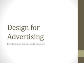
  • 1. Design for Advertising Developing, producing and evaluating
  • 2. Initial Ideas Idea 1 Designed to appeal to teenagers and young adults with a taste for the occult. Aimed at a younger crowd (about 15-20) who have more alternative tastes instead of enjoying mainstream things. More of a recreational drink than a sports recovery drink. Overall dark colour with shiny dots (stars) mixed in. Small highlights of colour, particularly in the logo to correspond each flavor. Regally styled Gothic logo that sets up a general theme and influence of a classic horror influence, werewolves. Wolf graphics that face the moon above the logo. Flavours: Lycan (Original) Blood Red (Cherry) Freerunner (Sugarfree) Idea 2 A drink marketed as a powerful recovery drink from strenuous tasks. Colour scheme of green and black for the original flavour, with the canā€™s colour changed according to the flavour. The canā€™s design is built up of lots of industrial elements, like bolted on panels and rust. These will show up as slightly shiny on the can. The logo is done with a very heavy and aggressive typeface and coloured black, with a grey stroke. Advertises with a lot of hard rock and metal bands to tie in with the heavy industrial theme. Flavours: Fury (Orange) Frenzy (Lemon) Fear (Apple) Full Throttle (Double Caffeine) Idea 3 A more relaxed drink marketed as organic and for an older crowd. Not aimed as a drink for sportsmen. Built up to be a recreational drink for summer. The name refers to the summer fruits used in the drink, like orange and blackcurrant. A white background with the writing and logo in a pinkish colour to tie in with the colour that is seen when closing your eyes in the sun, tying in further with the name. Can features a lot of smooth curvy lines to accent the design and also promote a free and unbound feeling. Advertises and promotes a lot of competitions to win holidays, outings and summer gear, promoting an outdoors lifestyle.
  • 3. Initial Ideas Idea 4 A drink that is marketed mainly around motorsport and car-related hobbies. Marketed mainly towards young men with a firm interest in cars. Can is red in colour to signify extreme speeds. All of the logos, writing and decals are in white. Logo has a speedometer dial above it displaying the fastest speed possible. Advertising features partnerships with motorsport events and hobby magazines, and their websites also offers tips and tutorials for car care, modification and repair. Fonts used will try to signify speed, by being slightly curved or leaning to one side. They could also be slightly wavy to resemble a checkered flag. Idea 5 Drink marketed for general sports recovery and aims at people who do professional sports and look up to famous sportsmen and women. Has a mostly silver colour scheme with white highlights to look like a trophy of sorts. The logo and text is in black. Mostly done with quite a classic and smart theme as opposed to gritty and distressed. Heavily involved with professional sports and sponsors many teams around the world. Also organizes their own events
  • 7. Copy/Script development 1. Darkstar / Full Moon Heavy connotations to the occult, werewolf mythos and links to the night, as well as astral themes. Darkstar as a name refers to the nocturnal and astral themes of this drink. - Shine Bright Tonight ā€“ Slogan used to interpret Darkstar as a drink that makes you light up or shine brighter as more energy is delivered than a regular energy drink. ā€˜Tonightā€™ links to the drinkā€™s nocturnal theme. - The Night Is Alive ā€“ ties into the drink being an energy/stimulation drink, delivering enough power to make the night feel alive. - Energy To Compose ā€“ Ties into the artistic and refined aspect of this drink, giving creative minds more energy to create new works of art. - For Your Nocturnal Side ā€“ Links to Darkstarā€™s alter ego theme (from the advert showing people transforming into wolves) and the theme of night. Advert Dev: Mentions of a dark character who provides the protagonists with Darkstar, a reference to the drinkā€™s mysterious nature that it is provided by spooky individuals.
  • 8. Font/Colour Scheme development Use this space to document your font and colour test. There should be lots of variety here. Ensure any font text are saved as images, otherwise I wonā€™t be able to see the fonts you intended.
  • 9. Font/Colour Scheme development Use this space to document your font and colour test. There should be lots of variety here. Ensure any font text are saved as images, otherwise I wonā€™t be able to see the fonts you intended.
  • 10. Font/Colour Scheme development Use this space to document your font and colour test. There should be lots of variety here. Ensure any font text are saved as images, otherwise I wonā€™t be able to see the fonts you intended.
  • 11. Font/Colour Scheme development Use this space to document your font and colour test. There should be lots of variety here. Ensure any font text are saved as images, otherwise I wonā€™t be able to see the fonts you intended.
  • 12. Product packaging development The second design was a lot different as it ditched the astral theme for a distressed classical feeling complete with the coat of arms. I designed the logo to wrap around the can horizontally. My first mockup kept Darkstarā€™s theme firmly rooted with space and stars. In the rightmost column would have been a space that informs consumers about Darkstar and what it sponsors.
  • 13. Product packaging development Another design similar to my second that is mocked up to celebrate Darkstarā€™s birthday. The large D in the centre column is highly reminiscent and inspired by the current Relentless logo. Variant of the above design that instead includes a diagonal logo across the coat of arms.
  • 14. Task 6: Advert Development I began my advert draft with a space-themed background to link to my chosen product name, Dark Star. I chose this particular image because I thought that the inclusion of the Earth at the bottom would make a nice footer and round off the image. Initially I had the name of the product and the tagline below the arrangement of the cans with my slogan, ā€˜Shine Bright Tonightā€™ above in a stylized font. I did this to replicate the look and feel of an old movie poster, where the font is similarly structured, which gave the advert quite a dramatic feel and also lead the viewerā€™s eyes onto the productā€™s name at the bottom after hyping them up using the tagline and background. With the cans in the middle, I arranged them so that the middle can (The original flavour) was in front of the others to represent its flagship status. Changes made in the second draft include swapping the positions of the tagline and brand name which allowed me to increase the size of both so that they became much more noticeable. An issue with the first draft was that the slogan was quite hard to make out, being a white font on a background with lots of white stars. I also managed to increase the size of the cans and add their respective names under each which raised brand awareness and allowed potential consumers to observe what flavours were sold before they purchased Dark Star. Finally, I added links to Dark Starā€™s official pages on both Facebook and Twitter which would be useful in spreading awareness about my drink and drawing in more consumers.
  • 15. Task 6: Advert Development In the next two advert drafts I went for a radically different design with a similar layout, this time adopting my auxiliary regal and medieval style for my energy drink. This theme included motifs such as the use of a large royal crest (taken from a dingbat collection) that served as the unofficial brand logo. I included this in the centre of the advert to show the most artistic aspect of the drink and entice customers thanks to its prominence and overly imposing appearance. I changed the slogan of the drink to, ā€˜The Official Drink of the Courtā€™ which further connotates it to a royal theme and gave the impression that it was a high quality beverage suitable for upper class individuals. Further changes in the fourth draft included a shift in the font colour to a more distinctive purple in order to stand out from the background, as opposed to the previous dull grey. I also reintroduced my idea of having three cans placed in the middle of the advert in order to promote the brandā€™s range, this time with the logo appearing in the background as an effective backdrop. I added in the web address at the bottom from my previous drafts.
  • 16. Task 6: Advert Development I then decided to start a new advert which didnā€™t follow my previous hierarchy of tagline, picture then name of the brand. In this new piece I tried to create an advert that properly connected to my drinkā€™s brand name and philosophy as well as the thinking behind it, and I did this by creating a star that seemed to shine down on the three drinks at the bottom of the page. The changes also include the removal of the two social media links (Facebook and Twitter) but I have kept the website as I believe it is an important part of an advert if there are no other links to the brandā€™s pages, as a website contains everything there is to say about the drink. I kept this advert mostly minimal, as opposed to my previous designs being quite busy and not easy on the eyes. It features a simple and smooth background that is intend to soothe the viewer and not wear them out by having an extremely detailed and heavy background that obscures key details. They star and the light beam is the key element in this advert as it directly leads down to the display of the brands three flavours on offer, and the logo of the brand itself. I have kept the logo at the bottom for most of my drafts because I think it is important that the thing that sticks with viewers after they leave the page should be the name of the product itself, so when they are next in a shop they can remember that name and recall the advert, hopefully being persuaded to purchase the drink in the process. I produced a second draft of this particular advert that removed the tagline at the very top and added stars in its place, as I believed that the advert was more effective with the text contained at the bottom as the viewer can gradually lead down to it via the light ray.
  • 17. Task 6: Final Advert
  • 18. Task 6: Advert Evaluation In this final piece I have used a range of aesthetic and technical qualities to produce the final result that is when compared to previous results, much more linked to my brand as a whole and does a better job at promoting the drink. The technical qualities used in this image are mainly usage of shadows, blurring and glows, particularly on the stars, to give them an authentic and almost ethereal look. I used Gaussian blur on the rectangle that cuts diagonally across the page to give it the appearance of a light ray coming from the star and also added outer glows to the cans below to give the impression that they were being illuminated by said ray. The beam also ties in to an aesthetic aspect as it is also used to direct the viewerā€™s eyes down onto the cans and the logo. In terms of aesthetics I have been inspired by a number of different sources. My main inspiration an existing energy drink is Relentless, which uses several similar styles and motifs to what I have included in my own work, particularly the usage of a old yet stylized font. I chose such a font because I wanted to aim my drink towards an alternative crowd and also try something different that didnā€™t necessarily coincide with todayā€™s standards of logo design, like using sans serif and simple yet effective blocky shapes. However, instead of following the Relentless logo fully I decided to go for a much more refined look and used a simple medieval styled font, lacking any of the curly lines around the Relentless logo that makes it almost resemble street art and graffiti, further demonstrating itā€™s appeal to young people and teenagers. My ad also uses lots of dark colours which highlights itā€™s appeal to the alternative crowd of which I am aiming for with this product.
  • 19. Task 6: Advert Evaluation I have also attempted to go for a house style that consists of three main fonts for certain elements. The aforementioned medieval font (Old London) is used strictly for the brand name, Verdana for small text and taglines, and Zapfino for my slogan, Shine Bright Tonight. The usage of Verdana helps to distinguish that Darkstar is a modern brand instead of a years old drink. This choice of font is quite common on several other drinks I researched including Rockstar, Relentless and Monster, which all feature distorted logos but with a refined tagline underneath that usually says ā€˜Energy Drinkā€™ to highlight what the product is. My choice of the astral theme and slogan is due to my idea of enlightenment ā€“ drinking Darkstar will help you focus and achieve your goals while also keeping you on your path. This is shown by my usage of the light ray to illuminate the drinks. Shine Bright Tonight gives consumers the idea that the drink is something that gives you an extra burst of energy, hence shining bright. Keeping with the dark and classically gothic theme my flavour names are also tied to this theme, with Dusk having links to the night-themed aspect (also linking to the slogan) and Sonata, as well as sounding quite refined and gothic, gives the drink an aspect that is similar again to Relentless, in that it helps with artistic endeavours. In terms of areas where I could further develop, I believe that this advert in particular could have used some more content in the upper areas, where aside from the stars it is quite empty. I experimented with several different slogans to put up there but in the end I decided that my slogan worked best when it was level to the cans at the bottom, where it was also able to sit nicely on the horizon of the background picture.
  • 20. Task 6: Advert Evaluation In terms of areas where I could further develop, I believe that this advert in particular could have used some more content in the upper areas, where aside from the stars it is quite empty. I experimented with several different slogans to put up there but in the end I decided that my slogan worked best when it was level to the cans at the bottom, where it was also able to sit nicely on the horizon of the background picture. I would also like to improve my usage of basic shape tools and beyond, as this piece uses some very simple geometric shapes for the star and the light beam. I would like to develop my skill in this primarily to create my own motifs for use in the media regarding the energy drink. An example of this would be the crest I use as the brandā€™s ā€˜officialā€™ logo, which is simply a dingbat pulled from a free collection. If I were to develop my shape skills I could possibly create my own logo for use in this project, which would improve upon my push towards an independent brand (that does not use simple and placeholder logos) and also improve my skill with Photoshopā€™s tools. To improve upon my skills I can study pictures of real life subjects that relate to mine and try to draw inspiration and draw them in Photoshop. A final point that I would like to Improve on is more connotation to my product. This is because a lot of my early drafts for the advert had no links to the name or style of my energy drink and instead had a simple classical theme applied. To work around this in the future I could brainstorm much more thoroughly before I attempt my drafts which will hopefully lead to a much more refined product that has a direction and goal and knows what it will look like at the end of the project.
  • 21. Task 6: Advert Evaluation What worked well with this advert was linking the colour scheme to both the font and the drink itself. I feel as if the the advert as a whole has a clear intended style that helps to tell audiences what the drink is aiming for and what kind of people is trying to appeal to, in this case the alternative crowd. On the other hand, I would have like to develop my visual elements more such as the star at the top and the cans themselves, which lack any sort of logo. Also, I think that the Darkstar logo itself could have worked much better if I had used a pattern as a clipping mask which would have enhanced depth and detail. Initially I was prepared to go with one of my second designs (the floral background with the coat of arms and ā€˜The official drink of the courtā€™ slogan) as my final piece, but I pushed myself and decided to create another draft from scratch which scrapped this hierarchy that had appeared in all my other drafts and instead start building up a new style, having the logo at the very bottom and the main element of the advert being the dark star itself. This push allowed me to create an advert that was very visually distinctive and didnā€™t look like a carbon copy of my other designs, and also allowed me to link my theme to the advert with much greater success.
  • 22. Task 7: Product Development ā€˜Darkstar Originalā€™ The first can draft is for Darkstarā€™s original flavour and is the most common can in the drinks range. I tried to achieve a house style using a combination of two bold colours and several small variations of these for accents and borders, in this case blue and gold (Originally white that become a pale gold through the use of a grunge texture) which gives the entire style quite an antiquated and classical theme that fits into Darkstarā€™s gothic style. What I like about this draft is the combination of colours used as they are unique and not seen on any current energy drinks, but at the same time are not too outlandish because of of that. I also like the cloudy sky backgrounds which while obscure gives the can a lot of depth and a dark, ominous flair. Couple with the grunge texture this makes the can look very antiquated and rustic. I included a shot of the can template without the grunge texture to show how much of a difference it makes and how the two are two very different styles that still tie into Darkstarā€™s theme. With the first design I tried to emulate the old design of Relentless with the vertically aligned text as I think this design makes the brand much more noticeable. However the second design is much more legible at first glance which increases the brandā€™s awareness as people can scan their eyes across the shelf, see the can and immediately know what the brand is called. I have tested design on a can template and the logo is partially obscured so that it cannot be seen completely from head on.
  • 23. The right side of the can is used to document Darkstar and what it is, using the brandā€™s theme to describe the drink in a creative way that would entice consumers. The line ā€˜see you through to sunriseā€™ implies that the drink delivers enough energy for you to stay up all night or an equal amount of time which appeals to the audience of people that buy these types of drinks for their caffeine and other supplements that provide lots of energy. To further compliment this I added ā€˜Charged With Taurineā€™ around the neck of the can which increases the visibility of this message. Underneath ā€˜are you brave enough to join our ranksā€™ I included links to the brandā€™s site as well as their social media profiles which, paired with the line, increases brand awareness as it invites people to ā€˜join their ranksā€™ by becoming a fan, which leads to more people knowing about the drink. Because the draft here represents the Original flavour, I decided to colour the background a dark blue to symbolize the brandā€™s trademark colours. Because of this when people see the original can they can link it back to using the original colours, so when they see something else that is Darkstar related they can make connections based on the colours used.
  • 24. Task 7: Product Development ā€˜Darkstar 10 Year Anniversary Editionā€™ I created a silver and blue themed anniversary edition to go alongside my original flavour. What I like about this design is the choice of colours and the emphasis on the brandā€™s logo, with the full name of the drink at the side to give way to the motif and a paragraph explaining the occasion. In the second image I moved said motif into the top right so that the can resembles the original packaging a little more while still being very distinctive. I have created the special packaging by using a floral patter as the background which makes the drink look quite shiny and distinctive. The blue colour used is the same blue from the original flavour to keep consistency. I imagined that the floral pattern would have a frosted effect on a real can which would shine under light, and highlight the brandā€™s logo and text. Because this particular can does not have Darkstarā€™s signature dark background I have emphasised the logos more so than other cans, especially the D of Darkstar, which features on the main face. I placed the crest behind the D which gives it a very bold appearance. This is so anyone including people who are not fans of the drink can recognize it on a shelf. I prefer the first design because it allows the anniversary text and logo to be emphasised more and ties in to the main theme of this variety, as well as looking much more striking when printed on a can.
  • 25. The anniversary edition contains a small paragraph underneath the enlarged logo which mentions how long the brand has been producing drinks, which helps veteran consumers of Darkstar to connect and relate. As well as this, I have placed the social media links under the paragraph so that any newcomers to the drink have a quick link to check out the drinkā€™s website/social media page and educate themselves about the drink and its history. The line, ā€˜ten years of shining brightā€™ directly ties into the drinkā€™s official slogan, ā€˜shine bright tonightā€™ so that anyone who is aware of the slogan will be able to make the connection. I decided to add the single D initial against an enlarged coat of arms to symbolize that this can was celebrating an achievement for Darkstar, as this logo gives the can a very bold and confident appearance. For easy recognition though I have kept the original vertical logo, although pushed to the right to make way for the specific anniversary text.
  • 26. Task 7: Final Packaging
  • 27. Task 7: Packaging Evaluation My final can design represents the original and most common flavour of Darkstar, and to link this to the design itself, I have used a combination of the brandā€™s typically used colours along with several other motifs. My reasoning behind using such colours was that because this flavour is considered the flagship of the brand, it would need to be easily recognizable on a shelf for consumers to see, and using the brandā€™s default colours would mean that people who have seen any other advertising material regarding Darkstar before would be able to instantly make the connection between that prior knowledge and the drink on the shelf. The motif below the logo itself that tells us what the flavour of the drink is, is on the front side and extremely visible for maximum exposure. The aesthetics in which I have done well in have been the colour choices and the positioning of all of the elements on the template. The aforementioned default colours (dark blue and a rustic gold) together create a very antiquated and worn appearance that gives the feeling of a drink from a bygone age. The group that I aimed towards, the steampunk and gothic subcultures are heavily involved with a retro themed styling that includes elements drawn from the Victorian era and before. I have tried to emulate this in my canā€™s packaging with the usage of the main font for my font for the logo that resembles Medieval text and not something that could be considered modern (as most fonts popular today are sans serif or minimalist typefaces.) Gold was a very important colour in the creation of this style as it is the most prevalent colour in steampunk culture, representing wealth and the upper class. These cultures that I have appealed to could also be described as dark and underground and not necessarily jolly or cheerful, which is the reasoning for my choice of dull and weathered textures, achieved through the use of a grunge texture. The grunge represents the passage of times as these cultures draw on influences from real life cultures that existed hundreds of years ago. As well as these cultural connotations the grunge was used to add depth to my can design which features a cloudy blue sky background as the backdrop for the packaging which gives the entire packaging a dark and gloomy feeling.
  • 28. Task 7: Packaging Evaluation As well as these cultural inspirations I have also drawn upon several other energy drinks to create my own style. In particular, my main influence in this regard was Relentless, a similar energy drink in that it is marketed to an ā€˜undergroundā€™ audience, with the difference being that the drink is heavily linked to music and music events through advertising and sponsorship. The key elements I drew from their packaging included the vertical logo on the front of the packaging (Which I used to increase the visibility of the brand name) and the placing of the name of the flavour beneath said logo. Another key elements was Relentlessā€™ use of a very detailed and obscure background which gives the can a lot of depth and detail when compared to a blank can. I tried to emulate something like this with my gloomy sky backdrop and accompanying grunge texture. In addition to this I have also drawn inspiration from their logo itself, particularly the use of a stylized, ā€˜classicā€™ font but have not included their use of many wave lines and accents which was intended to emulate street art of graffiti as this was not the culture I was aiming for. Finally, the new Relentless logo includes just the ā€˜Rā€™ of the logo and I have included something like this for the side panel of my can above the introduction to the drink and against an enlarged ornament used as my emblem. This is a motif that was used to show that just the first initial of Darkstar can mean that it is recognized by consumers simply because of how prominent and unique the font is, as is the same with Relentless. I was also prepared to have my alternate flavours keep the style of the original can but with a different coloured background so that the cans when lined up would have a strong brand unity (seen in the first picture below.) One thing I did try to avoid influencing from Relentless and other brands was the sponsorship they do, as I wanted my drink to retain the same ā€˜undergroundā€™ and independent feeling of the cultures it markets towards.
  • 29. Task 7: Packaging Evaluation In a technical aspect, my product has used a range of techniques to achieve the final piece including colour overlays, opacity modifying, warping and image modification. The background in particular was achieved by taking a normal picture of the night sky and overlaying it with a grunge texture, and then altering the opacity of said texture to blend the two images together. I went for this approach to avoid making the backdrop too much in focus and detracting from the other elements of the packaging, as well as creating a nice combined background that fits in with my drinkā€™s style and creates the ominous atmosphere that it is known for. Usage of this grunge texture also allowed me to swap the text colour from a bright white to the weathered gold that is present on the final piece which avoided a lengthy process of using clipping masks for such a purpose. I also used the opacity tool to allow the ornaments behind the logos to blend in well and not obscure the logo while still remaining visible. The logo for Darkstar itself uses a combination of a drop shadow and the emboss tool gives it more of a three dimensional look instead of appearing flat on the packaging. The box containing the name of the flavour uses two ornaments, one flipped to accents the sides of It and increase detail.
  • 30. Task 7: Packaging Evaluation In terms of opportunities for further improvement and modification of my images, I would primarily like to start creating some of my own original motifs instead of using sets that are available for free online. Being able to accomplish this will move me further towards independence and will allow me to produce a piece of work that is up to professional standards. One of my attempts at an original logo (shown here) is built to directly tie into the regal and classy theme I have built up for my can and also resembles a logo that can easily take the place of my default coat of arms ornament that is used to compliment my logo. Again I have been influenced by Relentless slightly by using the initial of my brand name and stylizing it, albeit In a much different fashion when compared to the Relentless logo. When using the original ornament, I sheared off part of the bottom so that it would fit onto my can better and keep the symmetry with the rest of the elements. The original ornament used. An original logo I created to replace it. Relentless logo for comparison The sheared logo in my final design. If I were to repeat this project I would likely create more original logos which vary in style and compare them for use in the final piece instead of keeping with a free and generic ornament available on the internet.
  • 31. Task 7: Packaging Evaluation Another element I would like to improve on is my spacing and positioning of each elements and how I can vary them. My final design is very geometric ā€“ everything is aligned horizontally or vertically ā€“ and there is not much that could be consider this design flared or wavy. What I would like to try as an alternative design would be something that has the Darkstar logo aligned diagonally or otherwise. This would increase the designā€™s creative and technical appeal and also allow me to experiment with something that isnā€™t defined by straight lines and boxes. While I do consider my ingredients list effective and fit for purpose I would have liked to have taken the time to create a unique recipe for Darkstar by choosing my own ingredients instead of lifting the ingredients and nutritional information directly from Monster. I would have liked to do this because I believe detail is very important and my work falls slightly short because of this.
  • 32. Task 7: Packaging Evaluation When talking about the planning and development process of my can design I believe that where I succeeded was the combination of grunge and background which affected the design as a whole, bringing my theme to life and helping to distinguish it from a test draft. Although my layout has remained mostly the same the difference that can be made is how my final piece feels like it was made over a hundred years ago, which is the entire point of the theme and audience I have tried to appeal towards. The colour choices of my final design are also much more refined and the choice of two main colours means that the entire design works together and doesnā€™t feel mismatched thanks to loads of different colours. Above is one of the test drafts and to the right is the final piece. I have also been able to account for the space to the right that was left empty in the preliminary draft as I did not know how to fill it, and instead planned to include a history of the drink and a list of the available flavours in the range. In the final piece I scrapped this idea and used the space to briefly explain ā€“ albeit poetically ā€“ what Darkstar was about and concluded it with links to the brandā€™s social media pages and their official website. I chose to put the social media links here because the assumption was that if someone is willing to learn more about Darkstar and becomes curious, they will pick up the can and turn it around to this side where the links can be found, prompting them to indulge themselves further and visit Darkstarā€™s pages to learn more.
  • 33. Task 7: Packaging Evaluation On the other hand, the areas of development where I could have developed more would have to be the variation in my designs and the elements involved. When comparing one of my initial drafts to the final product it is easy to see that almost everything is in the same place and orientation. I would have liked to experiment more with different layouts, particularly ones that have elements that are not aligned horizontally or vertically, instead being on a diagonal alignment to create an interesting layout. This was something I experimented with on one of my preliminary designs and I would like to implement this if I repeated this project. Also, I would have liked to have experimented with several different background choices for my design. I did have two distinct choices when drafting the can, an astral theme and a more upper class style that incorporated a patterned background and more lighter colours, which was used for my anniversary can. In the future I would like to try out more styles so that I have a bigger choice when preparing to make my final piece.
  • 34. Task 8: Web Banner Development With the leaderboard banner I started with a simple design that primarily intended to pull people in with the dramatic ā€˜itā€™s hereā€¦ā€™ tagline, that is announcing a new flavour in the Darkstar range. I later used colour overlay to change the colour of the cans to match the background used in this banner, and added a contour effect to the tagline to make it look more 3D. I have also used a grunge texture to give the gradient background a rougher and more detailed edge. Later I tried a more centred logo that still promoted the same drink but with a different and more fitting slogan, as well a custom logo. I experimented with positioning of the logo on the right.
  • 35. Task 8: Web Banner Development I created several other web banners that were a little larger and thus allowed me to experiment more. The first draft was akin to my very first drafts for my magazine advert, following a very similar layout but this time having Darkstarā€™s now default colours and grungy styling. I like this design for the colours and the feeling of it but dislike it for following the same formula as previous attempts. I then decided to use the astral theme of my drink to a greater extent and used a similar element to my final advert, as well as a star background that greatly enhances the imageā€™s detail and allows viewers to know what the theme of the drink Is.
  • 36. Task 8: Web Banner Development I developed my previous banner idea by animating it, showing the rays of the star gradually lighting up both of the cans and having the logo slowly appear. I improved on this by adding a second frame that had the opacity at 25% to allow for a smoother transition. To the right, I went for a square advert that I kept simple in hierarchy but I think that it is still very effective with the large star situated behind the row of cans. This time I have included the Darkstar initial so that the brand is much more represented then previous attempts. This banner is also much more dominating in appearance thanks to the size of the star and the cans helping to make it stand out more.
  • 37. Task 8: Final Web Banner
  • 38. Task 8: Web Banner Evaluation I chose this web banner as my final piece because I believe that it is the most striking and appealing of all my experiments in this section. I say this particularly for the inclusion of the large moon that is placed behind the cans which acts as a backdrop against the stars and pulls in viewers thanks to its position and size. Because Darkstar is related in name and in theme to stars this will allow consumers to make the connection between the advert and brand instantly. This is also supported by the inclusion of the Darkstar initial in the centre of the star. In terms of the aesthetic quality, I tried to position the cans so that it resembled figures looking out towards the moon on a hill, which adds a sense of scale to the image and ties it in to my theme of enlightenment. My inspiration for this particular image was the common pose of standing in front of a moon, creating a very distinctive silhouette. I didnā€™t place my cans directly in front of the star, my reasoning being to give the illusion that the cans were ground and the star was shining above them. I added the night sky in the background and used the opacity tool to lighten it so that it wasnā€™t too dominating and created a nice backdrop which fit the theme the banner was putting across. I used a row of all the available flavours of Darkstar so that anyone who is new to the brand instantly knows what is on offer and whether or not the flavours appeal to them.
  • 39. Task 8: Web Banner Evaluation The technical qualities of my work included use of the blur tool, the outer glow tool and saturation modifying to achieve my final result. The cans are all derived from my original can but have been made to look like other flavours by altering the hue of the image, resulting in a row of different flavours that keep the same design. For the star, I used a simple ellipse and gave it a large outer glow that gave the impression of luminosity, typical with large stars. I used a combination of Gaussian blur and opacity to achieve the background used in this banner. First beginning with a gradient I then added the background of stars over it and toned the opacity down, before using Gaussian blur to make the two images blend together. I did this so that the stars were not too dominating in the image and that I wanted them to stay in the background, hence making them visible but not standing out too much. The ways I could improve this image in a technical sense would be to create some more complicated shapes instead of taking them from the internet. For example, I could have added some light rays to illuminate each can, or I could have added a solid terrain for the cans to stand on instead of floating beneath the star.
  • 40. Task 8: Web Banner Evaluation Considering where I can develop my web banner, I would like to try creating some unique hierarchy instead of following the simple can and title that has been a staple of most of my advertisements. My theme is a bit difficult to adapt for something other than having the star positioned high but if I was to repeat this project I would try and experiment with having the star further down and creating the advert around it, which would lead to some more interesting layouts and untimely a better product at the end. I would also like to experiment with combining both my astral theme and classical theme into one advert, experimenting with different motifs and layouts to ensure a much better end product. In the planning aspect of this task I feel as if going back and trying lots of different styles worked well, by beginning with simple leaderboard shaped banners and progressing onto rectangular adverts. This allowed me to explore a lot of different techniques and ideas and lead me on to find what I believed was my preferred style in the end. What didnā€™t work as well during planning however was relegating myself to the same hierarchy from my magazine advert in the final piece when I could have tried something more stylish and experimental. If I was to repeat this task I would try out a lot of new styles and layouts to ensure that I end up with a striking and unique final piece that does not feel like a carbon copy of my other attempts.
  • 41. Task 9: Storyboard Development My first draft utilizes a heroic theme with the wolf jumping the crevasse. This was done to emphasize the power that Darkstar supposedly holds and make it appealing to a crowd that wants a drink with a lot of energy delivery. The boy turning into a wolf also connotates to Darkstarā€™s social media campaign, ā€˜are you brave enough to join our ranks?ā€™
  • 42. Task 9: Storyboard Development The second attempt, which has the same premise, takes on a more mystical theme with the wolves circling the fountain, an element that ties into Darkstarā€™s mystery and gloomy-centric advertising. In the right image I improved my final frame to include more detail about how the advert ends. It went through several revisions such as changing the Darkstar logo to glow yellow and having the wolves turn to face the viewer at the very end, before it cut out. This was replaced with the more subtle eyes glowing in the background. I am using this one as my final piece.
  • 43. Task 9: Storyboard Development My third storyboard has the same transformation concept that involves someone drinking Darkstar and becoming a wolf of the night. This time it involves a man defending his home from a zombie attack. It doesnā€™t involve any blood or gore to avoid troubles with the ASA but does feature a some cartoon violence, and a very ominous and scary atmosphere that would make it unsuitable for young viewers. This storyboard retains the third and sixth panels from the first draft and features a similar setting, a house in the middle of a dark, stormy forest. I feel as if this advert is more climatic than the other two drafts as it has more of a perilous situation that is solved by drinking Darkstar.
  • 44. Task 9: Storyboard Evaluation My final piece features a transformation story that links into one of Darkstarā€™s main slogans, ā€˜For Your Nocturnal Sideā€™ which links to the drinkā€™s night theme and how it urges you to join their ranks in some of the advertising. I chose the transformed animal to be a wolf so that it fits in with the traditional werewolf myth, replacing the full moon with a can of Darkstar. What I feel went well with my storyboard development was the use of most of Darkstarā€™s themes to create a coherent story, such as the night, werewolves and the aforementioned transformation. Because of this I believe that my final storyboard is fit for purpose, however I believe that I could improve it by connotating more with Darkstarā€™s colours and styles in the imagery.
  • 45. Task 9: Storyboard Evaluation You should evaluate your final piece. Are there opportunities for further development of your work? Are your final pieces are fit for purpose? What areas of planning and development worked well? What areas of planning and development could have done with more work? What effect did you think your development stages had on the final product? You should present your evaluation using a mixture of text and images. You should use images of existing products for comparison.
  • 46. Task 9: Storyboard Evaluation You should evaluate your final piece. Are there opportunities for further development of your work? Are your final pieces are fit for purpose? What areas of planning and development worked well? What areas of planning and development could have done with more work? What effect did you think your development stages had on the final product? You should present your evaluation using a mixture of text and images. You should use images of existing products for comparison.
  • 47. Task 9: Storyboard Evaluation You should evaluate your final piece. Are there opportunities for further development of your work? Are your final pieces are fit for purpose? What areas of planning and development worked well? What areas of planning and development could have done with more work? What effect did you think your development stages had on the final product? You should present your evaluation using a mixture of text and images. You should use images of existing products for comparison.
  • 48. Task 9: Storyboard Evaluation You should evaluate your final piece. Are there opportunities for further development of your work? Are your final pieces are fit for purpose? What areas of planning and development worked well? What areas of planning and development could have done with more work? What effect did you think your development stages had on the final product? You should present your evaluation using a mixture of text and images. You should use images of existing products for comparison.