The document discusses typography styles used in digipaks for the progressive house music genre. It analyzes typography elements in a mood board of progressive house album covers. Common styles identified include capital, bold or thin fonts with sharp edges. Exceptions include more creative fonts used by Avicii. Typography is a significant design element as it often replaces visuals. Font colors usually contrast the background. The document also explores specific fonts suited to the genre from the website dafont.com and examples applying song titles. It examines using both bold and creative fonts to represent the genre while making the design eye-catching.
Тема №2 Расширяем сознание реактивным подходом. RxJava и Android
Спикер — Владимир Артеменко — android developer Компания Rooky Pro
Уровень аудитории — Теория есть, начальный опыт применения
Цель доклада – Обучение
Francesca Gottschalk - How can education support child empowerment.pptxEduSkills OECD
Francesca Gottschalk from the OECD’s Centre for Educational Research and Innovation presents at the Ask an Expert Webinar: How can education support child empowerment?
Welcome to TechSoup New Member Orientation and Q&A (May 2024).pdfTechSoup
In this webinar you will learn how your organization can access TechSoup's wide variety of product discount and donation programs. From hardware to software, we'll give you a tour of the tools available to help your nonprofit with productivity, collaboration, financial management, donor tracking, security, and more.
Operation “Blue Star” is the only event in the history of Independent India where the state went into war with its own people. Even after about 40 years it is not clear if it was culmination of states anger over people of the region, a political game of power or start of dictatorial chapter in the democratic setup.
The people of Punjab felt alienated from main stream due to denial of their just demands during a long democratic struggle since independence. As it happen all over the word, it led to militant struggle with great loss of lives of military, police and civilian personnel. Killing of Indira Gandhi and massacre of innocent Sikhs in Delhi and other India cities was also associated with this movement.
Read| The latest issue of The Challenger is here! We are thrilled to announce that our school paper has qualified for the NATIONAL SCHOOLS PRESS CONFERENCE (NSPC) 2024. Thank you for your unwavering support and trust. Dive into the stories that made us stand out!
Model Attribute Check Company Auto PropertyCeline George
In Odoo, the multi-company feature allows you to manage multiple companies within a single Odoo database instance. Each company can have its own configurations while still sharing common resources such as products, customers, and suppliers.
Instructions for Submissions thorugh G- Classroom.pptxJheel Barad
This presentation provides a briefing on how to upload submissions and documents in Google Classroom. It was prepared as part of an orientation for new Sainik School in-service teacher trainees. As a training officer, my goal is to ensure that you are comfortable and proficient with this essential tool for managing assignments and fostering student engagement.
A Strategic Approach: GenAI in EducationPeter Windle
Artificial Intelligence (AI) technologies such as Generative AI, Image Generators and Large Language Models have had a dramatic impact on teaching, learning and assessment over the past 18 months. The most immediate threat AI posed was to Academic Integrity with Higher Education Institutes (HEIs) focusing their efforts on combating the use of GenAI in assessment. Guidelines were developed for staff and students, policies put in place too. Innovative educators have forged paths in the use of Generative AI for teaching, learning and assessments leading to pockets of transformation springing up across HEIs, often with little or no top-down guidance, support or direction.
This Gasta posits a strategic approach to integrating AI into HEIs to prepare staff, students and the curriculum for an evolving world and workplace. We will highlight the advantages of working with these technologies beyond the realm of teaching, learning and assessment by considering prompt engineering skills, industry impact, curriculum changes, and the need for staff upskilling. In contrast, not engaging strategically with Generative AI poses risks, including falling behind peers, missed opportunities and failing to ensure our graduates remain employable. The rapid evolution of AI technologies necessitates a proactive and strategic approach if we are to remain relevant.
June 3, 2024 Anti-Semitism Letter Sent to MIT President Kornbluth and MIT Cor...Levi Shapiro
Letter from the Congress of the United States regarding Anti-Semitism sent June 3rd to MIT President Sally Kornbluth, MIT Corp Chair, Mark Gorenberg
Dear Dr. Kornbluth and Mr. Gorenberg,
The US House of Representatives is deeply concerned by ongoing and pervasive acts of antisemitic
harassment and intimidation at the Massachusetts Institute of Technology (MIT). Failing to act decisively to ensure a safe learning environment for all students would be a grave dereliction of your responsibilities as President of MIT and Chair of the MIT Corporation.
This Congress will not stand idly by and allow an environment hostile to Jewish students to persist. The House believes that your institution is in violation of Title VI of the Civil Rights Act, and the inability or
unwillingness to rectify this violation through action requires accountability.
Postsecondary education is a unique opportunity for students to learn and have their ideas and beliefs challenged. However, universities receiving hundreds of millions of federal funds annually have denied
students that opportunity and have been hijacked to become venues for the promotion of terrorism, antisemitic harassment and intimidation, unlawful encampments, and in some cases, assaults and riots.
The House of Representatives will not countenance the use of federal funds to indoctrinate students into hateful, antisemitic, anti-American supporters of terrorism. Investigations into campus antisemitism by the Committee on Education and the Workforce and the Committee on Ways and Means have been expanded into a Congress-wide probe across all relevant jurisdictions to address this national crisis. The undersigned Committees will conduct oversight into the use of federal funds at MIT and its learning environment under authorities granted to each Committee.
• The Committee on Education and the Workforce has been investigating your institution since December 7, 2023. The Committee has broad jurisdiction over postsecondary education, including its compliance with Title VI of the Civil Rights Act, campus safety concerns over disruptions to the learning environment, and the awarding of federal student aid under the Higher Education Act.
• The Committee on Oversight and Accountability is investigating the sources of funding and other support flowing to groups espousing pro-Hamas propaganda and engaged in antisemitic harassment and intimidation of students. The Committee on Oversight and Accountability is the principal oversight committee of the US House of Representatives and has broad authority to investigate “any matter” at “any time” under House Rule X.
• The Committee on Ways and Means has been investigating several universities since November 15, 2023, when the Committee held a hearing entitled From Ivory Towers to Dark Corners: Investigating the Nexus Between Antisemitism, Tax-Exempt Universities, and Terror Financing. The Committee followed the hearing with letters to those institutions on January 10, 202
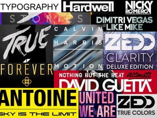
2. The mood board above has been focused on various digipak front covers which have included a use of typography in order to write the artists/bands name and album title. The mood board has
been focused on Progressive House genre which I will also reflect in my digipak. From the mood board I have concluded that the vast variety of Progressive House artists have used similar font
style which I consider to be typical for the genre. The set typography style for Progressive House mainly includes capital, sharp edged fonts that are either bold or thinner depending on the
information they give and their importance. On the other hand, we have exceptions which can be seen mainly on Avicii’s digipaks where the fonts used have a more creative and abstract
approach which I might consider using in my digipak creation. Within the Progressive House genre typography is a significant element of the digipak due to its mainly replacing any visuals on
the background therefore causing the typography to be the main visual interest. Within the mood board we can notice that the font colour mainly contrasts with the background colour in order
to make the text easy to read. The colours are mainly delicate for the eye in order to make the digipak pleasing to look at therefore this is something which I will consider within my making.
Considering the stereotypic typography styles I have researched a famous typography website ‘dafont.com’ which provided me with such font styles visible below:
FONT REFERENCE : 1) Bebas Neue, 2) Lemon Milk, 3) Big
Noodle Titling, 4) American Captain, 5) Built Titling, 6)
Palm Beach, 7) Abovea 8) Mad Rats, 10) Flamingo
On the left I portray my chosen font styles which I believe fit into the
Progressive House typography style. I have chosen a variety of bolder fonts
varying form sharp to curved edges as well as a more creative approach
which can be visible in the Palm Beach font. I have chosen each of the fonts
and applied the “Beautiful Now” song title as an example in order to gain an
insight on how the fonts differ from eachother. My attention has been
caught especially by the Bebas Neuefont as well as Built Titling, Palm Beach
as well as Abovea fonts which I will consider implementing into my final
product. In my final digipak I will consider using both bold as well as creative font styles in order to fulfil the need for both font styles
by which I believe I will make my digipak follow the conventions of Progressive House digipaks as well as make my product eye-
catching. Looking back at my mood board I have noticed that within the digipaks a typography overlay has been used in the form of
Logo creationLooking back at my artist logo creation, I have at first research already existing artists logo which can be seen on the image to
the left where I have concluded that the use of bold text, sharp angles and geometrical shapes is used. As a result of this I have
taken on inspiration and placed such elements into my own logo creation based on “Neo” as the artist name. The final product
can bee seen to the right, where all of the elements found within my research have been placed forward into making. While
researching already existing logos I have found that Progressive House artists mainly included
bold text which allowed for easy recognition of the logo from a far distance. As a result of this I
have chosen to go with font which is sharp, bold and contrasts with the bright background by
applying a black colour to it. In order to reflect the use of geometrical shapes within the
Progressive House we have constructed a background which consists of two overlapping
triangles. One of the triangles is filled in with bright red colour which reflects the dynamic
nature of the youth our music genre is focused on and their party/social life. On the other
hand, to reflect the surreal element which is mainly portrayed throughout the music videos
we have applied a cloud overlay to the other triangle. Overall the composition has a good
contrast which makes the artists name clearly stand out within the logo by which I believe it is
really effective.
colour, texture or image which suits the dynamic nature of Progressive House. As a result of this I would choose to further develop my fonts within my construction to experiment with various
colour combinations, textures as well as image overlay in order to effectively represent the Progressive House genre.
FONT REFERENCE : 1) Amethyst,
2)Basic Title, 3)Dolce Vita, 4)Neou
Within my research I have come across various digipaks
from Progressive House genre that use both bold and a
thinner font depending on the importance of the text.
As a result of this I have research the website ‘dafont.com’
to find potential fonts. On the left I portray the fonts which I
have found suitable for my digipak.
I believe they are suitable due to them being thin and portraying sharp edges
therefore following the same style from my logo as well as the bolder font.