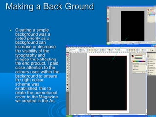
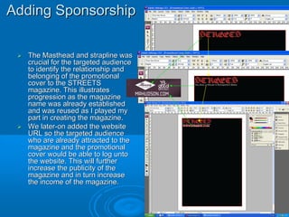
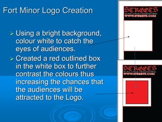
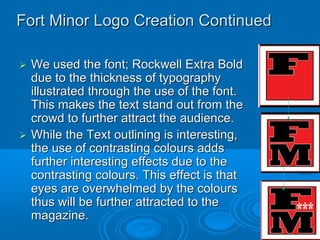
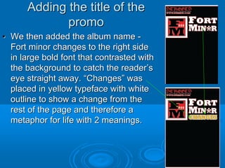
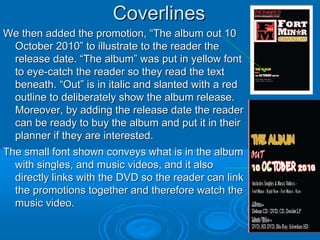
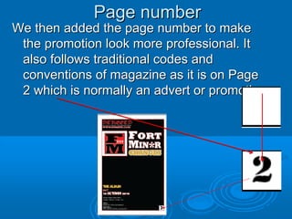
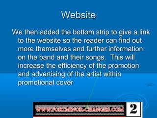
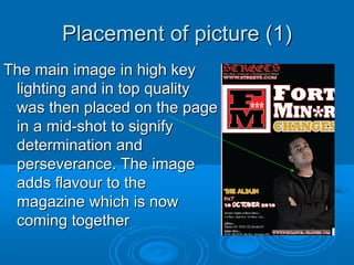
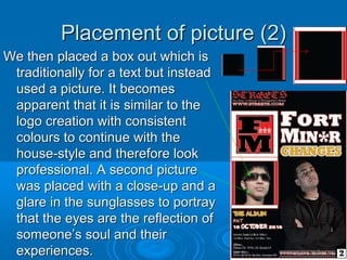
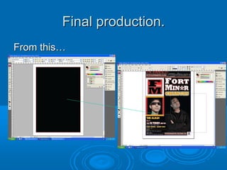
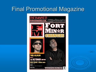
1. Promotional Cover
We will be using the following programs: Adobe In Design CS3 and
Adobe Photoshop CS3.
We will create my Promotional Cover within Indesign and will edit
images within Photoshop.
We will be doing this to show progression in my work, ideas, technology
and skills.
BY
Judah Chandra
Muhammad Zeeshan
Mohammed Zafraan
2. Making a Back Ground
Creating a simple
background was a
noted priority as a
background can
increase or decrease
the visibility of the
typography and
images thus affecting
the end product. I paid
close attention to the
colours used within the
background to ensure
the right colour
scheme was
established, this to
relate the promotional
cover to the Magazine
we created in the As.
3. Adding Sponsorship
The Masthead and strapline was
crucial for the targeted audience
to identify the relationship and
belonging of the promotional
cover to the STREETS
magazine. This illustrates
progression as the magazine
name was already established
and was reused as I played my
part in creating the magazine.
We later-on added the website
URL so the targeted audience
who are already attracted to the
magazine and the promotional
cover would be able to log unto
the website. This will further
increase the publicity of the
magazine and in turn increase
the income of the magazine.
4. Fort Minor Logo Creation
Using a bright background,
colour white to catch the
eyes of audiences.
Created a red outlined box
in the white box to further
contrast the colours thus
increasing the chances that
the audiences will be
attracted to the Logo.
5. Fort Minor Logo Creation Continued
We used the font; Rockwell Extra Bold
due to the thickness of typography
illustrated through the use of the font.
This makes the text stand out from the
crowd to further attract the audience.
While the Text outlining is interesting,
the use of contrasting colours adds
further interesting effects due to the
contrasting colours. This effect is that
eyes are overwhelmed by the colours
thus will be further attracted to the
magazine.
6. Adding the title of the
promo
• We then added the album name -
Fort minor changes to the right side
in large bold font that contrasted with
the background to catch the reader’s
eye straight away. “Changes” was
placed in yellow typeface with white
outline to show a change from the
rest of the page and therefore a
metaphor for life with 2 meanings.
7. Coverlines
We then added the promotion, “The album out 10
October 2010” to illustrate to the reader the
release date. “The album” was put in yellow font
to eye-catch the reader so they read the text
beneath. “Out” is in italic and slanted with a red
outline to deliberately show the album release.
Moreover, by adding the release date the reader
can be ready to buy the album and put it in their
planner if they are interested.
The small font shown conveys what is in the album
with singles, and music videos, and it also
directly links with the DVD so the reader can link
the promotions together and therefore watch the
music video.
8. Page number
We then added the page number to make
the promotion look more professional. It
also follows traditional codes and
conventions of magazine as it is on Page
2 which is normally an advert or promotion
9. Website
We then added the bottom strip to give a link
to the website so the reader can find out
more themselves and further information
on the band and their songs. This will
increase the efficiency of the promotion
and advertising of the artist within
promotional cover
10. Placement of picture (1)
The main image in high key
lighting and in top quality
was then placed on the page
in a mid-shot to signify
determination and
perseverance. The image
adds flavour to the
magazine which is now
coming together
11. Placement of picture (2)
We then placed a box out which is
traditionally for a text but instead
used a picture. It becomes
apparent that it is similar to the
logo creation with consistent
colours to continue with the
house-style and therefore look
professional. A second picture
was placed with a close-up and a
glare in the sunglasses to portray
that the eyes are the reflection of
someone’s soul and their
experiences.
12. Magazine Title/strapline/website
An image of the city was then added as well as a
circular red underline to emphasize the top
strip.
The image is that of the city and links with the
title, “Streets” and this is the title placed into
reality to help the reader engage with the
magazine and therefore more likely to read
more.