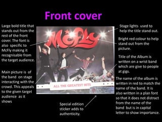
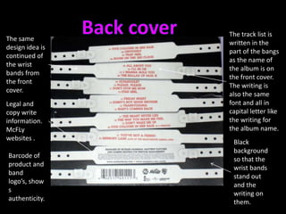
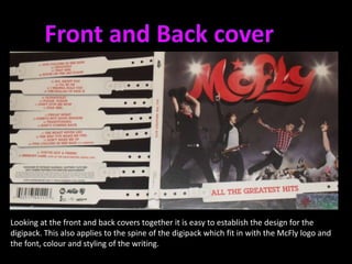
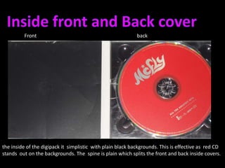
Digipack research- existing product analysis
McFly- All the great hits album
Front coverLarge bold title that stands out from the rest of the front cover. The font is also  specific to McFly making it recognisable from the target audience.Stage lights  used to  help the title stand out.Bright red colour to help stand out from the picture.Title of the Album is written on a wrist band  which are give to people at gigs.Main picture is  of the band  on stage interacting with the crowd. This appeals to the given target audience  as it shows The name of the album is written in red to match the name of the band. It is also written in a plan font so that it does not distract from the name of the band  but is in capital letter to show importance.Special edition sticker adds to authenticity.
Back coverThe track list is written in the part of the bangs as the name of the album is on the front cover. The writing is also the same font and all in capital letter like the writing for the album name.The same design idea is continued of the wrist bands from the front cover.Legal and copy write information.McFLy websites .Black background so that the wrist bands stand out and the writing on them.Barcode of product and band logo’s, shows authenticity.
Front and Back coverLooking at the front and back covers together it is easy to establish the design for the digipack. This also applies to the spine of the digipack which fit in with the McFly logo and the font, colour and styling of the writing.
Inside front and Back coverFront 					backthe inside of the digipack it  simplistic  with plain black backgrounds. This is effective as  red CD stands  out on the backgrounds. The  spine is plain which splits the front and back inside covers.

Digipack analysis McFly

  • 1.
  • 2.
    McFly- All thegreat hits album
  • 3.
    Front coverLarge boldtitle that stands out from the rest of the front cover. The font is also specific to McFly making it recognisable from the target audience.Stage lights used to help the title stand out.Bright red colour to help stand out from the picture.Title of the Album is written on a wrist band which are give to people at gigs.Main picture is of the band on stage interacting with the crowd. This appeals to the given target audience as it shows The name of the album is written in red to match the name of the band. It is also written in a plan font so that it does not distract from the name of the band but is in capital letter to show importance.Special edition sticker adds to authenticity.
  • 4.
    Back coverThe tracklist is written in the part of the bangs as the name of the album is on the front cover. The writing is also the same font and all in capital letter like the writing for the album name.The same design idea is continued of the wrist bands from the front cover.Legal and copy write information.McFLy websites .Black background so that the wrist bands stand out and the writing on them.Barcode of product and band logo’s, shows authenticity.
  • 5.
    Front and BackcoverLooking at the front and back covers together it is easy to establish the design for the digipack. This also applies to the spine of the digipack which fit in with the McFly logo and the font, colour and styling of the writing.
  • 6.
    Inside front andBack coverFront backthe inside of the digipack it simplistic with plain black backgrounds. This is effective as red CD stands out on the backgrounds. The spine is plain which splits the front and back inside covers.