The document discusses key elements used in print and radio advertisements.
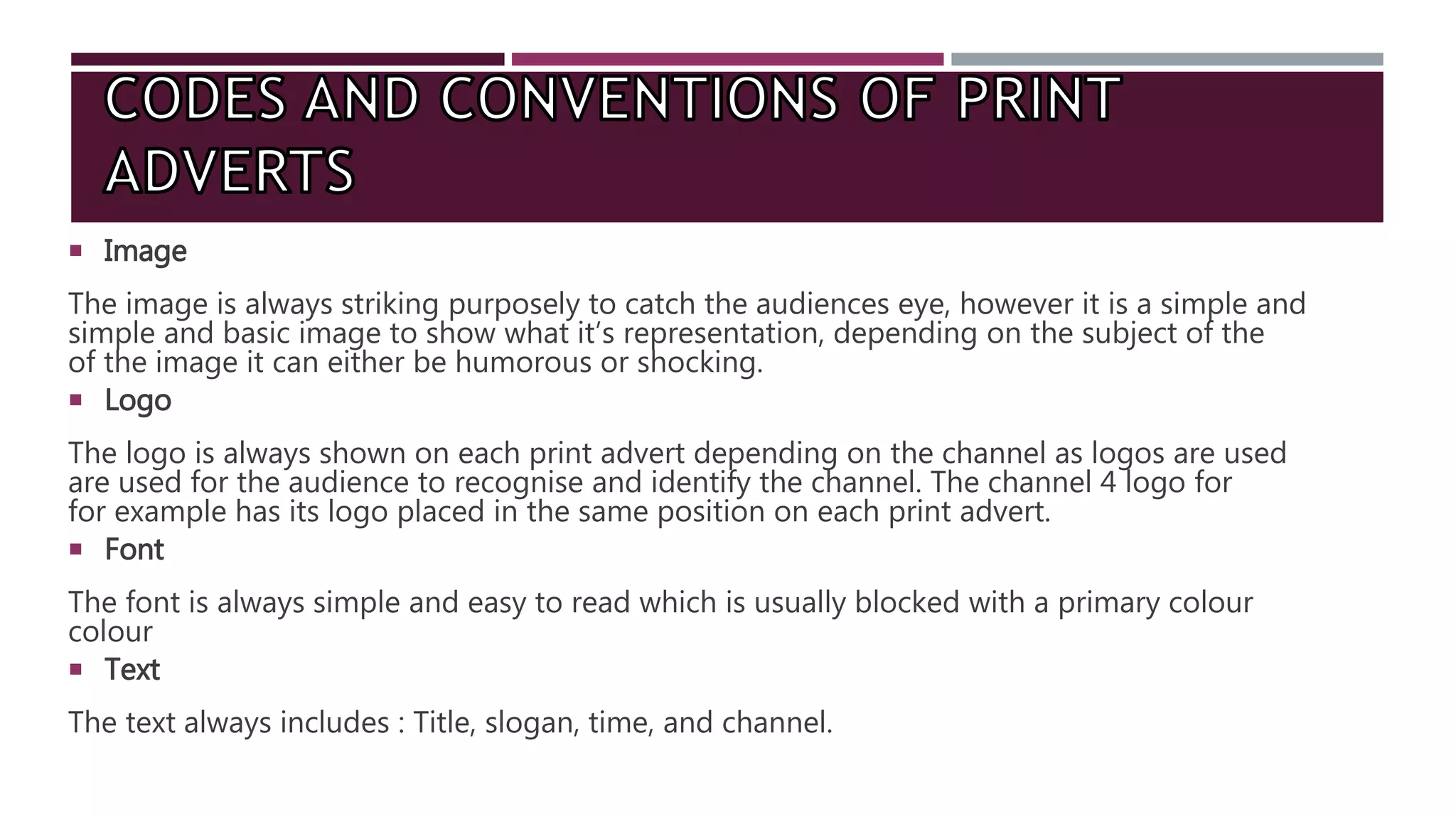
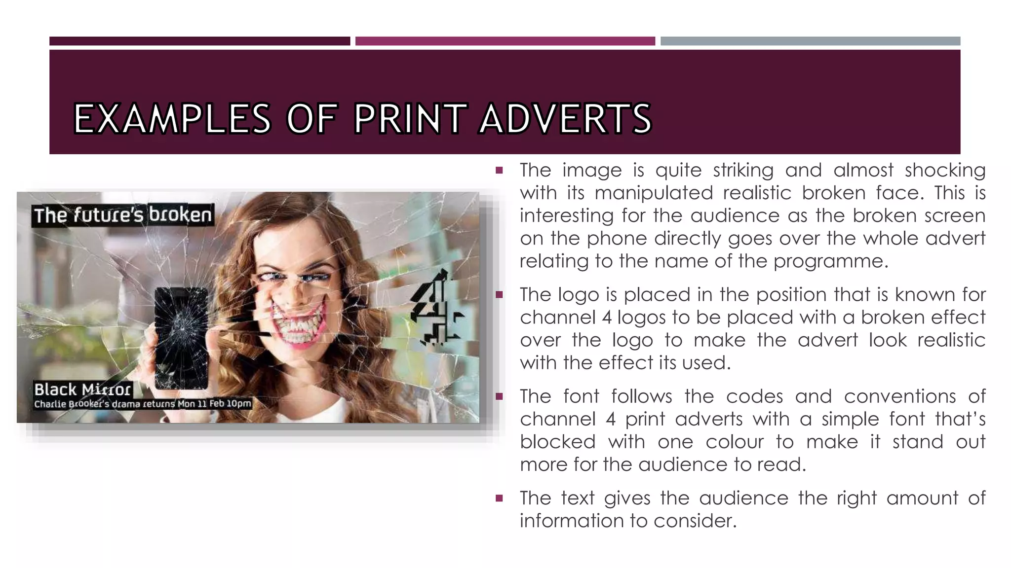
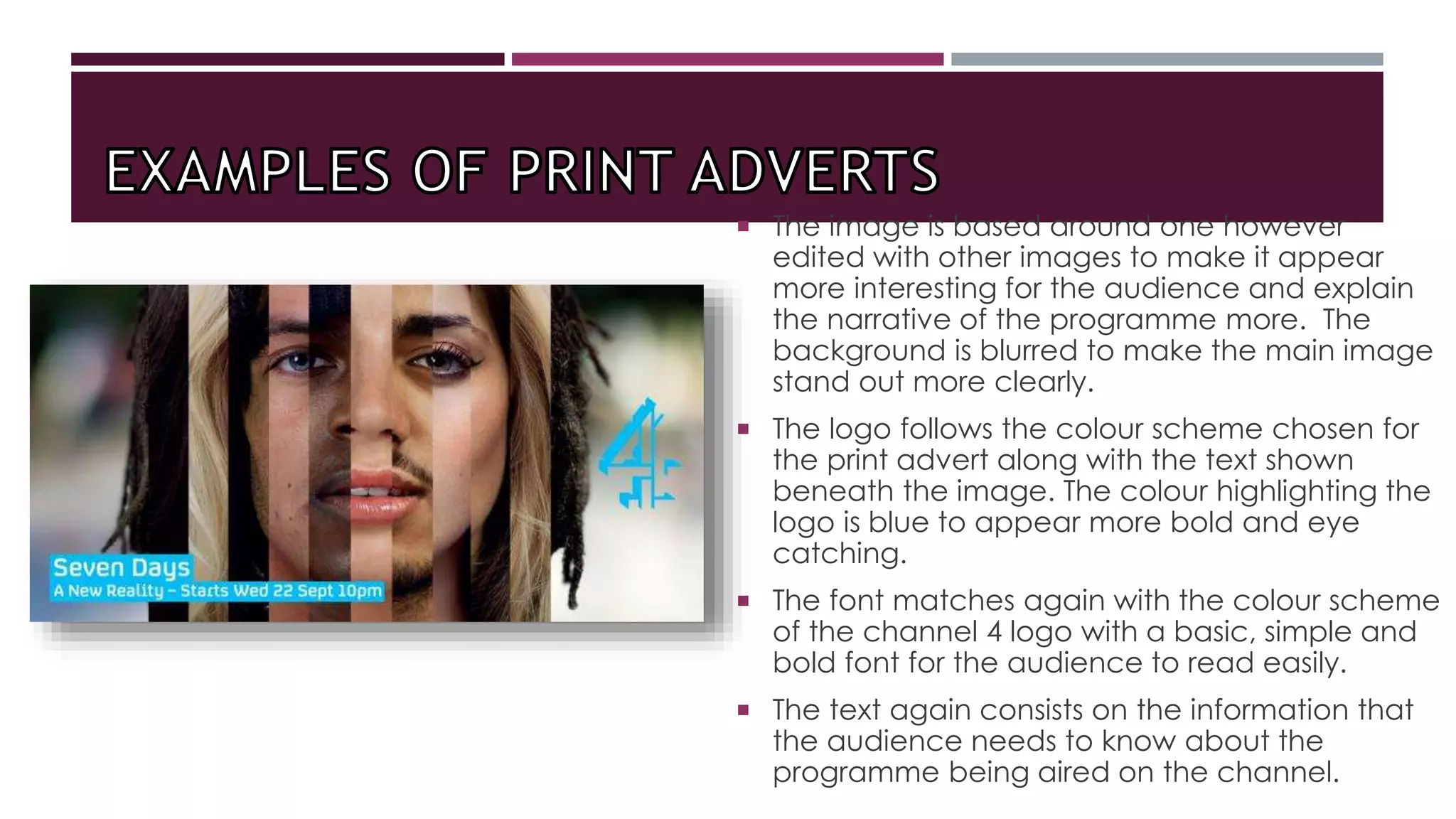
Print ads typically include an eye-catching image, channel logo in a consistent location, easy-to-read font often in a single color, and text providing the title, slogan, time and channel.
Radio ads commonly feature relevant sound effects to grab attention, a voiceover often from the show itself, background music relating to the topic, audio clips from the program to entice listeners, and a clear tone that can be humorous or serious. Both end by announcing air date, time and channel.