Introduction to Channel 4 style guide
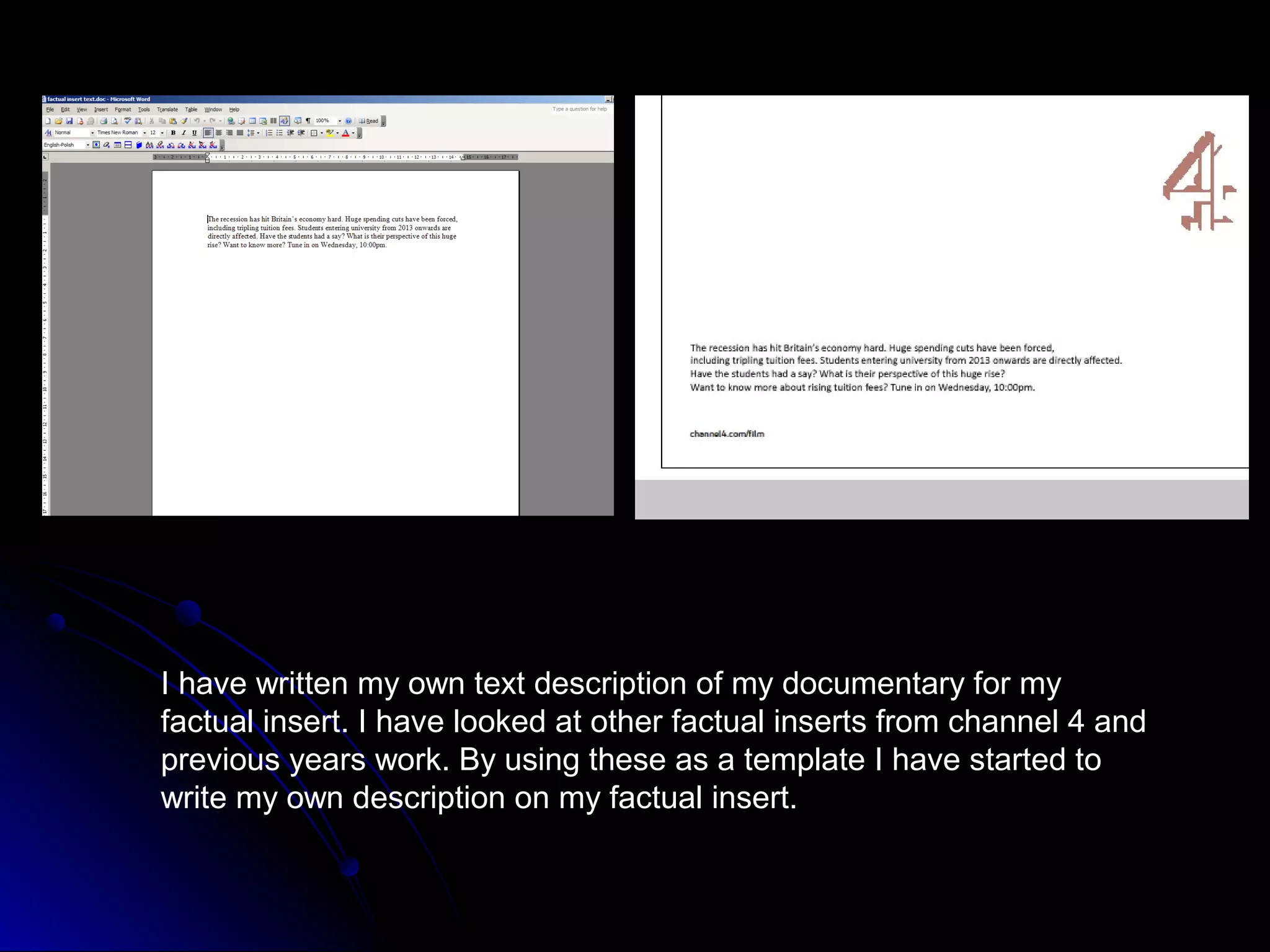
I have written my own text description of my documentary for my
factual insert. I have looked at other factual inserts from channel 4 and
previous years work. By using these as a template I have started to
write my own description on my factual insert.
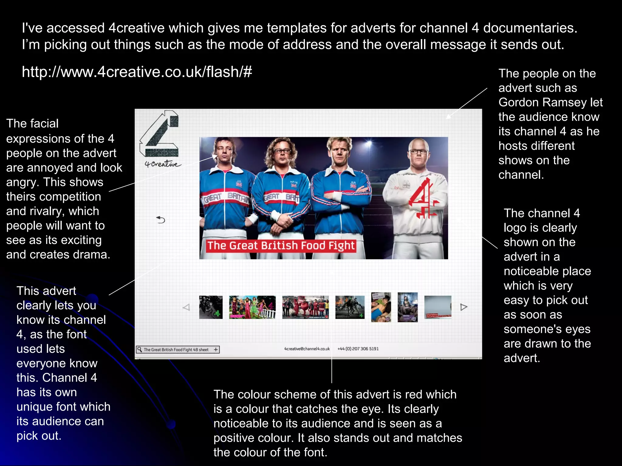
I've accessed 4creative which gives me templates for adverts for channel 4 documentaries.
  I’m picking out things such as the mode of address and the overall message it sends out.

  http://www.4creative.co.uk/flash/#                                              The people on the
                                                                                  advert such as
                                                                                  Gordon Ramsey let
                                                                                  the audience know
The facial
                                                                                  its channel 4 as he
expressions of the 4
                                                                                  hosts different
people on the advert
                                                                                  shows on the
are annoyed and look
                                                                                  channel.
angry. This shows
theirs competition
and rivalry, which                                                                The channel 4
people will want to                                                               logo is clearly
see as its exciting                                                               shown on the
and creates drama.                                                                advert in a
                                                                                  noticeable place
 This advert                                                                      which is very
 clearly lets you                                                                 easy to pick out
 know its channel                                                                 as soon as
 4, as the font                                                                   someone's eyes
 used lets                                                                        are drawn to the
 everyone know                                                                    advert.
 this. Channel 4
 has its own                    The colour scheme of this advert is red which
 unique font which              is a colour that catches the eye. Its clearly
 its audience can               noticeable to its audience and is seen as a
 pick out.                      positive colour. It also stands out and matches
                                the colour of the font.
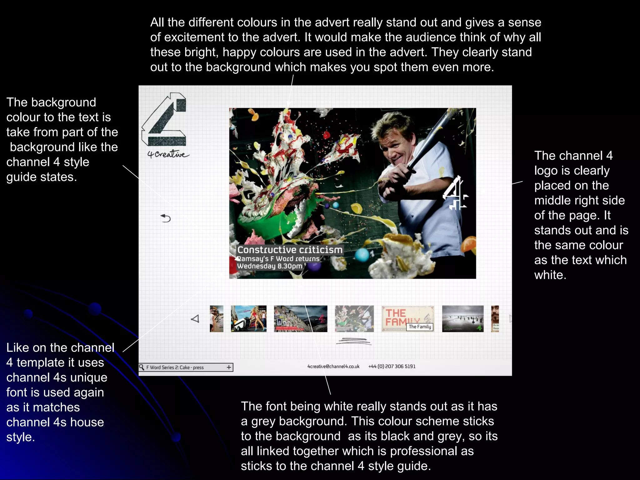
All the different colours in the advert really stand out and gives a sense
                        of excitement to the advert. It would make the audience think of why all
                        these bright, happy colours are used in the advert. They clearly stand
                        out to the background which makes you spot them even more.

The background
colour to the text is
take from part of the
 background like the
                                                                                                The channel 4
channel 4 style
                                                                                                logo is clearly
guide states.
                                                                                                placed on the
                                                                                                middle right side
                                                                                                of the page. It
                                                                                                stands out and is
                                                                                                the same colour
                                                                                                as the text which
                                                                                                white.


Like on the channel
4 template it uses
channel 4s unique
font is used again
as it matches                            The font being white really stands out as it has
channel 4s house                         a grey background. This colour scheme sticks
style.                                   to the background as its black and grey, so its
                                         all linked together which is professional as
                                         sticks to the channel 4 style guide.
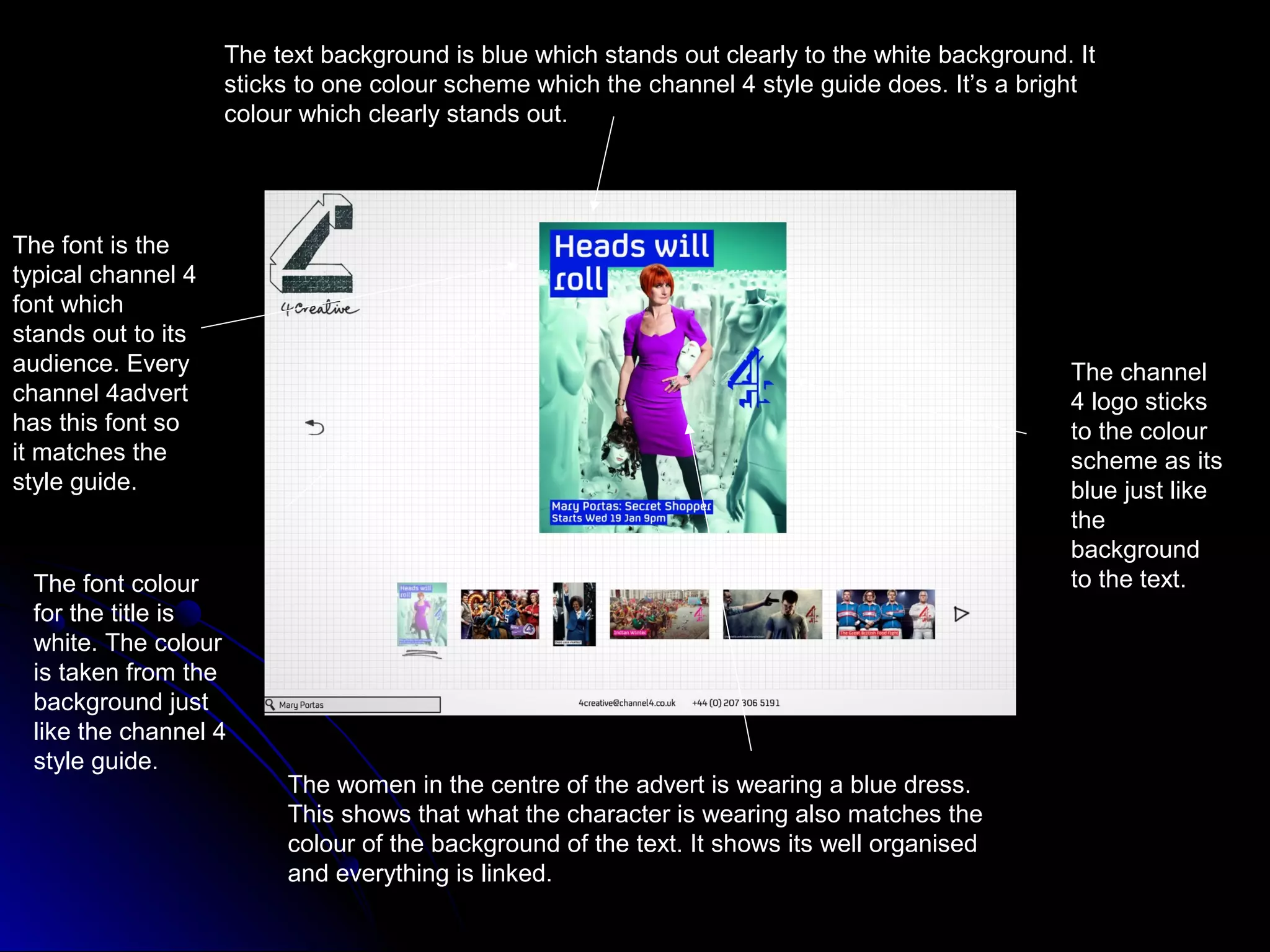
The text background is blue which stands out clearly to the white background. It
                    sticks to one colour scheme which the channel 4 style guide does. It’s a bright
                    colour which clearly stands out.


The font is the
typical channel 4
font which
stands out to its
audience. Every                                                                                  The channel
channel 4advert                                                                                  4 logo sticks
has this font so                                                                                 to the colour
it matches the                                                                                   scheme as its
style guide.                                                                                     blue just like
                                                                                                 the
                                                                                                 background
 The font colour                                                                                 to the text.
 for the title is
 white. The colour
 is taken from the
 background just
 like the channel 4
 style guide.
                         The women in the centre of the advert is wearing a blue dress.
                         This shows that what the character is wearing also matches the
                         colour of the background of the text. It shows its well organised
                         and everything is linked.
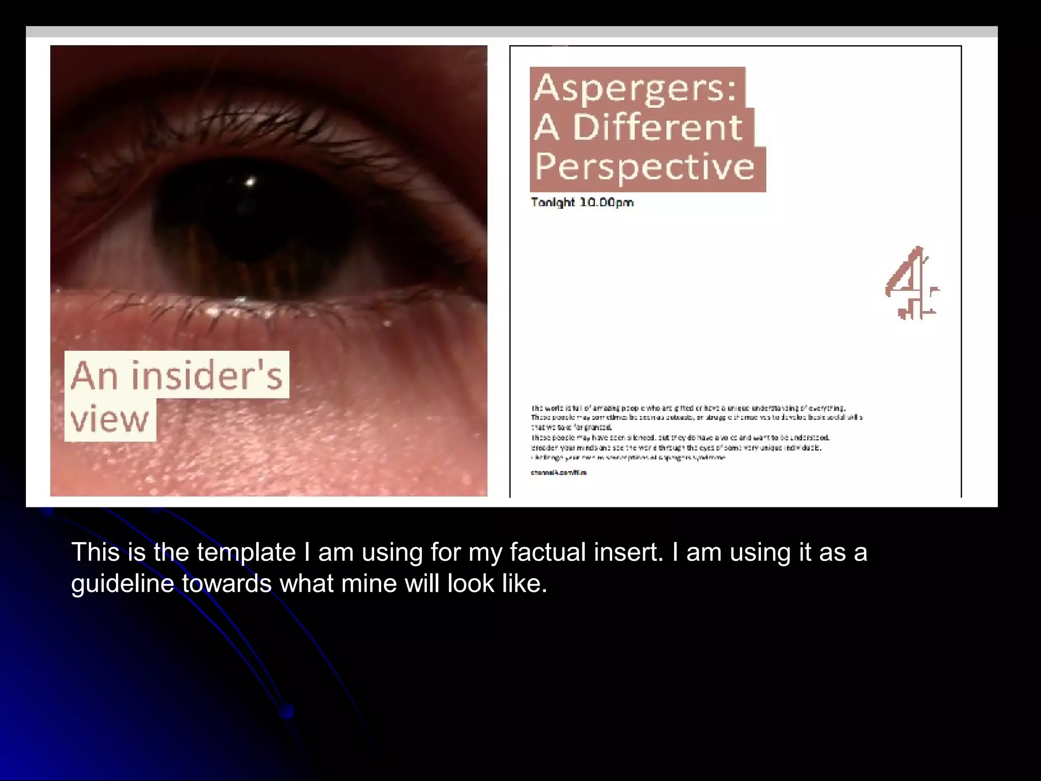
This is the template I am using for my factual insert. I am using it as a
guideline towards what mine will look like.
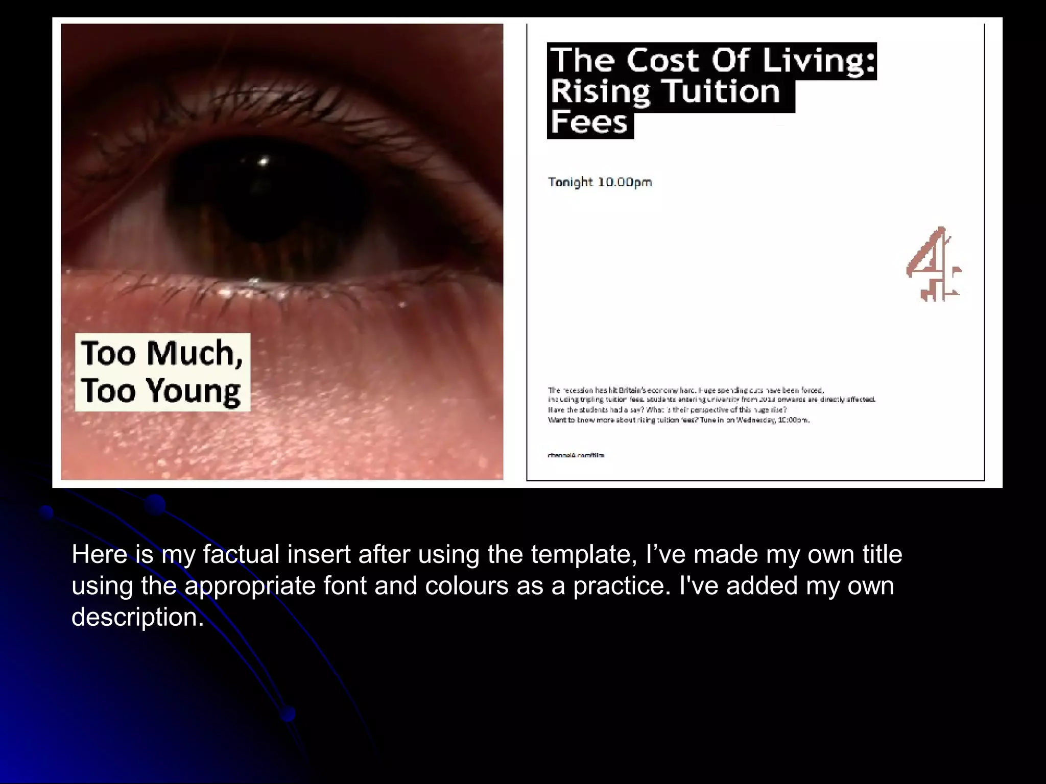
Here is my factual insert after using the template, I’ve made my own title
using the appropriate font and colours as a practice. I've added my own
description.
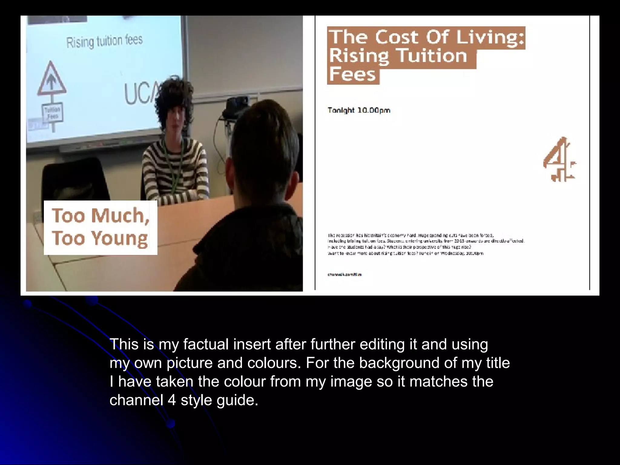
This is my factual insert after further editing it and using
my own picture and colours. For the background of my title
I have taken the colour from my image so it matches the
channel 4 style guide.
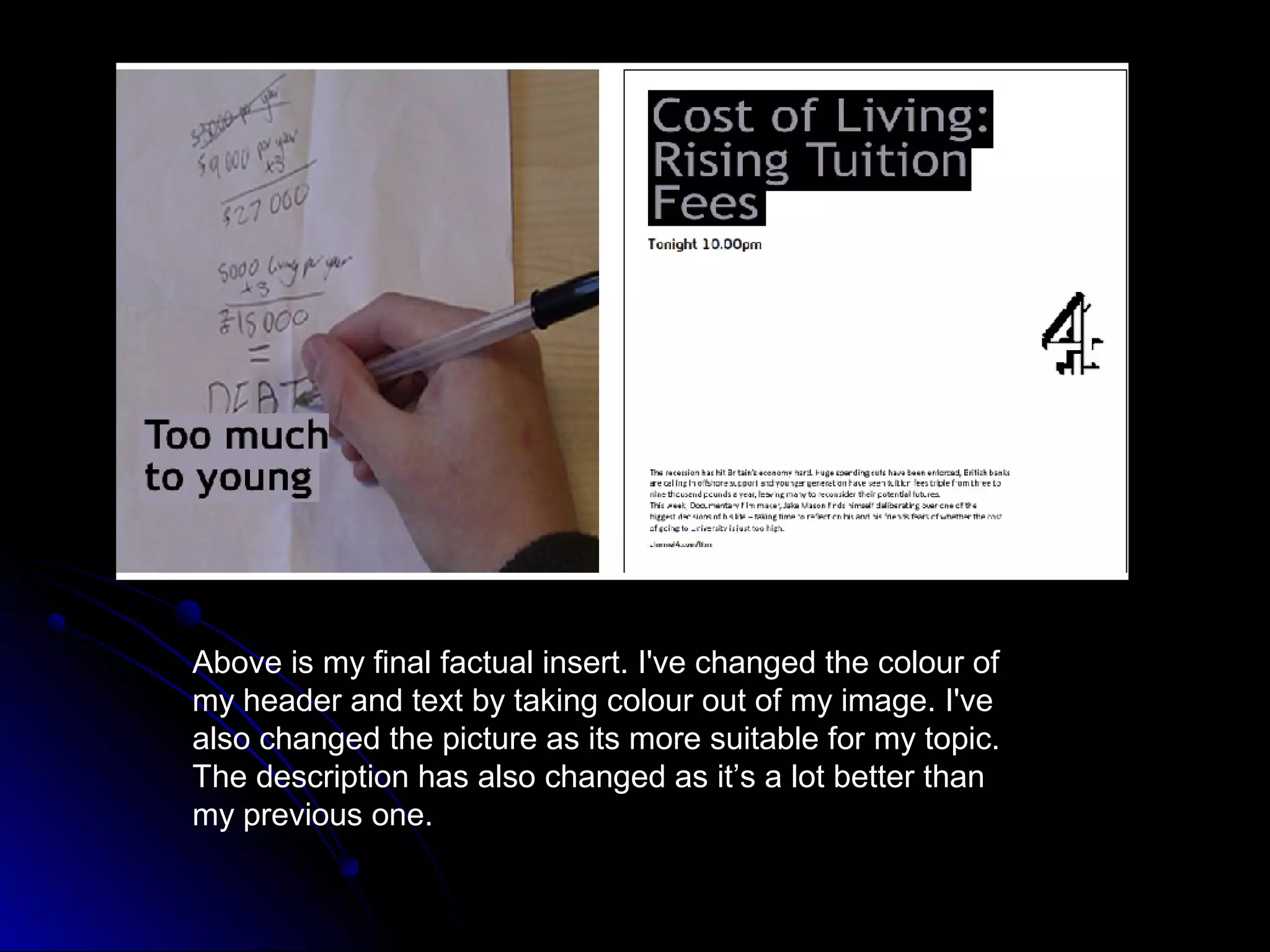
Above is my final factual insert. I've changed the colour of
my header and text by taking colour out of my image. I've
also changed the picture as its more suitable for my topic.
The description has also changed as it’s a lot better than
my previous one.
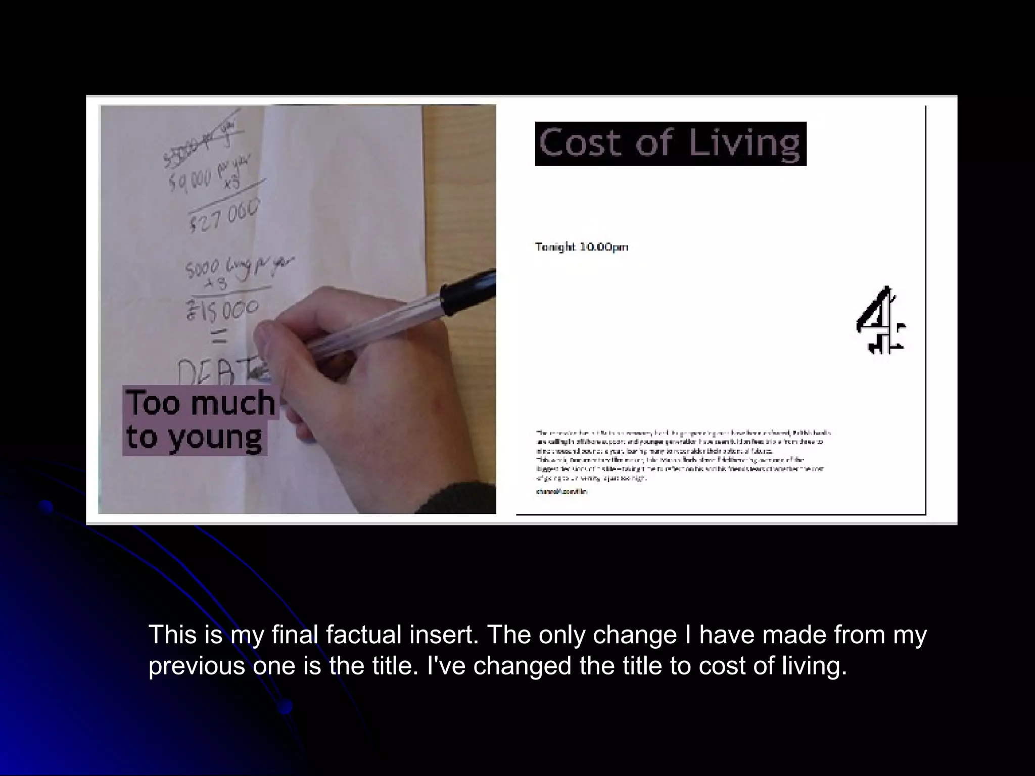
This is my final factual insert. The only change I have made from my
previous one is the title. I've changed the title to cost of living.

Evidence of style guide

  • 1.
  • 5.
    I have writtenmy own text description of my documentary for my factual insert. I have looked at other factual inserts from channel 4 and previous years work. By using these as a template I have started to write my own description on my factual insert.
  • 6.
    I've accessed 4creativewhich gives me templates for adverts for channel 4 documentaries. I’m picking out things such as the mode of address and the overall message it sends out. http://www.4creative.co.uk/flash/# The people on the advert such as Gordon Ramsey let the audience know The facial its channel 4 as he expressions of the 4 hosts different people on the advert shows on the are annoyed and look channel. angry. This shows theirs competition and rivalry, which The channel 4 people will want to logo is clearly see as its exciting shown on the and creates drama. advert in a noticeable place This advert which is very clearly lets you easy to pick out know its channel as soon as 4, as the font someone's eyes used lets are drawn to the everyone know advert. this. Channel 4 has its own The colour scheme of this advert is red which unique font which is a colour that catches the eye. Its clearly its audience can noticeable to its audience and is seen as a pick out. positive colour. It also stands out and matches the colour of the font.
  • 7.
    All the differentcolours in the advert really stand out and gives a sense of excitement to the advert. It would make the audience think of why all these bright, happy colours are used in the advert. They clearly stand out to the background which makes you spot them even more. The background colour to the text is take from part of the background like the The channel 4 channel 4 style logo is clearly guide states. placed on the middle right side of the page. It stands out and is the same colour as the text which white. Like on the channel 4 template it uses channel 4s unique font is used again as it matches The font being white really stands out as it has channel 4s house a grey background. This colour scheme sticks style. to the background as its black and grey, so its all linked together which is professional as sticks to the channel 4 style guide.
  • 8.
    The text backgroundis blue which stands out clearly to the white background. It sticks to one colour scheme which the channel 4 style guide does. It’s a bright colour which clearly stands out. The font is the typical channel 4 font which stands out to its audience. Every The channel channel 4advert 4 logo sticks has this font so to the colour it matches the scheme as its style guide. blue just like the background The font colour to the text. for the title is white. The colour is taken from the background just like the channel 4 style guide. The women in the centre of the advert is wearing a blue dress. This shows that what the character is wearing also matches the colour of the background of the text. It shows its well organised and everything is linked.
  • 9.
    This is thetemplate I am using for my factual insert. I am using it as a guideline towards what mine will look like.
  • 10.
    Here is myfactual insert after using the template, I’ve made my own title using the appropriate font and colours as a practice. I've added my own description.
  • 11.
    This is myfactual insert after further editing it and using my own picture and colours. For the background of my title I have taken the colour from my image so it matches the channel 4 style guide.
  • 12.
    Above is myfinal factual insert. I've changed the colour of my header and text by taking colour out of my image. I've also changed the picture as its more suitable for my topic. The description has also changed as it’s a lot better than my previous one.
  • 13.
    This is myfinal factual insert. The only change I have made from my previous one is the title. I've changed the title to cost of living.