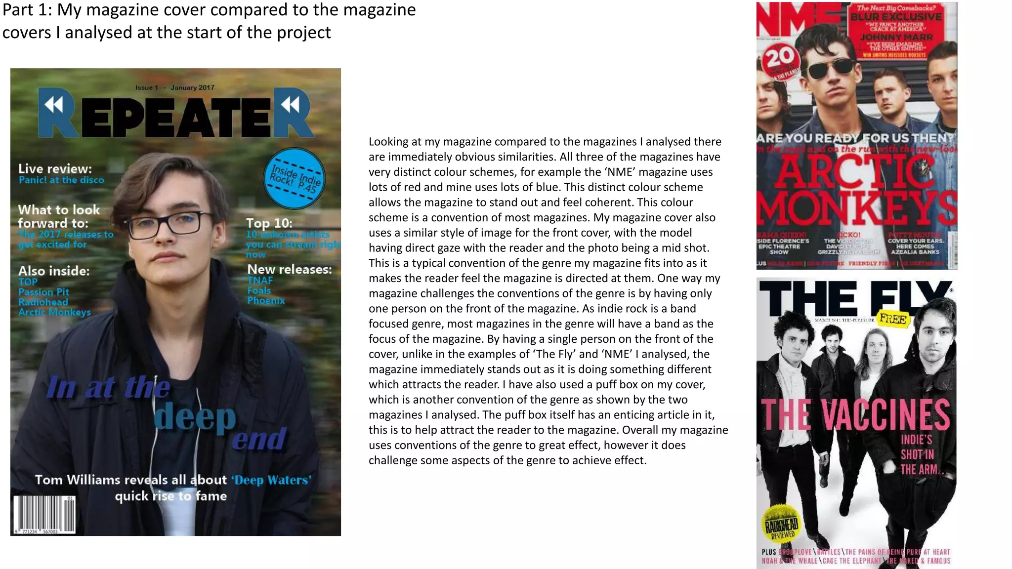
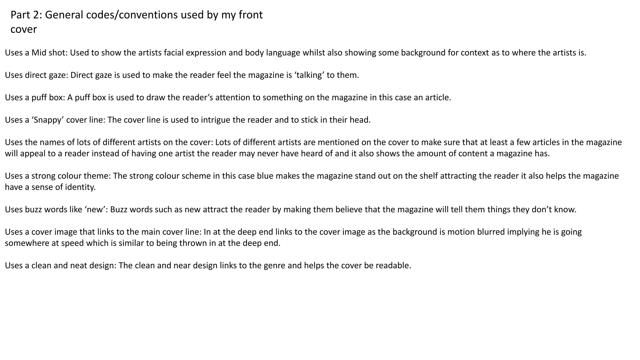
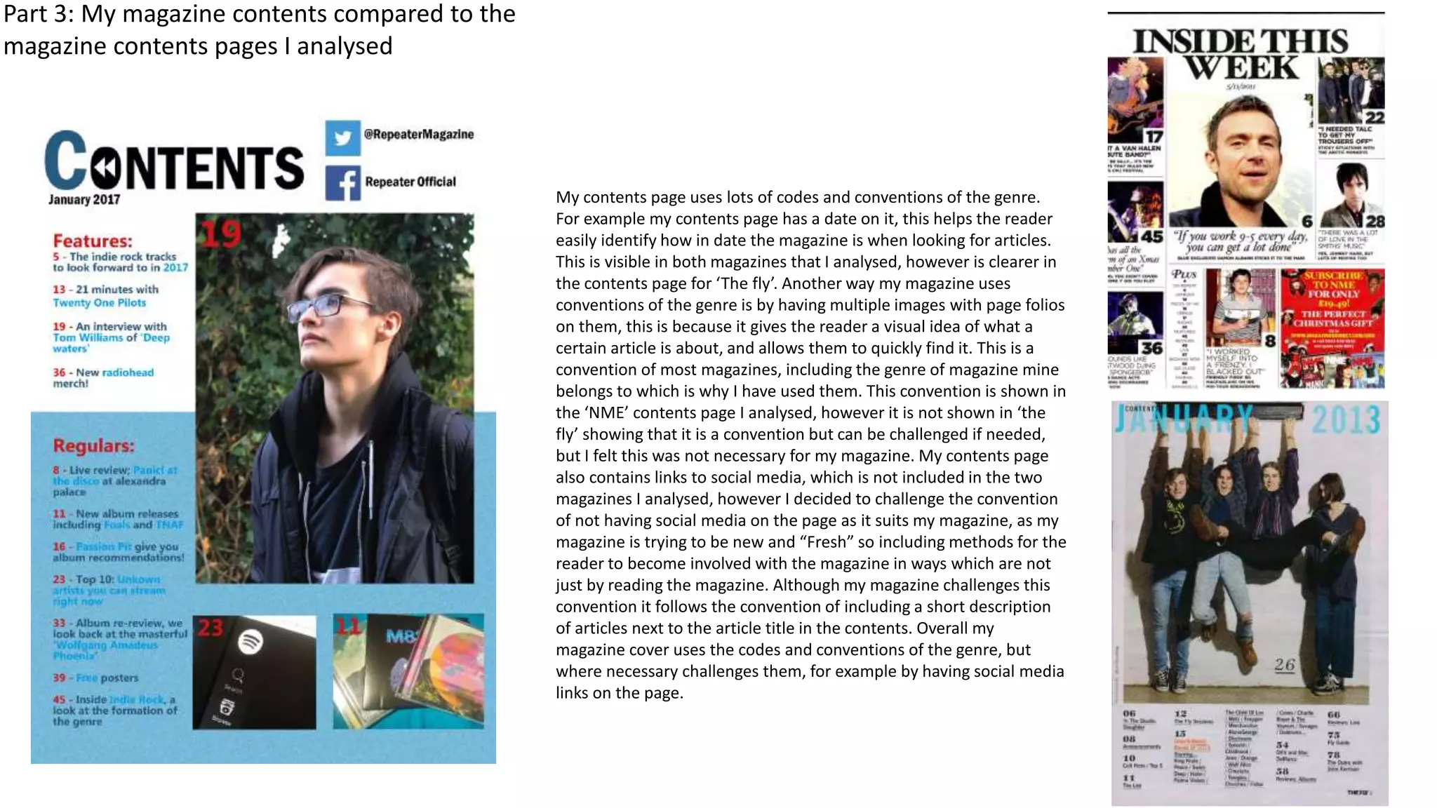
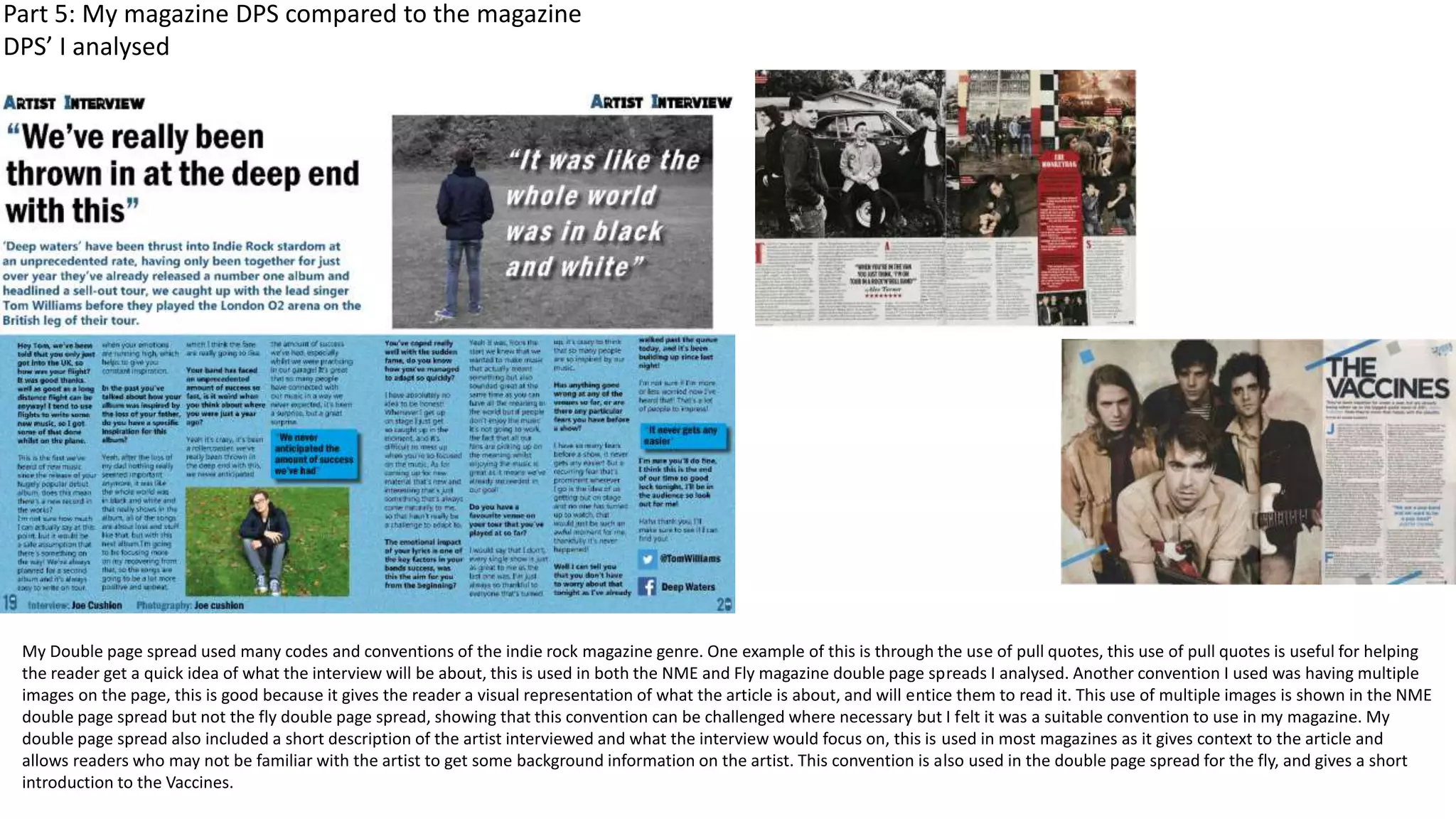
Evaluation question 1:
In what ways does your media product use, develop or challenge forms
and conventions of real media products?
Front cover
Part 1: My magazine cover compared to the magazine
covers I analysed at the start of the project
Looking at my magazine compared to the magazines I analysed there
are immediately obvious similarities. All three of the magazines have
very distinct colour schemes, for example the ‘NME’ magazine uses
lots of red and mine uses lots of blue. This distinct colour scheme
allows the magazine to stand out and feel coherent. This colour
scheme is a convention of most magazines. My magazine cover also
uses a similar style of image for the front cover, with the model
having direct gaze with the reader and the photo being a mid shot.
This is a typical convention of the genre my magazine fits into as it
makes the reader feel the magazine is directed at them. One way my
magazine challenges the conventions of the genre is by having only
one person on the front of the magazine. As indie rock is a band
focused genre, most magazines in the genre will have a band as the
focus of the magazine. By having a single person on the front of the
cover, unlike in the examples of ‘The Fly’ and ‘NME’ I analysed, the
magazine immediately stands out as it is doing something different
which attracts the reader. I have also used a puff box on my cover,
which is another convention of the genre as shown by the two
magazines I analysed. The puff box itself has an enticing article in it,
this is to help attract the reader to the magazine. Overall my magazine
uses conventions of the genre to great effect, however it does
challenge some aspects of the genre to achieve effect.
Part 2: General codes/conventions used by my front
cover
Uses a Mid shot: Used to show the artists facial expression and body language whilst also showing some background for context as to where the artists is.
Uses direct gaze: Direct gaze is used to make the reader feel the magazine is ‘talking’ to them.
Uses a puff box: A puff box is used to draw the reader’s attention to something on the magazine in this case an article.
Uses a ‘Snappy’ cover line: The cover line is used to intrigue the reader and to stick in their head.
Uses the names of lots of different artists on the cover: Lots of different artists are mentioned on the cover to make sure that at least a few articles in the magazine
will appeal to a reader instead of having one artist the reader may never have heard of and it also shows the amount of content a magazine has.
Uses a strong colour theme: The strong colour scheme in this case blue makes the magazine stand out on the shelf attracting the reader it also helps the magazine
have a sense of identity.
Uses buzz words like ‘new’: Buzz words such as new attract the reader by making them believe that the magazine will tell them things they don’t know.
Uses a cover image that links to the main cover line: In at the deep end links to the cover image as the background is motion blurred implying he is going
somewhere at speed which is similar to being thrown in at the deep end.
Uses a clean and neat design: The clean and near design links to the genre and helps the cover be readable.
Contents page
Part 3: My magazine contents compared to the
magazine contents pages I analysed
My contents page uses lots of codes and conventions of the genre.
For example my contents page has a date on it, this helps the reader
easily identify how in date the magazine is when looking for articles.
This is visible in both magazines that I analysed, however is clearer in
the contents page for ‘The fly’. Another way my magazine uses
conventions of the genre is by having multiple images with page folios
on them, this is because it gives the reader a visual idea of what a
certain article is about, and allows them to quickly find it. This is a
convention of most magazines, including the genre of magazine mine
belongs to which is why I have used them. This convention is shown in
the ‘NME’ contents page I analysed, however it is not shown in ‘the
fly’ showing that it is a convention but can be challenged if needed,
but I felt this was not necessary for my magazine. My contents page
also contains links to social media, which is not included in the two
magazines I analysed, however I decided to challenge the convention
of not having social media on the page as it suits my magazine, as my
magazine is trying to be new and “Fresh” so including methods for the
reader to become involved with the magazine in ways which are not
just by reading the magazine. Although my magazine challenges this
convention it follows the convention of including a short description
of articles next to the article title in the contents. Overall my
magazine cover uses the codes and conventions of the genre, but
where necessary challenges them, for example by having social media
links on the page.
Part 4: General codes/conventions used by my contents
page
Uses both features and regulars: Used to separate the unique things and the things usually included to help the reader find what they want more easily
Uses folios on the images: Folios on the images are used so the reader can easily find the article associated with an image if it interests them
Uses folios next to the articles: Folios next to text are used to help the reader find specific articles
One of the images links to the main cover line: Main cover article is used as an image so that the reader can easily find this as there is a high chance they purchased
the magazine specifically for that article
Uses a clear title showing it is the contents: The clear title helps the reader easily find the contents
Uses short descriptions for all of the articles: Each article is described briefly to help the reader find an article that interests them
Uses the same colour scheme as the cover: The colour scheme being the same helps to build a cohesive style for the magazine which is visually appealing to the
reader
Uses a clean and simple design: the clean and simple design is used so that the reader can easily navigate the page, and to help stick with the style of the front
cover which was also clean
Double Page Spread
My Double page spread used many codes and conventions of the indie rock magazine genre. One example of this is through the use of pull quotes, this use of pull quotes is useful for helping
the reader get a quick idea of what the interview will be about, this is used in both the NME and Fly magazine double page spreads I analysed. Another convention I used was having multiple
images on the page, this is good because it gives the reader a visual representation of what the article is about, and will entice them to read it. This use of multiple images is shown in the NME
double page spread but not the fly double page spread, showing that this convention can be challenged where necessary but I felt it was a suitable convention to use in my magazine. My
double page spread also included a short description of the artist interviewed and what the interview would focus on, this is used in most magazines as it gives context to the article and
allows readers who may not be familiar with the artist to get some background information on the artist. This convention is also used in the double page spread for the fly, and gives a short
introduction to the Vaccines.
Part 5: My magazine DPS compared to the magazine
DPS’ I analysed
Part 6: General codes/conventions used by my DPS
Uses a colour scheme consistent with the rest of the magazine: Helps the magazine feel more coherent and links the cover and DPS together as they are both
focusing on the same article.
Uses a puff box: The puff box contains artist recommendations from the artist interview, this adds more content to the article and makes the reader feel they are
getting more value for money
Uses pull quotes: these allow the reader to quickly identify what the article will be like
Uses a very clear design: allows the reader to easily read the large amounts of text on the page, without it being too difficult.
Has edited images to show meaning: This allows the reader to read what the article will be like through the images.

Evaluation question 1

  • 1.
    Evaluation question 1: Inwhat ways does your media product use, develop or challenge forms and conventions of real media products?
  • 2.
  • 3.
    Part 1: Mymagazine cover compared to the magazine covers I analysed at the start of the project Looking at my magazine compared to the magazines I analysed there are immediately obvious similarities. All three of the magazines have very distinct colour schemes, for example the ‘NME’ magazine uses lots of red and mine uses lots of blue. This distinct colour scheme allows the magazine to stand out and feel coherent. This colour scheme is a convention of most magazines. My magazine cover also uses a similar style of image for the front cover, with the model having direct gaze with the reader and the photo being a mid shot. This is a typical convention of the genre my magazine fits into as it makes the reader feel the magazine is directed at them. One way my magazine challenges the conventions of the genre is by having only one person on the front of the magazine. As indie rock is a band focused genre, most magazines in the genre will have a band as the focus of the magazine. By having a single person on the front of the cover, unlike in the examples of ‘The Fly’ and ‘NME’ I analysed, the magazine immediately stands out as it is doing something different which attracts the reader. I have also used a puff box on my cover, which is another convention of the genre as shown by the two magazines I analysed. The puff box itself has an enticing article in it, this is to help attract the reader to the magazine. Overall my magazine uses conventions of the genre to great effect, however it does challenge some aspects of the genre to achieve effect.
  • 4.
    Part 2: Generalcodes/conventions used by my front cover Uses a Mid shot: Used to show the artists facial expression and body language whilst also showing some background for context as to where the artists is. Uses direct gaze: Direct gaze is used to make the reader feel the magazine is ‘talking’ to them. Uses a puff box: A puff box is used to draw the reader’s attention to something on the magazine in this case an article. Uses a ‘Snappy’ cover line: The cover line is used to intrigue the reader and to stick in their head. Uses the names of lots of different artists on the cover: Lots of different artists are mentioned on the cover to make sure that at least a few articles in the magazine will appeal to a reader instead of having one artist the reader may never have heard of and it also shows the amount of content a magazine has. Uses a strong colour theme: The strong colour scheme in this case blue makes the magazine stand out on the shelf attracting the reader it also helps the magazine have a sense of identity. Uses buzz words like ‘new’: Buzz words such as new attract the reader by making them believe that the magazine will tell them things they don’t know. Uses a cover image that links to the main cover line: In at the deep end links to the cover image as the background is motion blurred implying he is going somewhere at speed which is similar to being thrown in at the deep end. Uses a clean and neat design: The clean and near design links to the genre and helps the cover be readable.
  • 5.
  • 6.
    Part 3: Mymagazine contents compared to the magazine contents pages I analysed My contents page uses lots of codes and conventions of the genre. For example my contents page has a date on it, this helps the reader easily identify how in date the magazine is when looking for articles. This is visible in both magazines that I analysed, however is clearer in the contents page for ‘The fly’. Another way my magazine uses conventions of the genre is by having multiple images with page folios on them, this is because it gives the reader a visual idea of what a certain article is about, and allows them to quickly find it. This is a convention of most magazines, including the genre of magazine mine belongs to which is why I have used them. This convention is shown in the ‘NME’ contents page I analysed, however it is not shown in ‘the fly’ showing that it is a convention but can be challenged if needed, but I felt this was not necessary for my magazine. My contents page also contains links to social media, which is not included in the two magazines I analysed, however I decided to challenge the convention of not having social media on the page as it suits my magazine, as my magazine is trying to be new and “Fresh” so including methods for the reader to become involved with the magazine in ways which are not just by reading the magazine. Although my magazine challenges this convention it follows the convention of including a short description of articles next to the article title in the contents. Overall my magazine cover uses the codes and conventions of the genre, but where necessary challenges them, for example by having social media links on the page.
  • 7.
    Part 4: Generalcodes/conventions used by my contents page Uses both features and regulars: Used to separate the unique things and the things usually included to help the reader find what they want more easily Uses folios on the images: Folios on the images are used so the reader can easily find the article associated with an image if it interests them Uses folios next to the articles: Folios next to text are used to help the reader find specific articles One of the images links to the main cover line: Main cover article is used as an image so that the reader can easily find this as there is a high chance they purchased the magazine specifically for that article Uses a clear title showing it is the contents: The clear title helps the reader easily find the contents Uses short descriptions for all of the articles: Each article is described briefly to help the reader find an article that interests them Uses the same colour scheme as the cover: The colour scheme being the same helps to build a cohesive style for the magazine which is visually appealing to the reader Uses a clean and simple design: the clean and simple design is used so that the reader can easily navigate the page, and to help stick with the style of the front cover which was also clean
  • 8.
  • 9.
    My Double pagespread used many codes and conventions of the indie rock magazine genre. One example of this is through the use of pull quotes, this use of pull quotes is useful for helping the reader get a quick idea of what the interview will be about, this is used in both the NME and Fly magazine double page spreads I analysed. Another convention I used was having multiple images on the page, this is good because it gives the reader a visual representation of what the article is about, and will entice them to read it. This use of multiple images is shown in the NME double page spread but not the fly double page spread, showing that this convention can be challenged where necessary but I felt it was a suitable convention to use in my magazine. My double page spread also included a short description of the artist interviewed and what the interview would focus on, this is used in most magazines as it gives context to the article and allows readers who may not be familiar with the artist to get some background information on the artist. This convention is also used in the double page spread for the fly, and gives a short introduction to the Vaccines. Part 5: My magazine DPS compared to the magazine DPS’ I analysed
  • 10.
    Part 6: Generalcodes/conventions used by my DPS Uses a colour scheme consistent with the rest of the magazine: Helps the magazine feel more coherent and links the cover and DPS together as they are both focusing on the same article. Uses a puff box: The puff box contains artist recommendations from the artist interview, this adds more content to the article and makes the reader feel they are getting more value for money Uses pull quotes: these allow the reader to quickly identify what the article will be like Uses a very clear design: allows the reader to easily read the large amounts of text on the page, without it being too difficult. Has edited images to show meaning: This allows the reader to read what the article will be like through the images.