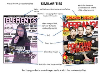
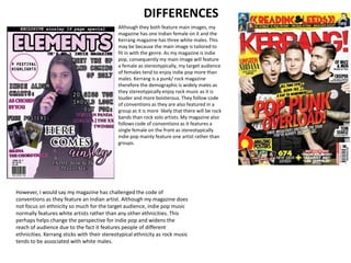
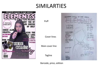
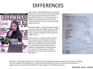
INTRODUCTION
• In my magazine, I think I have mostly used
codes of conventions as I believe following
current trends in magazine designs is what
makes a magazine successful so I took
inspiration from certain magazines. In some
aspects of my magazine, I have subtly
challenged and developed magazines but
overall, I have mostly used code of
conventions.
Tagline – slightly larger and occupying centre of whole
top row
SIMILARITIES
Masthead – occupying whole top row,
located in the centre
Puff
Cover lines
Secondary images
Barcode, date, issue number
Main image – both
camera shots are
medium long shot
Neutral colours are
used to balance off the
initial colour scheme
Artists of both genres mentioned
Anchorage – both main images anchor with the main cover line
DIFFERENCES
Although they both feature main images, my
magazine has one Indian female on it and the
Kerrang magazine has three white males. This
may be because the main image is tailored to
fit in with the genre. As my magazine is indie
pop, consequently my main image will feature
a female as stereotypically, my target audience
of females tend to enjoy indie pop more than
males. Kerrang is a punk/ rock magazine
therefore the demographic is widely males as
they stereotypically enjoy rock music as it is
louder and more boisterous. They follow code
of conventions as they are also featured in a
group as it is more likely that there will be rock
bands than rock solo artists. My magazine also
follows code of conventions as it features a
single female on the front as stereotypically
indie pop mainly feature one artist rather than
groups.
However, I would say my magazine has challenged the code of
conventions as they feature an Indian artist. Although my magazine does
not focus on ethnicity so much for the target audience, indie pop music
normally features white artists rather than any other ethnicities. This
perhaps helps change the perspective for indie pop and widens the
reach of audience due to the fact it features people of different
ethnicities. Kerrang sticks with their stereotypical ethnicity as rock music
tends to be associated with white males.
SIMILARTIES
Puff
Cover lines
Main cover line
Tagline
Barcode, price, edition
DIFFERENCES
Main image- I have decided not to use a choker as
it did not say much in terms of the representation
of the genre and age of the target audience. I
replaced it with the use of a prop which was a
lollipop as this represents her as playful and
childish which branches out to the young target
audience (16-25).
Secondary images – instead of lining the images
vertically I made them slightly overlap in order to
show make use of the empty space and so the
images could be enlarged in order to catch the
audiences eye.
Colour scheme – I have kept within the baby
pink colour scheme which gave a feminine
aspect to the magazine as pink is associated
with love and emotions and women tend to
be represented as sensitive and emotional.
However, I decided against the baby blue on
the cover line ‘ainsley’ because it looked
odd with the rest of the colour scheme and
did not fit in
Masthead – I have kept the same name ‘elements’ but I have slightly changed the design of my masthead. Instead of
the thin masthead, I have changed it to a thicker font and abandoned the curvey line behing the masthead as it
wouldn’t be seen undernesath the thick font. I have changed it to a thicker font because
Barcode, price, edition
Q1
Q1

Q1

  • 1.
    INTRODUCTION • In mymagazine, I think I have mostly used codes of conventions as I believe following current trends in magazine designs is what makes a magazine successful so I took inspiration from certain magazines. In some aspects of my magazine, I have subtly challenged and developed magazines but overall, I have mostly used code of conventions.
  • 2.
    Tagline – slightlylarger and occupying centre of whole top row SIMILARITIES Masthead – occupying whole top row, located in the centre Puff Cover lines Secondary images Barcode, date, issue number Main image – both camera shots are medium long shot Neutral colours are used to balance off the initial colour scheme Artists of both genres mentioned Anchorage – both main images anchor with the main cover line
  • 3.
    DIFFERENCES Although they bothfeature main images, my magazine has one Indian female on it and the Kerrang magazine has three white males. This may be because the main image is tailored to fit in with the genre. As my magazine is indie pop, consequently my main image will feature a female as stereotypically, my target audience of females tend to enjoy indie pop more than males. Kerrang is a punk/ rock magazine therefore the demographic is widely males as they stereotypically enjoy rock music as it is louder and more boisterous. They follow code of conventions as they are also featured in a group as it is more likely that there will be rock bands than rock solo artists. My magazine also follows code of conventions as it features a single female on the front as stereotypically indie pop mainly feature one artist rather than groups. However, I would say my magazine has challenged the code of conventions as they feature an Indian artist. Although my magazine does not focus on ethnicity so much for the target audience, indie pop music normally features white artists rather than any other ethnicities. This perhaps helps change the perspective for indie pop and widens the reach of audience due to the fact it features people of different ethnicities. Kerrang sticks with their stereotypical ethnicity as rock music tends to be associated with white males.
  • 4.
    SIMILARTIES Puff Cover lines Main coverline Tagline Barcode, price, edition
  • 5.
    DIFFERENCES Main image- Ihave decided not to use a choker as it did not say much in terms of the representation of the genre and age of the target audience. I replaced it with the use of a prop which was a lollipop as this represents her as playful and childish which branches out to the young target audience (16-25). Secondary images – instead of lining the images vertically I made them slightly overlap in order to show make use of the empty space and so the images could be enlarged in order to catch the audiences eye. Colour scheme – I have kept within the baby pink colour scheme which gave a feminine aspect to the magazine as pink is associated with love and emotions and women tend to be represented as sensitive and emotional. However, I decided against the baby blue on the cover line ‘ainsley’ because it looked odd with the rest of the colour scheme and did not fit in Masthead – I have kept the same name ‘elements’ but I have slightly changed the design of my masthead. Instead of the thin masthead, I have changed it to a thicker font and abandoned the curvey line behing the masthead as it wouldn’t be seen undernesath the thick font. I have changed it to a thicker font because Barcode, price, edition