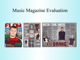
The student created a magazine called FLOW targeting a 16-25 year old audience interested in R&B/hip-hop music. On the front cover, a male model is featured looking relaxed in urban fashion. The contents page includes photos of artists like Beyonce and Lil Wayne representing the music genre. A double page article features multiple photos of Drake to discuss his influence on young people. Throughout, conventions of real music magazines like Vibe are used while developing the magazine for its target demographic.
Welcome, and thank you for watching the Powerpoint presentation titled “How to Disclose: A Guide for College Students”. This is the first of 2 presentations discussing how you can inform your instructors of your learning needs and accommodations. This first presentation will help walk you through the decision of choosing “to disclose or not to disclose.”
Special thanks to the Accessible Learning Services department at Sheridan College for producing this presentation.
The workshop covers all elements involved in planning and facilitating focus groups. It covers the logistics; techniques to attract attendees; activities to engage participants; techniques to improve facilitation; and how to record and share the results of the focus group. The workshop is interactive in nature, with discussion points throughout, and an opportunity to try things out.
Young Tom Selleck: A Journey Through His Early Years and Rise to Stardomgreendigital
Introduction
When one thinks of Hollywood legends, Tom Selleck is a name that comes to mind. Known for his charming smile, rugged good looks. and the iconic mustache that has become synonymous with his persona. Tom Selleck has had a prolific career spanning decades. But, the journey of young Tom Selleck, from his early years to becoming a household name. is a story filled with determination, talent, and a touch of luck. This article delves into young Tom Selleck's life, background, early struggles. and pivotal moments that led to his rise in Hollywood.
Follow us on: Pinterest
Early Life and Background
Family Roots and Childhood
Thomas William Selleck was born in Detroit, Michigan, on January 29, 1945. He was the second of four children in a close-knit family. His father, Robert Dean Selleck, was a real estate investor and executive. while his mother, Martha Selleck, was a homemaker. The Selleck family relocated to Sherman Oaks, California. when Tom was a child, setting the stage for his future in the entertainment industry.
Education and Early Interests
Growing up, young Tom Selleck was an active and athletic child. He attended Grant High School in Van Nuys, California. where he excelled in sports, particularly basketball. His tall and athletic build made him a standout player, and he earned a basketball scholarship to the University of Southern California (U.S.C.). While at U.S.C., Selleck studied business administration. but his interests shifted toward acting.
Discovery of Acting Passion
Tom Selleck's journey into acting was serendipitous. During his time at U.S.C., a drama coach encouraged him to try acting. This nudge led him to join the Hills Playhouse, where he began honing his craft. Transitioning from an aspiring athlete to an actor took time. but young Tom Selleck became drawn to the performance world.
Early Career Struggles
Breaking Into the Industry
The path to stardom was a challenging one for young Tom Selleck. Like many aspiring actors, he faced many rejections and struggled to find steady work. A series of minor roles and guest appearances on television shows marked his early career. In 1965, he debuted on the syndicated show "The Dating Game." which gave him some exposure but did not lead to immediate success.
The Commercial Breakthrough
During the late 1960s and early 1970s, Selleck began appearing in television commercials. His rugged good looks and charismatic presence made him a popular brand choice. He starred in advertisements for Pepsi-Cola, Revlon, and Close-Up toothpaste. These commercials provided financial stability and helped him gain visibility in the industry.
Struggling Actor in Hollywood
Despite his success in commercials. breaking into large acting roles remained a challenge for young Tom Selleck. He auditioned and took on small parts in T.V. shows and movies. Some of his early television appearances included roles in popular series like Lancer, The F.B.I., and Bracken's World. But, it would take a
Experience the thrill of Progressive Puzzle Adventures, like Scavenger Hunt Games and Escape Room Activities combined Solve Treasure Hunt Puzzles online.
Tom Selleck Net Worth: A Comprehensive Analysisgreendigital
Over several decades, Tom Selleck, a name synonymous with charisma. From his iconic role as Thomas Magnum in the television series "Magnum, P.I." to his enduring presence in "Blue Bloods," Selleck has captivated audiences with his versatility and charm. As a result, "Tom Selleck net worth" has become a topic of great interest among fans. and financial enthusiasts alike. This article delves deep into Tom Selleck's wealth, exploring his career, assets, endorsements. and business ventures that contribute to his impressive economic standing.
Follow us on: Pinterest
Early Life and Career Beginnings
The Foundation of Tom Selleck's Wealth
Born on January 29, 1945, in Detroit, Michigan, Tom Selleck grew up in Sherman Oaks, California. His journey towards building a large net worth began with humble origins. , Selleck pursued a business administration degree at the University of Southern California (USC) on a basketball scholarship. But, his interest shifted towards acting. leading him to study at the Hills Playhouse under Milton Katselas.
Minor roles in television and films marked Selleck's early career. He appeared in commercials and took on small parts in T.V. series such as "The Dating Game" and "Lancer." These initial steps, although modest. laid the groundwork for his future success and the growth of Tom Selleck net worth. Breakthrough with "Magnum, P.I."
The Role that Defined Tom Selleck's Career
Tom Selleck's breakthrough came with the role of Thomas Magnum in the CBS television series "Magnum, P.I." (1980-1988). This role made him a household name and boosted his net worth. The series' popularity resulted in Selleck earning large salaries. leading to financial stability and increased recognition in Hollywood.
"Magnum P.I." garnered high ratings and critical acclaim during its run. Selleck's portrayal of the charming and resourceful private investigator resonated with audiences. making him one of the most beloved television actors of the 1980s. The success of "Magnum P.I." played a pivotal role in shaping Tom Selleck net worth, establishing him as a major star.
Film Career and Diversification
Expanding Tom Selleck's Financial Portfolio
While "Magnum, P.I." was a cornerstone of Selleck's career, he did not limit himself to television. He ventured into films, further enhancing Tom Selleck net worth. His filmography includes notable movies such as "Three Men and a Baby" (1987). which became the highest-grossing film of the year, and its sequel, "Three Men and a Little Lady" (1990). These box office successes contributed to his wealth.
Selleck's versatility allowed him to transition between genres. from comedies like "Mr. Baseball" (1992) to westerns such as "Quigley Down Under" (1990). This diversification showcased his acting range. and provided many income streams, reinforcing Tom Selleck net worth.
Television Resurgence with "Blue Bloods"
Sustaining Wealth through Consistent Success
In 2010, Tom Selleck began starring as Frank Reagan i
Scandal! Teasers June 2024 on etv Forum.co.zaIsaac More
Monday, 3 June 2024
Episode 47
A friend is compelled to expose a manipulative scheme to prevent another from making a grave mistake. In a frantic bid to save Jojo, Phakamile agrees to a meeting that unbeknownst to her, will seal her fate.
Tuesday, 4 June 2024
Episode 48
A mother, with her son's best interests at heart, finds him unready to heed her advice. Motshabi finds herself in an unmanageable situation, sinking fast like in quicksand.
Wednesday, 5 June 2024
Episode 49
A woman fabricates a diabolical lie to cover up an indiscretion. Overwhelmed by guilt, she makes a spontaneous confession that could be devastating to another heart.
Thursday, 6 June 2024
Episode 50
Linda unwittingly discloses damning information. Nhlamulo and Vuvu try to guide their friend towards the right decision.
Friday, 7 June 2024
Episode 51
Jojo's life continues to spiral out of control. Dintle weaves a web of lies to conceal that she is not as successful as everyone believes.
Monday, 10 June 2024
Episode 52
A heated confrontation between lovers leads to a devastating admission of guilt. Dintle's desperation takes a new turn, leaving her with dwindling options.
Tuesday, 11 June 2024
Episode 53
Unable to resort to violence, Taps issues a verbal threat, leaving Mdala unsettled. A sister must explain her life choices to regain her brother's trust.
Wednesday, 12 June 2024
Episode 54
Winnie makes a very troubling discovery. Taps follows through on his threat, leaving a woman reeling. Layla, oblivious to the truth, offers an incentive.
Thursday, 13 June 2024
Episode 55
A nosy relative arrives just in time to thwart a man's fatal decision. Dintle manipulates Khanyi to tug at Mo's heartstrings and get what she wants.
Friday, 14 June 2024
Episode 56
Tlhogi is shocked by Mdala's reaction following the revelation of their indiscretion. Jojo is in disbelief when the punishment for his crime is revealed.
Monday, 17 June 2024
Episode 57
A woman reprimands another to stay in her lane, leading to a damning revelation. A man decides to leave his broken life behind.
Tuesday, 18 June 2024
Episode 58
Nhlamulo learns that due to his actions, his worst fears have come true. Caiphus' extravagant promises to suppliers get him into trouble with Ndu.
Wednesday, 19 June 2024
Episode 59
A woman manages to kill two birds with one stone. Business doom looms over Chillax. A sobering incident makes a woman realize how far she's fallen.
Thursday, 20 June 2024
Episode 60
Taps' offer to help Nhlamulo comes with hidden motives. Caiphus' new ideas for Chillax have MaHilda excited. A blast from the past recognizes Dintle, not for her newfound fame.
Friday, 21 June 2024
Episode 61
Taps is hungry for revenge and finds a rope to hang Mdala with. Chillax's new job opportunity elicits mixed reactions from the public. Roommates' initial meeting starts off on the wrong foot.
Monday, 24 June 2024
Episode 62
Taps seizes new information and recruits someone on the inside. Mary's new job
From Slave to Scourge: The Existential Choice of Django Unchained. The Philos...Rodney Thomas Jr
#SSAPhilosophy #DjangoUnchained #DjangoFreeman #ExistentialPhilosophy #Freedom #Identity #Justice #Courage #Rebellion #Transformation
Welcome to SSA Philosophy, your ultimate destination for diving deep into the profound philosophies of iconic characters from video games, movies, and TV shows. In this episode, we explore the powerful journey and existential philosophy of Django Freeman from Quentin Tarantino’s masterful film, "Django Unchained," in our video titled, "From Slave to Scourge: The Existential Choice of Django Unchained. The Philosophy of Django Freeman!"
From Slave to Scourge: The Existential Choice of Django Unchained – The Philosophy of Django Freeman!
Join me as we delve into the existential philosophy of Django Freeman, uncovering the profound lessons and timeless wisdom his character offers. Through his story, we find inspiration in the power of choice, the quest for justice, and the courage to defy oppression. Django Freeman’s philosophy is a testament to the human spirit’s unyielding drive for freedom and justice.
Don’t forget to like, comment, and subscribe to SSA Philosophy for more in-depth explorations of the philosophies behind your favorite characters. Hit the notification bell to stay updated on our latest videos. Let’s discover the principles that shape these icons and the profound lessons they offer.
Django Freeman’s story is one of the most compelling narratives of transformation and empowerment in cinema. A former slave turned relentless bounty hunter, Django’s journey is not just a physical liberation but an existential quest for identity, justice, and retribution. This video delves into the core philosophical elements that define Django’s character and the profound choices he makes throughout his journey.
Link to video: https://youtu.be/GszqrXk38qk
240529_Teleprotection Global Market Report 2024.pdfMadhura TBRC
The teleprotection market size has grown
exponentially in recent years. It will grow from
$21.92 billion in 2023 to $28.11 billion in 2024 at a
compound annual growth rate (CAGR) of 28.2%. The
teleprotection market size is expected to see
exponential growth in the next few years. It will grow
to $70.77 billion in 2028 at a compound annual
growth rate (CAGR) of 26.0%.
Maximizing Your Streaming Experience with XCIPTV- Tips for 2024.pdfXtreame HDTV
In today’s digital age, streaming services have become an integral part of our entertainment lives. Among the myriad of options available, XCIPTV stands out as a premier choice for those seeking seamless, high-quality streaming. This comprehensive guide will delve into the features, benefits, and user experience of XCIPTV, illustrating why it is a top contender in the IPTV industry.
In the vast landscape of cinema, stories have been told, retold, and reimagined in countless ways. At the heart of this narrative evolution lies the concept of a "remake". A successful remake allows us to revisit cherished tales through a fresh lens, often reflecting a different era's perspective or harnessing the power of advanced technology. Yet, the question remains, what makes a remake successful? Today, we will delve deeper into this subject, identifying the key ingredients that contribute to the success of a remake.
Meet Crazyjamjam - A TikTok Sensation | Blog EternalBlog Eternal
Crazyjamjam, the TikTok star everyone's talking about! Uncover her secrets to success, viral trends, and more in this exclusive feature on Blog Eternal.
Source: https://blogeternal.com/celebrity/crazyjamjam-leaks/
Meet Dinah Mattingly – Larry Bird’s Partner in Life and Loveget joys
Get an intimate look at Dinah Mattingly’s life alongside NBA icon Larry Bird. From their humble beginnings to their life today, discover the love and partnership that have defined their relationship.
Hollywood Actress - The 250 hottest galleryZsolt Nemeth
Hollywood Actress amazon album eminent worldwide media, female-singer, actresses, alhletina-woman, 250 collection.
Highest and photoreal-print exclusive testament PC collage.
Focused television virtuality crime, novel.
The sheer afterlife of the work is activism-like hollywood-actresses point com.
173 Illustrate, 250 gallery, 154 blog, 120 TV serie logo, 17 TV president logo, 183 active hyperlink.
HD AI face enhancement 384 page plus Bowker ISBN, Congress LLCL or US Copyright.
Panchayat Season 3 - Official Trailer.pdfSuleman Rana
The dearest series "Panchayat" is set to make a victorious return with its third season, and the fervor is discernible. The authority trailer, delivered on May 28, guarantees one more enamoring venture through the country heartland of India.
Jitendra Kumar keeps on sparkling as Abhishek Tripathi, the city-reared engineer who ends up functioning as the secretary of the Panchayat office in the curious town of Phulera. His nuanced depiction of a young fellow exploring the difficulties of country life while endeavoring to adjust to his new environmental factors has earned far and wide recognition.
Neena Gupta and Raghubir Yadav return as Manju Devi and Brij Bhushan Dubey, separately. Their dynamic science and immaculate acting rejuvenate the hardships of town administration. Gupta's depiction of the town Pradhan with an ever-evolving outlook, matched with Yadav's carefully prepared exhibition, adds profundity and credibility to the story.
New Difficulties and Experiences
The trailer indicates new difficulties anticipating the characters, as Abhishek keeps on wrestling with his part in the town and his yearnings for a superior future. The series has reliably offset humor with social editorial, and Season 3 looks ready to dig much more profound into the intricacies of rustic organization and self-awareness.
Watchers can hope to see a greater amount of the enchanting and particular residents who have become fan top picks. Their connections and the one of a kind cut of-life situations give a reviving and interesting portrayal of provincial India, featuring the two its appeal and its difficulties.
A Mix of Humor and Heart
One of the signs of "Panchayat" is its capacity to mix humor with sincere narrating. The trailer features minutes that guarantee to convey giggles, as well as scenes that pull at the heartstrings. This equilibrium has been a critical calculate the show's prosperity, resounding with crowds across different socioeconomics.
Creation Greatness
The creation quality remaining parts first rate, with the beautiful setting of Phulera town filling in as a scenery that upgrades the narrating. The meticulousness in portraying provincial life, joined with sharp composition and solid exhibitions, guarantees that "Panchayat" keeps on hanging out in the packed web series scene.
Expectation and Delivery
As the delivery date draws near, expectation for "Panchayat" Season 3 is at a record-breaking high. The authority trailer has previously created critical buzz, with fans enthusiastically anticipating the continuation of Abhishek Tripathi's excursion and the new undertakings that lie ahead in Phulera.
All in all, the authority trailer for "Panchayat" Season 3 recommends that watchers are in for another drawing in and engaging ride. Yet again with its charming characters, convincing story, and ideal mix of humor and show, the new season is set to enamor crowds. Write in your schedules and prepare to get back to the endearing universe of "Panchayat."
From the Editor's Desk: 115th Father's day Celebration - When we see Father's day in Hindu context, Nanda Baba is the most vivid figure which comes to the mind. Nanda Baba who was the foster father of Lord Krishna is known to provide love, care and affection to Lord Krishna and Balarama along with his wife Yashoda; Letter’s to the Editor: Mother's Day - Mother is a precious life for their children. Mother is life breath for her children. Mother's lap is the world happiness whose debt can never be paid.
Create a Seamless Viewing Experience with Your Own Custom OTT Player.pdfGenny Knight
As the popularity of online streaming continues to rise, the significance of providing outstanding viewing experiences cannot be emphasized enough. Tailored OTT players present a robust solution for service providers aiming to enhance their offerings and engage audiences in a competitive market. Through embracing customization, companies can craft immersive, individualized experiences that effectively hold viewers' attention, entertain them, and encourage repeat usage.
As a film director, I have always been awestruck by the magic of animation. Animation, a medium once considered solely for the amusement of children, has undergone a significant transformation over the years. Its evolution from a rudimentary form of entertainment to a sophisticated form of storytelling has stirred my creativity and expanded my vision, offering limitless possibilities in the realm of cinematic storytelling.
Skeem Saam in June 2024 available on ForumIsaac More
Monday, June 3, 2024 - Episode 241: Sergeant Rathebe nabs a top scammer in Turfloop. Meikie is furious at her uncle's reaction to the truth about Ntswaki.
Tuesday, June 4, 2024 - Episode 242: Babeile uncovers the truth behind Rathebe’s latest actions. Leeto's announcement shocks his employees, and Ntswaki’s ordeal haunts her family.
Wednesday, June 5, 2024 - Episode 243: Rathebe blocks Babeile from investigating further. Melita warns Eunice to stay clear of Mr. Kgomo.
Thursday, June 6, 2024 - Episode 244: Tbose surrenders to the police while an intruder meddles in his affairs. Rathebe's secret mission faces a setback.
Friday, June 7, 2024 - Episode 245: Rathebe’s antics reach Kganyago. Tbose dodges a bullet, but a nightmare looms. Mr. Kgomo accuses Melita of witchcraft.
Monday, June 10, 2024 - Episode 246: Ntswaki struggles on her first day back at school. Babeile is stunned by Rathebe’s romance with Bullet Mabuza.
Tuesday, June 11, 2024 - Episode 247: An unexpected turn halts Rathebe’s investigation. The press discovers Mr. Kgomo’s affair with a young employee.
Wednesday, June 12, 2024 - Episode 248: Rathebe chases a criminal, resorting to gunfire. Turf High is rife with tension and transfer threats.
Thursday, June 13, 2024 - Episode 249: Rathebe traps Kganyago. John warns Toby to stop harassing Ntswaki.
Friday, June 14, 2024 - Episode 250: Babeile is cleared to investigate Rathebe. Melita gains Mr. Kgomo’s trust, and Jacobeth devises a financial solution.
Monday, June 17, 2024 - Episode 251: Rathebe feels the pressure as Babeile closes in. Mr. Kgomo and Eunice clash. Jacobeth risks her safety in pursuit of Kganyago.
Tuesday, June 18, 2024 - Episode 252: Bullet Mabuza retaliates against Jacobeth. Pitsi inadvertently reveals his parents’ plans. Nkosi is shocked by Khwezi’s decision on LJ’s future.
Wednesday, June 19, 2024 - Episode 253: Jacobeth is ensnared in deceit. Evelyn is stressed over Toby’s case, and Letetswe reveals shocking academic results.
Thursday, June 20, 2024 - Episode 254: Elizabeth learns Jacobeth is in Mpumalanga. Kganyago's past is exposed, and Lehasa discovers his son is in KZN.
Friday, June 21, 2024 - Episode 255: Elizabeth confirms Jacobeth’s dubious activities in Mpumalanga. Rathebe lies about her relationship with Bullet, and Jacobeth faces theft accusations.
Monday, June 24, 2024 - Episode 256: Rathebe spies on Kganyago. Lehasa plans to retrieve his son from KZN, fearing what awaits.
Tuesday, June 25, 2024 - Episode 257: MaNtuli fears for Kwaito’s safety in Mpumalanga. Mr. Kgomo and Melita reconcile.
Wednesday, June 26, 2024 - Episode 258: Kganyago makes a bold escape. Elizabeth receives a shocking message from Kwaito. Mrs. Khoza defends her husband against scam accusations.
Thursday, June 27, 2024 - Episode 259: Babeile's skillful arrest changes the game. Tbose and Kwaito face a hostage crisis.
Friday, June 28, 2024 - Episode 260: Two women face the reality of being scammed. Turf is rocked by breaking
2. On my Front cover I used the conventions of the majority of RnB magazines when I was researching, these include the Big, bold title, the single person in the middle of the page looking directly at the camera (I did not see any using bands), and the very brief summary of what's in the magazines at the top of the cover. My model is dressed in urban fashion (polo shirt and baseball jacket) which is very popular in the stereotypical ‘badman’ gangster style that usually listen to RnB/ hip-hop music, to get rid of the hip-hop audience I made it slightly less aggressive, the models pose is more relaxed. The Vibe magazine below will have a very similar audience to my magazine as it is an American mixed genre magazine mainly including RnB but it also has stuff to do with Hip-Hop and lifestyle. My colour scheme is the same as this but I decided to used other colours for the headlines, Vibe uses a different a font from the title for the headlines, whereas I kept it the same. I did this because nothing linked them (not even the colour) and I had to make them link so I used the font. I put the name of my artist in a very large bold and stroked font 1/3 up the page of my cover, this was to attract my audience using the artist’s name. In Vibe, the model’s name is much smaller than mine (but is still the most noticeable font except the title) and is closer to the top. Due to there reputation they use the name of their magazine to attract their audience. Both covers also have the brief summary at the top but in mine I put topics of what they will see (party photo’s) whereas Vibe has this in the main headlines so they put what artist’s will be seen (Usher) up the top. I don’t think I needed to put anymore artist names on the page as for all but one of my headlines I have an artist’s name in large font. Vibe’s model looks more aggressive which makes gap between him and the audience but then he looks at the camera which fills this gap but makes you look up to him, whereas mine as he is relaxed and also looking directly at the camera its more friendly but you still look up to him because of the juxtaposition between the model and the title, showing he’s important. In what ways does your media product use, develop or challenge forms and conventions of real media products?
3. To create my contents page I used conventions like a large picture which covers the majority of the page, most were full body shots. Having the logo/name of the magazine in a small section of the page, doing little caption for the pictures (names) and most I noticed had the title of the contents page (which usually was not “contents” and some did not have titles) and then a sub-heading (usually “features”).The page numbers for each article always stood out a bit more even if it was just a bold font. It was half and half to whether they included the date or not, so I chose not to. All of my model’s suit the genre of music very well as Beyonce is holding a microphone so we know she is a singer and she is dressed appropriately (fashionable, long hair so its not rocky) and my main model in the center is wearing a Lil Wayne top who is very big in my genre of music and he has his bling up with a chain. The model on the left is a photo linked with my cover story and he is wearing chinos and a Ralph Lauren (becoming popular in urban cultures) polo shirt. My magazine compared to the Vibe contents on the left look very different in almost everyway but contain nearly all the same elements, the large picture in the middle, the main title (nearly same layout as both goes over 3 lines, except Vibes is also tilted which looks good but as mine is not as wide, its portrait, when tilted, it did not look good), they both have “Fashion” and “Features” sub-headings, Vibe has there logo of a big “V” and mine has “FLOW” as a logo. On Vibe the background is more plain but the logo being in the background adds depth, just like the brushes I used at the bottom of the page. Vibe only juxtaposes the title “contents”, the logo and the picture, everything appears in front of the logo, this is because if the reader is on the contents page they probably own the magazine and know what magazine it is so the information (headlines) given by Vibe becomes more important, I also used a similar juxtaposition with all the font being over the images, the brushes and the title. Unlike Vibe instead of having one huge picture, I had a large picture and two small ones, these small pictures relate to the headlines on the front cover and the large picture relates to the genre. I did very small brief captions for the small pictures whereas Vibe did a little paragraph for there large picture.
4. My Double page spread uses forms to make it known to my audience that it is a 2 page spread and the pages are linked, these conventions are using the same colour scheme and font on each page, having objects which cross the middle but are still readable (pictures, article, any other font or patterns) and making the layout visible as a whole instead of separate pages (symmetrical or very similar pages, having writing in a diagonal line so the readers eyes flow into the other page, whatever it is it has to feel right). The conventions I used were the amount of columns per a page after my research I decided 3 looked the best and made it visually more of a light read, there had to be a page number on at least one page even if it was not that noticeable and the pages have to look full of writing so wrap the text around the pictures so there a fewer empty spaces. Others forms I used one model 3 times on this page so it will connotate that this model is of great significance to the article and that he is popular and famous (this is also why there is a group photo). All my models are dressed in urban fashion (caps, chinos, gilets, short shorts and casual tops). My 2 page spread and Vibe’s, again look different but use some of the same elements, the large picture, Vibe uses a line pattern to help link the pages I use a line pattern (brush) to link the pages, multiple pictures of the main model and 3 columns per a page. Strangely Vibe does not have a title that stands out, it is tucked up in the top left corner, this could be because they made a big thing of it throughout the rest of the magazine and expect the audience to know it, they also don’t have the model’s/artists name that noticeable either it is just in a different colour font in the introduction. But this does work as you have to read the introduction and its only 1 line in, as our eyes read from left to right the title does not go unnoticed either. My title is in the same position but it’s a lot bigger and I have used this along with the artist’s name to link the pages together, both fonts the same and using the original colour scheme (Black, white and red). But Vibe also use the black and white picture banner to link the pages. The photos on the banner look very energetic and active but mine looked normal so I tilted them which made them more lively. Vibe did not use text wrap but instead filled the empty space with a quote from the artist which was put in bold, this is a good feature as it’s the only quote in the article.
5. How does your media product represent particular social groups and How did you attract/address your audience? Front Cover In my front cover, I used a slightly low angle picture even though it looks like a eye level shot and it was a medium close up, which makes all viewers involved with the model, but only my target audience should like that they are involved and the models clothing and facial expression helps them decide this, by having him with a relaxed expression it makes it more friendly and he is in the age group of my target audience which is 16-25 so these people should feel comfortable with their involvement. My model is also male and they are more aggressive this is also enhanced by his small beard as it adds a feel of roughness, like the RnB stereotype. But to narrow it down to the genre of music, his clothes can do this, the clothes he is wearing fits him into the stereotype of a more casual wannabe gangster mixed with the facial expression and the sharp focus of the image which gives less emotion it implies a ‘couldn’t care less’ look which captures my audience, as RnB is related to youth’s who are supposed to be lazy. The well lit photo shows he is not hiding anything and there is no mystery, it’s a ‘what you see, is what you get’ image which makes it more honest. The RnB genre has a lot to do with respect for the artists and not so much popularity so juxtaposing the model in front of the masthead shows he is important and well respected by the magazine, which is what my audience want. The Font is like my audience should be, big, bold, sharp, and confident, the font alone speaks very loudly and as there are no gaps between each character on the important text (title, artists etc.) they are all tight and together, which represents the gangs/groups which are known to be in the culture of my target audience. With framing, I use the rule of thirds as my model’s eye are on the top horizontal and the main artist’s name “DRAKE” lies on the bottom horizontal when dived into the rule thirds. The “drake” text is the 2nd thing I notice when looking at the cover behind the title of the magazine, which is what I want and the headline below it is direct to the audience which draws there attention in closer to the surround headings and the although know the title of the magazine. Contents My contents page uses three models, all looking like there into a slightly different type of RnB, Beyonce (middle right, female) is into the singing and more musical part as she is singing into a microphone, Main model (center, male) is into the rougher stuff like rapping which is found in the RnB genre along with beats as he looks more powerful and Drake (bottom left, male) is into more male vocals as
6. he looks relaxed, this represents the variety I should have in my audience and of the genre of music. The models age from 16-20 which should again catch a young audience of about 16-25, There is no mystery conveyed in these pictures as they are all well lit and the background is plain so the DoF becomes very small and its left to the imagination of the viewer, this is like RnB as it is a mainstream genre. All my font is like the front cover and therefore gives the same effect, I also use alliteration to make catchy headlines “Welcome Wiz”, colloquialism “A new thang in town” “bowls” “bombed” the target audience will understand all of these words and probably use the majority of them frequently. The main photo and Beyonce are shot at the same slightly high angle, but Beyonce was a medium shot and as she is kneeling down we get her full body, this means you can relate to her but your also looking down on her, this works because at this moment in time she is singing for you, and doing a service for you so you would be looking down on her but she is famous and it is a great service you would still respect and appreciate her. The main photo is a Medium long shot but as it has been edited and there is no background, there is no sense of isolation or establishment as to where and what's going on in the photo, instead you feel like you know everything about him but nothing about his surroundings. As your looking down on him and he seems to be below you, he looks as if he is praying because he is looking above you but at the same time its like he is saying ‘this is what its all about’ due to his stance. Drake has been shot in medium long shot as well but its eye level, this makes him look more powerful and confident than the main photo but as it is a smaller image it looks like he is more alone and because he is in the corner of the page. I used the rule of thirds in all the images with the top third of the photo being headspace and all the model are in the middle column of there individual frames, so they are all noticeable and look like what we are used the too seeing in a photo. Double Page Spread The font is the same for the headings, but as the font is capitals only I could not use it for my article so I had to change it to a more basic and readable font, its not great to represent the social group but not entirely boring to make them stop reading. The Brushes on my 3 products suit the social group very well as it looks freehand like graffiti and looks like a skyline which are often seen in graffiti and therefore has a very young and urban feel. All the models are 16-18 which is young again and they are all confident with their stances, even the female. The photo on the left shows female dominance which does happen in the RnB genre of music. In my article I also use a lot of slang like “Dropping tunes” “player” “blazzin” “slammed” which my audience will understand. As you need to be able the reltae to the images so that you can link the images with the article all the photos are eye level shots and you can see most of or all the pf the model’s bodies (Medium shot to long shot). I decided to juxtapose Drake’s name in front of his photo because to people who may not know who he is they are going to want to and in music its more about the fame of the name not their appearance. The tile of the article “sets the note” was chosen because the article is about how he has inspired young people and that he is at the top of his game (genre). Al the photos have a sharp focus, this mens they are crisp and gives them a more aggressive and upfront look.
7. What kind of media institution might distribute your media product and why? This screenshot is from http://www.intermediaadvisors.com/main.cfm?actionId=globalShowStaticContent&screenKey=cmpPortfolio&s=interMedia a publisher named, InterMedia who have managed to capture one of the biggest audiences for a RnB magazine. I think my magazine would fit nicely in WHSmiths as when I went in there store they only had two hip hop magazines (The Source and XXL) even though these do not appear on there website. But as they only have two similar, mine would be another product to give this audience a wider selection and it would benefit my magazine as there would be a small competition while giving WHSmiths something different. In Asda they have a large group of magazines but not many music magazines, only 1 or 2 rock and a few Indie which are next to gun magazines so my magazine could go inbetween and the stereotype would be a great bridge between music and violence. Overall I would use Facebook pages and Twitter to advertise my magazine as this way I can keep my audience (who use social networking a lot as its so accessible to young people now) interested and up to date, while your making the next issue of the magazine. I would do this with a daily status update which does not take long. In the updates I would also put link to articles on my magazine website as I would have a online version, this is because my target audience is the right age to understand technology enough to do this and even poorer families still have access to the internet because of phones with cheap deals. The price of my magazine is £2.50 which is cheap for a music magazine as most are around £4 but this will suit my audience because stereotypically people into this genre of music come from rougher and poorer areas.
8. Who would be the audience for your media product? This is Tyron, he is 17 years old, and would be a typical reader of my magazine. He would have a low income probably works in retail, his hobbies would be football, and rapping. His interests would be music, football and chilling with mates.He would have about 3 -7 GCSE’s but no other qualification’s as he would have left school as soon as possible. He would live in the rougher parts of the UK, London (Croydon, Peckham has lots of gangs and Hackney) or Reading (Whitley, Cemetery Junction or Tilehurst). His ambition is to become a rapper or music artist and will release many songs on Youtube trying to get noticed. He spends all of his money on branded clothes (Nike, Adidas and sometimes more expensive brands like Ralph Lauren), softer drugs (cannabis) and alcohol for parties. When he watches TV, he would watch channels for teens like MTV (cribs and jersey shore) and in his DVD collection he has criminal and violent DVD’s (Greenstreet, Fight Club and Shank). What have you learnt about technologies from the process of constructing this product? From the process of constructing this magazine I have learnt the most about Photoshop especially the basics (masks, tools, windows) like in this video http://www.youtube.com/watch?v=SafSh_u1FF0 . The general interface of Photoshop is a toolbar on the left, tool options on the top with a menu bar and the pallets/windows down the right. The thing your working on in the middle, the windows I used were Layers, characters and history, the main tools I used were selection, text and colour/gradient fill and the main menu I used was Image to edit the photo shoot images.
9. This is the exact setup for the bottom left photo on the double page spread, but the photos had the same lighting setup just different camera and model positioning. I learnt a bit about a camera while doing this shoot, like how to zoom in and out (twist the lens), but mainly it was about the amount of preparation a photo shoot takes. The next main software I used was InDesign that is very similar to Photoshop but a bit more complex, it still uses layers and has the same general interface but it has the ability to do text wrap, which is very effective and comes in handy. Although as it does not have any photo manipulation tools you have to create the photo’s, background’s and any brush’s you want in Photoshop then link them to the InDesign document. To do a lot of my research into professional magazines, their layouts and the conventions of RnB magazines I used Google search, which has a very simple layout and is easy to use, you select what type of results you want (web, video, images etc.), type in what you want to find out or find pictures of and it shows thousands of results. If your on videos you get more options like to choose the source and if your on images you can decide the size of the image etc. Youtube is similar to this but it only search for videos, there are lot more tutorial and guide on Youtube though, Below on the left is the Google interface and on the right is the Youtube interface.
10. Looking back at your preliminary task, what do you feel you have learnt in the progression from it to the full product? In my preliminary task I noticed at the evaluation of it that I had gone wrong in many areas, although I still completed it and I still think it captures its audience it could be much better and more informative, a big thing I did not do enough of was research, but this time I corrected that and I think it shows in the standard of the magazine, I did this by changing my method of audience research and using a social network survey instead of handouts, which got me many more results. As making the college magazine meant I had used both programs I was able to experiment with the basics to improve my knowledge of the program which had some cool results and showed in the my music magazine. I also put a lot more thought into the details of the music magazine (font, colour, headlines, photos) and received more feedback from the class while making it. I also knew about the amount of preparation I had to do for the photo shoot so I did a lot more this time which helped and got me the results I wanted, and as I had drafted all the products I had an idea of what type of photos I needed. For my music magazine cover and contents I made sure I made at least 2 drafts for each one so I had a draft to fall back on if one just did not work at all, this especially helped on the contents as I struggled to start this. In my music magazine as I had a better knowledge of my audience I was more acceptable to change as I always had the audience in mind whereas with my college magazine I was thinking more about what was on other college magazines that I had seen instead of the audience. I also spotted where the fonts were which would suit my music magazine while making my college magazine, so I had a rough idea of what categories to look under which saved time for other stuff.