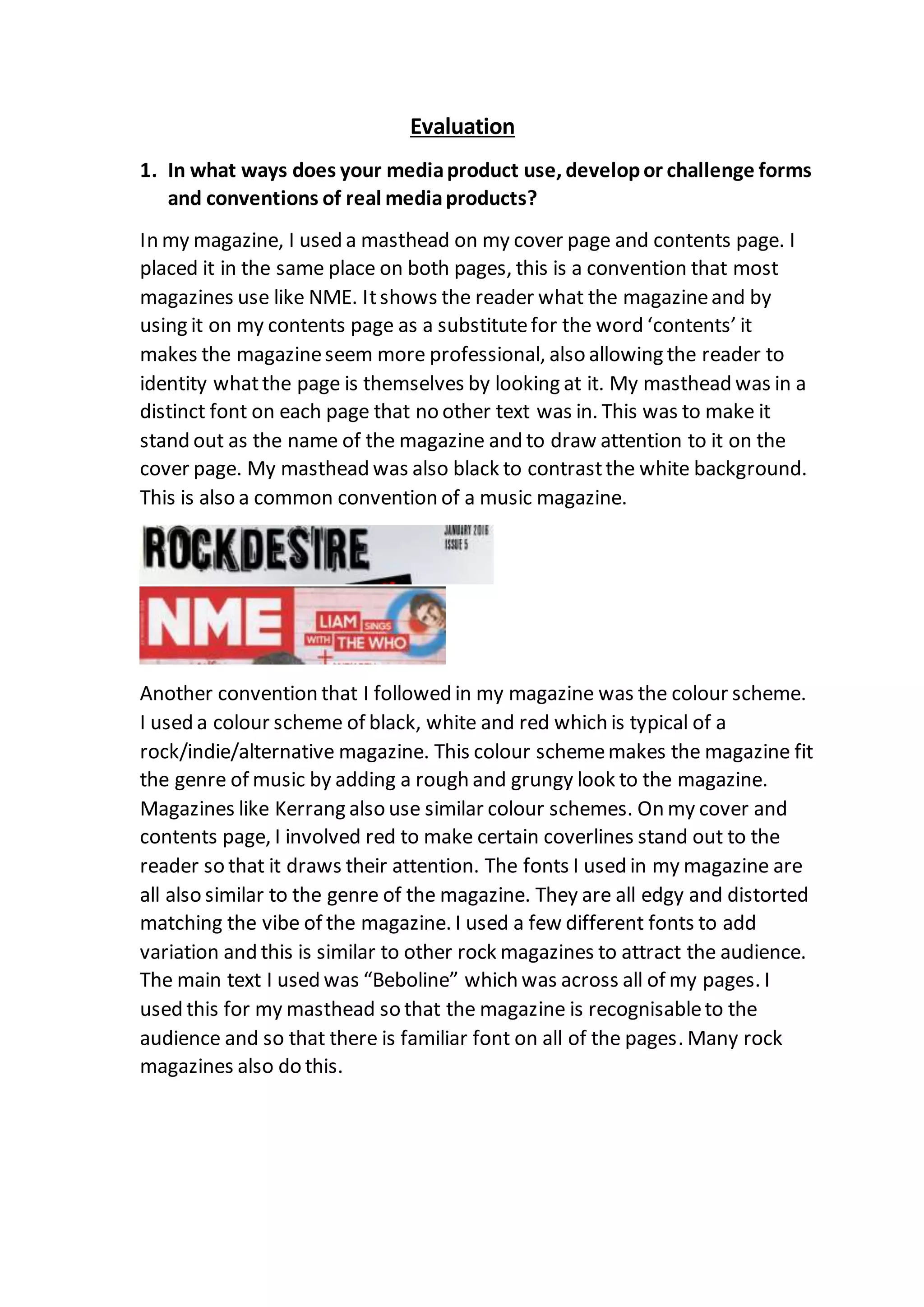
My magazine follows several conventions of real music magazines:
1. It uses a masthead on the cover and contents pages in a distinct font to identify the magazine title, mimicking techniques used by magazines like NME.
2. The color scheme of black, white, and red is typical of rock/indie magazines like Kerrang and adds a rough, grungy look.
3. The fonts mimic those of the genre to attract the target audience, and the main text font is used consistently throughout for familiarity, as seen in many rock magazines.
4. Studio photographs are the primary image on pages, a convention for a more professional look, though some action shots are also used on


![제 23회 보아즈(BOAZ) 빅데이터 컨퍼런스 - [MBOAX] : ABSA를 활용한 소비자 반응 분석 기반 운영 효율화 대시보드 설계](https://cdn.slidesharecdn.com/ss_thumbnails/3-1boaz23rdconferencemboax-260203102709-9d519923-thumbnail.jpg?width=640&height=640&fit=bounds)


