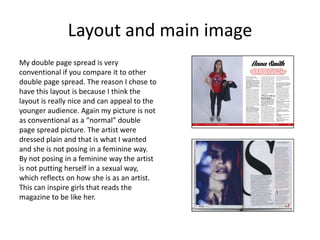
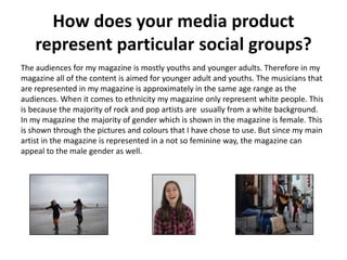
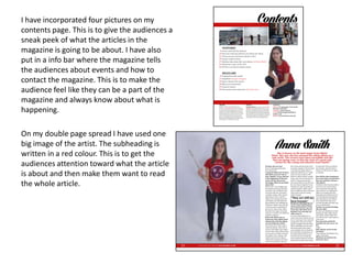
The document discusses the design choices made for various elements of a magazine media product, including the masthead, front cover, contents page, and a double page article spread. For each element, the student compares their design to examples from other magazines and explains how their choices develop or challenge conventions. The student also discusses how the magazine would represent its target audience and the technologies learned through the process of constructing the media product.
Wiztech Automation provides Automation Projects and Services in and around Chennai. Wiztech is the leading Industrial automation service provider company in Chennai
Wiztech offers advanced training on Embedded system with real time industrial project training and its certification. Even Wiztech organize the placement for their candidates. Here you can get the syllabus of advanced automation training and PG Diploma certified training.
Wiztech offers the best PLC Training in Chennai. Wiztech is the best PLC Training Centre in Chennai. You can get practical training on industrial automation live process in real time machineries in Chennai by wiztech. Also get training on PLC, Scada, DCS, HMI, VFD, Embedded, VLSI, IT Training with IAO Certification. So Wiztech is the best PLC Training Centre in Chennai. FOr more Details and online Chat visit http://www.plctraininginchennai.net or http://www.industrialautomation.net.in
01062024_First India Newspaper Jaipur.pdfFIRST INDIA
Find Latest India News and Breaking News these days from India on Politics, Business, Entertainment, Technology, Sports, Lifestyle and Coronavirus News in India and the world over that you can't miss. For real time update Visit our social media handle. Read First India NewsPaper in your morning replace. Visit First India.
CLICK:- https://firstindia.co.in/
#First_India_NewsPaper
27052024_First India Newspaper Jaipur.pdfFIRST INDIA
Find Latest India News and Breaking News these days from India on Politics, Business, Entertainment, Technology, Sports, Lifestyle and Coronavirus News in India and the world over that you can't miss. For real time update Visit our social media handle. Read First India NewsPaper in your morning replace. Visit First India.
CLICK:- https://firstindia.co.in/
#First_India_NewsPaper
31052024_First India Newspaper Jaipur.pdfFIRST INDIA
Find Latest India News and Breaking News these days from India on Politics, Business, Entertainment, Technology, Sports, Lifestyle and Coronavirus News in India and the world over that you can't miss. For real time update Visit our social media handle. Read First India NewsPaper in your morning replace. Visit First India.
CLICK:- https://firstindia.co.in/
#First_India_NewsPaper
role of women and girls in various terror groupssadiakorobi2
Women have three distinct types of involvement: direct involvement in terrorist acts; enabling of others to commit such acts; and facilitating the disengagement of others from violent or extremist groups.
03062024_First India Newspaper Jaipur.pdfFIRST INDIA
Find Latest India News and Breaking News these days from India on Politics, Business, Entertainment, Technology, Sports, Lifestyle and Coronavirus News in India and the world over that you can't miss. For real time update Visit our social media handle. Read First India NewsPaper in your morning replace. Visit First India.
CLICK:- https://firstindia.co.in/
#First_India_NewsPaper
In a May 9, 2024 paper, Juri Opitz from the University of Zurich, along with Shira Wein and Nathan Schneider form Georgetown University, discussed the importance of linguistic expertise in natural language processing (NLP) in an era dominated by large language models (LLMs).
The authors explained that while machine translation (MT) previously relied heavily on linguists, the landscape has shifted. “Linguistics is no longer front and center in the way we build NLP systems,” they said. With the emergence of LLMs, which can generate fluent text without the need for specialized modules to handle grammar or semantic coherence, the need for linguistic expertise in NLP is being questioned.
Welcome to the new Mizzima Weekly !
Mizzima Media Group is pleased to announce the relaunch of Mizzima Weekly. Mizzima is dedicated to helping our readers and viewers keep up to date on the latest developments in Myanmar and related to Myanmar by offering analysis and insight into the subjects that matter. Our websites and our social media channels provide readers and viewers with up-to-the-minute and up-to-date news, which we don’t necessarily need to replicate in our Mizzima Weekly magazine. But where we see a gap is in providing more analysis, insight and in-depth coverage of Myanmar, that is of particular interest to a range of readers.
ys jagan mohan reddy political career, Biography.pdfVoterMood
Yeduguri Sandinti Jagan Mohan Reddy, often referred to as Y.S. Jagan Mohan Reddy, is an Indian politician who currently serves as the Chief Minister of the state of Andhra Pradesh. He was born on December 21, 1972, in Pulivendula, Andhra Pradesh, to Yeduguri Sandinti Rajasekhara Reddy (popularly known as YSR), a former Chief Minister of Andhra Pradesh, and Y.S. Vijayamma.
हम आग्रह करते हैं कि जो भी सत्ता में आए, वह संविधान का पालन करे, उसकी रक्षा करे और उसे बनाए रखे।" प्रस्ताव में कुल तीन प्रमुख हस्तक्षेप और उनके तंत्र भी प्रस्तुत किए गए। पहला हस्तक्षेप स्वतंत्र मीडिया को प्रोत्साहित करके, वास्तविकता पर आधारित काउंटर नैरेटिव का निर्माण करके और सत्तारूढ़ सरकार द्वारा नियोजित मनोवैज्ञानिक हेरफेर की रणनीति का मुकाबला करके लोगों द्वारा निर्धारित कथा को बनाए रखना और उस पर कार्यकरना था।
‘वोटर्स विल मस्ट प्रीवेल’ (मतदाताओं को जीतना होगा) अभियान द्वारा जारी हेल्पलाइन नंबर, 4 जून को सुबह 7 बजे से दोपहर 12 बजे तक मतगणना प्रक्रिया में कहीं भी किसी भी तरह के उल्लंघन की रिपोर्ट करने के लिए खुला रहेगा।
Future Of Fintech In India | Evolution Of Fintech In IndiaTheUnitedIndian
Navigating the Future of Fintech in India: Insights into how AI, blockchain, and digital payments are driving unprecedented growth in India's fintech industry, redefining financial services and accessibility.
4. Masthead
When it came to the Masthead (Fig 1), I wanted
to create something that was simple but at the
same time something that would catch the
audiences eye. I wanted to use a font similar to
Fig 2(Rolling Stone), this is because I think sans
serif fonts can be a bit boring for a Masthead.
That is why I chose the font Lighthouse,
because it is simple but at the same time
interesting. I chose to use black on my
Masthead because I wanted the colours on the
front cover to stand out and keep the
masthead a bit more simple. And I think the
font it self is nice enough on its own, so I think
if I used a colour an the masthead this would
look as nice.
My masthead is then a mix between Fig
2(Rolling Stone) and Fig 3(Kerrang)
Fig 1
Fig 2
Fig 3
5. Main Image and colour scheme
For my main image I have used a medium close up of a girl. I think my front cover is not as conventional as
“normal” front covers. It was taken in a studio and which is normal for a front cover picture. But the way my
model is posing is not as conventional. Usually the artist/model stands in a more feminine pose if it is a woman,
but I did not want my front cover picture to be as conventional. Therefore I used a picture where my model is
smiling and it looks like she is having fun. As well she is not wearing a feminine shirt. She is wearing a oversized
shirt and it is buttoned up. Compared to Fig 2 where the model is wearing a dress with cleavage. While my
model is not showing cleavage at all, just like in Fig 3. But both the modes on Fig 2 and Fig 3 has fixed their hair
in a feminine way and both of the models has curls. While on my pictures my model is very simple with straight
hair and not that much make up.
All of the three covers has red a one of their colours on the front cover. That is way I chose to have red, black
and white as the colours in my colour scheme. I think the red colours on the front cover looks good with the
red on the shirt the model is wearing. I wanted to use red because I think red is a colours which really stands
out, but at the same time it is not to bright.
Fig 1 Fig 2 Fig 3
7. Masthead, Headline, Issue Number
and Date
On my contents page I decided to use the same
font on the masthead that I used on the front
page. This is because I want the magazine to
have the same look through the whole
magazine. Which creates a nice look
throughout the magazine. I was really inspired
by Fig 2(Billboard) contents page, and I liked
how the layout of this contents page. So as you
can see both Fig 1 and Fig 2 is quite similar.
Again I used the same colour scheme as the
front cover. The font I used on the issue
number and date is a sans serif font. I decided
to use this font because I think it is easier for
the audiences to read the date if the font is
written in a sans serif font.
Fig 1
Fig 2
Fig 3
8. Layout
As I said in the other slide I really liked the layout of Billboard’s (Fig 2) contents page.
So I made my contents page really similar to that contents page. I like how the
contents page is split up in three different parts. The layout is simple but at the same
time it is a bit different from all of the other contents pages I looked at when I did the
research. Fig 3(Rolling Stone) has the same colour scheme as my magazine and I think
the red colour is really nice in a magazine.
Fig 1 Fig 2 Fig 3
10. Headline
On my double page I decided to use the same
font as I did on the front page and contents
page. And I chose to do this to have make the
magazine have the same look throughout the
whole magazine. If I compare my headline to
both Fig 2 (Q) and Fig 3(Clash), I would say that
mine is really different from both of the
headlines. My font is bold and I think this
appeals to the younger audience, which is the
group I am aiming for with my magazine. The
headline is placed in at the top of the page
which is conventional at a double page spread.
I decided to use black as the colour because I
wanted the headline to be simple and let the
picture be the main focus. I also think that a
black is a nice colour to use on the headline.
Fig 1
Fig 3
Fig 2
11. Layout and main image
My double page spread is very
conventional if you compare it to other
double page spread. The reason I chose to
have this layout is because I think the
layout is really nice and can appeal to the
younger audience. Again my picture is not
as conventional as a “normal” double
page spread picture. The artist were
dressed plain and that is what I wanted
and she is not posing in a feminine way.
By not posing in a feminine way the artist
is not putting herself in a sexual way,
which reflects on how she is as an artist.
This can inspire girls that reads the
magazine to be like her.
12. How does your media product
represent particular social groups?
The audiences for my magazine is mostly youths and younger adults. Therefore in my
magazine all of the content is aimed for younger adult and youths. The musicians that
are represented in my magazine is approximately in the same age range as the
audiences. When it comes to ethnicity my magazine only represent white people. This
is because the majority of rock and pop artists are usually from a white background.
In my magazine the majority of gender which is shown in the magazine is female. This
is shown through the pictures and colours that I have chose to use. But since my main
artist in the magazine is represented in a not so feminine way, the magazine can
appeal to the male gender as well.
13. What kind of media institution might
distribute your media product and why?
Bauer Media Group already publishes a
magazine which is in the same genre:
• Q magazine, is a monthly magazine,
published by Bauer Media group.
The magazine is manly aimed
towards male gender and 68%
males read the magazine, while only
32% females reads the magazine.
Bauer Media Group publishes Q magazine which includes the same genre as Monitor, I
want Bauer Media Group to be the publisher for my magazine. Since Monitor is more
aimed for youths an younger adults, Bauer Media group will get a new audience. While
the “common” Q reader is usually a male in a bit older age then what Monitor will be
aimed at. Monitor will aim more to the female gender in younger age than what the
“common” Q reader is. In that way I think Bauer Media Group will get an even bigger
audience than they already have.
14. Who would be the audience for your
media product?
I did a survey and an interview to find out who my target audience. From my survey I
found out that my target audience should be aimed towards girls in the age range
from 16-24. In my interview the respondent told me how the she wanted the layout of
a magazine should be.
Now that I am finished with designing my magazine the target audience have not
changed that much. But instead of just focusing on the feminine female gender I have
also incorporated a bit more masculine female gender. Which can appeal to both
females and males.
The musician that I have written about in my magazine is wearing a Paramore t-shirt in
two of the pictures. This can attract Paramore fans and make them want to read about
this musician. And then again make them want to start subscribing to this magazine.
15.
16. How did you attract/address your
audience?
In my interview the respondent talked about how important a simple layout was
important. And that I should use to much colours because she thought this could
seem a bit tacky. She would rather buy a magazine with a simple and clean layout,
than buying a magazine with many strong colours and a messy layout. I decided to use
one colour, but after my magazine analysis I found out that many magazines used red
as a part of their colour scheme. And therefore I wanted to use this colour as well.
I used a medium close up for my front cover. She is
looking into the camera and she is smiling. The pose
and expression she has is not conventional to what a
front cover use to have. But she looks like she is
having fun and in that way she is connecting with the
audience in a positive way. The audiences will
immediately look at the front cover and think
positive thoughts about it since the artist is giving
the audiences such a big an realistic smile.
17. I have incorporated four pictures on my
contents page. This is to give the audiences a
sneak peek of what the articles in the
magazine is going to be about. I have also
put in a info bar where the magazine tells
the audiences about events and how to
contact the magazine. This is to make the
audience feel like they can be a part of the
magazine and always know about what is
happening.
On my double page spread I have used one
big image of the artist. The subheading is
written in a red colour. This is to get the
audiences attention toward what the article
is about and then make them want to read
the whole article.
18. What have you learnt about technologies from
the process of constructing this product?
• I have used survey monkey to create a survey, and now I know how I can easily
collect information when I need it.
• To create my media product I used Photoshop to edit my pictures and InDesign to
create the layout. I have learned different ways to edit an image and how to use
InDesign properly.
• I have learned how to use Slide Share, where I can upload my PowerPoints and
easily share them on the internet.
• For my interview I recorded it on my iPhone and then I put it in iMovie where I
created a audio file that I could post on my blog.
• To take my pictures I used a Canon Eos 550d camera and studio lights. Therefore I
learned which settings I should use and how I should light a model in the studio.
• I have also learned how to upload films, pictures and slideshows on my blog on
Wordpress.
19. Looking back at your preliminary task, what do you
feel you have learnt in the progression from it to the
full product?
Looking back at my preliminary task I can see how much I have learned since the
beginning of this project. I have learned how the layout and contents of a magazine
can appeal to the audience. I have learnt a lot about planning. The planning is really
important and the expression “Plans are nothing, planning is everything” has really
been shown to be true. There has occurred problems or new ideas throughout this
project, which has shown me that the first draft often is not as good as the final
project. I never thought that the research we did in the beginning would be as
important, but as we got further into the project the research showed it self that is
was really important when I was working towards a final product.