SlideShare a Scribd company logo
1 of 4
In what ways does your media product use, develop or challenge forms and conventions of real media products?   I have also used a dominant image for my front cover, although some music magazines have more than one image on their front cover used as anchorage, I chose to keep it more sophisticated and use just the one. The KERRANG magazine is an example of a magazine that uses more than one image on their front cover. They do this to ensure that their younger target audience take an interest in the front cover. The NME magazine is an example of what my magazine is most like. There is just the one image used with a bold font for the bands name. I chose to use a medium long shot image for my front cover because after researching other music magazines I found that it was this shot that was most common and effective. Although both styles of magazines are conventional I chose to use the more controlled use of image rather than the overuse of images. I feel as though it makes my magazine look more stylized, sophisticated and bold.  A convention I have used is the magazine title. It has it’s own style/font, it’s large and it stands out. All magazines do this with their titles. I also chose to overlap the image onto my title. Many magazines also do this as it gives the reader a sense of comfort when they know what the title says still although it is partly covered by an image, whereas people who are not familiar with the magazine may not know this.  I chose to challenge the fact that rock magazines are predominately aimed at males by putting a female rock band on my front cover and making that issue all about the women. I also carried this on in my article. I feel this will also appeal to the males as it is something new and unusual, also if they are a regular to the magazine they would still most likely purchase the magazine. I believe I have used the conventions of a music magazine well as my anchorage is similar to other music magazines on the market. It shows an advertisement for V Festival tickets which will catch more peoples eyes and urge them to pick the magazine up.
In what ways does your media product use, develop or challenge forms and conventions of real media products? Yet again I used the convention of a dominant image in my contents as the scanned in contents also has. I chose to scan in two contents pages from two different magazines to show the conventions and how they are used differently to create a house style. As you can see, both have used a dominant image but the KERRANG contents has chosen to use many more smaller images. This is to yet again, like the article, give the impression that there isn’t much text as the magazine is aimed at a younger audience. On the other hand the Q magazine contents only has two images which gives it a more sophisticated and grown up feel. I chose to use the convention of images in my contents to add some colour and to catch my audiences’ eye.  My contents house style is similar to that of Qs with the page numbers all down one side. I have also chosen to divide them into sections to make it easy reading. I chose to add a website address to my contents page which helps with advertising and distribution of the magazine.  A convention I have challenged is the images of males dominating the page. I chose to add one large image of a male band onto my contents to take the attention away from the girl band as I want to attract both a male and female target audience. I think the images balance each other out well as I also have two images of females. One being a close up of Elle Walker and the other a mid shot of The Banshees. The image of the album covers work well on my contents as it is not defining a sex and would appeal to anyone who is into good music! I chose not to do an editors letter as I believed only the high class magazines would contain one. Although I do want my magazine to be seen as that of a high class I still wanted my magazine to give the impression of young and fun.  The colours and the way I chose to use them are conventional of a Q magazine. As you can see they used a band of colour where the title is and bands of colour for the sections of contents. My contents also had these conventions which I believe helps it look more realistic and professional.
In what ways does your media product use, develop or challenge forms and conventions of real media products? I have used the convention of a dominant image in my article as the scanned in article also has. All magazines use a dominant image for front covers, contents pages and articles. I chose for  my dominant image take up only 50% of the page as I wanted focus more on the interview side of the article. Also as my magazine is aimed at an older audience than KERRANG there was no need to have to use images to draw readers in. This is why KERRANGs’ images are often large, to make their young readers feel as though there isn’t much reading to do. It’s all about the images and posters for KERRANG whereas in my magazine the people are more important.  Pull Quotes are also a convention that I have followed, along with every other magazine. The KERRA NG magazine has used pull quotes to draw their readers in in exactly the same way as I have. My first pull quote is very controversial which then attracts a great amount of attention as it has the name of a rival female singer. This automatically makes the reader think, “ooh I wonder what made her say that?!” they then eagerly read on.  I chose to develop the convention of columns in my magazine. I wanted to use three (as do many magazines) to enable me to fit more into my article and I personally think three columns looks generally better. The KERRANG magazine has only used two columns but as this is an unusual article and also aimed at a much younger audience who are not wanting to read pages of text this layout and style is suited to the magazine.  I chose to challenge the common convention of an all male rock band by interviewing an all female rock band! I made it very obvious in my interview that this was a rare occurrence and that female rock bands are just as good as male, if not better!
In what ways does your media product use, develop or challenge forms and conventions of real media products? This is a questionnaire I created for my target audience to complete. Although the questions are very simple, they open up a chance for the audience to criticise anything they dislike or feel may need to be improved and also to give me a rating from 1-5 of how realistic they feel my magazine is. I decided to target a certain class with the price of my magazine rather than a specific age range, so I chose to simply ask the people who I thought would buy my magazine.  The feedback and results I got from my questionnaire is… Charlie a 19 year old university student rated my magazine 4/5. He would add more vibrant colours to my magazine if he could change anything as he feels it is very dark throughout. Charlie thinks the fonts are very effective and consistent but would like to see more colour in the fonts. There was no advice/constructive criticism to be given.  Tim a 17 year old student rated my magazine 5/5 He would not change anything about my magazine and thinks my layout, colours and fonts are effective as they are clear, eye catching and easy on the eye. He would like a  more retro feel to the magazine if he could change anything.  Jess, an 18 year old student rated my magazine 4/5. She  said she would not change anything about my magazine and she thinks the layout, colours and fonts look professional. As  advice Jess would target my magazine at a larger audience.  Faran a 17 year old student rated my magazine a 5/5 and said she would change the dark colours throughout my  magazine. She thinks the fonts and layout are effective but  as previously said would add more colours. Advice Faran gave me was to add more males in my magazine.  From looking at the results I gained from my questionnaire I have come to the conclusion that more colours would compliment my magazine and attract more readers as would broadening the content in my magazine to catch a larger target audience.

More Related Content

What's hot

Powerpoint evaluation writting
Powerpoint evaluation writtingPowerpoint evaluation writting
Powerpoint evaluation writtingSteve_Royle
 
Jim Lewis AS Media Evaluation
Jim Lewis AS Media EvaluationJim Lewis AS Media Evaluation
Jim Lewis AS Media EvaluationAnne Horne
 
Evaluation 5
Evaluation 5Evaluation 5
Evaluation 5zelrii
 
Evaluation 1 for media
Evaluation 1 for media Evaluation 1 for media
Evaluation 1 for media ruba ibnwargan
 
Evaluation 2 (1)
Evaluation 2 (1)Evaluation 2 (1)
Evaluation 2 (1)harley
 
Evaluation draft answers
Evaluation draft answersEvaluation draft answers
Evaluation draft answersEleanor Round
 

What's hot (18)

Evaluation
EvaluationEvaluation
Evaluation
 
As media evaluation
As media evaluation As media evaluation
As media evaluation
 
Ben mantell
Ben mantellBen mantell
Ben mantell
 
Question 7
Question 7Question 7
Question 7
 
Question 1
Question 1Question 1
Question 1
 
Magazine evaluation
Magazine evaluationMagazine evaluation
Magazine evaluation
 
Powerpoint evaluation writting
Powerpoint evaluation writtingPowerpoint evaluation writting
Powerpoint evaluation writting
 
Evaluation Powerpoint
Evaluation PowerpointEvaluation Powerpoint
Evaluation Powerpoint
 
Jim Lewis AS Media Evaluation
Jim Lewis AS Media EvaluationJim Lewis AS Media Evaluation
Jim Lewis AS Media Evaluation
 
Question 2
Question 2 Question 2
Question 2
 
Evaluation 5
Evaluation 5Evaluation 5
Evaluation 5
 
Magazine evaluation.
Magazine evaluation.Magazine evaluation.
Magazine evaluation.
 
Question 5
Question 5Question 5
Question 5
 
Evaluation 1 for media
Evaluation 1 for media Evaluation 1 for media
Evaluation 1 for media
 
Evaluation
EvaluationEvaluation
Evaluation
 
Evaluation 2 (1)
Evaluation 2 (1)Evaluation 2 (1)
Evaluation 2 (1)
 
Evaluation draft answers
Evaluation draft answersEvaluation draft answers
Evaluation draft answers
 
Ben mantell
Ben mantellBen mantell
Ben mantell
 

Viewers also liked

Sesion 4.6 santiago diaz de sarralde
Sesion 4.6 santiago diaz de sarraldeSesion 4.6 santiago diaz de sarralde
Sesion 4.6 santiago diaz de sarraldeHOLTChristopher
 
Publishing houses
Publishing housesPublishing houses
Publishing housesStacey
 
Victorian square Presentation
Victorian square PresentationVictorian square Presentation
Victorian square Presentationvictoriansquare
 
Fonts & colors
Fonts & colorsFonts & colors
Fonts & colorsStacey
 
Victorian square presentation
Victorian square presentationVictorian square presentation
Victorian square presentationvictoriansquare
 
Victorian Square (Rockwood, TN)
Victorian Square (Rockwood, TN)Victorian Square (Rockwood, TN)
Victorian Square (Rockwood, TN)victoriansquare
 
Idea to Success, a Guide for First Time Entrepreneurs
Idea to Success, a Guide for First Time EntrepreneursIdea to Success, a Guide for First Time Entrepreneurs
Idea to Success, a Guide for First Time EntrepreneursGaurav Oberoi
 

Viewers also liked (9)

Sesion 4.6 santiago diaz de sarralde
Sesion 4.6 santiago diaz de sarraldeSesion 4.6 santiago diaz de sarralde
Sesion 4.6 santiago diaz de sarralde
 
Publishing houses
Publishing housesPublishing houses
Publishing houses
 
Catedrales
CatedralesCatedrales
Catedrales
 
Victorian square Presentation
Victorian square PresentationVictorian square Presentation
Victorian square Presentation
 
Fonts & colors
Fonts & colorsFonts & colors
Fonts & colors
 
Victorian square presentation
Victorian square presentationVictorian square presentation
Victorian square presentation
 
Victorian Square (Rockwood, TN)
Victorian Square (Rockwood, TN)Victorian Square (Rockwood, TN)
Victorian Square (Rockwood, TN)
 
Idea to Success, a Guide for First Time Entrepreneurs
Idea to Success, a Guide for First Time EntrepreneursIdea to Success, a Guide for First Time Entrepreneurs
Idea to Success, a Guide for First Time Entrepreneurs
 
Intro to WebSockets
Intro to WebSocketsIntro to WebSockets
Intro to WebSockets
 

Similar to Q1 done

Question 1
Question 1Question 1
Question 1Romany2
 
Question 1
Question 1Question 1
Question 1romany4
 
Question 1
Question 1Question 1
Question 1Romany2
 
Question 1
Question 1Question 1
Question 1Romany2
 
Question 1
Question 1Question 1
Question 1Romany2
 
Media evaluation 1 and 2
Media evaluation 1 and 2Media evaluation 1 and 2
Media evaluation 1 and 2shaunahughes
 
G321 AS Media Studies
G321 AS Media Studies G321 AS Media Studies
G321 AS Media Studies Lauren Oakley
 
Question 5
Question 5Question 5
Question 5ghrg
 
As media evaluation jake
As media evaluation jakeAs media evaluation jake
As media evaluation jakeJ4K360
 
Media evaluation
Media evaluationMedia evaluation
Media evaluationfaithsavory
 
Gareth tomlins 2
Gareth tomlins 2Gareth tomlins 2
Gareth tomlins 2afrench14
 

Similar to Q1 done (20)

Question 1
Question 1Question 1
Question 1
 
Question 1
Question 1Question 1
Question 1
 
Question 1
Question 1Question 1
Question 1
 
Question 1
Question 1Question 1
Question 1
 
Question 1
Question 1Question 1
Question 1
 
Media evaluation 1 and 2
Media evaluation 1 and 2Media evaluation 1 and 2
Media evaluation 1 and 2
 
G321 AS Media Studies
G321 AS Media Studies G321 AS Media Studies
G321 AS Media Studies
 
Question 5
Question 5Question 5
Question 5
 
As media evaluation jake
As media evaluation jakeAs media evaluation jake
As media evaluation jake
 
Evaluation
EvaluationEvaluation
Evaluation
 
My final evaluation
My final evaluationMy final evaluation
My final evaluation
 
My final evaluation
My final evaluationMy final evaluation
My final evaluation
 
Final evaluation
Final evaluationFinal evaluation
Final evaluation
 
Media evaluation
Media evaluationMedia evaluation
Media evaluation
 
Evaluation
EvaluationEvaluation
Evaluation
 
Gareth tomlins 2
Gareth tomlins 2Gareth tomlins 2
Gareth tomlins 2
 
Evaluation
EvaluationEvaluation
Evaluation
 
Question 2 evaluation
Question 2 evaluationQuestion 2 evaluation
Question 2 evaluation
 
Question 2 evaluation
Question 2 evaluationQuestion 2 evaluation
Question 2 evaluation
 
Jessica's evaluation
Jessica's evaluationJessica's evaluation
Jessica's evaluation
 

More from Stacey

Ppt0000002
Ppt0000002Ppt0000002
Ppt0000002Stacey
 
Ppt0000004
Ppt0000004Ppt0000004
Ppt0000004Stacey
 
Ppt0000002
Ppt0000002Ppt0000002
Ppt0000002Stacey
 
Ppt0000001
Ppt0000001Ppt0000001
Ppt0000001Stacey
 
Ppt0000004
Ppt0000004Ppt0000004
Ppt0000004Stacey
 
Ppt0000001
Ppt0000001Ppt0000001
Ppt0000001Stacey
 
Ppt0000002
Ppt0000002Ppt0000002
Ppt0000002Stacey
 
Ppt0000001
Ppt0000001Ppt0000001
Ppt0000001Stacey
 
Official websites
Official websitesOfficial websites
Official websitesStacey
 
Presentation1
Presentation1Presentation1
Presentation1Stacey
 
Audience feedback questionnaire
Audience feedback questionnaireAudience feedback questionnaire
Audience feedback questionnaireStacey
 
Audience feedback questionnaire
Audience feedback questionnaireAudience feedback questionnaire
Audience feedback questionnaireStacey
 
Track list questionnaire results
Track list questionnaire resultsTrack list questionnaire results
Track list questionnaire resultsStacey
 
Track list questionnaire
Track list questionnaireTrack list questionnaire
Track list questionnaireStacey
 
Image questionnaire
Image questionnaireImage questionnaire
Image questionnaireStacey
 

More from Stacey (20)

Ppt0000002
Ppt0000002Ppt0000002
Ppt0000002
 
Ppt0000004
Ppt0000004Ppt0000004
Ppt0000004
 
3
33
3
 
Ppt0000002
Ppt0000002Ppt0000002
Ppt0000002
 
Ppt0000001
Ppt0000001Ppt0000001
Ppt0000001
 
Ppt0000004
Ppt0000004Ppt0000004
Ppt0000004
 
3
33
3
 
Ppt0000001
Ppt0000001Ppt0000001
Ppt0000001
 
Ppt0000002
Ppt0000002Ppt0000002
Ppt0000002
 
4
44
4
 
Ppt0000001
Ppt0000001Ppt0000001
Ppt0000001
 
3
33
3
 
Official websites
Official websitesOfficial websites
Official websites
 
3
33
3
 
Presentation1
Presentation1Presentation1
Presentation1
 
Audience feedback questionnaire
Audience feedback questionnaireAudience feedback questionnaire
Audience feedback questionnaire
 
Audience feedback questionnaire
Audience feedback questionnaireAudience feedback questionnaire
Audience feedback questionnaire
 
Track list questionnaire results
Track list questionnaire resultsTrack list questionnaire results
Track list questionnaire results
 
Track list questionnaire
Track list questionnaireTrack list questionnaire
Track list questionnaire
 
Image questionnaire
Image questionnaireImage questionnaire
Image questionnaire
 

Q1 done

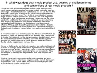
  • 1. In what ways does your media product use, develop or challenge forms and conventions of real media products? I have also used a dominant image for my front cover, although some music magazines have more than one image on their front cover used as anchorage, I chose to keep it more sophisticated and use just the one. The KERRANG magazine is an example of a magazine that uses more than one image on their front cover. They do this to ensure that their younger target audience take an interest in the front cover. The NME magazine is an example of what my magazine is most like. There is just the one image used with a bold font for the bands name. I chose to use a medium long shot image for my front cover because after researching other music magazines I found that it was this shot that was most common and effective. Although both styles of magazines are conventional I chose to use the more controlled use of image rather than the overuse of images. I feel as though it makes my magazine look more stylized, sophisticated and bold. A convention I have used is the magazine title. It has it’s own style/font, it’s large and it stands out. All magazines do this with their titles. I also chose to overlap the image onto my title. Many magazines also do this as it gives the reader a sense of comfort when they know what the title says still although it is partly covered by an image, whereas people who are not familiar with the magazine may not know this. I chose to challenge the fact that rock magazines are predominately aimed at males by putting a female rock band on my front cover and making that issue all about the women. I also carried this on in my article. I feel this will also appeal to the males as it is something new and unusual, also if they are a regular to the magazine they would still most likely purchase the magazine. I believe I have used the conventions of a music magazine well as my anchorage is similar to other music magazines on the market. It shows an advertisement for V Festival tickets which will catch more peoples eyes and urge them to pick the magazine up.
  • 2. In what ways does your media product use, develop or challenge forms and conventions of real media products? Yet again I used the convention of a dominant image in my contents as the scanned in contents also has. I chose to scan in two contents pages from two different magazines to show the conventions and how they are used differently to create a house style. As you can see, both have used a dominant image but the KERRANG contents has chosen to use many more smaller images. This is to yet again, like the article, give the impression that there isn’t much text as the magazine is aimed at a younger audience. On the other hand the Q magazine contents only has two images which gives it a more sophisticated and grown up feel. I chose to use the convention of images in my contents to add some colour and to catch my audiences’ eye. My contents house style is similar to that of Qs with the page numbers all down one side. I have also chosen to divide them into sections to make it easy reading. I chose to add a website address to my contents page which helps with advertising and distribution of the magazine. A convention I have challenged is the images of males dominating the page. I chose to add one large image of a male band onto my contents to take the attention away from the girl band as I want to attract both a male and female target audience. I think the images balance each other out well as I also have two images of females. One being a close up of Elle Walker and the other a mid shot of The Banshees. The image of the album covers work well on my contents as it is not defining a sex and would appeal to anyone who is into good music! I chose not to do an editors letter as I believed only the high class magazines would contain one. Although I do want my magazine to be seen as that of a high class I still wanted my magazine to give the impression of young and fun. The colours and the way I chose to use them are conventional of a Q magazine. As you can see they used a band of colour where the title is and bands of colour for the sections of contents. My contents also had these conventions which I believe helps it look more realistic and professional.
  • 3. In what ways does your media product use, develop or challenge forms and conventions of real media products? I have used the convention of a dominant image in my article as the scanned in article also has. All magazines use a dominant image for front covers, contents pages and articles. I chose for my dominant image take up only 50% of the page as I wanted focus more on the interview side of the article. Also as my magazine is aimed at an older audience than KERRANG there was no need to have to use images to draw readers in. This is why KERRANGs’ images are often large, to make their young readers feel as though there isn’t much reading to do. It’s all about the images and posters for KERRANG whereas in my magazine the people are more important. Pull Quotes are also a convention that I have followed, along with every other magazine. The KERRA NG magazine has used pull quotes to draw their readers in in exactly the same way as I have. My first pull quote is very controversial which then attracts a great amount of attention as it has the name of a rival female singer. This automatically makes the reader think, “ooh I wonder what made her say that?!” they then eagerly read on. I chose to develop the convention of columns in my magazine. I wanted to use three (as do many magazines) to enable me to fit more into my article and I personally think three columns looks generally better. The KERRANG magazine has only used two columns but as this is an unusual article and also aimed at a much younger audience who are not wanting to read pages of text this layout and style is suited to the magazine. I chose to challenge the common convention of an all male rock band by interviewing an all female rock band! I made it very obvious in my interview that this was a rare occurrence and that female rock bands are just as good as male, if not better!
  • 4. In what ways does your media product use, develop or challenge forms and conventions of real media products? This is a questionnaire I created for my target audience to complete. Although the questions are very simple, they open up a chance for the audience to criticise anything they dislike or feel may need to be improved and also to give me a rating from 1-5 of how realistic they feel my magazine is. I decided to target a certain class with the price of my magazine rather than a specific age range, so I chose to simply ask the people who I thought would buy my magazine. The feedback and results I got from my questionnaire is… Charlie a 19 year old university student rated my magazine 4/5. He would add more vibrant colours to my magazine if he could change anything as he feels it is very dark throughout. Charlie thinks the fonts are very effective and consistent but would like to see more colour in the fonts. There was no advice/constructive criticism to be given. Tim a 17 year old student rated my magazine 5/5 He would not change anything about my magazine and thinks my layout, colours and fonts are effective as they are clear, eye catching and easy on the eye. He would like a more retro feel to the magazine if he could change anything. Jess, an 18 year old student rated my magazine 4/5. She said she would not change anything about my magazine and she thinks the layout, colours and fonts look professional. As advice Jess would target my magazine at a larger audience. Faran a 17 year old student rated my magazine a 5/5 and said she would change the dark colours throughout my magazine. She thinks the fonts and layout are effective but as previously said would add more colours. Advice Faran gave me was to add more males in my magazine. From looking at the results I gained from my questionnaire I have come to the conclusion that more colours would compliment my magazine and attract more readers as would broadening the content in my magazine to catch a larger target audience.