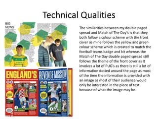
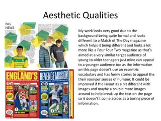
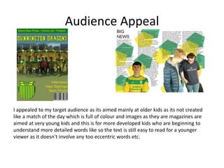
Evaluation
Oscar Gibb
Research
• My research had a lot of strengths as I already knew what idea I was
intending on creating as I had created a piece of magazine for my GCSE
project on a football team so I wanted to make a similar piece as it was
creatively different and interesting (for me) to make. My research
consisted of a lot of sport magazines like Match of The Day, Four Four Two
as I also researched a stereotypical women's magazine as I wanted to see
what may help me attract a bigger audience (the women) as younger girls
are mostly segregated to only pink and don’t find football as interesting so
I thought I may attempt to create a double paged spread which involved
men and women teams so it would appeal to all audiences and is better
fro the younger ages.
Planning
• The strengths to my planning is that I had already made a similar project
on magazines so I had a fairly clear understanding of the project and what
I needed to do and so I had an idea already in my had of what I could
create as it was going to link to what I enjoy so the project is enjoyable but
also something I know I can create but in prove my skills and create
something different to the usual football magazines that are released all
the time as I didn't want to make a complete replica of a Match of The Day
magazine and so I wanted to make a magazine which was a bit more
formal and wasn’t packed full of explosive colours etc.
Time Management
• My time management was better than on the other projects as I was ill for
a full weak but I came in and stayed behind in lessons and spent all my
frees catching back up on the pre-production stage and also I caught up on
all my past projects etc. I was up to date throughout the project as every
piece of my work has been delivered on on deadline days until my week
off although I have still caught up an everything was on time. I think I
could have still improved my time management by spending less time on
production and more time on. My pre-production and planning stages as
they are lacking in detail etc.
Technical Qualities
My front covers isn't very similar to a match of
the day magazine as my magazine is dedicated
to one club and so I wanted to focus more on
that side than creating a magazine which is
very similar to Match of The Day as it is full of
different PUGs and is not suitable for a kid in
the age that my magazine is aimed towards.
The similarities between my magazine and the
Match of The Day magazine is that they're
both football based and both are made o
appeal to a younger audience although mine is
aimed at a slightly higher aged audience due
to the cover.
Technical Qualities
The similarities between my double paged
spread and Match of The Day’s is that they
both follow a colour scheme with the front
cover as mine follows the yellow and green
colour scheme which is created to match the
football teams badge and kit whereas the
Match of The Day double paged spread still
follows the theme of the front cover as It
involves a lot of PUG’s as there is still a lot of
information dotted around the page as most
of the time the information is provided with
an image as most of their audience would
only be interested in the piece of text
because of what the image may be.
Aesthetic Qualities
My work looks good and better than most of my
other project due to me using new and different
tools on Photoshop like the pencil an gradient blend
tool and having the layout of the text to be natural
and in a more formal style to combine a children's
magazine like Match of The Day with a more formal
and adult consumed one like Four Four Two as mine
is aimed at an older audience than match of the day
as the younger teenagers will begin to understand
the humour of the magazine compared to the
humour in Match of The Day. The strengths of my
magazine is that it hits the main target audience of
teenagers.
Aesthetic Qualities
My work looks very good due to the
background being quite formal and looks
different to a Match of The Day magazine
which helps it being different and looks a lot
more like a Four Four Two magazine as that’s
aimed at a very similar target audience of
young to older teenagers just mine can appeal
to a younger audience too as the information
on this page doesn't use an eccentric
vocabulary and has funny stories to appeal the
their younger senses of humour. It could be
improved if the layout as a bit different with
images and maybe a couple more images
around to help break up the text on the page
so it doesn't’t come across as a boring piece of
information.
Audience Appeal
I appealed to my target audience as its aimed mainly at older kids as its not created
like a match of the day which is full of colour and images as they are magazines are
aimed at very young kids and this is for more developed kids who are beginning to
understand more detailed words like so the text is still easy to read for a younger
viewer as it doesn't involve any too eccentric words etc.

7. evaluation(1)

  • 1.
  • 2.
    Research • My researchhad a lot of strengths as I already knew what idea I was intending on creating as I had created a piece of magazine for my GCSE project on a football team so I wanted to make a similar piece as it was creatively different and interesting (for me) to make. My research consisted of a lot of sport magazines like Match of The Day, Four Four Two as I also researched a stereotypical women's magazine as I wanted to see what may help me attract a bigger audience (the women) as younger girls are mostly segregated to only pink and don’t find football as interesting so I thought I may attempt to create a double paged spread which involved men and women teams so it would appeal to all audiences and is better fro the younger ages.
  • 3.
    Planning • The strengthsto my planning is that I had already made a similar project on magazines so I had a fairly clear understanding of the project and what I needed to do and so I had an idea already in my had of what I could create as it was going to link to what I enjoy so the project is enjoyable but also something I know I can create but in prove my skills and create something different to the usual football magazines that are released all the time as I didn't want to make a complete replica of a Match of The Day magazine and so I wanted to make a magazine which was a bit more formal and wasn’t packed full of explosive colours etc.
  • 4.
    Time Management • Mytime management was better than on the other projects as I was ill for a full weak but I came in and stayed behind in lessons and spent all my frees catching back up on the pre-production stage and also I caught up on all my past projects etc. I was up to date throughout the project as every piece of my work has been delivered on on deadline days until my week off although I have still caught up an everything was on time. I think I could have still improved my time management by spending less time on production and more time on. My pre-production and planning stages as they are lacking in detail etc.
  • 5.
    Technical Qualities My frontcovers isn't very similar to a match of the day magazine as my magazine is dedicated to one club and so I wanted to focus more on that side than creating a magazine which is very similar to Match of The Day as it is full of different PUGs and is not suitable for a kid in the age that my magazine is aimed towards. The similarities between my magazine and the Match of The Day magazine is that they're both football based and both are made o appeal to a younger audience although mine is aimed at a slightly higher aged audience due to the cover.
  • 6.
    Technical Qualities The similaritiesbetween my double paged spread and Match of The Day’s is that they both follow a colour scheme with the front cover as mine follows the yellow and green colour scheme which is created to match the football teams badge and kit whereas the Match of The Day double paged spread still follows the theme of the front cover as It involves a lot of PUG’s as there is still a lot of information dotted around the page as most of the time the information is provided with an image as most of their audience would only be interested in the piece of text because of what the image may be.
  • 7.
    Aesthetic Qualities My worklooks good and better than most of my other project due to me using new and different tools on Photoshop like the pencil an gradient blend tool and having the layout of the text to be natural and in a more formal style to combine a children's magazine like Match of The Day with a more formal and adult consumed one like Four Four Two as mine is aimed at an older audience than match of the day as the younger teenagers will begin to understand the humour of the magazine compared to the humour in Match of The Day. The strengths of my magazine is that it hits the main target audience of teenagers.
  • 8.
    Aesthetic Qualities My worklooks very good due to the background being quite formal and looks different to a Match of The Day magazine which helps it being different and looks a lot more like a Four Four Two magazine as that’s aimed at a very similar target audience of young to older teenagers just mine can appeal to a younger audience too as the information on this page doesn't use an eccentric vocabulary and has funny stories to appeal the their younger senses of humour. It could be improved if the layout as a bit different with images and maybe a couple more images around to help break up the text on the page so it doesn't’t come across as a boring piece of information.
  • 9.
    Audience Appeal I appealedto my target audience as its aimed mainly at older kids as its not created like a match of the day which is full of colour and images as they are magazines are aimed at very young kids and this is for more developed kids who are beginning to understand more detailed words like so the text is still easy to read for a younger viewer as it doesn't involve any too eccentric words etc.

Editor's Notes

  • #3Ā What were the strengths of your research? How did your research help your product? What were the weaknesses of your research? What could you have done better/improve? What effect would this have had on your product?
  • #4Ā What were the strengths of your planning? How did your planning help your product? What were the weaknesses of your planning? What could you have done better/improve? What effect would this have had on your product?
  • #5Ā Did you manage your time well? Did you complete your project on time or would your products have improved with additional time? What would you have done if you had more time to produce your work?
  • #6Ā Compare your work to similar existing products and discuss the similarities and differences Put your final piece(s) in the centre of a page alongside an existing product Use text boxes and arrows
  • #7Ā Compare your work to similar existing products and discuss the similarities and differences Put your final piece(s) in the centre of a page alongside an existing product Use text boxes and arrows
  • #8Ā Does your work look good? Was it creative? What aspects of your game’s visuals do you like? What would you improve? How would you improve it? Discuss the strengths and weaknesses Put your final piece(s) in the centre of a page and analyse them Use text boxes and arrows
  • #9Ā Does your work look good? Was it creative? What aspects of your game’s visuals do you like? What would you improve? How would you improve it? Discuss the strengths and weaknesses Put your final piece(s) in the centre of a page and analyse them Use text boxes and arrows
  • #10Ā How have you appealed to your target audience? What specific bits of content would appeal to your target audience. Refer to your findings from your questionnaire. Put your final piece(s) in the centre of a page and analyse them Use text boxes and arrows