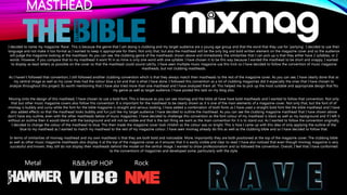
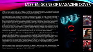
The document discusses the language and design conventions used in the student's media magazine project on clubbing culture. For the masthead, the student chose the word "Rave" to match the target audience's interests while analyzing conventions from other music magazines. Font choices and layouts were selected to be bold, colorful and eye-catching based on analyzing examples from Mixmag magazine. Photoshoots used props like neon makeup and lighting to represent the club atmosphere. Typography and language for the cover, contents page and double-page spread followed conventions of being short, catchy and informal to engage the young adult audience. Conventions were both adhered to and developed based on in-depth analysis of comparable magazines.