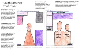
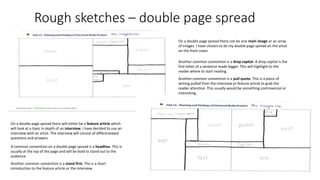
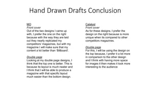
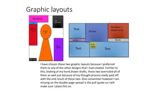
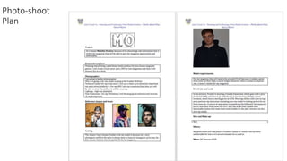
The document provides details on the layout and design elements for the front cover and double page spread of a magazine. For the front cover, it discusses the placement of the masthead, strapline, main image, barcode, and cover lines. For the double page spread, it outlines features like the headline, stand first, images, drop capital, and pull quote. It also includes sketches of potential graphic layouts for these sections.
This is an Evaluation point for my AS Media coursework. I have picked out small sections and analysed what I have done well and what could be improved.
2024.06.01 Introducing a competency framework for languag learning materials ...Sandy Millin
http://sandymillin.wordpress.com/iateflwebinar2024
Published classroom materials form the basis of syllabuses, drive teacher professional development, and have a potentially huge influence on learners, teachers and education systems. All teachers also create their own materials, whether a few sentences on a blackboard, a highly-structured fully-realised online course, or anything in between. Despite this, the knowledge and skills needed to create effective language learning materials are rarely part of teacher training, and are mostly learnt by trial and error.
Knowledge and skills frameworks, generally called competency frameworks, for ELT teachers, trainers and managers have existed for a few years now. However, until I created one for my MA dissertation, there wasn’t one drawing together what we need to know and do to be able to effectively produce language learning materials.
This webinar will introduce you to my framework, highlighting the key competencies I identified from my research. It will also show how anybody involved in language teaching (any language, not just English!), teacher training, managing schools or developing language learning materials can benefit from using the framework.
Instructions for Submissions thorugh G- Classroom.pptxJheel Barad
This presentation provides a briefing on how to upload submissions and documents in Google Classroom. It was prepared as part of an orientation for new Sainik School in-service teacher trainees. As a training officer, my goal is to ensure that you are comfortable and proficient with this essential tool for managing assignments and fostering student engagement.
A Strategic Approach: GenAI in EducationPeter Windle
Artificial Intelligence (AI) technologies such as Generative AI, Image Generators and Large Language Models have had a dramatic impact on teaching, learning and assessment over the past 18 months. The most immediate threat AI posed was to Academic Integrity with Higher Education Institutes (HEIs) focusing their efforts on combating the use of GenAI in assessment. Guidelines were developed for staff and students, policies put in place too. Innovative educators have forged paths in the use of Generative AI for teaching, learning and assessments leading to pockets of transformation springing up across HEIs, often with little or no top-down guidance, support or direction.
This Gasta posits a strategic approach to integrating AI into HEIs to prepare staff, students and the curriculum for an evolving world and workplace. We will highlight the advantages of working with these technologies beyond the realm of teaching, learning and assessment by considering prompt engineering skills, industry impact, curriculum changes, and the need for staff upskilling. In contrast, not engaging strategically with Generative AI poses risks, including falling behind peers, missed opportunities and failing to ensure our graduates remain employable. The rapid evolution of AI technologies necessitates a proactive and strategic approach if we are to remain relevant.
How to Make a Field invisible in Odoo 17Celine George
It is possible to hide or invisible some fields in odoo. Commonly using “invisible” attribute in the field definition to invisible the fields. This slide will show how to make a field invisible in odoo 17.
Francesca Gottschalk - How can education support child empowerment.pptxEduSkills OECD
Francesca Gottschalk from the OECD’s Centre for Educational Research and Innovation presents at the Ask an Expert Webinar: How can education support child empowerment?
Macroeconomics- Movie Location
This will be used as part of your Personal Professional Portfolio once graded.
Objective:
Prepare a presentation or a paper using research, basic comparative analysis, data organization and application of economic information. You will make an informed assessment of an economic climate outside of the United States to accomplish an entertainment industry objective.
Read| The latest issue of The Challenger is here! We are thrilled to announce that our school paper has qualified for the NATIONAL SCHOOLS PRESS CONFERENCE (NSPC) 2024. Thank you for your unwavering support and trust. Dive into the stories that made us stand out!
Welcome to TechSoup New Member Orientation and Q&A (May 2024).pdfTechSoup
In this webinar you will learn how your organization can access TechSoup's wide variety of product discount and donation programs. From hardware to software, we'll give you a tour of the tools available to help your nonprofit with productivity, collaboration, financial management, donor tracking, security, and more.
2. Rough sketches –
front cover
The masthead is also known as
the title of the magazine. The
masthead here is placed the top
left hand corner very much like
‘Q’ magazine. The masthead
should give off a sense of brand
identity and should be the same
on each magazine that is
produced.
The strapline is a short, snappy
slogan associated to the
magazine. This is usually placed
near the masthead and I have
decided to place it below the
masthead.
The main image is placed at the
center of the magazine and
would usually overlap the
masthead. This can be any type
of technical code, I decided to
use the technical code of a
medium close up.
The barcode would usually
contain the price, issue and date
of the magazine. This ‘informs’
(Katz) the user before they
decide to buy the magazine.
The convention of a puff
promotion is placed on the
magazine to entice the reader to
buy the magazine. This is usually
something free, or something
the audience can win.
Cover lines are usually placed down the left and right
hand side of the magazine. These are secondary
stories and will tell the reader what will be inside the
magazine. You can usually tell the genre of the
magazine by reading the cover lines.
3. Rough sketches – double page spread
On a double page spread there will either be a feature article which
will look at a topic in depth of an interview. I have decided to use an
interview with an artist. The interview will consist of differentiated
questions and answers.
A common convention on a double page spread is a headline. This is
usually at the top of the page and will be bold to stand out to the
audience.
Another common convention is a stand first. The is a short
introduction to the feature article or the interview.
On a double page spread there can be one main image or an array
of images. I have chosen to do my double page spread on the artist
on the front cover.
Another common convention is a drop capital. A drop capital is the
first letter of a sentence made bigger. This will highlight to the
reader where to start reading.
Another common convention is a pull quote. This is a piece of
writing pulled from the interview or feature article to grab the
reader attention. This usually would be something controversial or
interesting.
4. Hand Drawn Drafts Conclusion
MO
Front cover
Out of the two designs I came up
with, I prefer the one on the right
because with the way they are laid
out they nearly replicated my
competitors’ magazines, but with my
magazine I will make sure that my
content a lot better than ‘Billboard’.
Double page
Looking at my double page designs, I
think that the top one is better. This is
because its layout is much neater and
I think that I will be able to produce a
magazine with that specific layout
much easier than the bottom design.
Catalyst
Front cover
As for these designs, I prefer the
design on the right because is more
unique when its compared to other
competitors magazines.
Double page
For this, I will be using the design on
the top because, I prefer it a lot more
in comparison to the other design
and I think with having more space
for images it then makes it look more
interesting to the audience
5. House Style - MO
Colour scheme
For MO magazine I will be using monochrome with hints of yellow. This is
because using black and white will show the contrast of my magazine and
how my magazine can bring sunlight to the darkness using the hints of
yellow. I have decided to using yellow because I connotes sunlight and
joyfulness.
Font style
For MO magazine I will be using the font style is known as ‘Arial rounded MT
bold’. The reason for this is, I think that is a great font to go with my
masthead, also because of my younger targeted audience as the font is
rounded and bold it shows the informal side to my magazine, as I don’t
intend on targeting anyone over the age of 25 and that aren't in the socio-
economic needs sector that I have chosen.
Social media
MO magazine will be a synergy with all social medias. This is because I will
then be able to reach out to a lot more people and possibly on a global scale
eventually. Using the most popular social medias such as Instagram, Snapchat
and twitter to promote and give my audience updates and possible
exclusives.
6. Font Styles
MO magazine fonts Catalyst magazine fonts
For MO magazine I have chosen these fonts because they reflect my
intentions with this magazine, as you can see with some of my chosen fonts
are more suited to my audience. Looking at font number three, it definitely
target my audience of the socio-economic needs table which was from C2-
E, this has an age range of about 15-25 meaning that I will need to make
sure that my fonts are more informal as it will attract the targeted audience.
looking at my fonts that I have selected for my second magazine called
“Catalyst”, this magazine is targeted more towards people of a different
taste to “MO” as the language in “Catalyst” magazine even though it is still
targeted at C2-E, it is more formal.
7. Masthead ideas
Looking at the mind map on the side you can
see that I had several other ideas of what I
wanted to call my magazine. From inspirations
such as NME, Q and Billboard, I have used
their magazines as inspiration into making my
magazines. I have chosen MO because it
denotes ‘Monthly Ovation’ which connotes
the magazine will be produced monthly to
‘entertain’ (Katz) the audience and using the
word ‘ovation’ connotes the magazine will be
professional and the audience will applaud
the magazine for being a brand new and
good.
Masthead
KiNGS
GRiME
MADDDD
RAD
COOL
MAGIC
QuE
MO
9. Images of influence
The magazine above are some of the magazines that I will be
trying to replicate it in my own way on my front covers. The
positioning of the masthead and model are the few things that I
will be trying to repeat. For my MO magazine, I will be repeating
the positioning and size of the model image and positioning of
the magazine logo. Further to this, looking at the front cover of
NME I will be using their similar colour scheme making it plain
and simple for everyone.
10. Draft interview
Hi Frankie, how are you doing?
Hello, I'm doing great thanks, how have you been keeping
mate?
I've been amazing, thank you for asking! Lets get into this
interview then shall we?
Go on I’m more than ready.
For many weeks now, there has been a rumour going
around about a collaboration with someone big, is that
true?
Yes this is true, however I am most definitely not prepared to
release this to anyone until I am ready to get to work with this
artist, sorry for the disappointment.
That's ok, I totally understand that you want to keep it as a
surprise.
I am very proud of this new project, I feel that it could be one
of my biggest pieces of work that I have ever done; its going
to something else!
Well something else that people want to know is that in
some of your most recent singles, there have been some
suspicious remarks to really specific things, are they relating
to something that has actually happened to you?
Wow. You really have looked into my work with great detail
haven't you. With some of my remarks, they are relatable to
things that have really happened to me. For example there
was a moment in the song where I began to speak about how
when I say hello, no one answers; this is to do with a tough
breakup that I went through that I found really hard to deal
with.
That must have been really hard, are you feeling ok to talk about it ?
Yes, I am totally over it now. Thank you for asking.
Ok, lets move onto another topic. Everyone wants to know what
makes you smile everyday?
Well, some things that I enjoy in my spare time is modelling, I am very
keen on keeping my Instagram up to date by posting every other week.
I could never of guessed! What are you most proud of, out of all your
success?
Through my success, I am most grateful and proud of my fans as they
are the reason why I have got to where I am today, without them I am
nothing.
That’s really nice of you to say… lets talk about another part of your
crazy journey, what did you spend your first check on after you had
your debut single in the top 10 for several weeks?
Well there was many spending sprees, but my most memorable item I
bought was a car for my mum and dad, Mercedes G-wagon. I really do
love doing things like this, especially for the people who I love, it makes
me feel like I really have succeeded when I'm able to give back to the
people who have supported me on my journey.
Wow that is something special. What a great way to end the
interview, with a heartwarming outline of how you made your
parents proud and displayed your respect and success.
Yes, it is really something special. Thank you for having me, its been
great to share my story with you and your fans.
For the double page spread I
decided to do an interview. I
drafted the interview before I
put it on the page.
11. Graphic layouts
caption Quote
Text Text
Photos
Headline /
stand verse
Drop
capital
Text
Masthead
Headline or
Anchorage
text. Photo of
artist
barcode
Puff
promotion
strapline
Cover
stories
I have chosen these two graphic layouts because I preferred
them to any of the other designs that I had created. Further to
this, looking at my hand drawn drafts, these two overruled all of
them as well just because of my thought process really paid off
with the end result of these two. One convention however I am
missing on the double page spread is the pull quote so I will
make sure I place this on.
13. Production plan
Week beginning
Monday Tuesday Wednesday Thursday Friday
Find a location for
an office
Buy equipment Recruit staff Set up equipment
and furniture in the
office
Meet all employees
and go through
what needs to be
done
Completed by
June 4th June 5th June 6th June 7th June 8th
Week beginning
Monday Tuesday Wednesday Thursday Friday
Get writers and
journalists to gather
information for the
magazine.
Organize a meeting
for design ideas
Set a date to when
the magazine will
be released
Manage the
schedule for the
magazine
Editorial and
budget decisions
need to made
Completed by
June 11th June 12th June 13th June 14th June 15th
14. Production plan continued
Week beginning
Monday Tuesday Wednesday Thursday Friday
Editorial and
budget decisions
need to made
Decide the content
which will be in the
magazine
Decide the content
which will be in the
magazine
Edit the magazine Edit the magazine
Completed by
June 18th June 19th June 20th June 21st June 22nd
Week beginning
Monday Tuesday Wednesday Thursday Friday
Edit the magazine Layout the pages
for the magazine
Layout the pages
for the magazine
Proofreading Proofreading
Completed by
June 25th June 26th June 27th June 28th June 29th
I will be making around 15,000 copies for my magazine. The reason for this is because
of the high demand for the exclusives that my magazines can provide.
15. Environment and presentation
On the side are some pictures that are evidence of the
equipment and the environment that I was surrounded with.
Using these I was able to complete my pitch for my
magazine. From the images you can see that I had used
many things to make sure that my pitch was successful. For
example, I used a slide changer, this was so that I didn't
have to be put in an awkward position where i had to
constantly use the keyboard or mouse to change the slide.
Further to this, i had to use a Apple Mac computer, which
was where i was able to have my pitch loaded and ready on
there; using this i was able to link it to the interactive
whiteboard, this was where i was able to present my work
where it could be viewed by my peers. One of the more
imporant components to the pitch was the camera and it’s
stand, this was so that it could get a video of me presenting
the pitch but also showing the powerpoint that i had made.
16. Conclusion
In LO1, I have had to produce slides on what I needed to perform my
pitch. I have completed some rough sketches and graphical layouts so I
am bale to present my front covers and double page spreads, for my
chosen magazine Monthly Ovation (MO). Further to this, I have created
a slide portraying the photo shoot plan and the details on it. Lastly, to
finish of I added my production plan which is highlighting the aims and
objectives to complete in a week and what will be happening everyday
before the first release of my magazine.