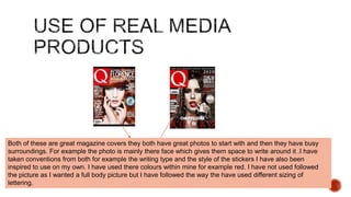
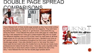
I chose to look at this cover to inspire me for my own.
This is a very good cover as it has many good features
within it. The masthead is very bold and you are
attracted to the cover story because it’s had the
biggest writing on the page. I have followed these
conventions in my own magazine as I have a bold
mast head and a big cover story on the front page.
Another thing that is good about this front cover is that
it stick to 3 main colours throughout. They are all
complimenting colours together which I have followed
within my own magazine. I have also followed the
design as I really like the way the photo takes up most
of the page so you know the main story is about them.
Both of these are great magazine covers they both have great photos to start with and then they have busy
surroundings. For example the photo is mainly there face which gives them space to write around it .I have
taken conventions from both for example the writing type and the style of the stickers I have also been
inspired to use on my own. I have used there colours within mine for example red. I have not used followed
the picture as I wanted a full body picture but I have followed the way the have used different sizing of
lettering.
Both of these magazines contents are really well
written and presented they both have a good layout as
all of the writing is lined up and there are 2-3 main
colours they have consistently used. They are both
different as they have different audiences but they
have both marketed there music genre in the
magazine. For example the one on the right is mainly
for rock music so they have ‘rock stars’ modelling in a
picture. Where as the Q’s contents is more classy and
sophisticated they have also designed the magazine
for the type of genre of music, as I think this magazine
is more up market than the other one. Compared to
mine I have followed Q’s contents as I think for my
type of music genre (pop) it is a better design it I have
also followed the colouring within the contents page
which means sticking to 2-3 main colours.
I have followed both of these double page spreads as they have similar writing.
The two double page spreads above are from Q’s magazine. They both have
big starting sentences e.g. ‘early on’ or ‘got the love’. I have done this e.g.
‘living the dream’. I have followed the picture of the USA page as I really liked
the way it was designed but I have got a united kingdom flag over my model.
The difference between mine and Q’s is that I have my mast head on all three
pages where as Q’s only has it on there front cover. I decided to put mine on
as I wanted a sense of consistency throughout my front cover, contents and
double page spread. I have also decided to put in a ‘text wrap’ this mean I
have made the text indent when the models foot is by the text as it looks more
professional and makes the text flow more. I have also used a big letter at the
start of the story to show that’s where it starts as it defines the start of the
story. I have followed this from the two double page spreads above.
my magazine is not like these as when I was looking
as past magazines I did not want anything like this as I
feel it looks too much like a comic. I feel that the
picture and the design has no music feel towards it
and the yellow banner on one of the magazines looks
like an ordinary magazine. The masthead is also not
very clear as the pictures consistently are in front of it.
This is why when I designed mine I wanted a clear
bold masthead. I have not used any of the font from
these two front covers as they do not fit in to my target
audience. I also think these are very Goth looking front
covers so only appeal to one type of audience where
as mine can range from teenagers to young adults.

Evaluation.pptx question 1

  • 2.
    I chose tolook at this cover to inspire me for my own. This is a very good cover as it has many good features within it. The masthead is very bold and you are attracted to the cover story because it’s had the biggest writing on the page. I have followed these conventions in my own magazine as I have a bold mast head and a big cover story on the front page. Another thing that is good about this front cover is that it stick to 3 main colours throughout. They are all complimenting colours together which I have followed within my own magazine. I have also followed the design as I really like the way the photo takes up most of the page so you know the main story is about them.
  • 3.
    Both of theseare great magazine covers they both have great photos to start with and then they have busy surroundings. For example the photo is mainly there face which gives them space to write around it .I have taken conventions from both for example the writing type and the style of the stickers I have also been inspired to use on my own. I have used there colours within mine for example red. I have not used followed the picture as I wanted a full body picture but I have followed the way the have used different sizing of lettering.
  • 4.
    Both of thesemagazines contents are really well written and presented they both have a good layout as all of the writing is lined up and there are 2-3 main colours they have consistently used. They are both different as they have different audiences but they have both marketed there music genre in the magazine. For example the one on the right is mainly for rock music so they have ‘rock stars’ modelling in a picture. Where as the Q’s contents is more classy and sophisticated they have also designed the magazine for the type of genre of music, as I think this magazine is more up market than the other one. Compared to mine I have followed Q’s contents as I think for my type of music genre (pop) it is a better design it I have also followed the colouring within the contents page which means sticking to 2-3 main colours.
  • 5.
    I have followedboth of these double page spreads as they have similar writing. The two double page spreads above are from Q’s magazine. They both have big starting sentences e.g. ‘early on’ or ‘got the love’. I have done this e.g. ‘living the dream’. I have followed the picture of the USA page as I really liked the way it was designed but I have got a united kingdom flag over my model. The difference between mine and Q’s is that I have my mast head on all three pages where as Q’s only has it on there front cover. I decided to put mine on as I wanted a sense of consistency throughout my front cover, contents and double page spread. I have also decided to put in a ‘text wrap’ this mean I have made the text indent when the models foot is by the text as it looks more professional and makes the text flow more. I have also used a big letter at the start of the story to show that’s where it starts as it defines the start of the story. I have followed this from the two double page spreads above.
  • 6.
    my magazine isnot like these as when I was looking as past magazines I did not want anything like this as I feel it looks too much like a comic. I feel that the picture and the design has no music feel towards it and the yellow banner on one of the magazines looks like an ordinary magazine. The masthead is also not very clear as the pictures consistently are in front of it. This is why when I designed mine I wanted a clear bold masthead. I have not used any of the font from these two front covers as they do not fit in to my target audience. I also think these are very Goth looking front covers so only appeal to one type of audience where as mine can range from teenagers to young adults.