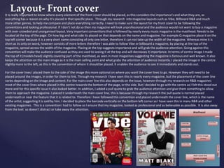
This document discusses the use of fonts, colors, mastheads, and images in magazines to develop or challenge conventions of real media products.
It describes choosing the Calibri font for its readability and simplicity. Burgundy, black, and white colors were used consistently, with some gold added to the double page spread.
The masthead "VOLUME" was chosen to reference music and R&B genres. It is located at the top in a bold sans-serif font, following conventions. Images on the front cover dress a male model in black clothes to reflect R&B style. Folded hands convey confidence. Conventions from magazines like Vibe and Billboard were both followed and developed upon in the design choices