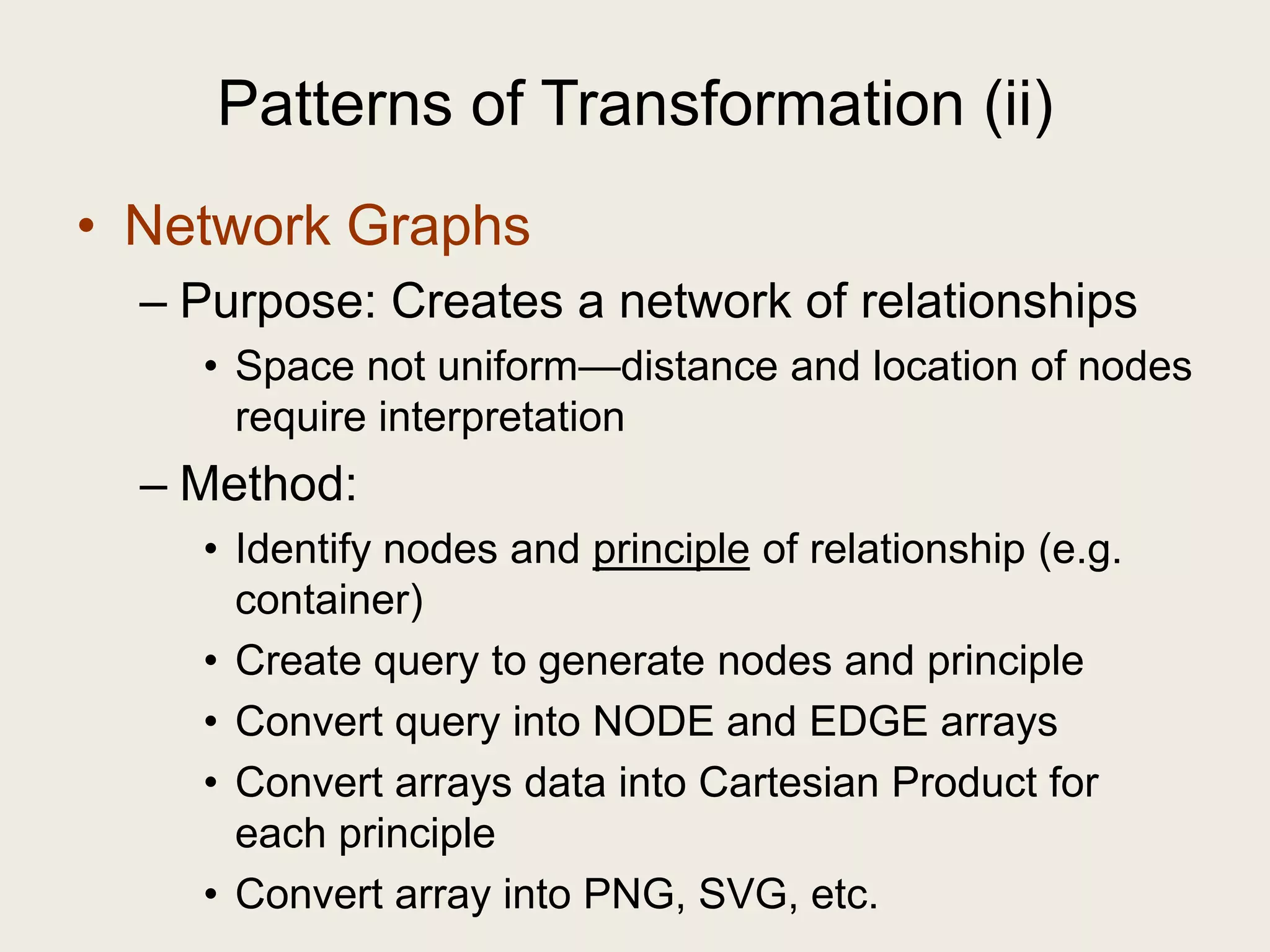
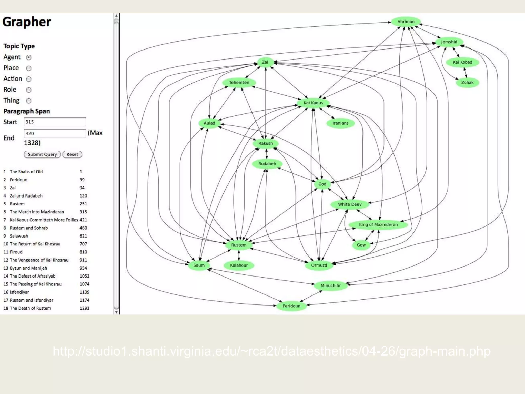
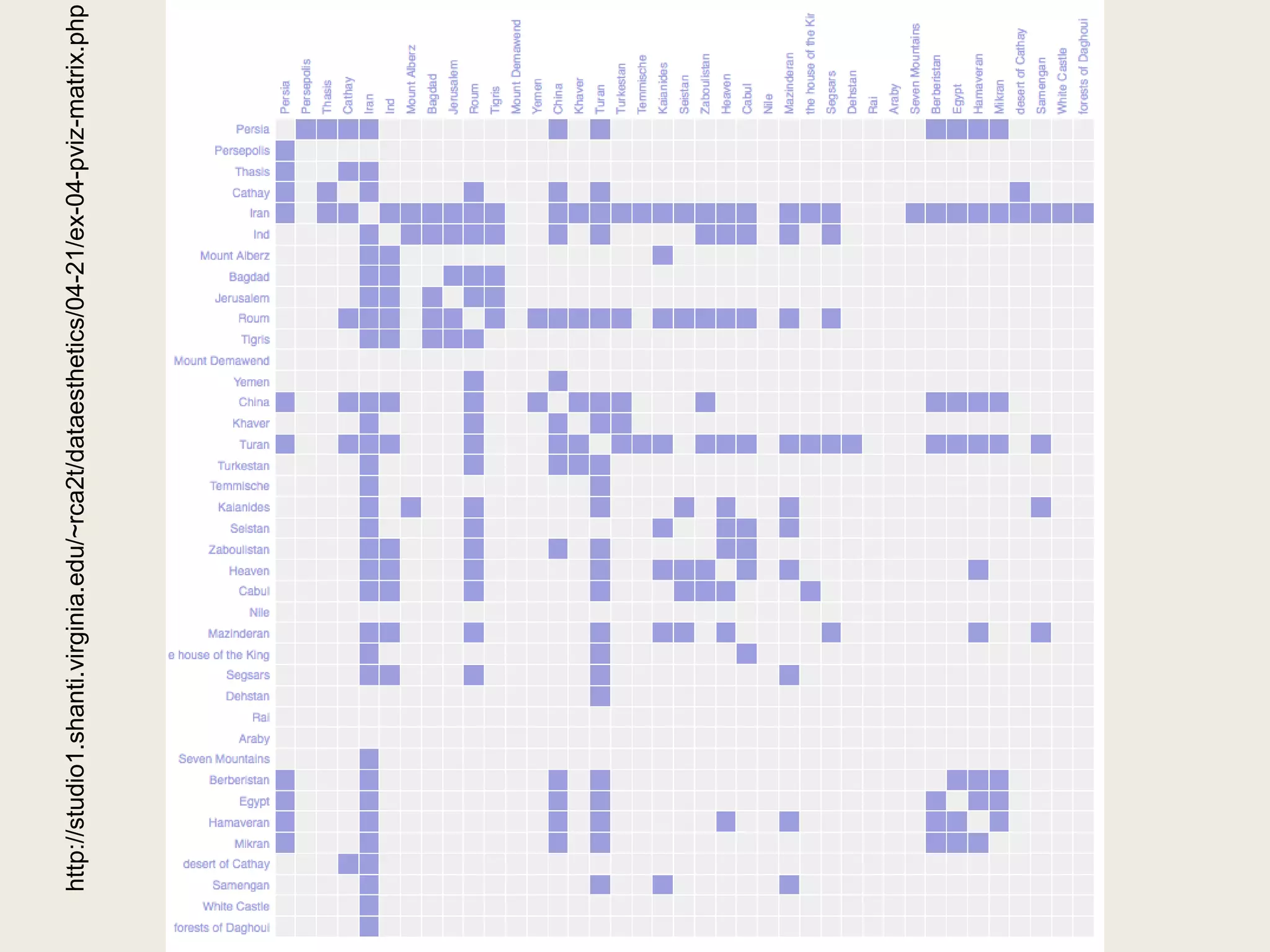
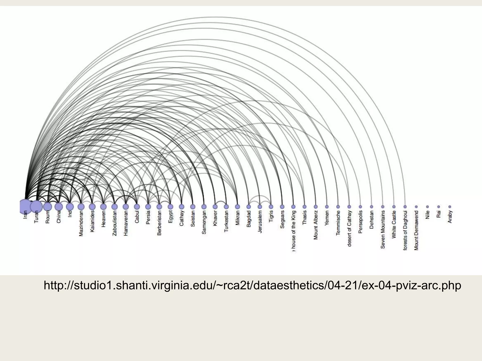
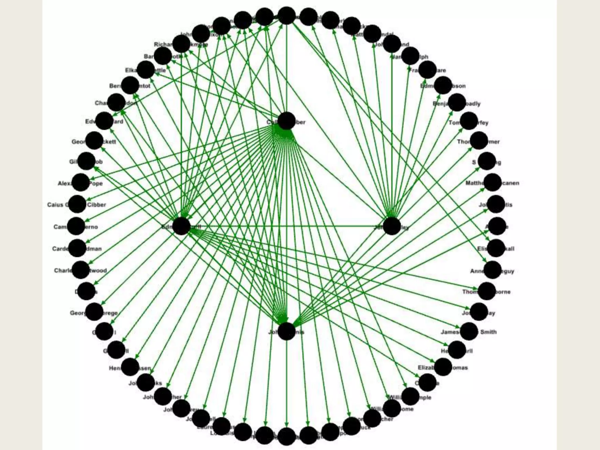
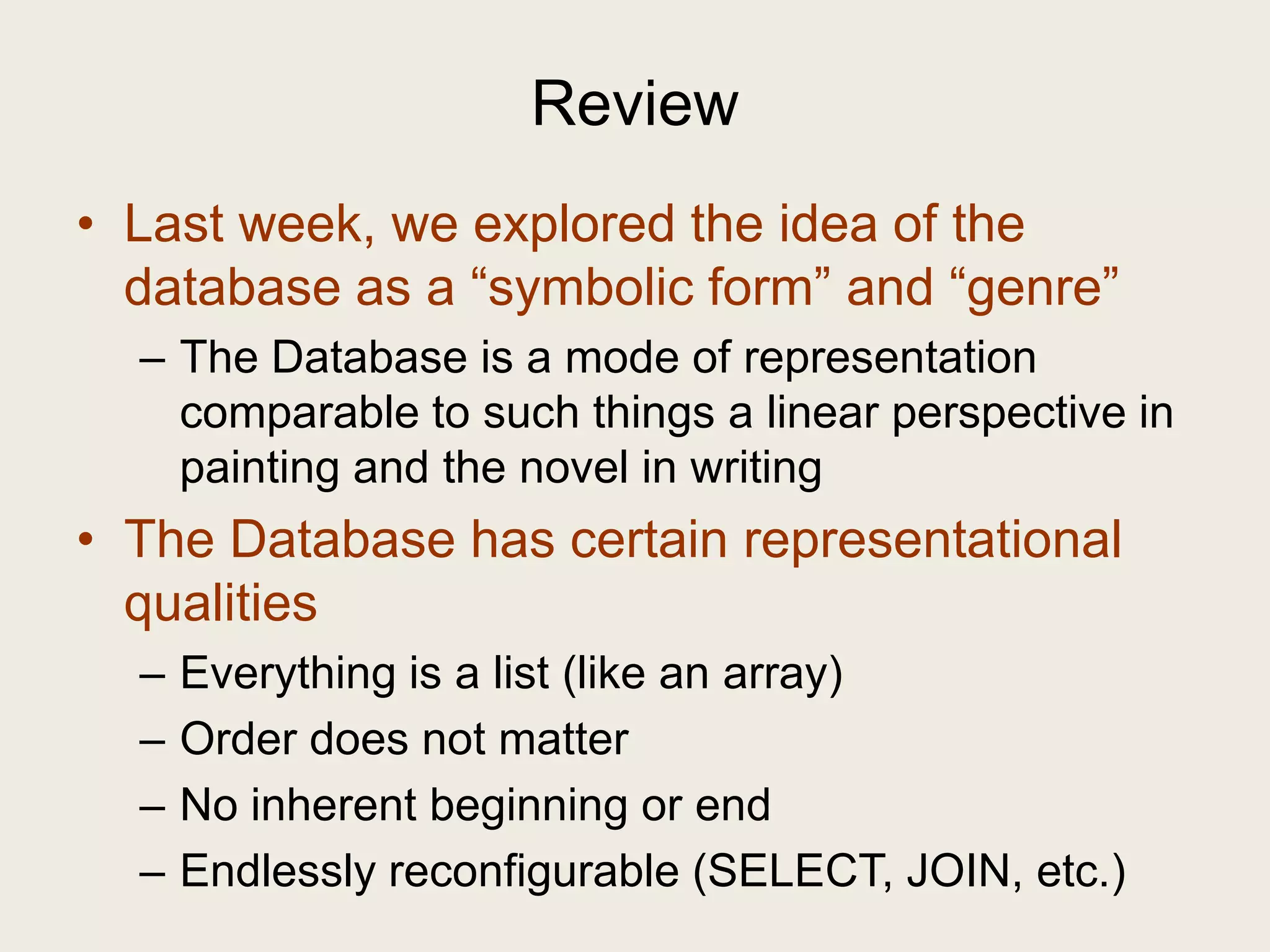
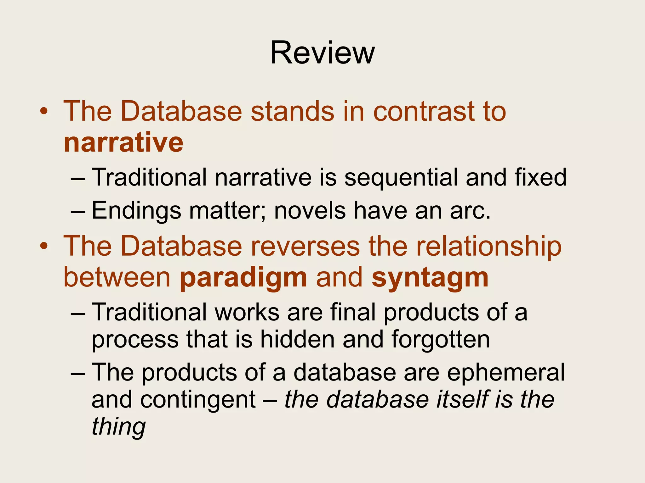
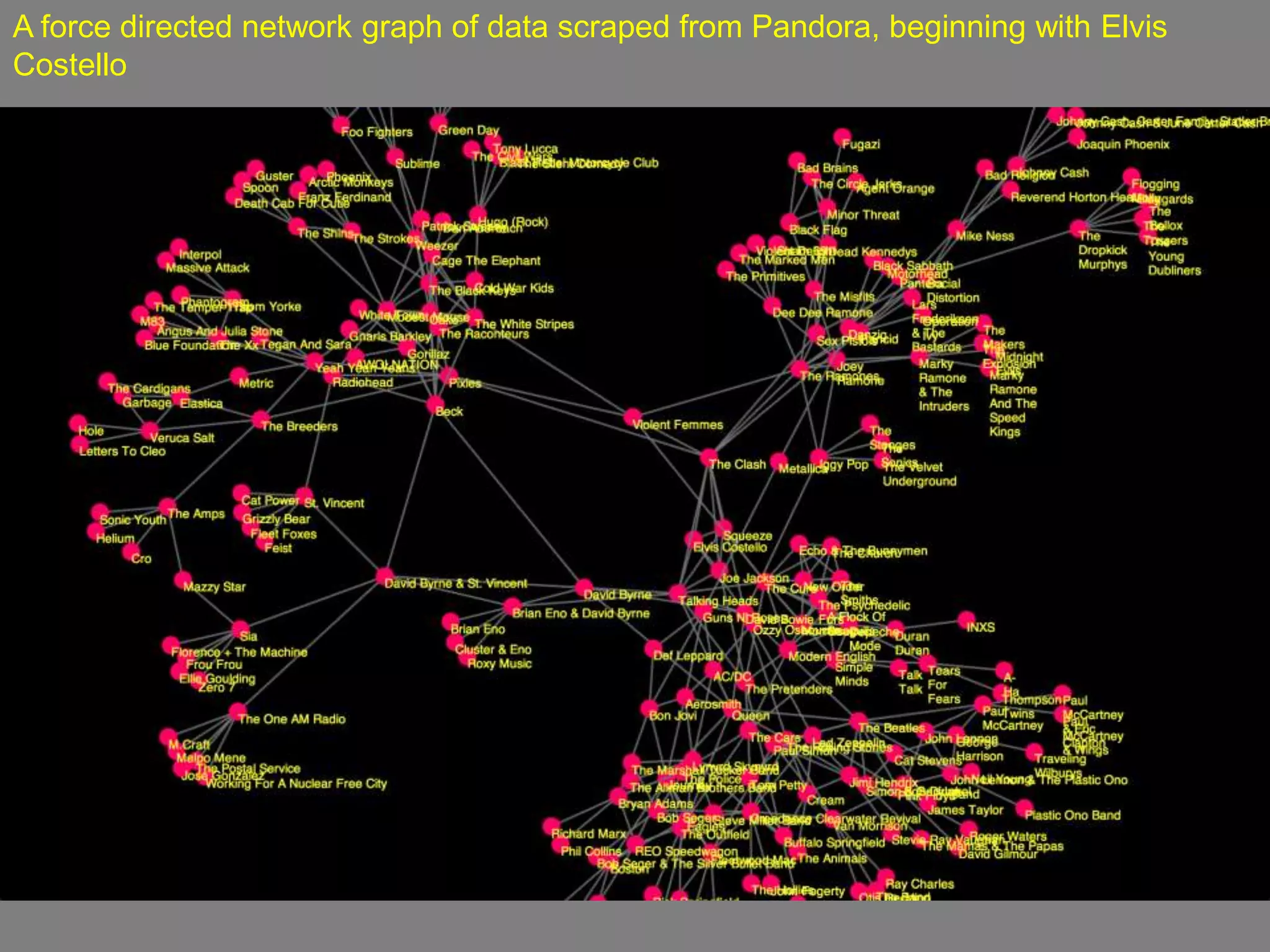
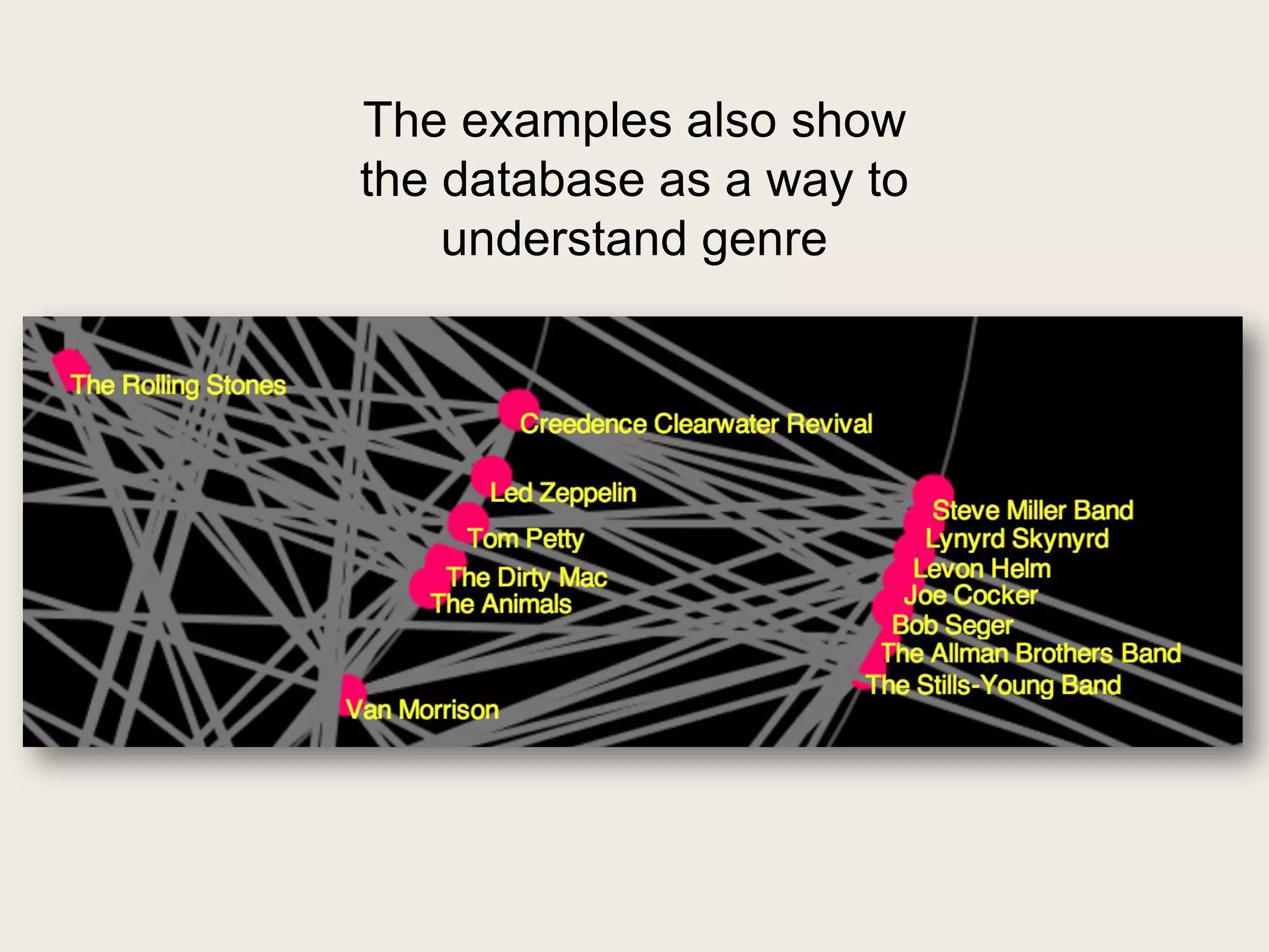
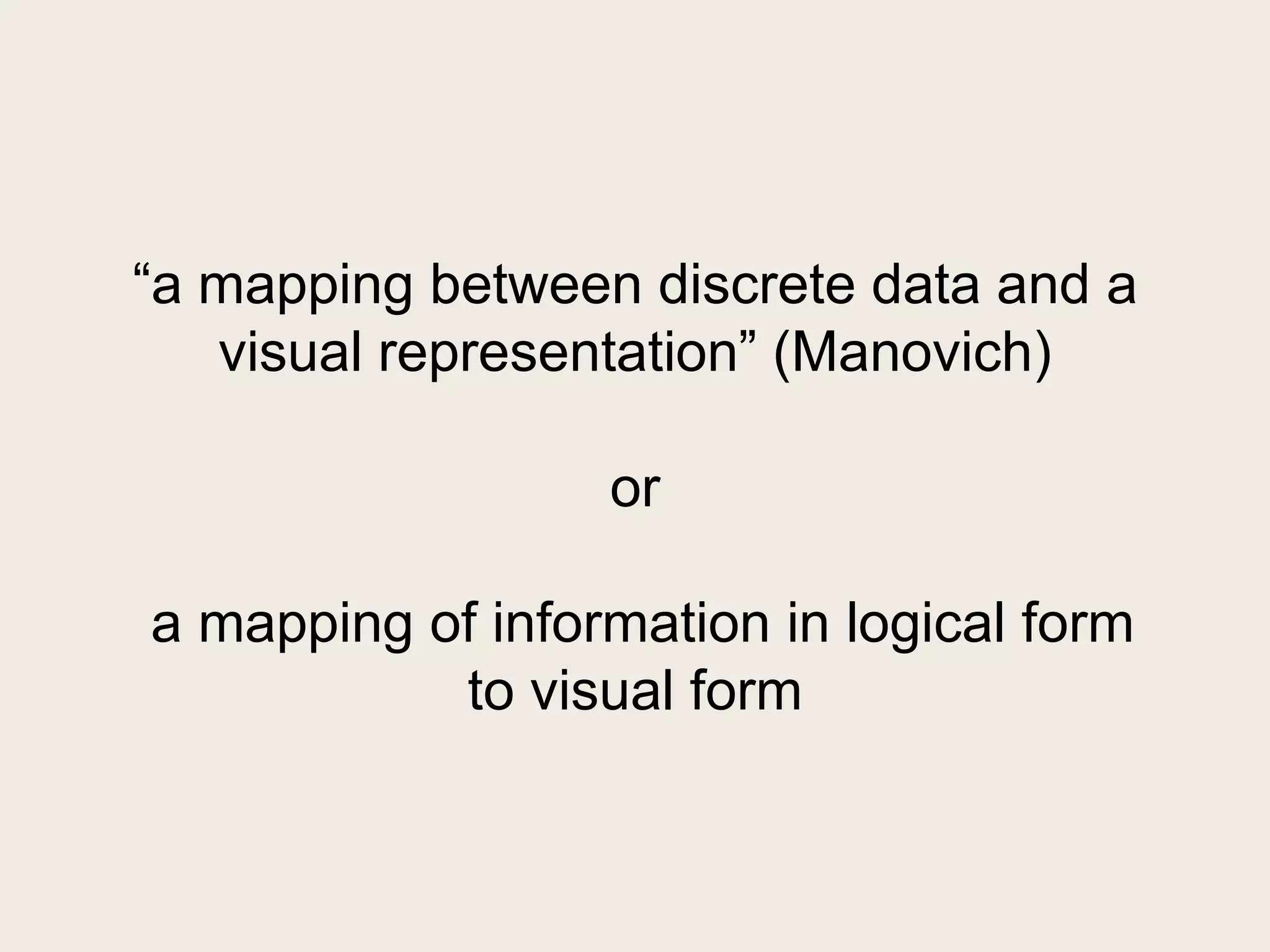
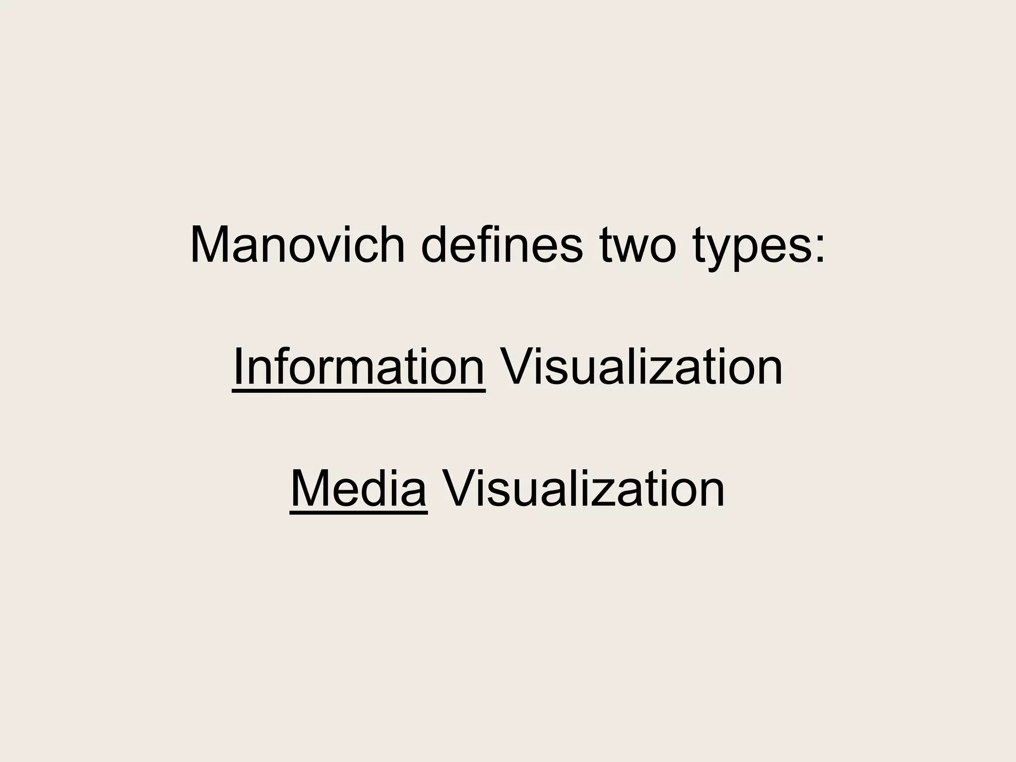
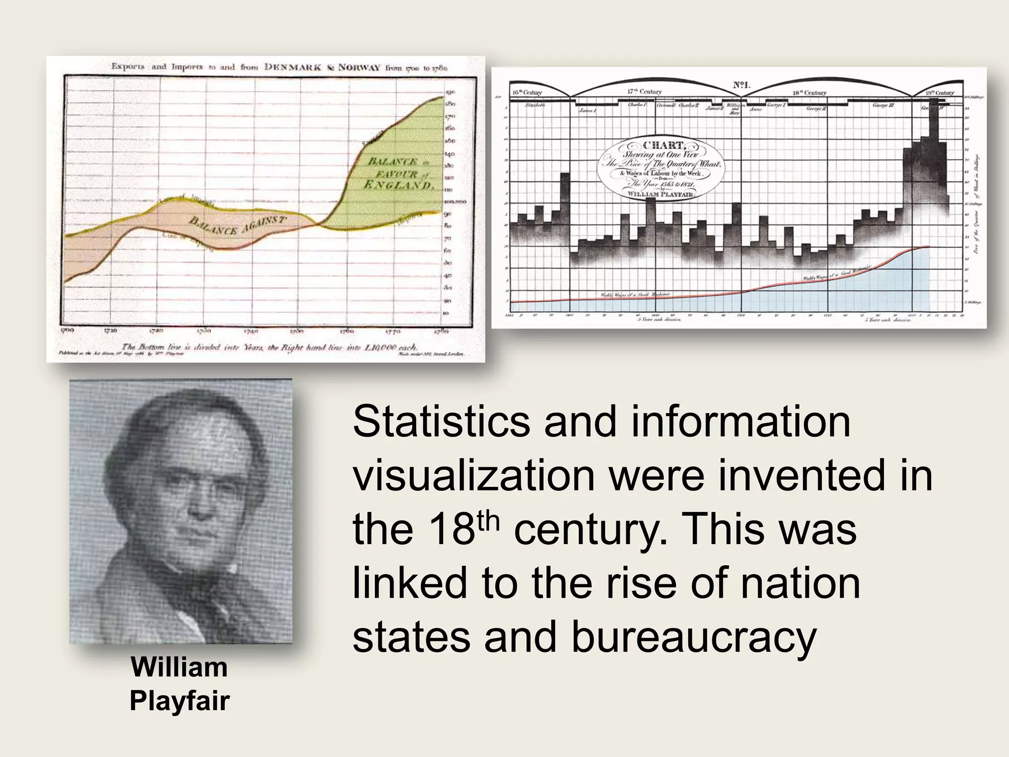
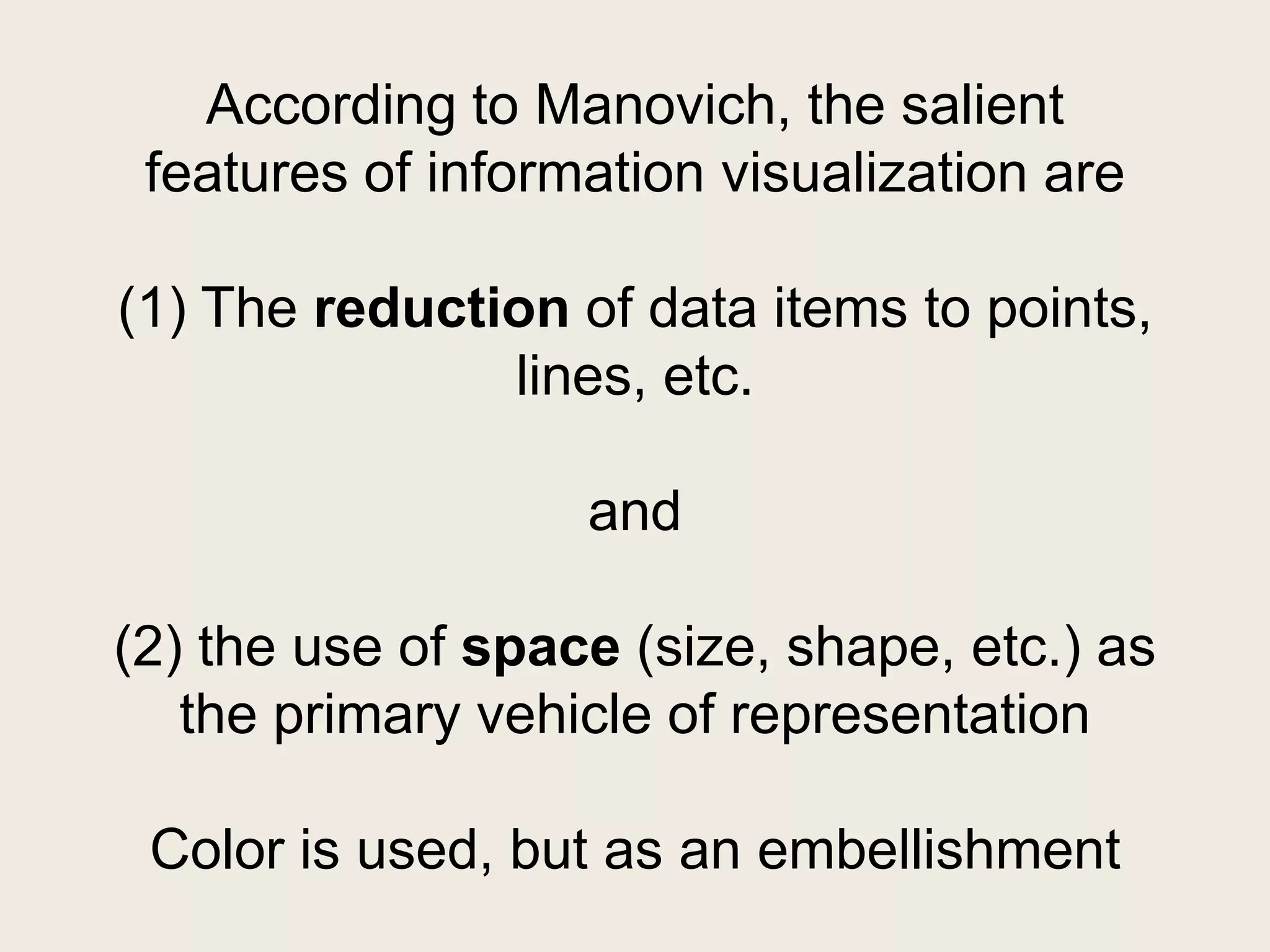
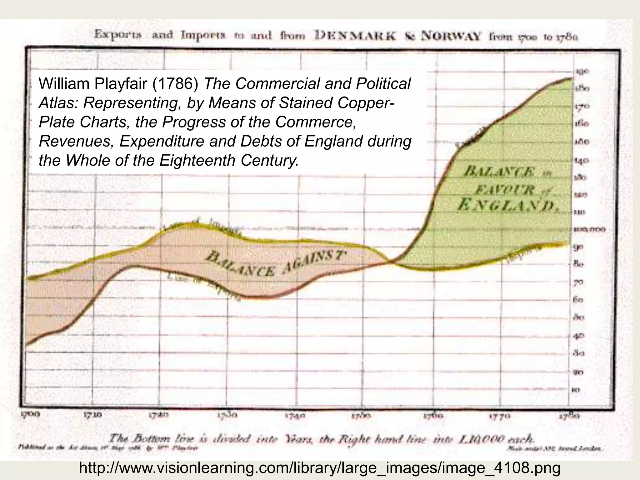
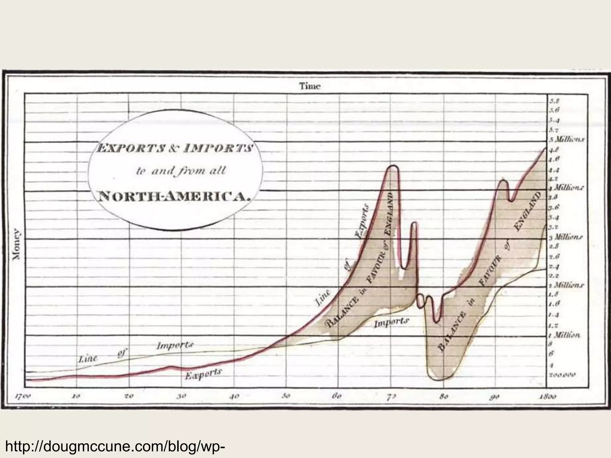
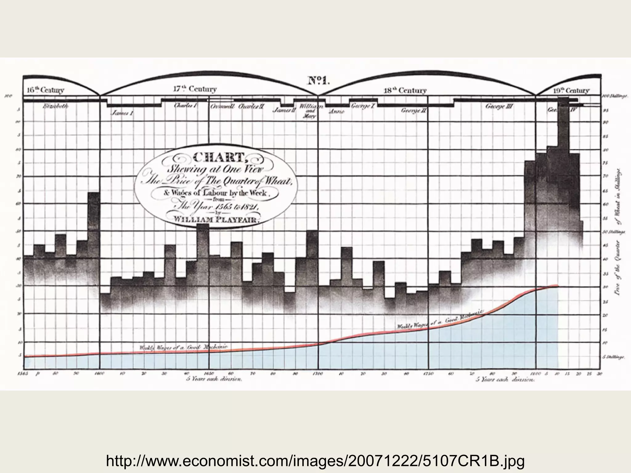
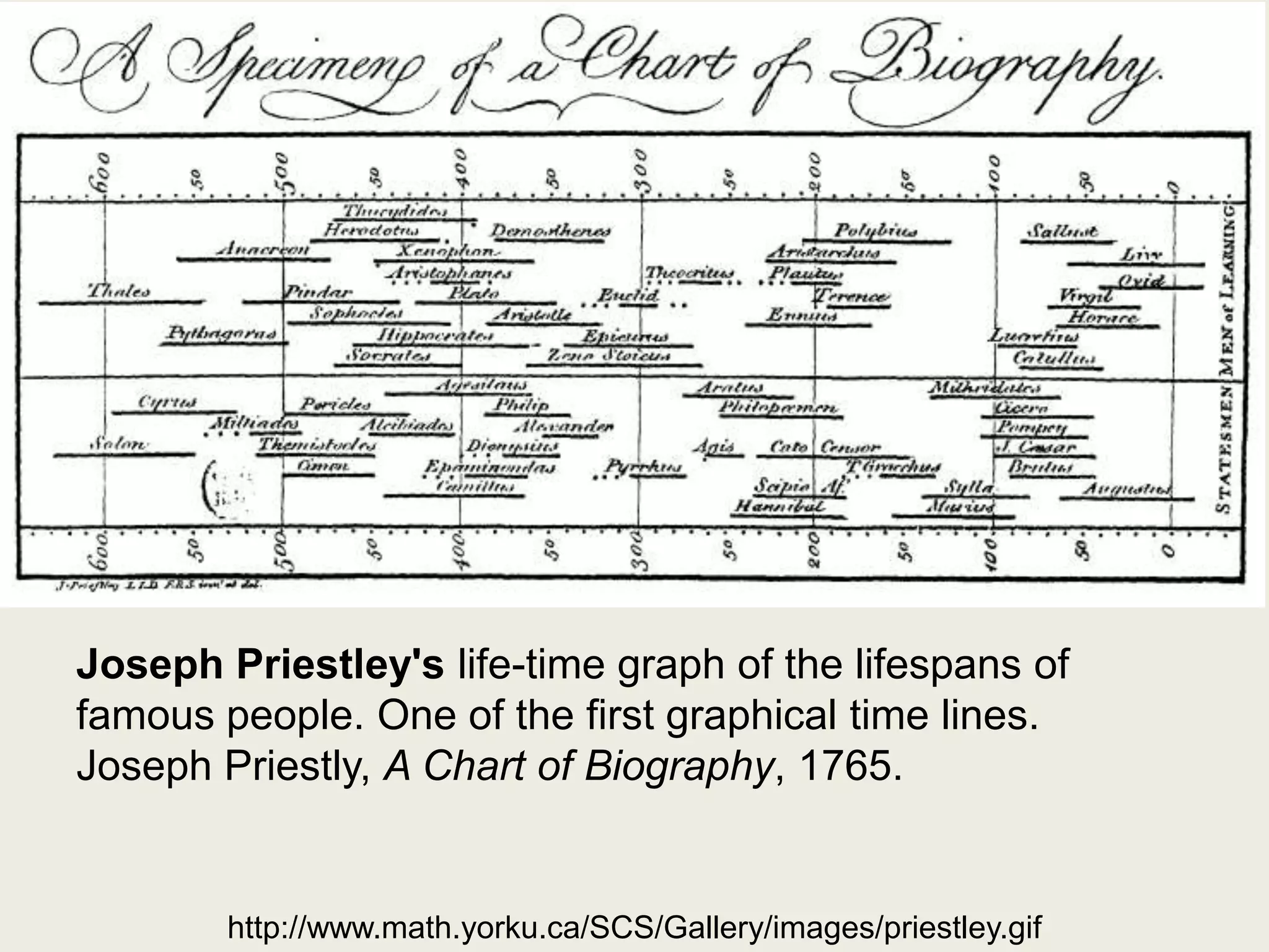
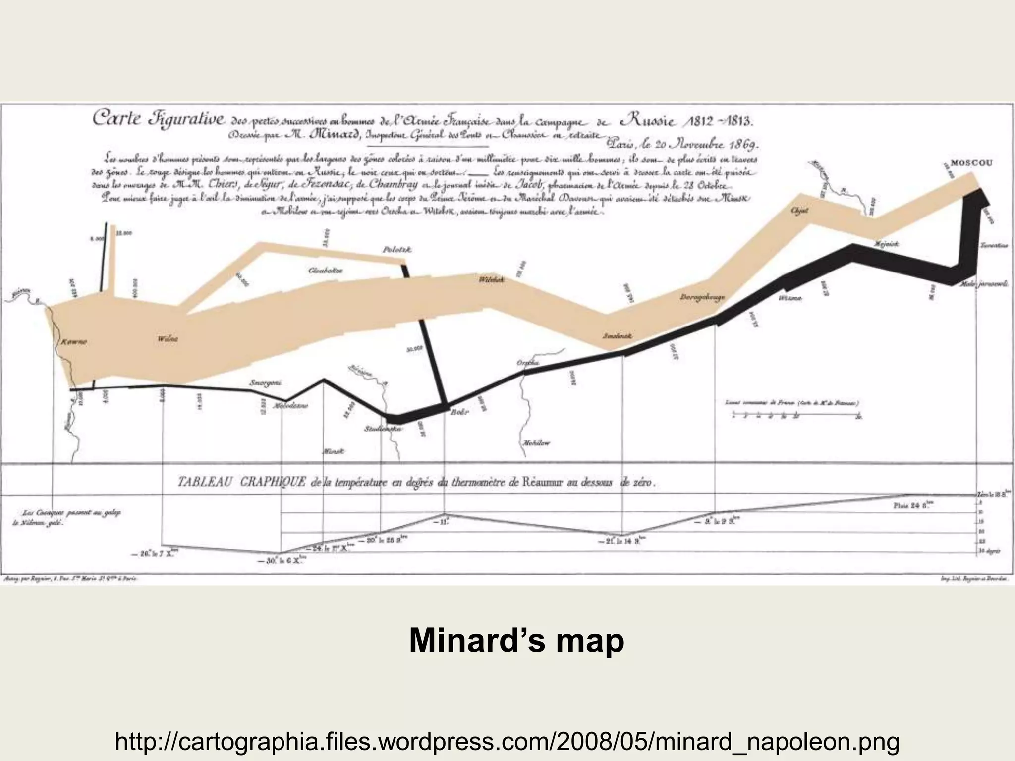
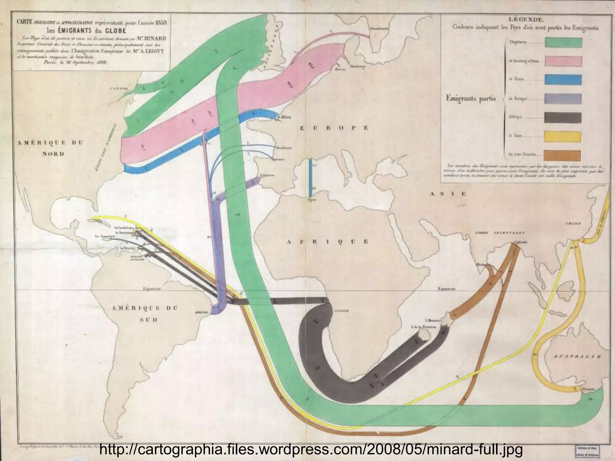
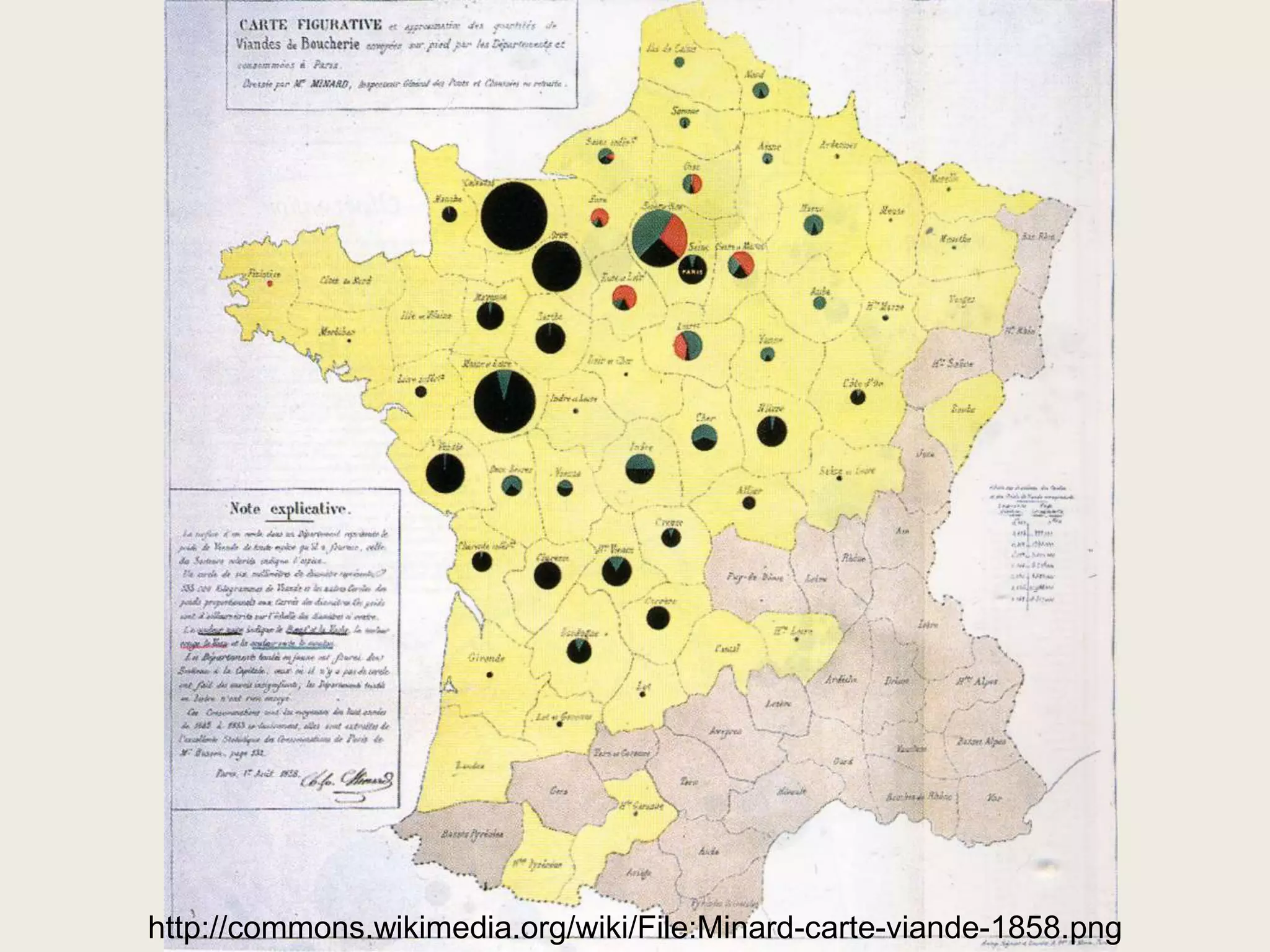
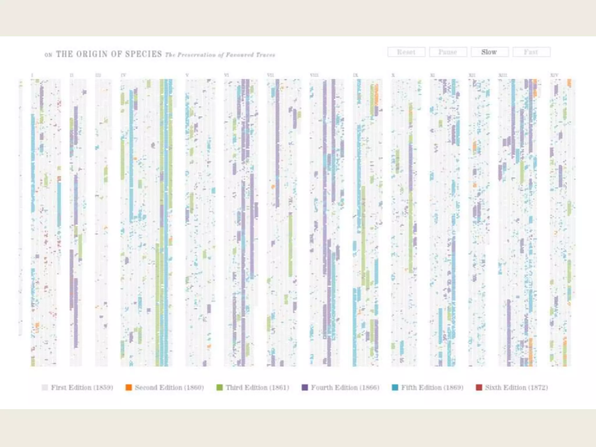
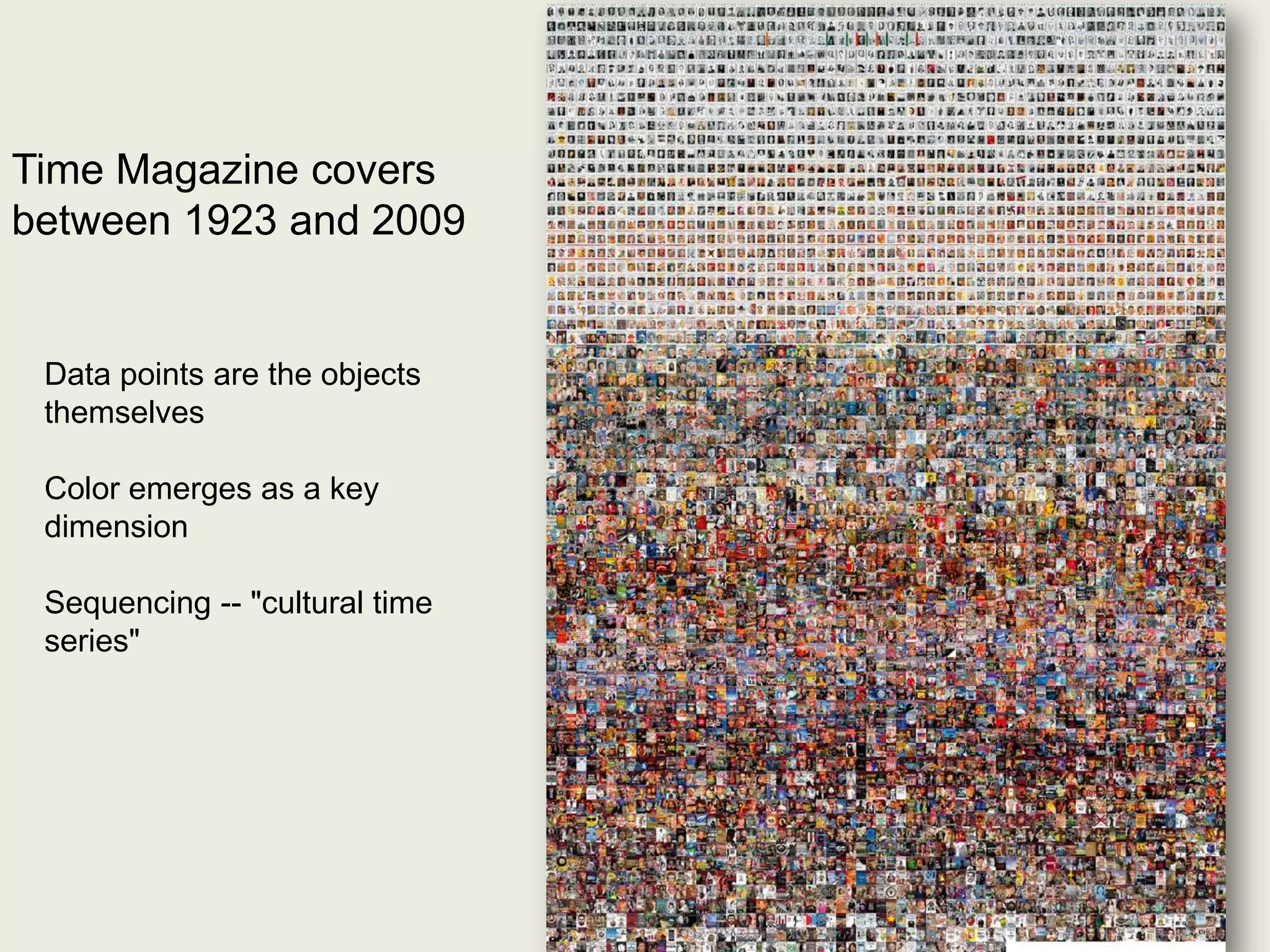
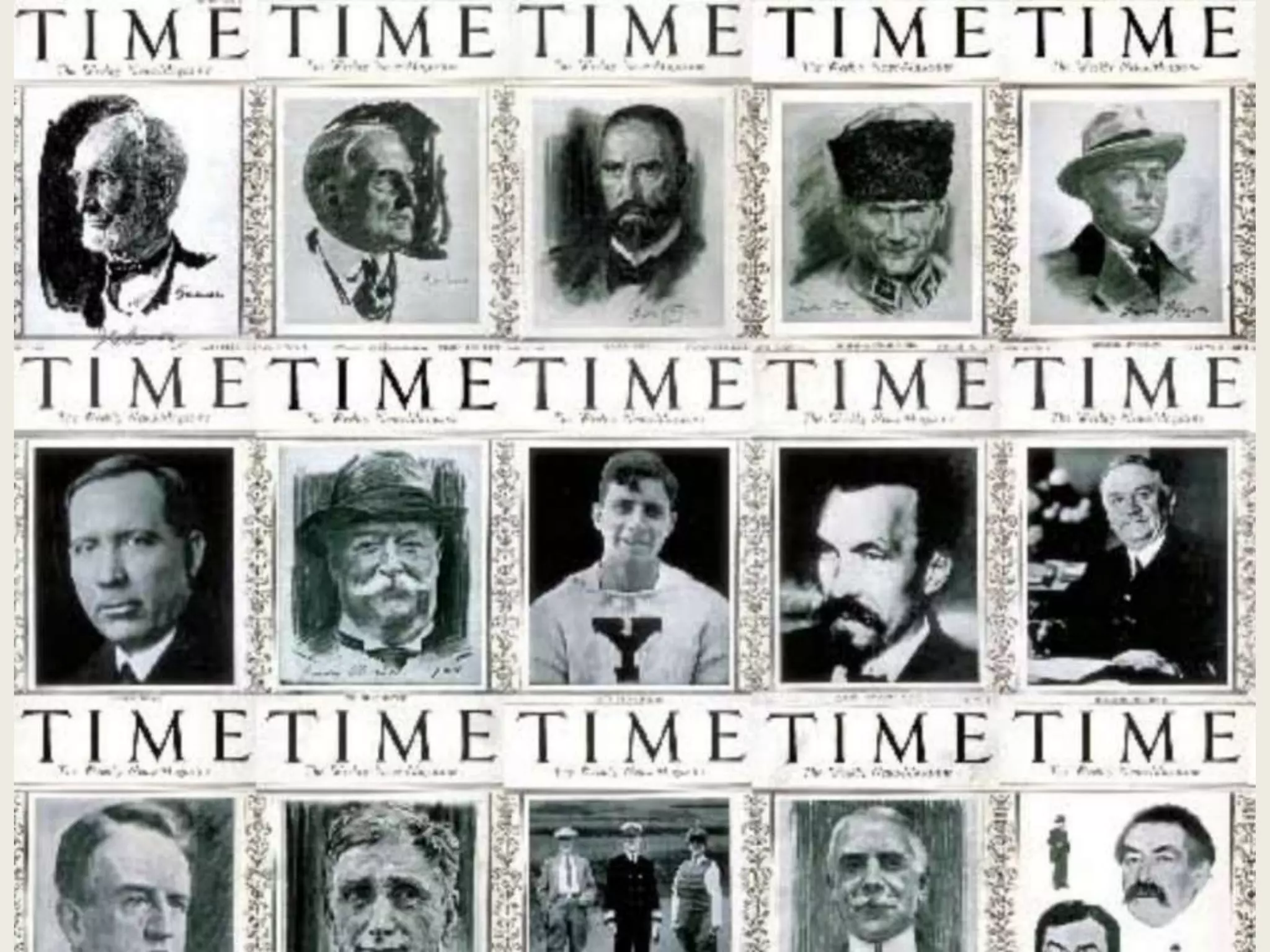
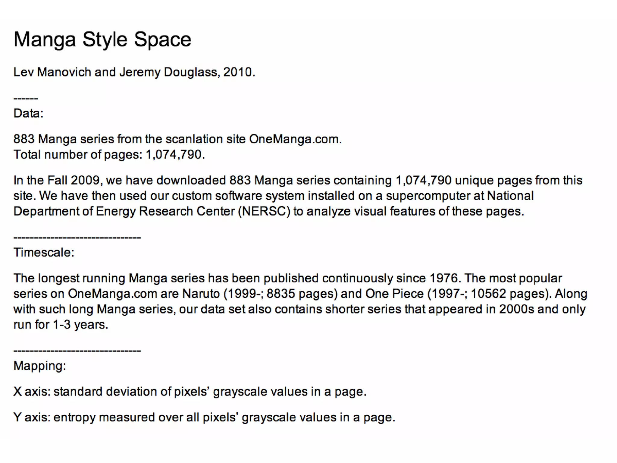
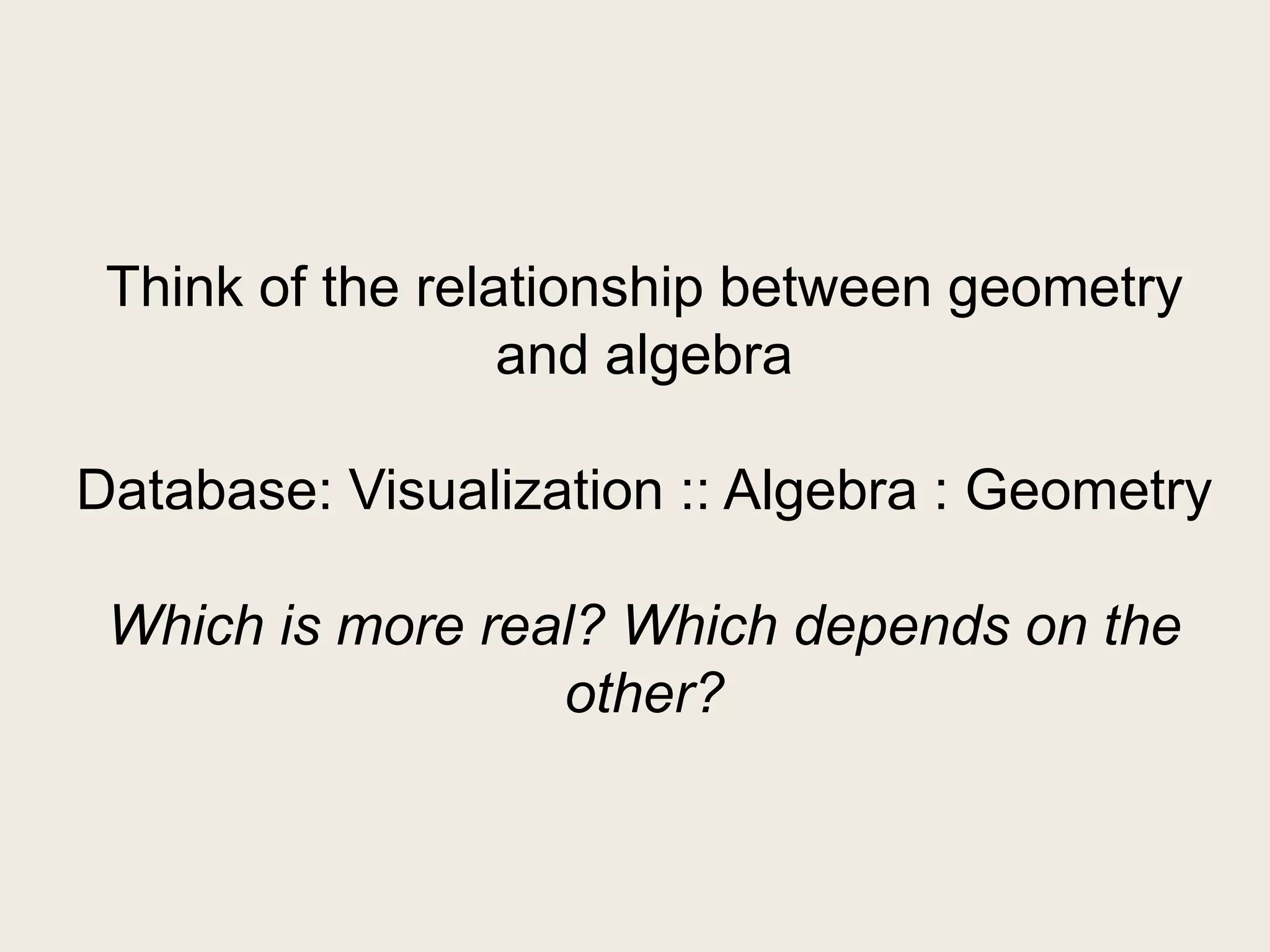
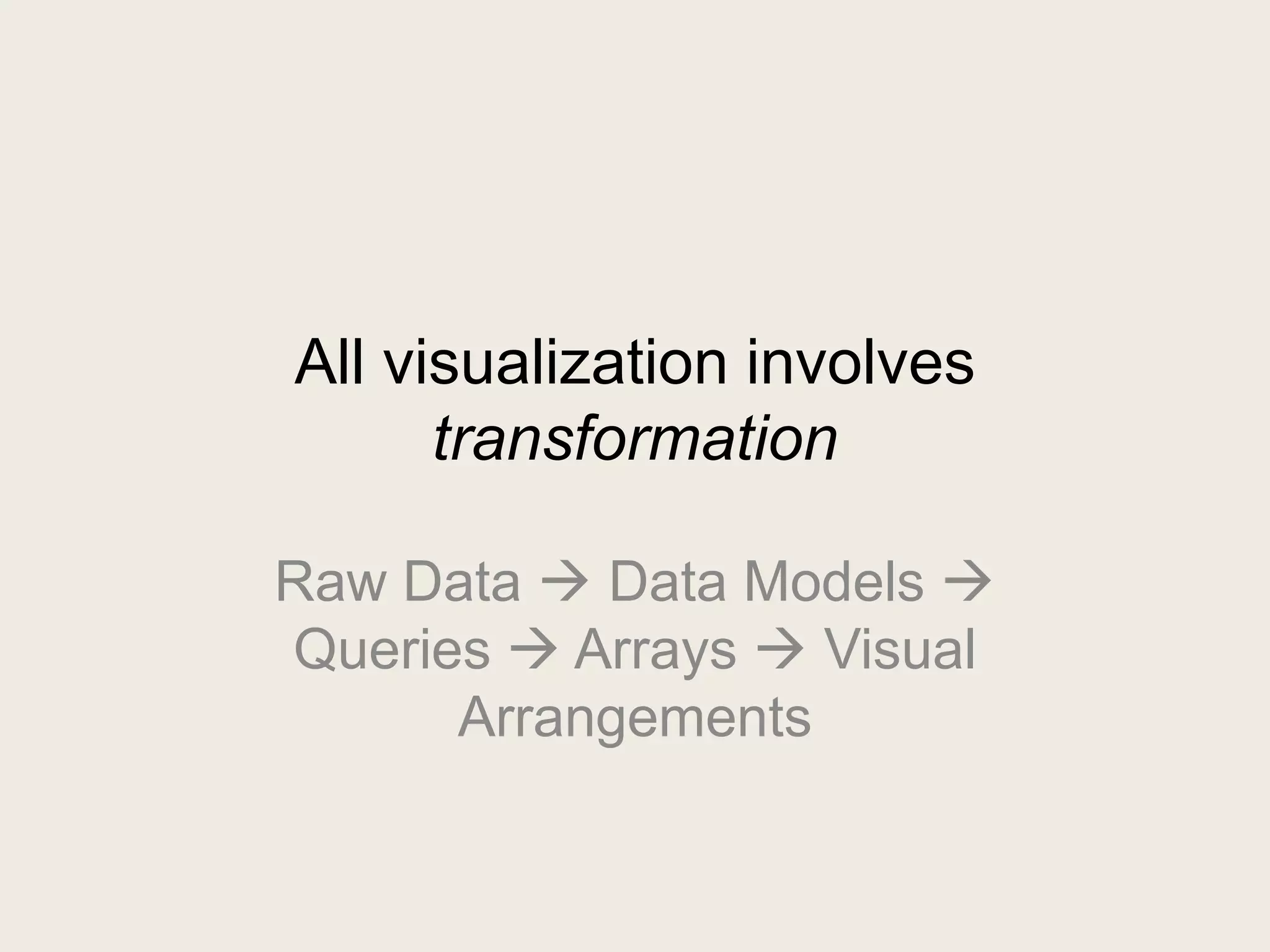
This document discusses database visualization and transformation. It provides examples of different types of visualizations including image grids, network graphs, adjacency matrices, arcs and circles. It explains that raw data undergoes a series of transformations to data models, queries and arrays before being arranged visually. Different visualization techniques use space, location and other elements differently to reveal patterns in the data.


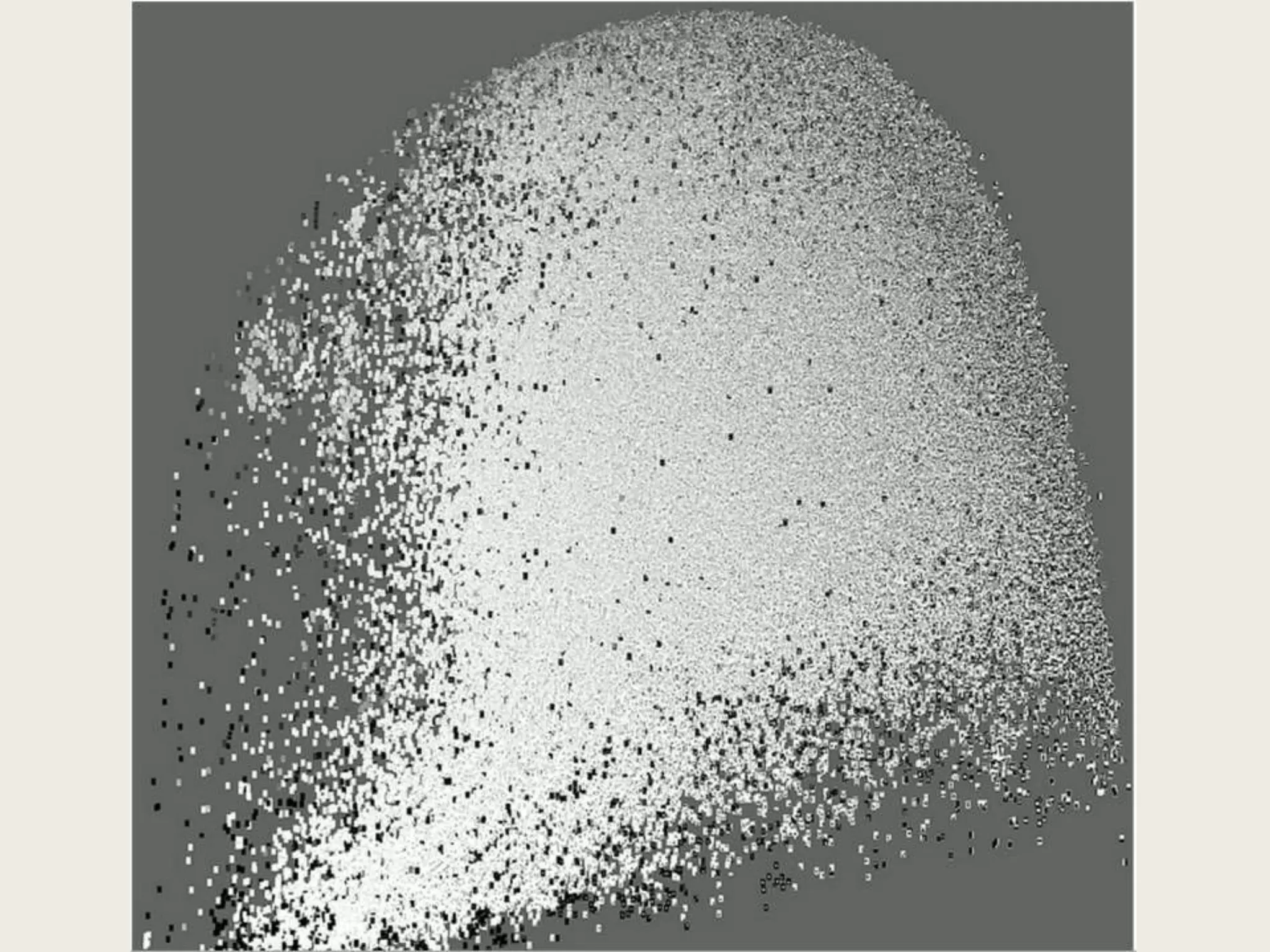
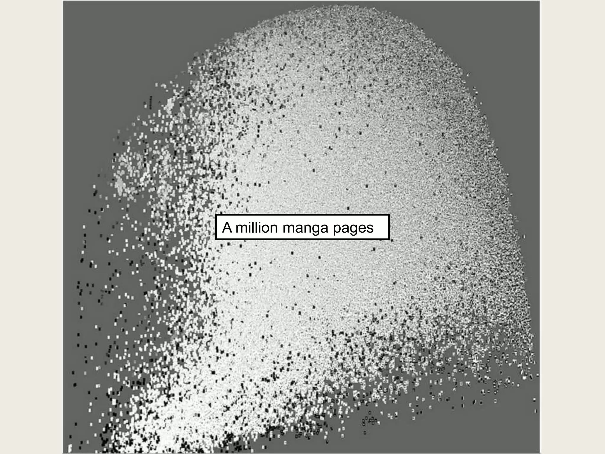


![Patterns of Transformation (i)
• Image Grids (aka Image Graphs)
– Purpose: Creates 2D qualitative space
• Space is uniform, Cartesian
• ―Points‖ are actually not atomic, but contain
content
• Designed to show ―hot spots‖
– Method:
• Identify X and Y in which to plot objects of type A
• Create query to generate A, X and Y columns
• Convert query data into 3D array $DATA[$X][$Y] =
$A
• Convert array into HTML](https://image.slidesharecdn.com/presentation1-130317234806-phpapp02/75/MDST-3705-2012-03-05-Databases-to-Visualization-64-2048.jpg)