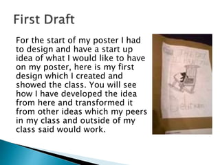
For the start of my poster I had
to design and have a start up
idea of what I would like to have
on my poster, here is my first
design which I created and
showed the class. You will see
how I have developed the idea
from here and transformed it
from other ideas which my peers
in my class and outside of my
class said would work.
 I am trying to get my image quite
similar to the image of The
Conjuring poster. I am doing this
because I like the feel the poster
gives off and the image in itself is
very eerie. They both have a
similar type of story line so I feel
if I was to create one which is
similar of the mother and the
teddy bear then I would be happy,
this image is where I got my main
inspiration for my magazine
image.
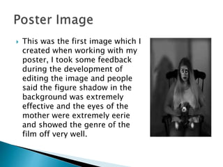
 This was the first image which I
created when working with my
poster, I took some feedback
during the development of
editing the image and people
said the figure shadow in the
background was extremely
effective and the eyes of the
mother were extremely eerie
and showed the genre of the
film off very well.
 This is my first complete
design of my poster. We did
a peer review in the
classroom and we concluded
that I needed to develop
more on the horror side and
make the view of the teddy
bear more clear, I also
needed to make the billing
block more clear and a
reference to social media
platforms would be good. I
listened to all the advice I
was gave and developed on
what was said.
 This is my image development
and I made the view of the
teddy bear more clear and
added a noose around the neck
of the mother to signalise
death. I asked for opinions of
the different images and 8/8
people agreed that this was the
better image and 8/10 people
would be more interested in
looking into the film and
possibly watching it.
 I added the image and
social media platforms
onto the poster and I think
it made a huge difference
in making the poster more
attractive to the main
audience.
 I changed the billing
block to make the image
more clear and made
surer the teddy was in
more clear of the image
and the mothers eyes
were isolated and the
shadow seemed bigger
and overwhelming her.

Poster development

  • 2.
    For the startof my poster I had to design and have a start up idea of what I would like to have on my poster, here is my first design which I created and showed the class. You will see how I have developed the idea from here and transformed it from other ideas which my peers in my class and outside of my class said would work.
  • 3.
     I amtrying to get my image quite similar to the image of The Conjuring poster. I am doing this because I like the feel the poster gives off and the image in itself is very eerie. They both have a similar type of story line so I feel if I was to create one which is similar of the mother and the teddy bear then I would be happy, this image is where I got my main inspiration for my magazine image.
  • 4.
     This wasthe first image which I created when working with my poster, I took some feedback during the development of editing the image and people said the figure shadow in the background was extremely effective and the eyes of the mother were extremely eerie and showed the genre of the film off very well.
  • 5.
     This ismy first complete design of my poster. We did a peer review in the classroom and we concluded that I needed to develop more on the horror side and make the view of the teddy bear more clear, I also needed to make the billing block more clear and a reference to social media platforms would be good. I listened to all the advice I was gave and developed on what was said.
  • 6.
     This ismy image development and I made the view of the teddy bear more clear and added a noose around the neck of the mother to signalise death. I asked for opinions of the different images and 8/8 people agreed that this was the better image and 8/10 people would be more interested in looking into the film and possibly watching it.
  • 7.
     I addedthe image and social media platforms onto the poster and I think it made a huge difference in making the poster more attractive to the main audience.
  • 8.
     I changedthe billing block to make the image more clear and made surer the teddy was in more clear of the image and the mothers eyes were isolated and the shadow seemed bigger and overwhelming her.