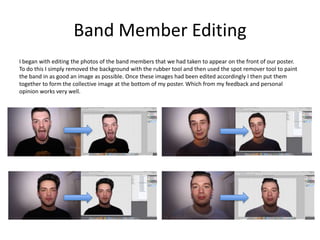
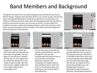
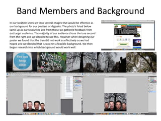
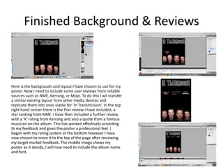
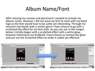
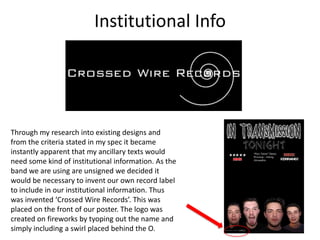
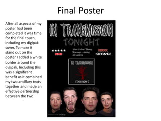
Prints of My Poster Design
   Development So Far
Band Member Editing
I began with editing the photos of the band members that we had taken to appear on the front of our poster.
To do this I simply removed the background with the rubber tool and then used the spot remover tool to paint
the band in as good an image as possible. Once these images had been edited accordingly I then put them
together to form the collective image at the bottom of my poster. Which from my feedback and personal
opinion works very well.
Band Members and Background
Throughout the research for our poster background we stumbled across various
diferent images. However when deciding which to use it came up that none we had
taken really worked effectively and that we would have to try something more
simple and effective. We then tried a plain black background with the font that we
would be using and the results came out very successful. The plain black font
enabled us to have a simple and innovative design in which the main focus of the
poster was the band name and the members, not a flashy excentric background
that took away from these features.


I began with a bold, chunky text            This text was much more effective        This text instantly jumped out at us
that really stood out and made the          and was a good reflection onto the       as being effective and of our genre.
band name recognisable. This was            band genres. The font was                The text was said to be reminiscent
good as it did stand out, however           consistent with the bands similar to     of ‘50’s/60’s horror films’ which was
the font was not very original and          In Transmission and worked               an interesting take and worked well
we collectively decided that it was         effectively. However when                with the bands alternate image.
simply not good enough. We then             reviewing to our target audience         The text was an original font for a
chose to use a slightly smaller text,       they said that it was to ‘celtic’ like   band and according to our user
as our target audience had                  and as In Transmission were not a        feedback ‘gave the band a
encouraged us too.                          traditional or Irish band it did not     professional image that worked
                                            work effectively.                        efficiently’. We decided to keep this
Band Members and Background
In our location shots we took several images that would be effective as
our background for our postters or digipaks. The photo’s listed below
came up as our favourites and from these we gathered feedback from
out target audience. The majority of our audience chose the tree second
from the right and we decided to use this. However when designing our
poster we found that the tree did not work as effectively as we had
hoped and we decided that is was not a feasible background. We then
began research into which background would work well.
Finished Background & Reviews


Here is the backgroudn and layout I have chosen to use for my
poster. Now I need to include some user reviews from reliable
sources such as NME, Kerrang, or Mojo. To do this I wil transfer
a similar existing layout from other media devices and
replicate them into ones viable for ‘In Transmission’. In the top
right hand corner there is the first review I have included, a
star ranking from NME. I have then included a further review
with a ‘K’ rating from Kerrang and also a quote from a famous
musician on the album. This has worked effectively according
to my feedback and gives the poster a professional feel. I
began with my rating system at the bottom however I have
now chosen to move it to the top of the page after reviewing
my target market feedback. The middle image shows my
poster as it stands, I will now need to include the album name
and font.
Album Name/Font
After chosing my reviews and placement I needed to include my
albums name. However I did not want my font to clash with my band
logo so the font would have to be suttle yet interesting. Through my
research into bands with a similar genre I have chosen to go with a
scratched like effect for my font style. As you can see in the images
below I initially began with a scratched effect with a white glow,
however listening to my feedback I have chosen to remove the glow
and just use the scratched effect to make it subtle yet effective.
Institutional Info


Through my research into existing designs and
from the criteria stated in my spec it became
instantly apparent that my ancillary texts would
need some kind of institutional information. As the
band we are using are unsigned we decided it
would be necessary to invent our own record label
to include in our institutional information. Thus
was invented ‘Crossed Wire Records’. This was
placed on the front of our poster. The logo was
created on fireworks by tyoping out the name and
simply including a swirl placed behind the O.
Final Poster
After all aspects of my
poster had been
completed it was time
for the final touch,
including my digipak
cover. To make it
stand out on the
poster I added a white
border around the
digipak. Including this
was a significant
benefit as it combined
my two ancillary texts
together and made an
effective partnership
between the two.

Ancillary Task Poster Development

  • 1.
    Prints of MyPoster Design Development So Far
  • 2.
    Band Member Editing Ibegan with editing the photos of the band members that we had taken to appear on the front of our poster. To do this I simply removed the background with the rubber tool and then used the spot remover tool to paint the band in as good an image as possible. Once these images had been edited accordingly I then put them together to form the collective image at the bottom of my poster. Which from my feedback and personal opinion works very well.
  • 3.
    Band Members andBackground Throughout the research for our poster background we stumbled across various diferent images. However when deciding which to use it came up that none we had taken really worked effectively and that we would have to try something more simple and effective. We then tried a plain black background with the font that we would be using and the results came out very successful. The plain black font enabled us to have a simple and innovative design in which the main focus of the poster was the band name and the members, not a flashy excentric background that took away from these features. I began with a bold, chunky text This text was much more effective This text instantly jumped out at us that really stood out and made the and was a good reflection onto the as being effective and of our genre. band name recognisable. This was band genres. The font was The text was said to be reminiscent good as it did stand out, however consistent with the bands similar to of ‘50’s/60’s horror films’ which was the font was not very original and In Transmission and worked an interesting take and worked well we collectively decided that it was effectively. However when with the bands alternate image. simply not good enough. We then reviewing to our target audience The text was an original font for a chose to use a slightly smaller text, they said that it was to ‘celtic’ like band and according to our user as our target audience had and as In Transmission were not a feedback ‘gave the band a encouraged us too. traditional or Irish band it did not professional image that worked work effectively. efficiently’. We decided to keep this
  • 4.
    Band Members andBackground In our location shots we took several images that would be effective as our background for our postters or digipaks. The photo’s listed below came up as our favourites and from these we gathered feedback from out target audience. The majority of our audience chose the tree second from the right and we decided to use this. However when designing our poster we found that the tree did not work as effectively as we had hoped and we decided that is was not a feasible background. We then began research into which background would work well.
  • 5.
    Finished Background &Reviews Here is the backgroudn and layout I have chosen to use for my poster. Now I need to include some user reviews from reliable sources such as NME, Kerrang, or Mojo. To do this I wil transfer a similar existing layout from other media devices and replicate them into ones viable for ‘In Transmission’. In the top right hand corner there is the first review I have included, a star ranking from NME. I have then included a further review with a ‘K’ rating from Kerrang and also a quote from a famous musician on the album. This has worked effectively according to my feedback and gives the poster a professional feel. I began with my rating system at the bottom however I have now chosen to move it to the top of the page after reviewing my target market feedback. The middle image shows my poster as it stands, I will now need to include the album name and font.
  • 6.
    Album Name/Font After chosingmy reviews and placement I needed to include my albums name. However I did not want my font to clash with my band logo so the font would have to be suttle yet interesting. Through my research into bands with a similar genre I have chosen to go with a scratched like effect for my font style. As you can see in the images below I initially began with a scratched effect with a white glow, however listening to my feedback I have chosen to remove the glow and just use the scratched effect to make it subtle yet effective.
  • 7.
    Institutional Info Through myresearch into existing designs and from the criteria stated in my spec it became instantly apparent that my ancillary texts would need some kind of institutional information. As the band we are using are unsigned we decided it would be necessary to invent our own record label to include in our institutional information. Thus was invented ‘Crossed Wire Records’. This was placed on the front of our poster. The logo was created on fireworks by tyoping out the name and simply including a swirl placed behind the O.
  • 8.
    Final Poster After allaspects of my poster had been completed it was time for the final touch, including my digipak cover. To make it stand out on the poster I added a white border around the digipak. Including this was a significant benefit as it combined my two ancillary texts together and made an effective partnership between the two.