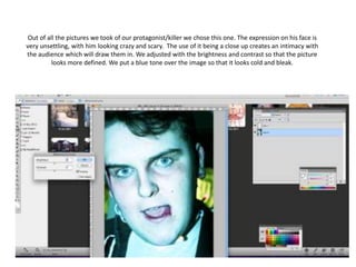
1. Out of all the pictures we took of our protagonist/killer we chose this one. The expression on his face is
very unsettling, with him looking crazy and scary. The use of it being a close up creates an intimacy with
the audience which will draw them in. We adjusted with the brightness and contrast so that the picture
looks more defined. We put a blue tone over the image so that it looks cold and bleak.
2. We then got a picture of
our female protagonist
and placed it over the
first image.
3. However, because we used an image of
her standing up you couldn’t see our
killers face as clear. We wanted our male
protagonist to be the main subject on
our poster. Therefore we selected
another image which was a close up of
her face in some netting. We then placed
her face over the male protagonists and
blurred her image slightly. The netting
and her screaming over the killers face
emphasises her desperation to get out of
his trap. Her hands round his neck is
demonstrating her struggle and utter
pain. I think that this image is appealing
to the eye and is very original, although
still looks like a horror film poster.
4. Even though we were very pleased with how it looked, it still
needed perfection. When we looked more closely at the image
we could see that there was some netting on his shirt which
shouldn’t have been there. We sorted this problem out by simply
colouring in the area with black paint brush.
5. When we come to add our text we want to use the same effect
as ‘The Shining’ poster. I like the way the image is the main
subject and there is a simple piece of text at the bottom.
However, instead of having a white background we will have
black and our writing will be white.