
Recommended
More Related Content
What's hot
What's hot (20)
Viewers also liked
Similar to Poster Analysis Two
Similar to Poster Analysis Two (20)
More from StephanieAlabi
More from StephanieAlabi (20)
Recently uploaded
Recently uploaded (20)
Poster Analysis Two
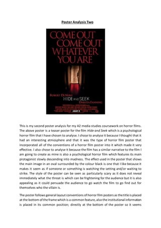
- 1. Poster Analysis Two This is my second poster analysis for my A2 media studies coursework on horror films. The above poster is a teaser poster for the film Hide and Seek which is a psychological horror film that I have chosen to analyse. I chose to analyse it because I thought that it had an interesting atmosphere and that it was the type of horror film poster that incorporated all of the conventions of a horror film poster into it which made it very effective. I also chose to analyse it because the film has a similar narrative to the film I am going to create as mine is also a psychological horror film which features its main protagonist slowly descending into madness. The effect used in the poster that shows the main image in an oval surrounded by the colour black is one that I like because it makes it seem as if someone or something is watching the setting and/or waiting to strike. The style of the poster can be seen as particularly scary as it does not reveal immediately what the threat is which can be frightening for the audience but it is also appealing as it could persuade the audience to go watch the film to go find out for themselves who the villain is. The poster follows general layout conventions of horror film posters as thetitleis placed at the bottom of theframewhich is a common feature, also theinstitutional information is placed in its common position; directly at the bottom of the poster so it seems
- 2. inconspicuous and does not draw too much attention to itself. Other conventions fulfilled are the use of colour as the common horror film colours (black, red, white, etc) have been displayed on the poster so that the audience can instantly recognise the genre of the film so they can swiftly decidewhether or not they want to view the movie or not. Someconventions havebeen broken in this poster such as the main image does not take up the entire frame which is what is expected; instead it only takes up the centre of the poster in a small oval. This could have been done because it is not an official poster for the film, it is only a teaser poster so they may haveonly wanted to give the audience a glimpse into what the film will include and leave the rest a surprise. In themain imagefor this poster for Hide and Seek the setting is of a darkened hallway inside of a house which gives the impression to the audience that there is something waiting for the protagonist at the end of the hallway which they will have to figure out for themselves. The setting is typical for a psychological horror film as the main antagonist is usually a regular person so it would be normal for the movie to be set in a regular house that they would inhabit. This helps to fulfil horror conventions as it is common for the villain to be a regular person and also it makes it scarier for the audience as they may think that it could happen to them in their own homes. The setting allows theaudienceto form expectations about thefilm’s narrative as theidea of it being in someone’s homeindicates that theproblem is within them; or in this case to do with their mental capacity. Low key available lighting is used in this film poster as the lighting is coming from a source inside the house and this creates the effect of normality which could be quickly ripped away from the main characters once their equilibriums are disrupted by the villain. The lighting creates fear and the appropriatemood as the light is only shining on one end of the hallway and the other end is in complete darkness which could signify the split personalities of the main character and the psychological torment that they endure but also it could represent the fight of good versus evil and the two sides that will be shown in thefilm against each other which could hint to the audience which side triumphs in the end. One of themain characters in thefilm Emily is presented in themain imageof the poster who is positioned at the end of the hallway standing in the light with only half of her showing. The fact that she is positioned at the light end of the hallway could represent that her character is good and could be one of the victims of the villains torture; however this is compromised as theposter only showshalf of her body as the other half is hidden in a doorway which could indicatethat sheis thecharacter whosemental state is deteriorating. You cannot depict her facial expression other than the fact that she is giving the camera direct address which could show how she is personally staring at the audience which in turn could make them more scared. Her costume gives much away
- 3. about the character as she is shown wearing pyjamas which represents how her character is only a child, innocent, and usually meant to keep pure and good. This however, is conventional in horror films to make children the antagonist or evil being in the films as the audience are used to seeing children as untouchable so it would scare them to imagine that a child can cause all of this unrest. The colours depicted in the main imageare typical of a horror film as thered could signify blood or danger, theblack could signify death or evil and the white could signify the good trying to remain in the main character which frightens theaudiencebut also signals what genreof film this is so the audience can recognise it easily. The titleof the film is Hide and Seek and themeaning suggested through it is the carried on theme of children as ‘hide and seek’ is a children’s playground game so it instantly gives theaudience an indication that children are going to be a main factor in the film’s narrative; which links in well with the child character Emily who is shown in the main image. The nameof thefilm isn’t particularly typical for this typeof psychological horror film as they usually start with the word ‘the’ to proclaim immediately what the focus should be on in the film. A simplebut bold white sans serif font is used for the title of the film on the poster but thestyleis almost presented as if it isn’t finished yet as there are black splodges on the whitefont which could signal that thereare facts missing that theaudience are unaware of and that they need to watch the film to figure out what they are. The size of the title is medium and compared to theother text on the pageit isn’t thebiggest pieceof text in theframe which breaks conventions as usuallythetitle is thelargest piece of text on the poster. This could mean that the title isn’t the biggest indicator to what the storyline could include; this could be put onto the tagline. The colour used for the titleis whitewhich could link to theactual title Hide and Seek as it is meant to be seen as an innocent children’s game, not as anything sinister. The title is placed towards the bottom of the poster underneath the main image. This layout is typical for a horror film poster as this is commonly where titles are placed so after the audience has been attracted by the main image they can find out what film is being promoted by looking at the title. The title could have been placed here so it doesn’t draw attention away from the main image as they want that to dominate the frame more. “Comeout, comeout, whatever you are” is the taglineused on this poster for thehorror film Hide and Seek which continues on with the theme of children’s games as it is what you would reply if you were indeed playing the game hide and seek. It also causes fear for the audience by replacing the words ‘wherever’ to ‘whatever’ as usually you would be trying to find where someone is hiding, but in this case they are trying to figure out
- 4. what is hiding at thebottom of thehallway. The taglinereveals that in the narrative, the main characters will be trying to discover who the villain is and what they want. It anchors the image whilst also creating an air of mystery as it links well with the child shown the main image but also doesn’t reveal who or what it is they are searching for. The taglineis displayed in a large, red serif font at the top of the frame. The fact that the tagline is the largest piece of text on the poster indicates that it is of more importance than say the title as it gives the audience a bigger clue as to what the narrative will include. It being presented in the colour red also signifies how it may be linked more to the dangerous antagonist and plus it gives it a more sinister, eerie look and feel which could be used to frighten the audience. Also, the serif font shows that the audience should take the tagline more seriously than the title as it also gives a hint towards the threat theprotagonist will befacing. The taglineis placed at thetop of theposter, taking up most of the space. This is not typical as the tagline is usually supposed to be small, not enough to be indistinguishable but enough so it doesn’t draw too much attention. This posters’ tagline however draws most of the attention to itself as the audience would immediately be drawn to it. Other text presented on theposter are thenames of the actors featuring in the film e.g. ‘Robert De Niro’ or ‘Dakota Fanning’ which are used to lure in the audience as they would recognise the famous actors’ name instantly and may feel more inclined to go watch thefilm if they know that the characters will be portrayed by well-known actors. The poster also features institutional information which is introduced at the bottom of theframe. This positioning is so that it doesn’t takeattention away from the other parts of the poster which are more important and the audience would want to know more about. The presentation of the institutional information is typical for a psychological horror film poster as it is meant to be seen as inconspicuous because no one who sees theposter would usually go to read theinstitutional information so it is best for it to be not noticeable. Black, red and white are the colours that dominate the frame of the poster and this colour schemecreates an eerie, almost detached mood on theposter as it quickly shows theaudience what typeof film this is and lets them decide for themselves whether they will want to see it or not. The colour therefore is used to signal genre and sub-genre so mostly fans of horror films will pick up on it and recognise that it is the type of film they enjoy. Overall, I believe the poster is very effective in promoting the film Hide and Seek as it clearly shows the audience what type of film they are going to be watching and gives them hints to what the narrative will include whilst also leaving most of it a surprise successfully which I think is why the poster will be successful in luring in its audience.