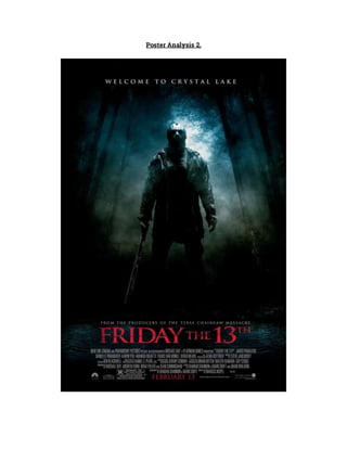
The poster promotes the 2009 film "Friday the 13th" which was released on February 13th, coinciding with the date the film is named after. The poster follows conventions like displaying the title prominently and including the antagonist holding a weapon. It establishes the slasher genre through elements like the killer's mask and clothing and use of the colors black, white, and red. The tagline "Welcome to Crystal Lake" hints at the film's setting and lures audiences with the promise of killings near a lake.
Ethnobotany and Ethnopharmacology:
Ethnobotany in herbal drug evaluation,
Impact of Ethnobotany in traditional medicine,
New development in herbals,
Bio-prospecting tools for drug discovery,
Role of Ethnopharmacology in drug evaluation,
Reverse Pharmacology.
We all have good and bad thoughts from time to time and situation to situation. We are bombarded daily with spiraling thoughts(both negative and positive) creating all-consuming feel , making us difficult to manage with associated suffering. Good thoughts are like our Mob Signal (Positive thought) amidst noise(negative thought) in the atmosphere. Negative thoughts like noise outweigh positive thoughts. These thoughts often create unwanted confusion, trouble, stress and frustration in our mind as well as chaos in our physical world. Negative thoughts are also known as “distorted thinking”.
Instructions for Submissions thorugh G- Classroom.pptxJheel Barad
This presentation provides a briefing on how to upload submissions and documents in Google Classroom. It was prepared as part of an orientation for new Sainik School in-service teacher trainees. As a training officer, my goal is to ensure that you are comfortable and proficient with this essential tool for managing assignments and fostering student engagement.
Synthetic Fiber Construction in lab .pptxPavel ( NSTU)
Synthetic fiber production is a fascinating and complex field that blends chemistry, engineering, and environmental science. By understanding these aspects, students can gain a comprehensive view of synthetic fiber production, its impact on society and the environment, and the potential for future innovations. Synthetic fibers play a crucial role in modern society, impacting various aspects of daily life, industry, and the environment. ynthetic fibers are integral to modern life, offering a range of benefits from cost-effectiveness and versatility to innovative applications and performance characteristics. While they pose environmental challenges, ongoing research and development aim to create more sustainable and eco-friendly alternatives. Understanding the importance of synthetic fibers helps in appreciating their role in the economy, industry, and daily life, while also emphasizing the need for sustainable practices and innovation.
Operation “Blue Star” is the only event in the history of Independent India where the state went into war with its own people. Even after about 40 years it is not clear if it was culmination of states anger over people of the region, a political game of power or start of dictatorial chapter in the democratic setup.
The people of Punjab felt alienated from main stream due to denial of their just demands during a long democratic struggle since independence. As it happen all over the word, it led to militant struggle with great loss of lives of military, police and civilian personnel. Killing of Indira Gandhi and massacre of innocent Sikhs in Delhi and other India cities was also associated with this movement.
This is a presentation by Dada Robert in a Your Skill Boost masterclass organised by the Excellence Foundation for South Sudan (EFSS) on Saturday, the 25th and Sunday, the 26th of May 2024.
He discussed the concept of quality improvement, emphasizing its applicability to various aspects of life, including personal, project, and program improvements. He defined quality as doing the right thing at the right time in the right way to achieve the best possible results and discussed the concept of the "gap" between what we know and what we do, and how this gap represents the areas we need to improve. He explained the scientific approach to quality improvement, which involves systematic performance analysis, testing and learning, and implementing change ideas. He also highlighted the importance of client focus and a team approach to quality improvement.
Read| The latest issue of The Challenger is here! We are thrilled to announce that our school paper has qualified for the NATIONAL SCHOOLS PRESS CONFERENCE (NSPC) 2024. Thank you for your unwavering support and trust. Dive into the stories that made us stand out!
The Indian economy is classified into different sectors to simplify the analysis and understanding of economic activities. For Class 10, it's essential to grasp the sectors of the Indian economy, understand their characteristics, and recognize their importance. This guide will provide detailed notes on the Sectors of the Indian Economy Class 10, using specific long-tail keywords to enhance comprehension.
For more information, visit-www.vavaclasses.com
2. The film above promotes the film “Friday the 13th” which was released in 2009. On the
13th February, which coincidentally falls on Friday the 13th. Those who were brave
enough to watch the film on the release date potentially would have been more scared
than those who watched it another day, as Friday the 13th is renowned for bad things
occurring.
The poster itself follows many conventions of a film poster. The title is the biggest font
within the frame, clearly indicating that that is the title of the movie, allowing the
audience to focus on it and remember it. Smaller fonts including the institutional
information, is placed at the bottom of the frame, out of the way in an undistinguished
place so that the audience can focus on the main details. Such as the release date which
is the last piece of text on the poster and is placed at the bottom so it is the last thing the
audience will see and therefore remember. Lastly, the image dominates the frame
allowing the audiences to have some sort of insight into the movie. In this case it is a low
angle shot of the antagonist, whom is wearing a mask. This will draw the audience in
because they will want to find out who it is and what their motive is.
The image dominants the frame. It is a long shot of the antagonist from a low angle,
making him look stronger, more dominant and superior. It could be said that this image
is present through the victim's point of view, making the audience fear the antagonist
more and would also sympathise with the victims more. The general mise-en-scene of
this poster allows the audience to establish it as a slasher film. The first thing to give this
is away costume which is dark baggy clothing which is complete with a mask. The mask
is the main item of clothing that signifies the genre, as masks are conventional in
slashers. The main prop is the machete, a main part of the iconography in this poster.
The audience can guess how the victims are going to slaughtered, just from looking at
the weapon, which will effectively give them horrific visual imagery before they have
even seen the trailer/movie. Lighting is made apparent just behind the antagonist, due to
the forest scenery in the background, it is easy to establish this lighting as ambient,
which is made available from the moon. Not only does the lighting show us the scenery,
allowing the audience to establish where the killings take place but it also amplifies the
misty fog, which will further increase the audience's fear factor.
The title of the film is “Friday the 13th” suggesting all the events occurring during the
film are going to be building up to and then taking place on this date. This creates
suspicion and curiosity for the audience as many people deem Friday the 13th to be
‘unlucky’ and a date when bad things happen. The font itself is written in a basic sans
serif font, however it is written in caps lock which adds extra emphasis. It is written in
3. red which gives connotations of blood which the audience would expect to see plenty of
as it is a convention of a slasher.
The tagline of the poster is presented at the top of the poster, which is a conventional
location for a tagline to be place. A tagline is used in order to give the audience a further
insight to the movie, which it successfully does. The tagline itself is “Welcome to Crystal
Lake”, giving the audience an insight to location whereby the film is going to take place.
This can be luring to the audience as they might be interested in the plot of a vast
amount of killings taking place by a lake. On the contrary, this could make them dismiss
watching the film altogether as it is not something they might particularly be interested
in. It is written in a basic sans serif font, in capital letters which further emphasises the
tagline and its importance. It is written in white which has connotations to innocence
and purity, which juxtaposes with the idea that it is a slasher film. However, can relate to
all the innocent people the killer will be murdering.
Institutional information is placed at the bottom of the poster, out of the way so it doesn’t
distract the audience from reading the more important text on the poster such as the
title, tagline and release date. Additionally, it is written in a smaller font, further highlight
the idea that it is not as important as the other text presented on the poster. Just below
the institutional information is the release date, which is written in a slightly larger font,
which will manage to retain the audience's attention once again. It will be the last thing
that the audience will see and therefore, this will stay in their minds.
The main colours presented on this poster are black, white/greyand red. All stereotypical
and expected colours to be used on a horror film, more specifically a slasher. The colour
black represents the darkness behind the killer and his thoughts that entices him to go
out and kill people. Not only this, it represents where he will be hiding, it is very rare to
see the antagonist of a slasher film in daylight, they are always under the radar. The use
of the colour red signifies that there will be plenty of blood in this film, the audience
would not expect anything less, as it is a slasher. The colour white could effectively
represent the purity of his victims as well as youth, making their killings tragic. The
colours grey and black have different connotations and can effectively tie in with human
emotion. Both these colours reflect ideas of loneliness and fear, which is applicable to
both the antagonist and protagonists. Allowing the audience to see a different side to the
film, a tragic one, and not just the horror aspects.
Judging by the general mise-en-scene of this poster the audience are able to establish
that a group of teenagers will be misbehaving somewhere near a lake, and will end up
being killed by the antagonist. This is a generic storyline followed by many slashers.
4. However, each is made original allowing the audience not to forget them. This is a similar
idea for my own trailer, however, some conventions will be changed in order to maintain
originality.
This film poster successfully promotes “Friday the 13th” and entices the audience to want
to watch the movie but giving them a clear indication of the narrative, without giving the
story line away.