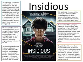
This could entice the audience into
watching the film because if the
targeted audience are fans of insidious
and saw which might make them
consider watching the film . Their
unique selling point.
The setting of the image is of a
cellar; this setting enabled them
to put the spotlight on what I
presume to be the main
character and the doll. The use
lighting put emphasis on the
centre of the image as the
bottom and the top of the image
are quite dark but it gradually
gets lighter which highlights the
girl in the chair and the doll.
The girl is not faced front which
created a sense of mystery to
who she may be however the
doll has a direct gaze which is
used ironically because dolls are
usually used by little kids as a
form of protection but in this
case its quite sinister
The movie is based on a real life story
of Ed and Lorraine who were
paranormal investigators. This lures in
the audience because it could have
happened to absolutely anyone. It
creates a sense of curiosity to what
may have happened to them.
The title ‘ the conjuring’ implies that
whatever was going on to the warrens
was very mystical and it can play on
the minds of the audiences which is
what horror films aim to do.
The font type is very simplistic which
might baffle the audience as the white
colour of the font implies purity which
is in contrast to everything else in the
poster so the audience may start to
question is it an illusion. The meaning
of the title is reflected in the contrast
between black and white. This might
imply to the audience mind that not
everything in this movie will be as it
seems.
The poster has a blurb ; the
blurb includes the names of the
directors , editors, executive
producers , producing
companies and their logos etc.
A website is also featured at the
bottom of the poster which
allows the audience to research
the film etc.
The Conjuring
The poster features the ‘Coming soon’ which builds anticipation to when its coming out of which they can go on the website to find out
when its actually coming out
The Last Exorcism
The tagline of the film bring in the
element of religion; the sense of
good vs evil and who will prevail.
The sentence is imperative as it tells
the audience they must believe in
the devil which entices them to
watch the film for them to see for
themselves how badly the girl is
possessed. The tagline also
interlinks with the image as the
possessed girl clearly has some form
of evil in her
At the top of the poster it states ‘ Eli
Roth and Strike present’ to which
the image is positioned directly
underneath it implying that they
(the creators) created the demonic
character
The image is presumably of the
main character who is posing is
quite disfigured and grotesque
with her hair draping over her face
which emphasises the demonic
side of her as only a quarter of her
face is showing it implies that
something mysterious, dark and
unknown has taken over her and
she isn't in control anymore.
The setting is of the corner of a run
down room with a rotting ceiling
and a really washed out painting
coat further emphasising the dark
element of the film. It shows the
lifelessness. The fact that she's
hanging onto the top of the corner
of the room conveys the
supernatural part of the film as no
normal human can physically do
that.
The poster has the date in which the film is coming out
which is a conventional feature of a poster if it doesn’t
say coming soon (release date)
The poster features who wrote it
and produced it which might lure in
the audience as they might already
be aware of their work.
The title of the film appears to be
smudged blood which conveys that
in this exorcism blood may be shed
and the E looks some unknown
spirit tempered with the text as if
something came and doodled over
it as a sign of them not being alone.
The fact that it’s the last exorcism it
makes it un-missable. The title
implies that there is a force that’s
troubled and wants to release its
anger or simply cause pain.
The poster includes the website for
the film, company logos, age
restriction etc although its not in
the conventional format in which
all the other posters follow.
The Last House On
The Left
The lighting of the poster is
very dark. The black and grey
lighting creates a sinister
atmosphere. The grey
lighting implies that it
happens at night time which
is usually the time for
darkness The title of the poster creates a
sense of isolation which usually
conveys danger. The title is in
white and red and takes the
main focus of the poster. The
use of the red and blood
smudges on the poster
suggests quite a gruesome and
bloody series of events that are
going to take place; that blood
will be shed in the film.
The image is an establishing
shot of where the action will
take place. We are not
introduced to any characters
which creates a sense of
mystery to who occupies the
last house on the left. The
house is surrounded by trees
showing that its isolated which
implies danger and the
question ‘who is going to save
them at such an isolated
place?’ it enables the audience
to create their own storylines.
The tagline positioned right
above the credits involves
the audience as it directly
asks them what they would
do if someone hurts
someone they love. It
involves their emotion into
the film because they can
start to imagine how they
would feel. The tagline
reveals a bit of the storyline;
its going to be about
revenge linking into the
bloody title and the house.
Blood will be shed in the last
house on the left.
The blurb doesn't feature the
coming soon date but it has a
website for the audience to
keep informed. The blurb
includes names of directors,
producing companies aswel
as many other relevant
information
This could entice the audience into
watching the film because if the
targeted audience are fans of
paranormal activity and saw which
might make them consider watching
the film . Their unique selling point.
The main image is a medium
shot of possibly the main
character of the film. The
character is positioned on the
centre of the poster implying
that he will be at the centre of
all the mysterious events that
are going to take place in the
film. The setting of the image
is an outdoor space at which
you are introduced to by the
establishing shot of the house
(where all the action will be
taking place).
The conventional dark lighting was
used in the poster to suggest an evil
atmosphere. The grey clouds match
the characters eyes which further
emphasises the sinister element of the
film . It implies that the character has
some form of evil inside of him
creating audience curiosity. The lighting
matches the colours used for the text.
It creates a flow and consistency to the
poster .
The poster also has reviews
and ratings. Insidious has a 5*
rating on this poster showing
that it’s a good film and the
commentary acts as an
enticing device as ‘so scary’
and ‘sheer terror’ are in a
larger font which puts
emphasis the scary element of
the film.
The tagline ‘its not the house
that’s haunted’ creates
curiosity and mystery to the
film as the audience are left
wondering what exactly is
haunted. The tagline is also in
green which is quite ironic
because green is a colour that
connotes safety not danger.
The poster has a blurb ; the blurb
includes the names of the directors ,
editors, music by , producing companies
and their logos etc. A website is also
featured at the bottom of the poster
which allows the audience to research
the film etc. However it doesn’t have a
coming out date or coming soon which
is unconventional.
Insidious
The Blurb
The blurb usually
has the company logos lined up at the bottom of the blog.
It sometimes includes the age rating aswel. A website for
the film is usually featured on there and sometimes they
now include the icon of their facebook page and twitter
page to keep fans updated,
watch the trailer etc. Blurbs tend to follow the same
format for example they name the production company,
the director, the name of the film, music
producers, editors etc. The blurb usually includes a
‘release date’ or ‘coming soon’

Horror film analysis

  • 2.
    This could enticethe audience into watching the film because if the targeted audience are fans of insidious and saw which might make them consider watching the film . Their unique selling point. The setting of the image is of a cellar; this setting enabled them to put the spotlight on what I presume to be the main character and the doll. The use lighting put emphasis on the centre of the image as the bottom and the top of the image are quite dark but it gradually gets lighter which highlights the girl in the chair and the doll. The girl is not faced front which created a sense of mystery to who she may be however the doll has a direct gaze which is used ironically because dolls are usually used by little kids as a form of protection but in this case its quite sinister The movie is based on a real life story of Ed and Lorraine who were paranormal investigators. This lures in the audience because it could have happened to absolutely anyone. It creates a sense of curiosity to what may have happened to them. The title ‘ the conjuring’ implies that whatever was going on to the warrens was very mystical and it can play on the minds of the audiences which is what horror films aim to do. The font type is very simplistic which might baffle the audience as the white colour of the font implies purity which is in contrast to everything else in the poster so the audience may start to question is it an illusion. The meaning of the title is reflected in the contrast between black and white. This might imply to the audience mind that not everything in this movie will be as it seems. The poster has a blurb ; the blurb includes the names of the directors , editors, executive producers , producing companies and their logos etc. A website is also featured at the bottom of the poster which allows the audience to research the film etc. The Conjuring The poster features the ‘Coming soon’ which builds anticipation to when its coming out of which they can go on the website to find out when its actually coming out
  • 3.
    The Last Exorcism Thetagline of the film bring in the element of religion; the sense of good vs evil and who will prevail. The sentence is imperative as it tells the audience they must believe in the devil which entices them to watch the film for them to see for themselves how badly the girl is possessed. The tagline also interlinks with the image as the possessed girl clearly has some form of evil in her At the top of the poster it states ‘ Eli Roth and Strike present’ to which the image is positioned directly underneath it implying that they (the creators) created the demonic character The image is presumably of the main character who is posing is quite disfigured and grotesque with her hair draping over her face which emphasises the demonic side of her as only a quarter of her face is showing it implies that something mysterious, dark and unknown has taken over her and she isn't in control anymore. The setting is of the corner of a run down room with a rotting ceiling and a really washed out painting coat further emphasising the dark element of the film. It shows the lifelessness. The fact that she's hanging onto the top of the corner of the room conveys the supernatural part of the film as no normal human can physically do that. The poster has the date in which the film is coming out which is a conventional feature of a poster if it doesn’t say coming soon (release date) The poster features who wrote it and produced it which might lure in the audience as they might already be aware of their work. The title of the film appears to be smudged blood which conveys that in this exorcism blood may be shed and the E looks some unknown spirit tempered with the text as if something came and doodled over it as a sign of them not being alone. The fact that it’s the last exorcism it makes it un-missable. The title implies that there is a force that’s troubled and wants to release its anger or simply cause pain. The poster includes the website for the film, company logos, age restriction etc although its not in the conventional format in which all the other posters follow.
  • 4.
    The Last HouseOn The Left The lighting of the poster is very dark. The black and grey lighting creates a sinister atmosphere. The grey lighting implies that it happens at night time which is usually the time for darkness The title of the poster creates a sense of isolation which usually conveys danger. The title is in white and red and takes the main focus of the poster. The use of the red and blood smudges on the poster suggests quite a gruesome and bloody series of events that are going to take place; that blood will be shed in the film. The image is an establishing shot of where the action will take place. We are not introduced to any characters which creates a sense of mystery to who occupies the last house on the left. The house is surrounded by trees showing that its isolated which implies danger and the question ‘who is going to save them at such an isolated place?’ it enables the audience to create their own storylines. The tagline positioned right above the credits involves the audience as it directly asks them what they would do if someone hurts someone they love. It involves their emotion into the film because they can start to imagine how they would feel. The tagline reveals a bit of the storyline; its going to be about revenge linking into the bloody title and the house. Blood will be shed in the last house on the left. The blurb doesn't feature the coming soon date but it has a website for the audience to keep informed. The blurb includes names of directors, producing companies aswel as many other relevant information
  • 5.
    This could enticethe audience into watching the film because if the targeted audience are fans of paranormal activity and saw which might make them consider watching the film . Their unique selling point. The main image is a medium shot of possibly the main character of the film. The character is positioned on the centre of the poster implying that he will be at the centre of all the mysterious events that are going to take place in the film. The setting of the image is an outdoor space at which you are introduced to by the establishing shot of the house (where all the action will be taking place). The conventional dark lighting was used in the poster to suggest an evil atmosphere. The grey clouds match the characters eyes which further emphasises the sinister element of the film . It implies that the character has some form of evil inside of him creating audience curiosity. The lighting matches the colours used for the text. It creates a flow and consistency to the poster . The poster also has reviews and ratings. Insidious has a 5* rating on this poster showing that it’s a good film and the commentary acts as an enticing device as ‘so scary’ and ‘sheer terror’ are in a larger font which puts emphasis the scary element of the film. The tagline ‘its not the house that’s haunted’ creates curiosity and mystery to the film as the audience are left wondering what exactly is haunted. The tagline is also in green which is quite ironic because green is a colour that connotes safety not danger. The poster has a blurb ; the blurb includes the names of the directors , editors, music by , producing companies and their logos etc. A website is also featured at the bottom of the poster which allows the audience to research the film etc. However it doesn’t have a coming out date or coming soon which is unconventional. Insidious
  • 6.
    The Blurb The blurbusually has the company logos lined up at the bottom of the blog. It sometimes includes the age rating aswel. A website for the film is usually featured on there and sometimes they now include the icon of their facebook page and twitter page to keep fans updated, watch the trailer etc. Blurbs tend to follow the same format for example they name the production company, the director, the name of the film, music producers, editors etc. The blurb usually includes a ‘release date’ or ‘coming soon’